https://www.youtube.com/watch?v=CIPdU6RqBqk
How to Make a Website from Scratch _ Step-by-Step for Beginners
What's going on guys in this video ?
I'm gonna show you step by step how to make a website from scratch , literally starting from zero .
So the website , I'm gonna show you how to make has a one page design .
So all of your most important information is right here on the home page .
It has a strong call to action with a clickable button .
It also has a sticky menu that stays at the top whenever you scroll down and it has clickable jump buttons that take you to other parts of your website such as contact about services and more everything is easily customizable .
So it's fantastic for beginners and there's absolutely no coding involved .
It's also very mobile responsive .
So no matter what with your device is , it perfectly resizes all the content to flow seamlessly .
Over 52% of global online traffic is from a mobile device .
So this is really important .

I'll also show you how to make a logo for your website for free without downloading any software to do it as well as showing you where to get awesome royalty free images for your website .
This video tutorial is perfect for online entrepreneurs , freelancers , anyone that wants to get their feet wet with web development or anyone that doesn't know anything about web development and just wants to get their first website up quickly .
So by the end of this video , you'll have a beautiful fully functional website within about one hour .
So , just a quick demo .
Before we begin , we're gonna be using a free theme called Hestia .
It's very clean , quick to customize .
And you can also add widgets and plugins to do almost anything like set up a shop , a gallery or collect email options .
So I'll show you how to create this sleek home page with this awesome call to action here as well as a clickable image over here that can take you to any custom URL right now .
Mine is on the App store .
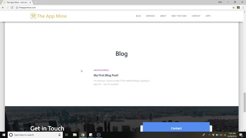
I'll also show you how to edit these clickable icons and make them your own as well as the text and where they link to .
I'll show you how to edit your about section or maybe you want this to be your mission statement .
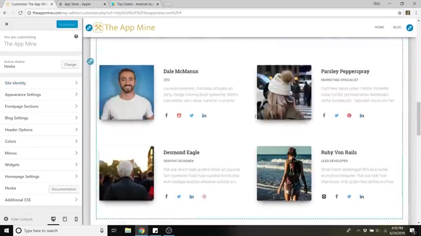
I'll also show you how to upload your own images for your team section .
I'll also be showing you how to write your first blog post and all of your latest posts will show up here on your website and I'll show you how to create separate pages in case you want something that's different from this one pager front page layout .
In this case , I have a separate page called apps .
Because in this tutorial , I'll be designing a fake app development company while I show you how to do everything .
And I'll also show you how to edit your contact form down here as well as plenty of design tips to achieve the overall look and the style of your website .
So without further ado , my name is Dale , I'm a web developer , a youtuber and I help people create websites .
I absolutely love of it and I'm excited to show you how to do it today .
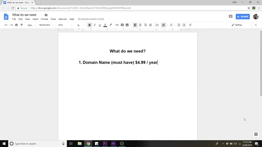
So in order to set up a website , we're just gonna need a few things first .
So first you're gonna need a domain name and a domain name is a must have , you really can't have a website without this .
So normally this is about 12 to $13 in a year .
But I partnered up with host Gator and got an awesome discount for you guys for this .
It'll be about 4 99 instead .
So in case you don't know what a domain name is , let me explain it .
So every website has an IP and that's just a random string of numbers .
So when you register and purchase a domain name , it's kind of like saving your home address as home into your phone .
It takes this ridiculous set of numbers and assigns them a very simple name that you can type in any time you want to go there , ok ?
And you're also gonna need web hosting , web hosting is also a must have .
Normally , it's about somewhere between 7 to $10 in a month .
But again , with this discount that I'm gonna provide you , it's gonna be somewhere around 2 to $7 in a month , depending on which plan that you choose .
So if you don't know what web hosting is , let me explain that too .
Web hosting is just a service that allows you to rent space on the internet , fill it with all of your media and go live much like renting space out of a shopping center if you wanted to open up a shop .
So when you want to start a website , all of your text pictures , buttons and so on have to be stored on a server somewhere that's connected to the internet .
No , if ands or buts about it and web hosting companies have buildings filled with these servers .
They also provide you with design software security and support .
Next , you're gonna need to install wordpress .
And this is also free wordpress is just what we're gonna use to design our website .
And number four , we're gonna need to activate a new theme .
And again , we're using a free theme called Hestia .
That's super awesome .
So whenever you're ready , let's get started .
All right .
So step one is to secure a domain name and hosting plan .
All right .
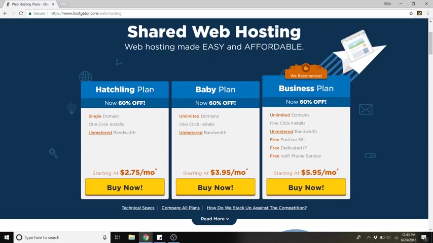
So let's do it , head on over to your web browser and just go to host gator dot com or you can click on the link below .
And once you're in host gator , we will want to go over to web hosting and in web hosting , you'll see these are the different plans that uh host gator offers .
And I've been using host gator to host all of my websites for a while now and their website is super easy to navigate .
Their customer service is awesome and they're really affordable .
And if anyone has ever been on my website and looked at my about page , I am all about no BS , I'm not gonna pitch you something that I don't use myself .
So , uh if you plan on having multiple domains , baby plan is the way to go .
Uh for the sake of this lesson , I'm just gonna do the hatchling plan .
It's one single domain .
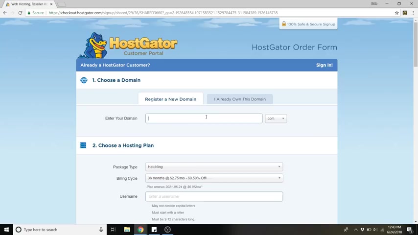
So we're just gonna go ahead and click buy now and from here is where you can search for a new domain or if you already own a domain , you can click on this tab over here .
So let's just say I want to do a app development company .
So I'm gonna type in the app mine and dot com is over here already and ok , it's available .
So you'll see it'll say added primary and green if it's not available , like let's say , let's try at mine dot com , click dot com .
It'll say unavailable and it'll give you some other options that are like dot site dot online dot space .
There's all these weird ones honestly dot com is what legitimizes your website the most .
So I would really recommend sticking with dot com .
Also , when you're choosing your domain name , you want it to be something that is gonna be really easy to remember for your visitors , something that's not too difficult to type in .
Uh And it's also got searchable keywords in it .
So the app mind dot com , the word app is searched a lot on Google .
So that's something that you wanna have in your domain name .
If you can and before you're securing your domain name , you're gonna wanna read it through a couple of times just to make sure that there's nothing hidden in it .
Uh A few bad domain names that have been purchased are old man's haven , which can be translated to something else .
Um Speed of art dot com .
We've also got a therapist in a box .
You can see why these are not good domain names .
Uh They were not reviewed before being secured .
So make sure you review yours or else you could end up with therapist in a box .
So let's go back and type in the at mine dot com and you'll see domain privacy protection down here .
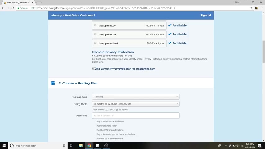
You're gonna wanna leave that checked because if you don't , your information is gonna be public for solicitors to call you and blow up your phone .
It happened to me the first time I ever bought a domain name and my phone just got bombarded with solicitors asking if they can set up my website for me and all this stuff , uh which we don't need because you're gonna do it .
All right here today with this video .
So make sure that's checked and let's scroll down .
And so you've got your plan here again , I selected hatchling .
You might be on baby if you plan on having multiple domains .
Uh and then the billing cycle here .
So what happens is if you're at one month , the cost is a little bit higher and I recommend going with the 12 months or 36 even if you know that you're gonna commit to this for a while .
Uh because it's the cheapest plan , it says 2 75 a month here .
And again , I have an affiliate link uh with host skater that'll get you a massive discount .
So it'll be even less than that .
Uh So I recommend going higher because it is cheaper .
But again , if this is your first website , you can go ahead and click one , give it a little trial run and then you can always upgrade later and you can enter in a user name .
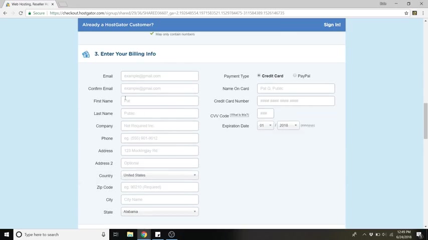
I like to just do my first name and last name and you can enter in a pin and scroll down and this is where you're going to enter in your billing info .
So you can pay by credit card or you can also do paypal .
Uh I'm just gonna do credit card .
All right .
So now we can scroll down to the add additional services and we're actually gonna want to uncheck these because actually , if you follow my channel , I have videos that show you how to do these things for free and just scroll down .
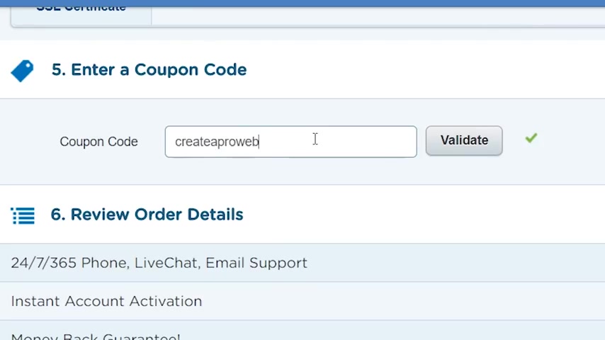
And this is where you're gonna enter in that coupon code that I talked about earlier .
Uh , again , this is my affiliate link .
Uh , It saves you a massive amount of money , but it also does give me a commission .
So it kind of helps fund uh these free youtube videos for me to do .
So , that's awesome too .
It's a nice win , win .
Uh So just put in the coupon code , create a pro website and hit validate .
And now you can see you've got , instead of a $15 domain name , you've got a 4 99 and the hatchling plan just brought you down to 7 67 .
Again , if you were doing 12 months , the price would be like half of what it would normally be .
So if you're doing 36 again , saves you even more money .
So that's why I recommend doing the 12 or the 36 .
So now you just have to uh agree to the terms of service and click , check out now and it'll bring you to this payment , completed page .
So that's awesome .
We've now secured our domain name and bought our hosting plan .
Ok ?
So step two is install wordpress .
So after host gator is finished setting up your account , you'll end up in the host gator customer portal , which is also called the C panel .
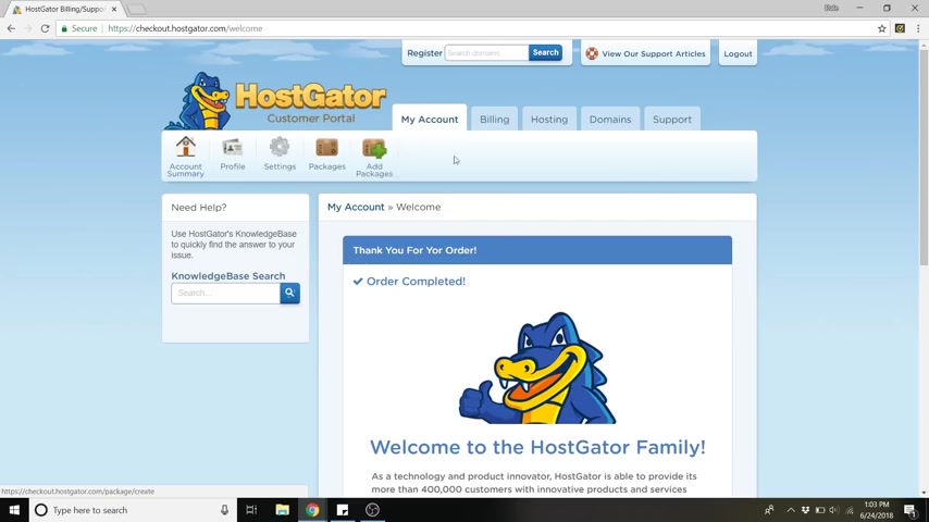
Uh If you're not here , you can just click on this uh host gator customer portal logo at the top of the last screen and it should take you here as well .
So once you're in here , just click on hosting and in hosting , you'll see wordpress one click installation .
Simply put , Wordpress is just a software that you use to design and publish your website or your blog .
Wordpress is by far the most popular website builder on the market and it powers about 30% of the internet , which is a lot of frickin websites .
Wordpress comes with over 11,000 different themes that you can choose for your website .
And also over 55,000 widgets and plug ins to help you optimize the functionality and the tools on your website .
And wordpress is free .
It's an open source software .
So there's tons of developers all over the world working on it every day to make it better .
So we're just gonna head over to Wordpress one click installation and click that .
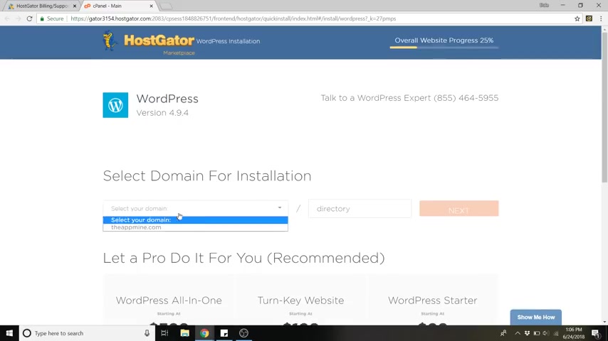
And now just go to select your domain and select the domain that you just purchased and click next and then give your website a title .
I'm just gonna call mine in the app mine because again , this is a app development company , a imaginary one of course , maybe by the time you're watching this , it won't be imaginary admin user .
Just put your name , the first name , last name and admin email , same email that you used for host gator to sign up and then just agree to the terms of service and then just click , install .
Ok , installation complete .
So now you can see that it was installed to your domain name .
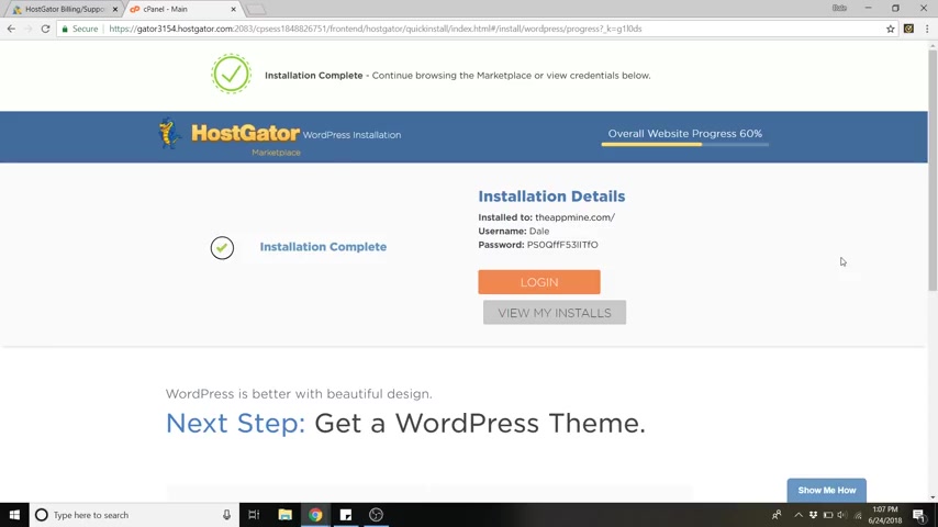
You've got your user name and this ridiculous password , what I recommend is copying the user name and password and putting that somewhere on your computer to remember it or write it down because you're going to need that ridiculous password in order to change your password once we get into wordpress .
So now you can go ahead and click log in and you're brought to this page because wordpress has to send your website out across the entire world .
So it's sending it to every DNS to let it know that it's there and it's existing .
So this process could take anywhere from 15 minutes to two hours .
Uh It says it can take up to 24 hours , but I've never actually had it , take that long .
It's typically around 15 minutes , but just take a break and come back after it's done and we will pick back up where we left off .
All right .
So we're back .
And the way to check on your website is to just type in your new domain name and you'll be taken to this page .
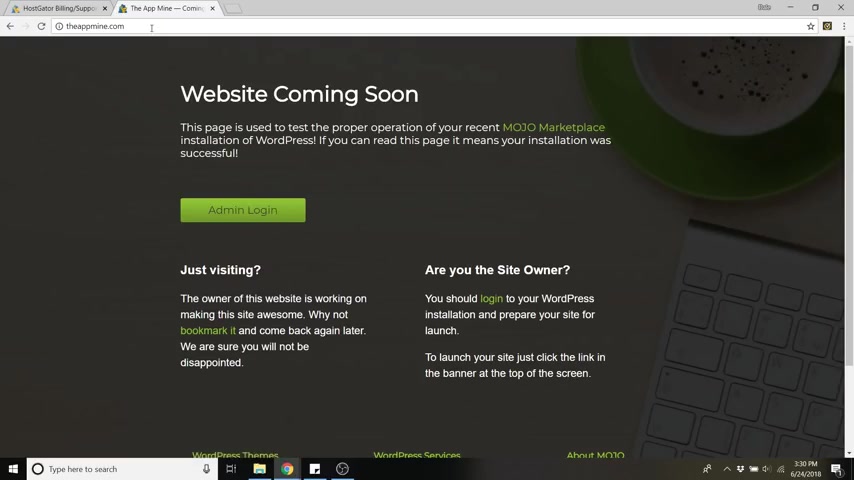
So instead of signing in here with this button , the real way that you should get used to signing in is by going to your domain name and typing forward slash WP dash admin because this page is actually going to go away once you publish your website .
So now this will take us to your wordpress , log in for your domain name .
So here is where you put in your user name and that ridiculous password from earlier .
So I'm gonna do that now and my user name was just my name and just copy and paste that password and hit log in .
All right .
So here we are , uh this is the Wordpress dashboard .
It is not as daunting as it looks at first .
So in order to make it a little less daunting , the first thing we're gonna do is just dismiss all of the things on the dashboard .
So we're just gonna hit these little axes on everything and clear it up up , arrow up , arrow .
All right .
So there we go .
This is far less daunting to look at .
So step number three is to reset your password because we don't want to remember that ridiculous password .
We want to make our own custom password .
So to do this , just go over to users go to all users and then just click on your name and then scroll all the way down to the bottom of this page and you'll see generate password just click that button and delete this other ridiculous password that it wants you to save and create your own and then just click update profile and there you go .
Now , you can just type in that new password any time you log in using WP admin .
Now , step four is to activate a new theme .
A theme for your website is basically just what determines the whole layout and the look and the style of it .
And you can tweak it around after you install a theme .
But a theme is just your basis template .
So to install a new theme , just go to appearance and go to themes and wordpress has over 11,000 different themes .
So you could play around with these all day .
So to add a new theme , just go down to this box here and click , add new theme and now you can search based off of the featured ones .
You can go to the popular list , then you've got the latest .
So any developers that are creating themes will upload them .
Uh So there's constantly new themes being created all the time .
But the one that we're gonna work with today is a absolutely free theme and it's very user friendly .
Definitely my number one choice for a beginner theme and they even have a pro version , which is awesome .
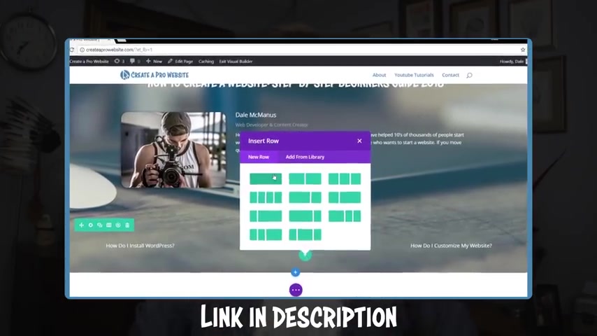
Now , if you do want to work with a paid theme , I highly highly recommend divi it's by elegant themes .
It is fantastic .
Super user friendly .
It's got a drag and drop type of software to it .
So it makes it really simple to customize everything and you have a lot of customizing options .
But today we're gonna be working with a free theme called Hestia .
So we're just gonna go to the search bar and type in Hestia and you can see it .
It's the third one right over here .
So just click install and now it'll turn to an activate button .
So just click , activate and there we go .
So now he has been activated in order to see it , just go up to your website name here and click visit site .
I'm just gonna open it up in a new window .
So our website looks a little boring , but not for long because we are going to customize it and make it our own .
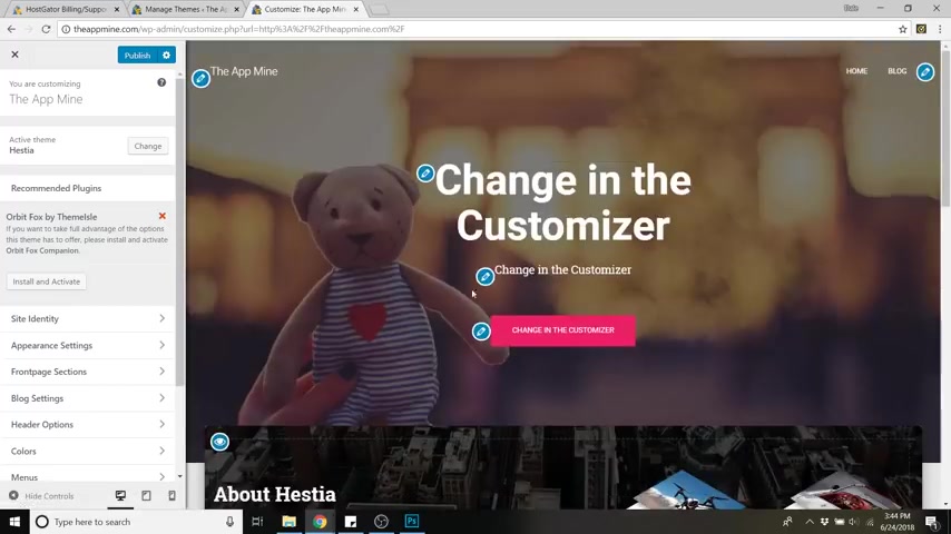
So just go ahead and click , customize .
And now when we're in the customized menu , it changes our website to the way it's actually going to look , uh which is like this .
Well , we're going to change everything , the font backgrounds , all of it .
So next step before we do absolutely anything is step number five , install and activate Orbit Fox .
So Orbit Fox is just a plug in for he , that's gonna give you a lot more modules than just the simple contact and blog .
So we will do install and activate right here .
You'll see it under recommended plugins and that is installing and now activating .
So there we go .
Uh Orbit Fox just added some extra stuff .
We've got uh the services area which is actually called features .
We've got an about section , meet the team clients .
So gave us some extra stuff to work with .
All right .
So next is step number six , which is to add your logo and your site identity .
So I'm gonna show you how to make a logo for free and without any software and we can do it in about two minutes .
And I'm also going to show you how to resize that image so that all of your images on your website are optimized for speed .
So nothing is going to slow down your website .
So go ahead and go to logo maker without the E that's logo maker with Justin R dot com and you can skip the tutorial .
So here we've got this nice blank canvas which we can make a logo with .
So I'm gonna make mine and it's an app company .
So I'm just gonna search up here at the search bar app and it gives us all these awesome free icons that we can choose and these are all vector images so they can be scaled as high as you want them .
So I'm gonna just go with this blank app looking symbol here .
I'm gonna scale that .
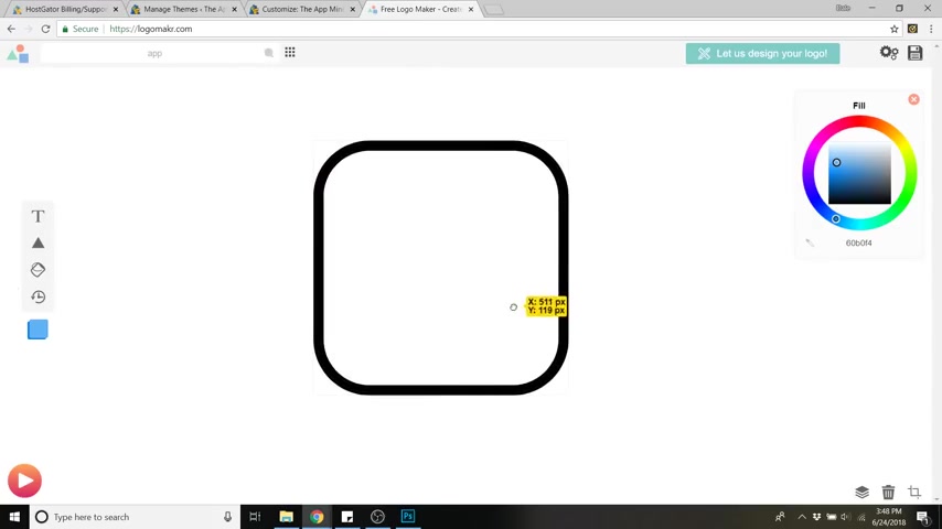
Oh I'm going to scale that up , drag it back in the center to a scale .
You just drag one of these boxes right here and you can uh move it up and down .
And I'm also going to search for anything that has to do with the mine .
So I'm gonna type in mine .
This is why I love this program .
It's very simple .
So the logo really doesn't matter as much as you think .
Uh what matters is the content that you put out for your customers or your visitors .
And the value that you're providing the logo is just a way to tweak their memory of .
OK , I know what that company is .
So make it really clean and simple .
So I want to go with something that is like a pick ax .
Maybe I like this one right here .
It's got these uh shading lines on it .
So I'm just gonna scale that up and put it right in the middle and you also want to pick a color for your website .
It should be dependent on what type of website yours is .
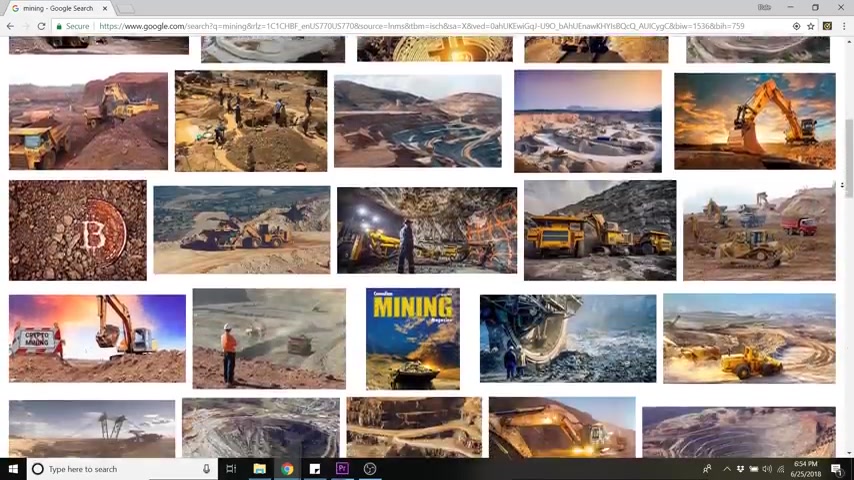
So with mine , it's uh got mining in the name .
So I'm gonna pick anywhere from like a dirt to a gold color because people mine for gold .
So like a brown or a yellow or somewhere in between .
So first before you change the color , you wanna make sure that these are both selected , so select the ax and also the rim around it .
And now you can drag around to any of these colors and change it however you want .
But I have a color code in mine .
So I'm gonna put that here by pasting and there we go .
That's the color code that I want .
So that's done .
I'm gonna save that and then I'm also gonna put the words next to it and save a long version of the logo .
So to save this , just go up to save logo at the top right , and you can have option one which is to buy it for $19 .
Uh And you can scale it to any resolution that you want because it's gonna stay as a vector file .
Um And you also don't have to give credit .
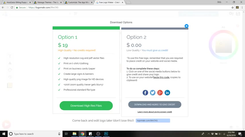
So option two is the free version and all you have to do is agree to give credit .
And if you want to save the logo uh and come back to it later , you can copy this uh URL down here .
So I'm just gonna do that just in case and download and agree to give credit and now it just downloaded .
So we're going to go back and do a long version as well .
So I'm going to select both of these and drag it off to the left , drag the size down to out there and I'm gonna add a text box by clicking on this t over here on the left and I'm gonna type in my company name and size that up and I'll just drag that to where it's centered , maybe make it a little bit higher just drag that right there and I'm gonna change the font by going up here and I'm going to pick , there's all these different categories that you could go with .
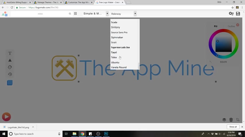
I'm just gonna stick with simple and modern and I'm also going to choose one called Teli at the very bottom .
You can play around with these as much as you want .
Figure out what you like .
And I'm also gonna make that my color code .
So with that selected , I'm going to repass that color code and now we can save that one too .
So just go up to save logo , download and agree to give credit .
All right .
So now that that's done , we're gonna go to a website called tour dot com .
That's fotor dot com .
And this is where we're gonna resize our logo .
So just click edit over here .
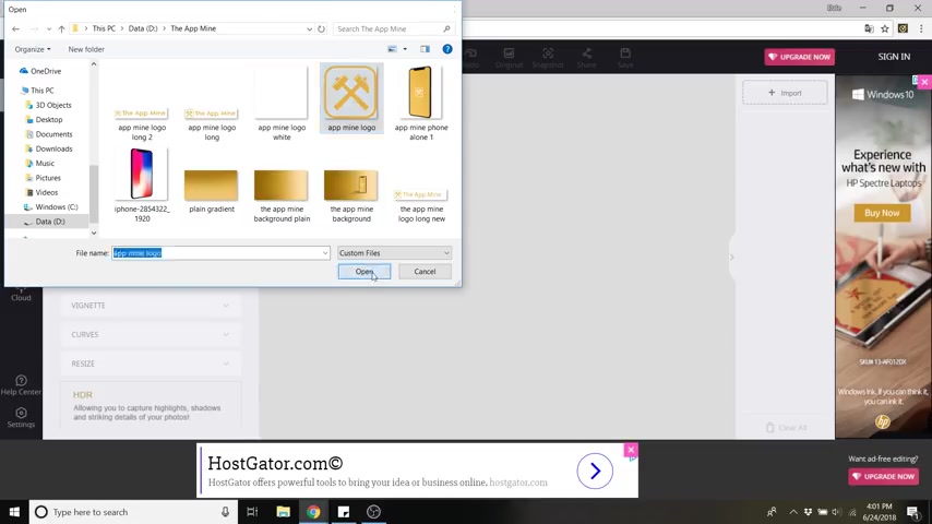
So just go up to open , go to computer and go to where you've downloaded your logos or put them into a new file and select the logo and now just go over to resize at the bottom left and we're gonna just resize this to 1 50 by 1 50 click apply .
That's 1 50 by 1 50 pixels , click apply .
And now just go up to save and we're gonna do this logo and just say 1 50 times 1 50 .
So we know what the size is and we want it to be a PNG if it's not a PNG and you save it as a JPEG .
Then your logo is gonna have a white background behind it and this is gonna show up on your website and it's gonna look kind of tacky .
So a PNG gives it a nice transparent background and we want the quality to be high and it's gonna ask us to create an account for this .
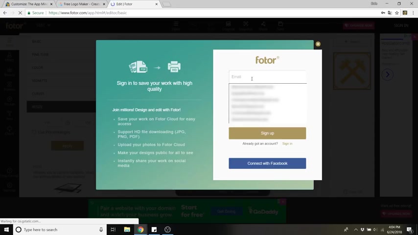
So you can either do this with Facebook or you can just click sign up down here this little button and just make a quick account .
It takes like two seconds and click sign up .
There you go .
So literally , that took like two seconds and you'll probably be using this more often if you're editing images for your website .
Anyway , and we don't need to do this to the long logo because it's already the perfect size .
It's at about 600 pixels .
So we're just gonna go back to our website and you'll see our name up here at the top left , just click the pencil icon next to that and you'll see this section over here where you can select a logo .
So just click that button and then go to select files .
So if you're in media library , you just go over to upload files , select files , click on the logo .
So this is gonna be the long logo .
This is where we want our name with it too .
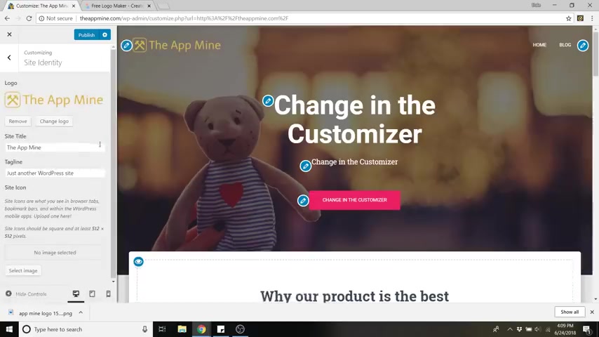
So we've got the long logo click open and then just go to select and you can crop this to whatever size you need .
Or you can just click , skip if you don't need it , then click crop image and you can see it just added our logo up here , which is pretty cool .
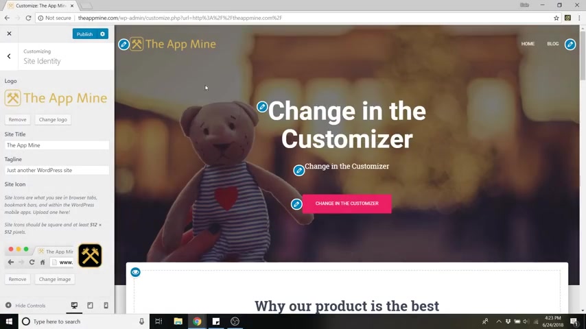
So now we wanna add the site identity , which is the Facon .
Uh another name for it .
It's this little symbol up here uh on the web browser .
So it just adds a little bit more of a customization .
So just go down to site icon and click select image and then go to upload files , select files and you can select the same um 1 50 by 1 50 pixel logo , then click select , click skip cropping and now you can just see that change to our logo .
Now , step number seven is to customize your website .
So we're gonna be changing this title here .
We're gonna change the background image , the color of this button where the button goes , all that fun stuff .
So what we're gonna do is click on this pencil icon next to the header .
So that just brought us to an area where we can edit all that stuff .
So for the title , which is this main header , I'm going to edit that to be my call to action .
So it's what I do here at the app mine .
So I'm gonna just say we build mobile apps and now it just updated my header and the subtitle .
I'm gonna change that to games to capitalize games , social platforms , business , educational and more .
There we go and the button we can edit by changing the text to whatever we want .
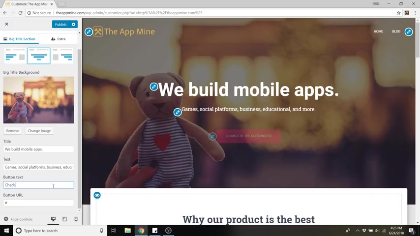
So let's say , check us out on the App Store and now we can change the button URL .
So if I had an App Store development profile on Apple's website , then I would do that .
But if not , I'm just gonna do the App Store and just get the main Apple app store URL , click copy .
And I'm just going to paste that under button URL .
So now if we were to click on that button , it'll take us over to the App Store or wherever you want .
You could do youtube , you could do a different part of your website , whatever you'd like .
And I'm gonna show you how to create pages uh that will go up here in your menu a little bit later .
So now we're gonna change this background image and then I'll show you how to change the button color .
So to change the background image , just click on change image right here .
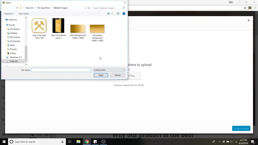
And again , I've supplied all of these sample images for you guys .
If you want to follow along with my images or you can upload your own .
But the size for the main background should be about 1800 pixels by 1000 .
So I'm gonna just click on that one , click open , then click choose image .
And now we've got this nice clean background .
You could add a picture or whatever you want to add .
If you want free images that are pretty awesome .
You can go to Pisa bay dot com and Pixie Bay is a free stock image website .
I get all of my free images from them .
They have a lot of stuff .
You can just search whatever you'd like .
You can type in any keyword and it'll give you images uh based on that keyword .
So that's pretty cool .
And you can change the alignment of the text and the buttons by clicking on one of these alignment options above the background .
You could do right , you could do left .
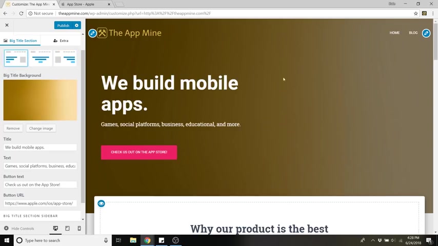
I'm gonna go with the left because I'm gonna end up adding an image right here .
I'll show you how to do that with a quick widget and that image will also be clickable .
And if you'd like to change the font and the font size here , you can just go back , go back again , go down to appearance settings , click on typography so you can change the font family .
And ideally you want to match your logo and mine was Teli there we go .
And it also changes your subtext as well .
And if you'd like to change the size , just go up to front size and it's actually not title or headings .
It's actually big title section .
This is what uh this section is .
So you can change that .
So if you want it all in one line , you can do like that and that's it pretty quick and simple .
So now just go back .
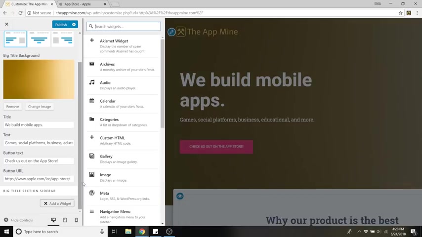
So to add that image , just go down and click , add a widget and then go to image down here and now you can't see it , but it just added a image box for us .
So if we scroll down , you can now see we've got this image widget .
So just click add image and then go to upload select files .
I've got this phone picture right here .
It's about 500 by 6 27 pixels .
That's about the right aspect ratio that you should use .
So just click open and click add to widget and now it's gonna look a little funny because it's kind of small .
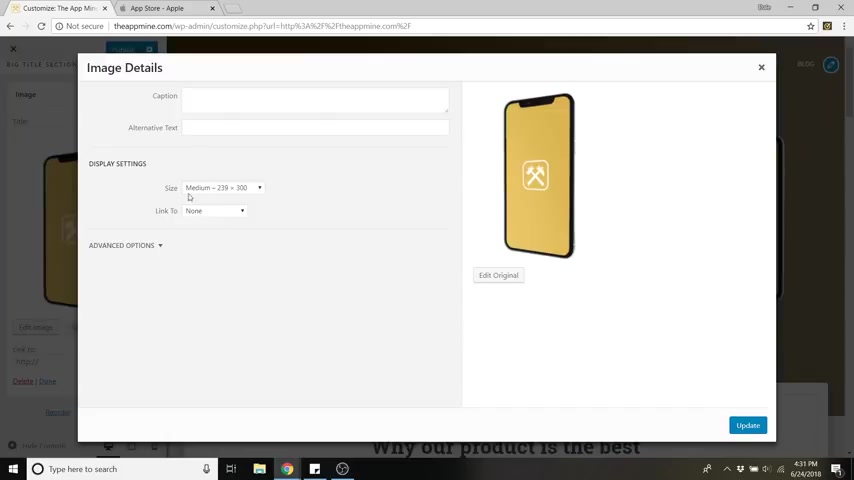
So what we're gonna do is go down to edit image here and we're gonna go to size under display settings and we're gonna go to custom size and I'm just gonna type in about 450 pixels into the height you can play around with this .
Uh However you need .
So if I click update it will update that size .
And so if you're like , OK , my image is too big , go down to maybe 300 pixels .
If that's too small , go up to 400 .
Uh We just got to play around with it a little bit to figure out what you need .
And the last thing we're gonna do uh for this image widget is to add a link to it .
So we're also going to link this to the App Store .
So I'm going to copy the app store , URL again , go back , go back to edit image and then go to link to custom URL paste that URL under custom ul .
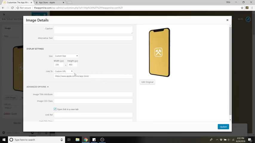
Then go to your advanced options under here and click open link in a new tab because we don't want to take them away from our website .
We want them to spend as much time on our website as we can then update .
So now if we were to click on that image , it would take us to the app store as well .
So we've got two buttons that will lead us to our call to action and just make sure you click apply just in case and we're also going to change this button color now .
So our main color is obviously this gold color , but this should be our accent color .
So to do that , just go to the back arrow here , back arrow again , go to colors and then just click on accent color .
So what I recommend here is if this is a strong called action , you should have a very complementary color .
You could go ahead and paste the same color code in there , which will give you the same color , which it all kind of blends in too much .
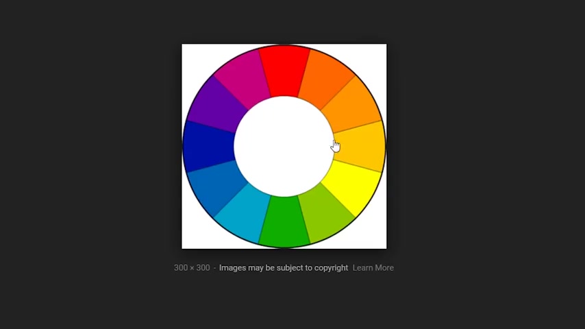
So it doesn't stand out enough for me to want to click on it .
So what I recommend is going with more of a complementary color .
So blue is actually the best option here .
And if you're not sure you can just go to Google and type in Color Wheel and just go to , let's say one of these and you can see whatever is on the opposite side of your color .
So my color is somewhere around here or here .
So the best on the opposite side , the complementary color would be a dark blue or a light blue .
So if your website was red , then maybe green might be the best button color , something that's gonna stand out the most .
So I'm gonna go with kind of a lightish blue and that is all done now .
So we're gonna go down and you can now edit each one of these sections .
So the nice thing about Hestia is you've got all these little pen icons where you can just click and it'll bring you exactly where you need to edit these things .
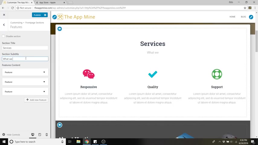
So first we're going to edit the features box .
So if you click on that little pencil icon , it'll take you to that features page and we're just going to change that to services .
So this is what our company does and we're going to change that subtitle to what we do best and you can change each one of these icons and the text and everything to make it your own .
So just click on this feature box here and click on the drop down and we're gonna change that icon .
So if you click on this part that says wechat , you can now change that to whatever you want .
I'm gonna do an Apple logo because we're gonna say that we code with I Os and Android and we're also going to do a coding course .
So let's change all these symbols first .
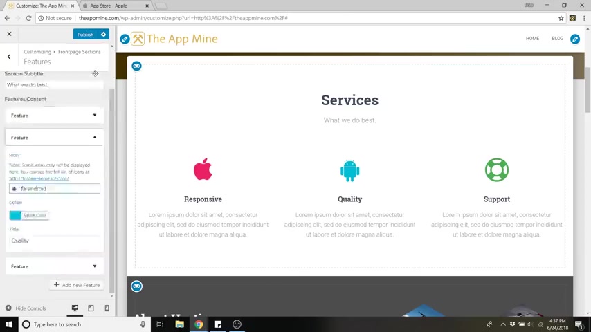
So if we go back out , we can go to the second feature box , change that icon to an android symbol and go to the third box and let's just change that to a coating symbol .
Let's do this one .
And you can also change all of their colors .
So I'm just gonna go back to the first one and let's change that to kind of a grayish color .
I'm gonna change the Android to a green and the coating .
I'm gonna change that to a blue color .
And lastly , you can change the names .
So if I want to change the name , you can just go down to title inside of that feature box .
We're gonna change this to I Os development and you can also make this link to somewhere .
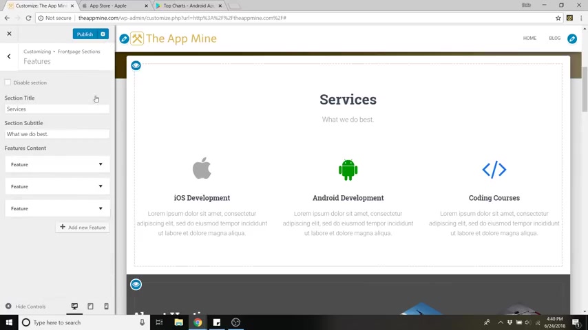
So if I click on the apple symbol , it'll go to whatever custom URL I put in here .
So I could link that to my I OS apps .
So again , I could do whatever my app store uh page was gonna be again , I don't have one , so I'm just linking to the App store .
So there we go .
And if you'd like to add more , you can click , add new feature and add as many as you'd like .
So that is done .
Now , we can move down to our about section and I'm gonna just show you real quick , you can edit this , you can change the background here .
Uh I have another image already saved in those files for you guys .
Uh It's called secondary background .
It's kind of the gradient that goes downwards instead of to the right , just click open , then click choose image and we can also edit uh what it says here .
So I'm just going to delete everything and start fresh .
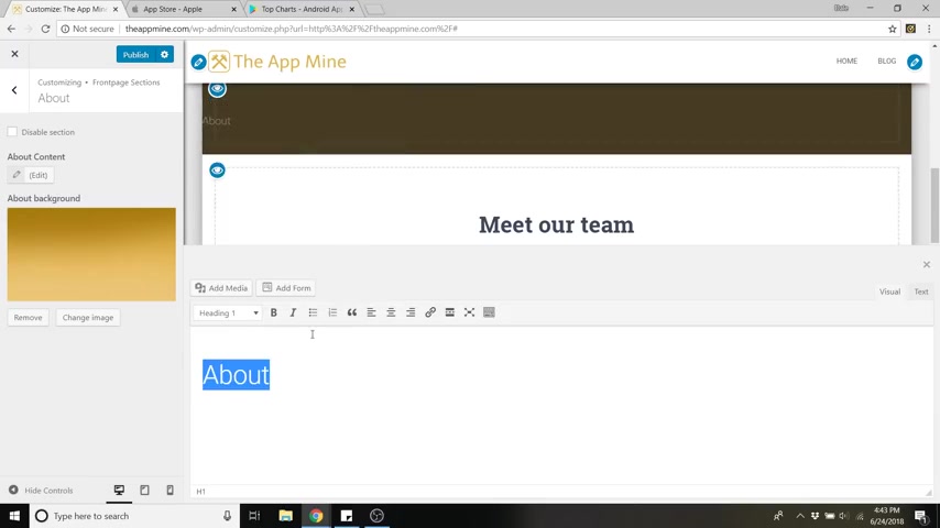
So this will say about and I'm gonna just select that and I can make that a heading one which will be the biggest font and I'm gonna click enter and write this is where you write your about info and I can also add an image .
So if I click uh behind about and click a space bar , I can click , add media and you can put a picture of yourself whatever you want to put .
I'm just gonna put my logo for now just to show you and I'm gonna select all this and realign it .
So actually I'm gonna put that below the icon .
So let's just cut that click , enter , paste .
There we go .
So that's all kind of on top of each other like that .
So if you click this X , you can see it a little bit better and this gray won't be here forever .
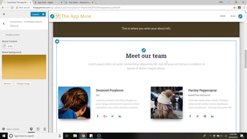
Uh The actual background will be there once you publish it and go to your site .
Next is the Meet our team section .
So you could put all of the employees here .
Uh Just to show you real quick , you can edit this title here by clicking on the pencil and I'll just change that to our team and you can go over to a team member box .
So this is the first one and we can upload an image in here .
So we'll change Desmond to myself .
So click upload image , upload files , select files .
And I'm just gonna add this goofy picture of me that I took click insert into post and I can change the name to my name .
Oops , if I can spell it right , and you can edit the job title , whatever you wanna do and you can also add a link .
So this is actually clickable .
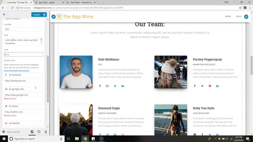
So if I were actually out of the customized menu and on the actual website , uh this image would kind of enlarge a little bit .
So you could put a link there .
I'm not gonna put one for right now and you can also add all of your social links .
So you can also change it .
So if you don't have a Google plus , you could change it to anything .
So I can make this , let's say my youtube and then you can just change the link underneath .
So I'm not gonna do all that right now , it'll take a while and you can edit all these sections the same way .
So clients , you've got all these client logos which are all clickable .
Uh You can edit those so that you can change them to whatever you want .
And now we've got the blog and contact .
So I'm gonna show you how to do your first blog post .
But first , I'm gonna show you how to install a quick plug in for a contact sheet .
So it'll allow people to send you an email .
So to do this , it says in order to add a contact form to this section , you need to install pirate forms .
So if you click on that little pencil , so this will bring you to where you can install and activate it .
And before you do that , it'd be a good thing to click , publish site up at the top that blue button and then you can click on install and activate , publishing your site .
Just saves the changes that you've made and it puts them live for other people to see .
All right .
So now that should have installed our contact form .
So if we go all the way down , you can now see we've got this contact form and this is the same accent color that we picked for the button and you can edit what this says by clicking on the pencil .
First , I'm gonna change this just to contact just to show you you can change it and same with this .
Get in touch , you can say um well , I'll leave that as get in touch and I'll change the subtitle to we don't bite and you can change your background image by clicking , change image .
I'm just gonna leave it as the city for now .
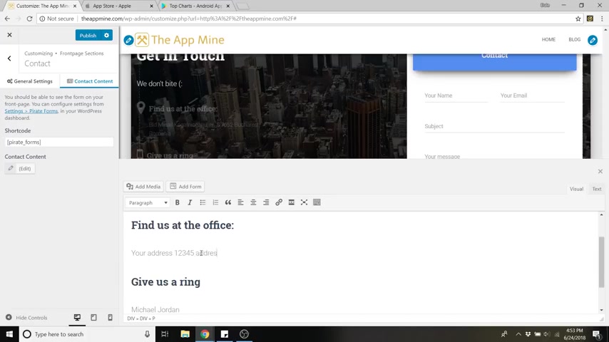
And you can also edit this information here by going up to contact content and then go down to edit with the little pencil and this little word uh editor comes up and you can change that stuff as well .
So your address , 12345 address lane , I don't know , give us a ring , you can put your information here .
So just put the app line and you could add an email here .
So if you just uh copy this and paste it below , you can change that to email .
And once that's done , you can just click this little X and now you've got all of your information right here .
And in order for anyone's email to actually make it in your inbox , we're gonna have to go put in our email .
So just save our work by clicking publish and then go back to your dashboard .
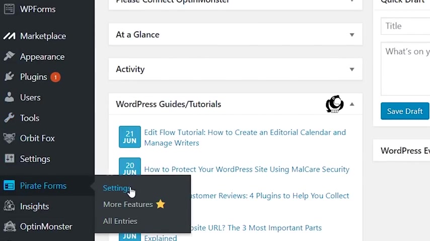
So just click on the X and go to dashboard and then just go down to pirate forms here and click on settings and then you can click on options over here .
So this is where you could put in your email , so you could put it under contact submission recipients and pirate forms is pretty good .
They already know that your wordpress email is the one that I wanted to use .
If you want to change it , feel free to change it and you can go to field settings .
So this is where you can determine which fields are required .
So I'm gonna keep them all as required .
I want a subject .
I want a message , I want their email and their name .
And you could also add a spam trap .
So you could add a Google capture to reduce spam .
So just click save changes and you could also send yourself a test email .
So I'm just gonna go ahead and click that sent email successfully .
So now we can just go over to our gmail and check it .
So we're over in our gmail and it looks like it didn't show up .
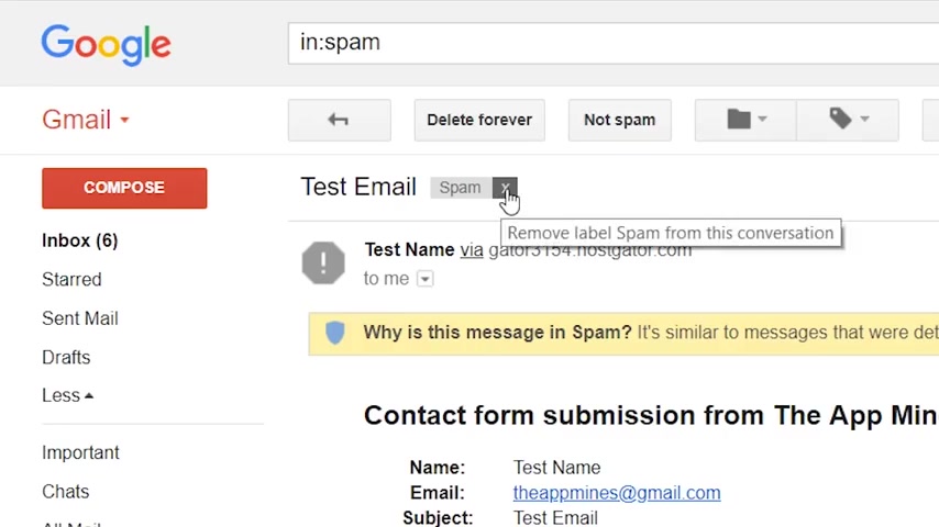
But if you go over to your spam folder , you can see that we have got it right here .
So it ended up in the spam folder for a couple of reasons .
One is that we need to uncheck this as spam .
So from this email , we're gonna uncheck this little box or remove it and go back to your inbox .
So it'll show up now , just that one email .
So the next thing you need to do is grab the name here , uh Wordpress at the app mind dot com or whatever your domain name dot com is .
So you get that by clicking this little triangle here to show details and copy that .
And we're just gonna add that to our contacts .
So you can go up here to the top right and click on contacts and now just go over to this little pink button and you can add a new contact .
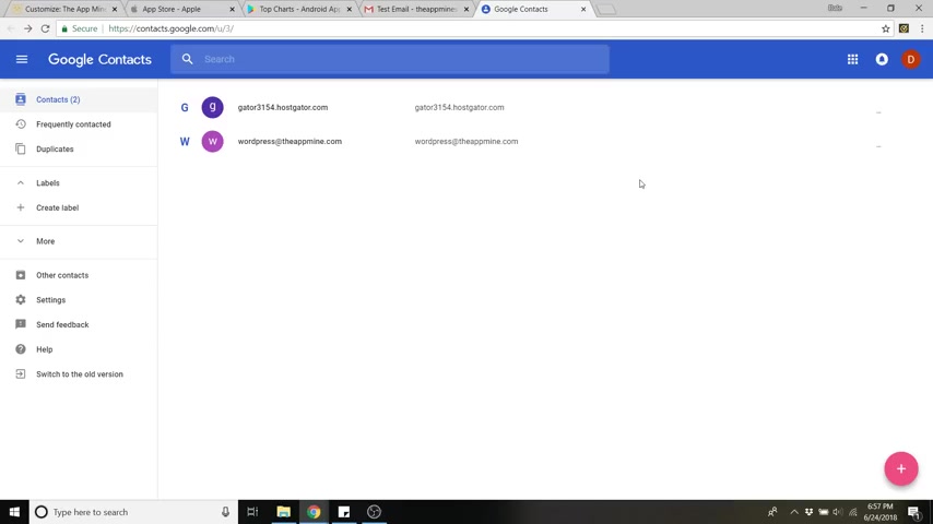
So just add that email , click on save and now it recognizes that this is one of your contacts .
So the rest of the emails will come through just fine .
So if we go back , we can now send a new test , email , email sent success .
So let's go back to our email .
And now we have the new one that showed up and it showed up in our inbox just fine .
And now step number eight is to create a primary menu .
So the primary menu is this one right here .
So I wanna , I slide down , you can see this big bar and we're gonna fill that with some buttons .
We're actually gonna fill it with jump buttons .
So when we click on them , it will jump to another part of our page .
So to edit the primary menu , just click on the little edit button and it'll take you right to the primary menu .
You can just click edit menu and now we can add items to this menu .
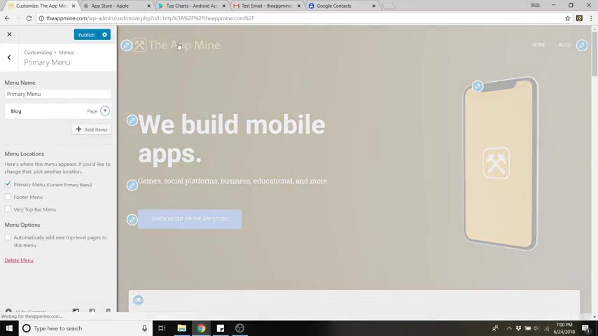
So I'm actually going to delete the home uh button because when we click on our logo up here , that will actually take us to home and most people know to do that .
So now just click , add items and we can add certain pages which I'm gonna show you how to create in the next step .
Uh We can add posts , which I'll show you how to create your first blog post next .
Um Or we can do categories , tags , but we're gonna do a custom link .
So we want this to be a jump button .
So let's actually create a jump button for these services .
So just go down to link text and type in services .
So this is what's gonna display on the screen and we're gonna do hashtag features .
So the services section is actually called the features section .
And the hashtag is what allows us to jump to that section .
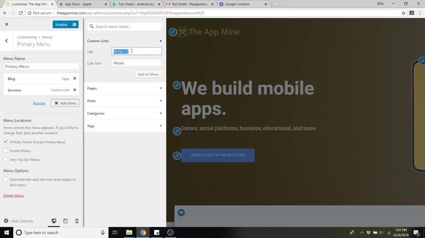
So just do hashtag features and click add to menu and we are also going to do about and do a hashtag about add a menu .
We're going to do meet the team and hashtag team add to menu and lastly contact and just do hashtag contact add to menu .
So click publish to save .
And now if we click on one of these buttons , like let's say services , it'll jump down to services or we could click on about , it'll go to about meet the team and contact .
So that is pretty rad .
You can also add all of these things to the footer menu at the bottom .
So if you check this button , you'll see that they're now added to the footer down here .
Uh I don't typically do that .
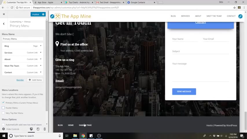
I add things like a disclaimer to the bottom or a terms and conditions , page , things like that .
OK .
So step nine is adding pages .
So if you want to add a page that's separate from this one page layout , like let's say a disclaimer or terms and conditions or maybe you want your about section to be a full page , it could be anything you want .
So let's save our work and let's go back to the dashboard to go to dashboard and you can just go down to pages , go to all pages and you can see we've got our pages here while you're here , you can trash this sample page .
So when you trash something , it's deleted temporarily .
But if you want to delete it forever , you can just click on this trash button and you can just check that or hit uh delete permanently .
So I'm gonna go back to all and now I wanna add a new page so I can just go up to add new up here and now we can add a page .
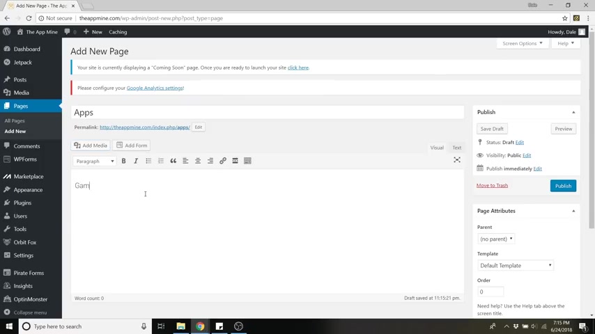
So let's say that we wanted to have a page for apps that we create here .
So I'm gonna just put apps in the headline and then you could edit everything down here .
You could add pictures of the apps , you could add different categories like games , do uh social , things like that , whatever you'd like to add on whatever page you're trying to create .
And now if we preview this by clicking on the preview button over here , you'll see that it's pretty empty .
Uh There's no background image .
So to fix that , just go back and go all the way down to set featured image and then just select your image and then just click set featured image .
And while you're here also change the layout to full width .
So if we go back up , let's save that draft .
And now we can preview that and boom , just updated , we've now got that background image in there .
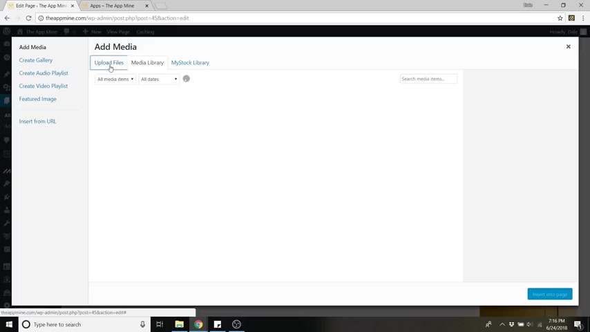
So all of your content will go right here and you can edit it the same way you do with everything else with this word editor here .
So just for fun , I'll put in games and I'll just add a picture for now just to show you , I'll change this to a heading one .
I'll make both of this center aligned and now save draft .
And if you like it , you can publish it and then just go to preview changes .
So now you can see we've got our content in here .
So if you'd like to add this page up to the uh primary menu up here , I'll show you how to do that now .
So just go back , go over to appearance and then go down to menus .
So now this is our primary menu .
These are all the buttons that we added earlier .
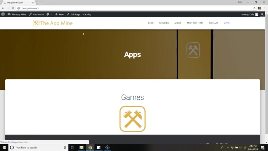
So if we wanted to add the apps page , we could just click on apps and then click , add to menu and then click save menu .
So now if we go to our site by going up to our page title and click visit site , you'll see that we've now got apps .
And if we click on that , it takes us to our apps page .
And then again , you can click on the logo to go back to the home page .
Now , step number 10 is to write your first blog post .
So if you're driving traffic from Instagram or youtube or Pinterest or Facebook , it's great to have a blog that you can update continuously for your visitors to see all of your latest articles .
So I'll show you how to do that right now .
So let's just go back to the dashboard and then go down to posts , go to all posts and we've got this basic Hello World one .
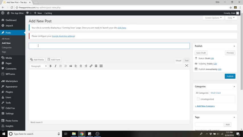
Let's go ahead and trash that and again , go over to the trash button and get rid of it , completely delete it permanently .
All right .
So now we can click add new .
It's just like we were doing with the pages .
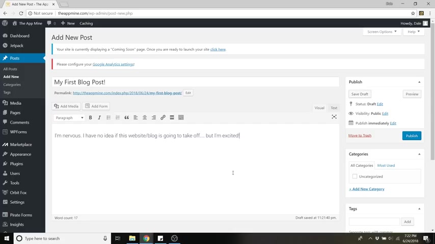
So what I like to recommend , which I got this idea from a friend is to literally write your first blog post and write about your feelings uh about starting a blog and you're starting this new website and you have no idea what's gonna happen .
So I could write in here , my first blog post .
Uh and I could just write my feelings in here .
I'm nervous .
I have no idea if this website slash blog is going to take off , but I'm excited just good to write your feelings down .
So that later if you have a ton of visitors , you can look back at that post and be like man , starter from the bottom .
Now we're here .
All right .
So once that's done , you can click on publish or you can just save your draft if you want to add to it later and again , just like the pages , you can add media and all of that and you can also add your featured image so you can set one here .
But I already showed you how to do that with pages .
So we'll just click publish .
And now if we go back to our site , our main page , we've got our blog button up here .
You can just click on that and it will show you your first blog post .
So this is where everything would show up if you don't want all this stuff here on the right .
You can take that off by just going back to the post section .
So just go to dashboard , go back to posts , all posts , then click on that one and then just go down to layout and do full width and that will also take away all that stuff on the right .
But if you want that layout .
It's good .
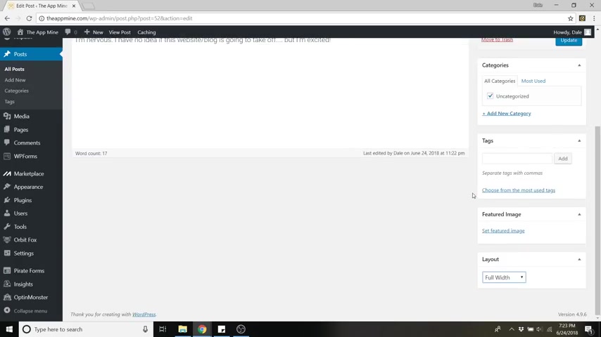
It tells people what your latest categories are of posts , it gives them their latest posts .
So I kind of like having it .
So I'm gonna keep that back at default and then click update to save any of your changes .
And also if you go back to your site , you'll notice that if you go down to the blog , it'll also show up here .
So if you write a new post , it'll show up next to this one .
They'll be equal .
If you have three , there will be three all the way across the board .
And if you click on customize and click on the blog section , you can edit how many posts are actually in a row over here .
Now , a bonus , I'm gonna show you how to create a shop .
So in case you're starting this website to have a shop on there , because you want to make some money with your website , you'll want to use Woocommerce .
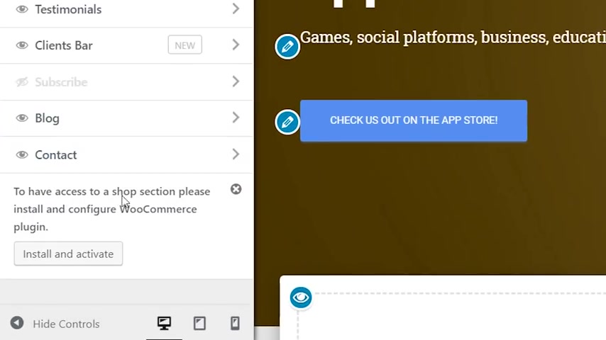
So to get Woocommerce , just go up and click on customize and from here , just click on front page sections and you can see at the bottom to have access to a shop , please install and configure Woocommerce plug in .
So Woocommerce is literally just a plug in that allows you to put pictures of the product up there and do pricing and everything you need to have a legitimate shop .
So to do that , just install and activate .
All right , there we go .
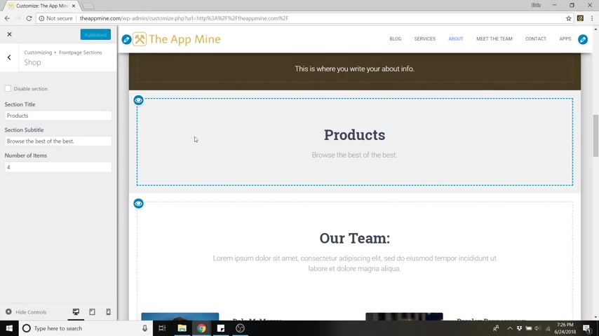
So if we scroll down , you will see products here .
So you can just click on that edit section and you can call it products , you could call it whatever you're selling .
Really , I'm just gonna keep it as products .
Uh I'll just say brows the best of the best .
I don't know .
And you can change the number of items that show up here on the main page .
So save your changes with publish and then to actually edit and add products to this .
We're gonna have to go back to the dashboard .
So click on the X , go to the dashboard and from the dashboard , you can just click on Woocommerce , just click on the main title here and you'll just want to run the setup wizard .
So I'm not gonna get into it right now .
That's for a whole different video .
But if you follow my channel , you can check that out , but it's pretty simple .
And Woocommerce kind of walks you through it .
And as you can see , you've got your orders , you can make coupons , you've got your statistics for your sales uh settings , all that kind of stuff .
OK ?
So last but not least how to publish your website so that everyone can see it .
Go ahead and go to your dashboard and just go to the top here .
It'll say your site is currently displaying a coming soon page .
So whenever you're ready , you can launch it by clicking here .
All right guys .
So this website is all done .
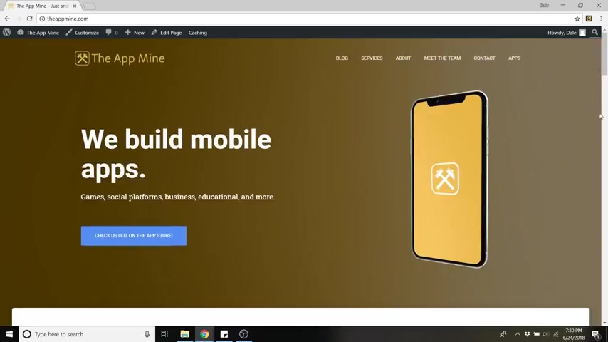
We've got a fantastic layout here and the whole thing is also mobile friendly .
So if you were to squish this page , the whole thing resizes for mobile .
So scrolling down , it's all nicely aligned .
Everything still works the same , which is pretty awesome .
Uh Mobile viewing is about 52% of all online traffic .
So it's a really good idea to have a very mobile responsive website and Hestia is fantastic with that .
All right guys .
So that is how to create your first website and customize it and optimize the phone .
So if you enjoyed this video , it would mean the world to me if you would subscribe if you want to see more or give this video a like if you found it helpful , the more activity I get on my channel , the more opportunity I have to create new tutorials .
Thanks for watching Creative Pro website .
And I will see you guys on the next video .
Are you looking for a way to reach a wider audience and get more views on your videos?
Our innovative video to text transcribing service can help you do just that.
We provide accurate transcriptions of your videos along with visual content that will help you attract new viewers and keep them engaged. Plus, our data analytics and ad campaign tools can help you monetize your content and maximize your revenue.
Let's partner up and take your video content to the next level!
Contact us today to learn more.