https://www.youtube.com/watch?v=WgXU7XAZYmQ
Why is THIS the Perfect Homepage
You're about to start your new website .
You found some great tutorials right here on youtube and you're pretty sure you've got this .
But when you go in to begin on your home page , it hits you , you have no idea what to put on your website .
What content do you need ?
What order should it go in to actually do something for your business ?
Like get you more clients .
If you just wing it , you're gonna miss a lot of proven conversion techniques .
And if you were to basically just copy what your competitors are doing , chances are you're just copying their best amateur attempt .
Well , my friend , you don't need to waste one more second staring at a blank screen because in this video , I'm going to just show you exactly what to put on your home page in the exact right order to maximize sales and bookings .
This is the exact home page structure that's worked wonders for hundreds of my small business clients over the years and today it's all yours .
OK .
So I'm pulling it up right now and we're just gonna start right up at the top with what we call the hero section .
So pretty much every modern website starts out this way .
But I'd say that 95% of them either miss some key opportunities here or they just miss the mark altogether .
Now , co marketing actually did a study where they found out that the single biggest thing that annoyed website visitors is lack of message even more than animated ads or um you know , audio playing .
The thing that made them the website the most was not being able to easily tell what the business does or what services they provide .
So that should be a huge clue for you .
And it's why we need to really maximize this Euro section to let people know inside of five seconds what you do , why it matters and what they need to do to get it .
So if you don't do that , they won't see anything else on your page because you've already lost them and they're out of .
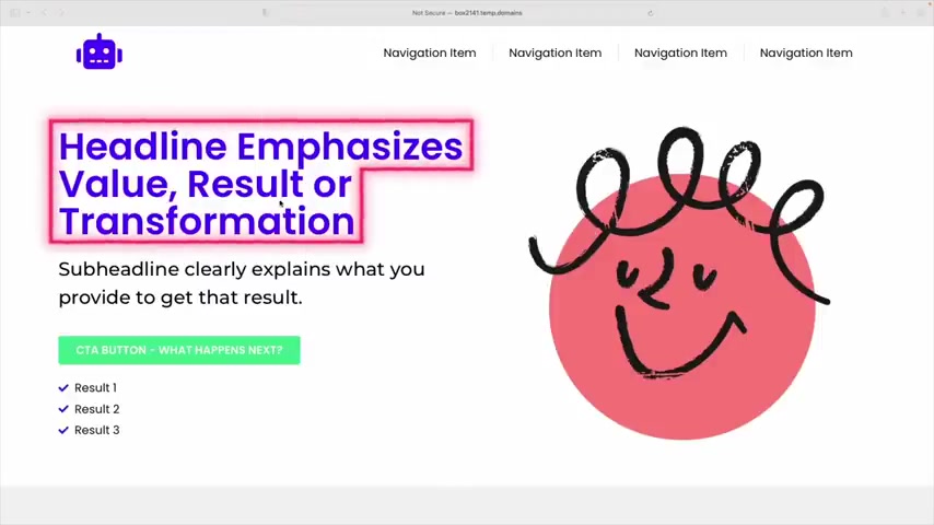
So just to break that down , we have the main headline which should clearly communicate the value or the result or the transformation that you're promising with what you offer .
This is the why it matters part and you definitely want to lead with that because the thing that marketers have always understood that most small business owners don't is that people aren't buying the thing that you're selling , right ?
They're buying the result that your thing brings to them .
That's an emotion you buy in , right ?
If , if you can hit on the feeling or the emotion that they can expect to feel after they've bought from you , you're gonna do way better than if you just kind of tell them about the thing that you're offering .
So that's the headline .
Next , we have the subhead line which is there to support your headline by clearly explaining how you get them .
That result .
In other words , now is the time to bring up the thing that you offer .
So the idea is you're saying will get you this result .
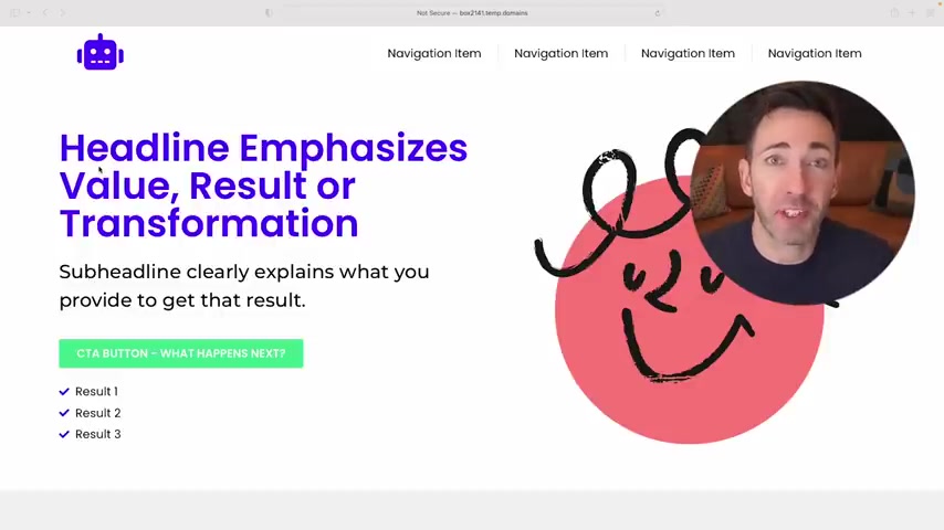
And then here's how you know , headline could be land your dream job down here with resume consulting services , create a stronger bond with your best friend with dog training classes , get it .
And here's where you might call out your ideal customer type too .
So something like we help executive level talent create the perfect resume for instance .
And if you want to go even further with it , you can use these little check marks down here to really paint the picture even more , either throwing out three results that they can expect or three different use cases for what you offer .
And now we are still looking on the hero section because again , it's just that important .
We still have two really important things here .
Um We have the call the action button which is there to give anyone who's ready to go a really clear , easy path forward to getting started working with .
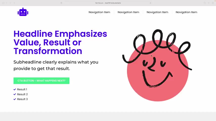
And you should make this really prominent and bold so that it's extremely obvious uh where they need to click next and you also want to word it to be really actionable and specific .
So it should never be something like contact us or learn more , right ?
It should be very descriptive of what actually comes next .
I'm talking something like schedule a call or book a free consultation or if you're selling something even buy now and last , but not least we have the image over here .
So there's a recent study that shows that people will look at the main image on a website for nearly six seconds on average .
Now , I know that doesn't sound like a lot , but I'm telling you in the web world , it actually is .
So what that means to you um is this is important to get right , so that you can emotionally connect with the most people and honestly , most businesses get this really wrong .
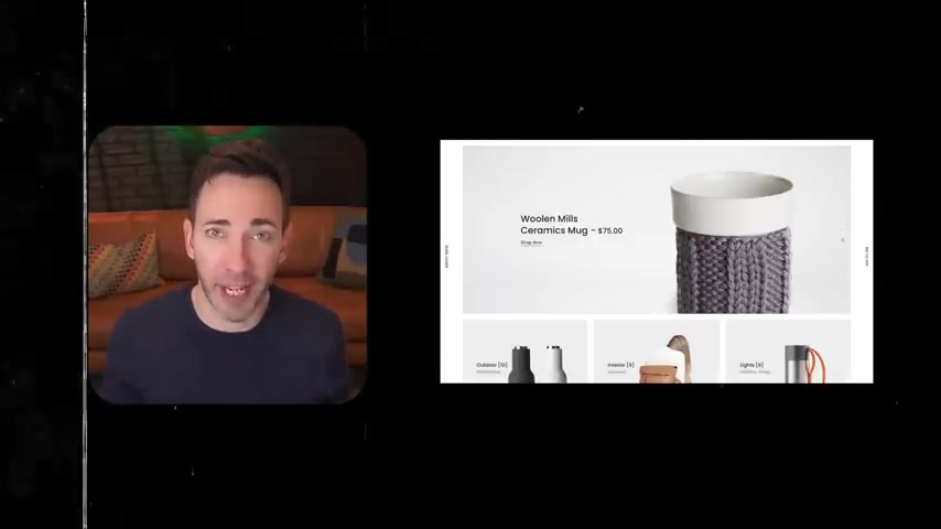
They either put in a photo of , you know , a building or a skyline or a fake customer service rep or team photo of themselves or just a product on a plain background .
But what's better than any of those options is to use what I call a happy customer photo .
So um that doesn't mean it has to be a real customer of yours .
It's more like a representation of the happy after state that your customers are feeling .
So it should feel really natural and overall positive .
You know , if you're a service business , just show that happy feeling in some kind of context .
And the example I always like to use here is , you know , if you fix computers , don't show a photo of you with all the guts of a broken computer spread out in a million pieces .
No one wants to see that .
Instead you want to show a person who's , you know , using her laptop worry free now or if you sell a product , you can still show the product but show a person using it if you can , it really just helps people visualize themselves using it too .
OK .
So we're done with this one .
We can finally move on to our next section , which is the problem solution section .
And this one is pretty easy .
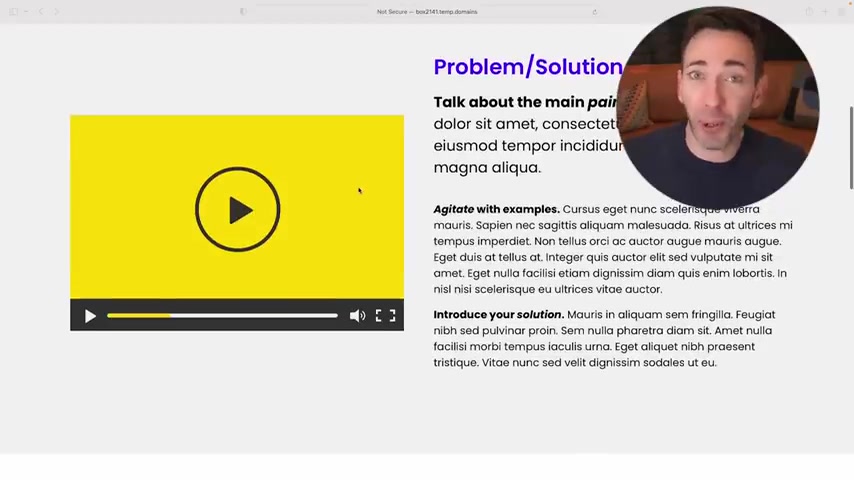
It's mostly just going to be two or three short paragraphs that lay out the problem that your customer is likely experiencing right now and to do this right , you'll generally want to use the tried and true what marketers call the pain agitate solution , copy writing framework here .
So , so going back to our dog training example , you'd bring up the main pain point , which is something like , you know , you love your dog , but let's face it .
He's a bit much .
Then you would agitate that pain with uh bringing up examples of bad behavior .
Like maybe he's hard to take on walks or to dog friendly restaurant patios .
He's always jumping up on your friends and maybe you've even had trouble keeping dog sitters as a result , but not to worry because here's our solution that's going to turn it all around .
And my best pro tip here when it comes to designing this section is to actually , and you'll see what I've done here is to make this first paragraphs text a little bit bigger than normal .
And the reason is , um , there was a recent eye tracking study that showed when test subjects saw a story with a bold or larger introductory paragraph , 95% of them viewed all or part of it , which is a lot more than you'll see for typical texts on a website , especially when it's , you know , several paragraphs long like this is .
So you bring them in with a larger text and then if you write it well enough and you lay out pain points , right ?
That'll pull them all the way through the rest of it and for some extra credit .
Um And if you can pull it off , I highly recommend pairing this text with a really short video for your business alongside of it .
So something that hits on the problem you solve and how will help you be more memorable and trustworthy .
So um video also really just keeps people on your page longer , which is a great Google signal to help you rank higher in search .
And again , they've done studies on this and pages with video on them , increase conversions by 86% on average .
And in my experience , um if you're going to add a video to your home page , this is the section where it's just going to get the most eyeballs and do the most good .
Ok .
Moving on , we now have the benefit section where you just want to call out three main benefits um that your customers can expect from you .
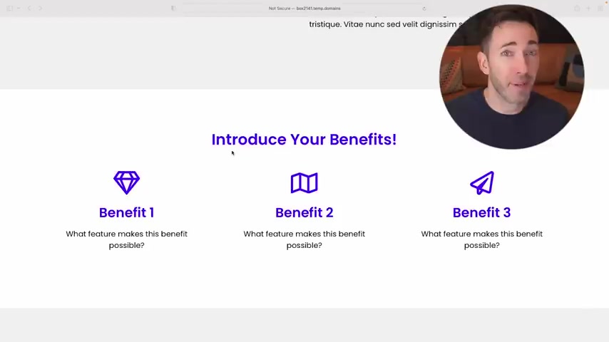
So , and it's super important because this is where you'll try to set yourself apart from your competitors by either bringing up extras or perks that you bring , that your competition doesn't or maybe these are things they do too .
But if you're the one talking about it and they're not , the end result is the same , you win and benefits really tend to trip people up because they always confuse them with features .
And the best way that I can think of to show you the difference between , between benefits and features is actually right here on Tesla's website .
Let's bring that up .
So if you go down to their benefits , ok .
So here's their benefits section .
It's not really labeled benefits , but that's what it is .
Um Just notice what they're leading with in these headlines .
This one says stay connected .
Now , they could have put a headline here , you know about Bluetooth or 36 watt USB C charging .
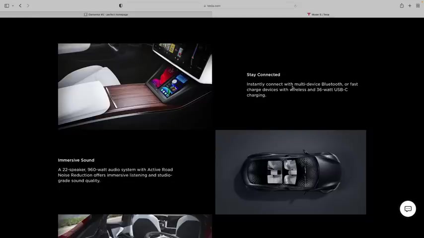
But the thing is those are those two things are just the features that bring the real benefit , which is you get to stay connected , right .
Um Then we have immersive sound , which could have been all about the 22 speaker , 960 watt audio system , blah , blah , blah .
But they know that nobody cares about wattage and the number of speakers necessarily they want good sound and then room for everything , uh not fold flat seats in a 90 cubic feet trunk , there's room for everything and that's what matters .
So list out your most compelling three benefits .
So list out your most compelling three benefits , then go into the feature that makes the benefit possible .
And then you'll also just want some kind of a visual that helps illustrate each benefit too .
So you can either use photos or icons , whatever works best for you .
All right .
Moving on down .
Next , we have testimonial .
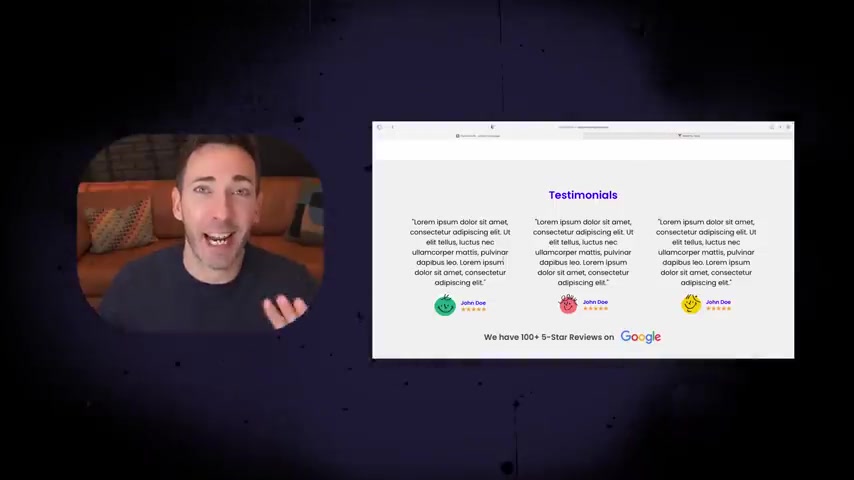
So it's really important to include social proof like this on your home page so that people can see proof that what you're claiming is true .
And actually 72% of consumers will take action only after reading a positive review .
Um So you don't want to miss it .
And again , rule of threes here , I definitely recommend finding three testimonials that do a really good job saying something that's going to help someone overcome an objection , they may have or speak to one of your benefits or the results that the rest of your page is promising .
No bland , you know , great service .
Highly recommend type testimonials on your home page , please they need to say something to earn their place here .
Oh , and keep them really short .
Like this amount of text that I have here is pretty much what you want to shoot for .
If you can , you know , people aren't going to read novels here , then you want to include their photo if you can get permission to use it .
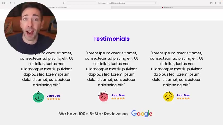
Um That just helps it hit a little bit harder because hey , if this person is willing to stand behind this review publicly , I can trust it , right ?
And then always use a five star graphic here too as a visual shorthand for people just to quickly see that this is in fact a glowing five star review and then to add to pile on to the social proof .
If you happen to have a bunch of great reviews on review sites like Google or Yelp or you know , Angie , what whatever it is , you can always drop a line like this using those review site logos just to let people know how popular really are as high school as that may sound .
It actually works pretty well .
Ok .
So next , we've already talked about benefits versus features and this is the place where those plain old features are gonna go .
So um think of this like the tech specs for a TV that you're gonna buy online .
Um So you know , you may be saying , but I thought benefits were the important thing , not features and that's , that's very true benefits are more important than features in general .
But there's a really famous saying in marketing that goes buying decisions are always made based on emotion first , then backed up by logic .
So this is the part where we let those analytical people who really just need to justify their emotional buy in by seeing exactly what they're gonna get .
So here's where you can put things like 24 hour customer support , unlimited revisions .
And yes , even and I usually like to put anywhere from 10 to 20 features here , either in a simple bullet list or a checklist or with icons for each one .
OK .
Next , we have Fa Qs and yes , this is to proactively answer common questions that people ask you all the time .
But more importantly , this is a place to proactively handle objections that they may have to .
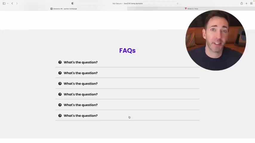
So think of this section almost like a virtual sales person on your home page making the case for your business as airtight as possible .
So what are the top five or six questions that people need answered or objections that they need settled before they'll feel comfortable taking the next step .
Just write each one out as a question , then address each one with your answer or if it's an objection , what's your best rebuttal against that objection ?
Keep them really short .
And actually this is another great use case for video on your home page .
You know , if you can create a short little video for each fa Q and then with your best answer for it , that's gonna help you build even more trust and get you even closer to that sale or booking .
Ok .
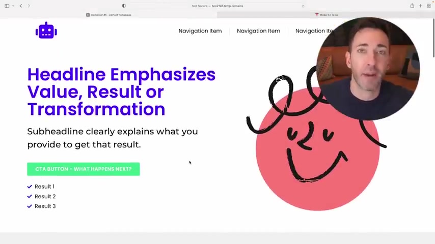
So next , we have a really simple called action section where you simply ask them if they're ready to get started or you know , some version of that question and then you'll repeat the same called action button right here as you had up in the Hero section .
It's important just to kind of carry it through and make it the same .
But guess what ?
That's just the home page .
There's definitely more to a website that converts visitors into paying clients .
So I want to invite you now to my free on demand master class , the automated clients demand website blueprint for service businesses .
So just click right here and you'll get immediate access to my most in depth video training I've ever done .
But I'm gonna show you what you need on your website , what you don't and how to seamlessly bring it all to life in just one weekend .
So click right here and I can't wait to show you how easy it really is .
Are you looking for a way to reach a wider audience and get more views on your videos?
Our innovative video to text transcribing service can help you do just that.
We provide accurate transcriptions of your videos along with visual content that will help you attract new viewers and keep them engaged. Plus, our data analytics and ad campaign tools can help you monetize your content and maximize your revenue.
Let's partner up and take your video content to the next level!
Contact us today to learn more.