https://www.youtube.com/watch?v=MrjLr8kOxfo
Sketchbook Techniques- Portraits in Ink
All right .
Fine .
Let's draw today .
I mean , twist my arm .
Why don't you ?
Let's draw .
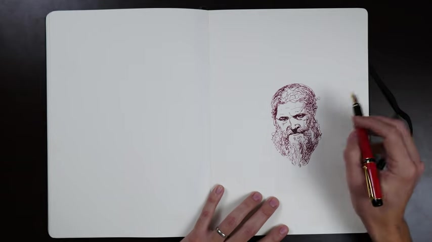
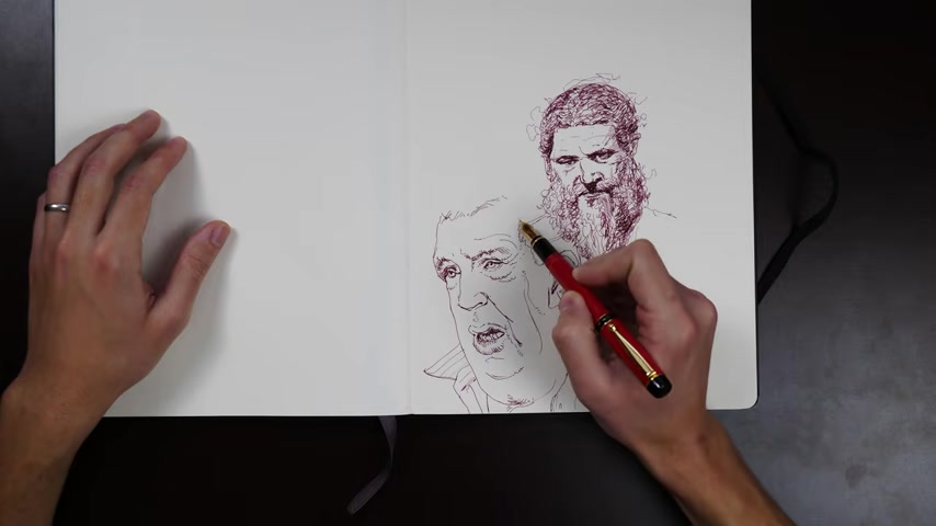
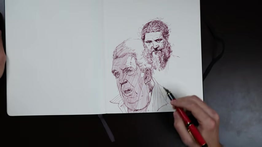
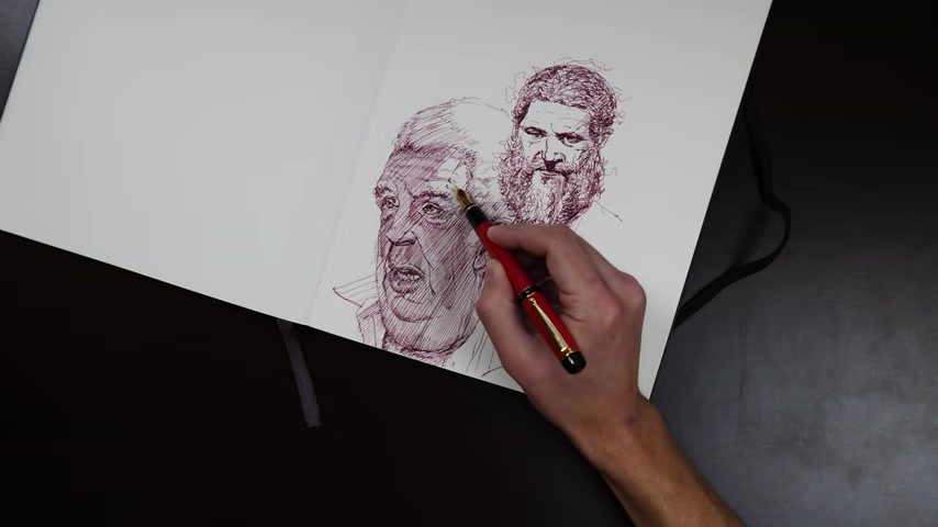
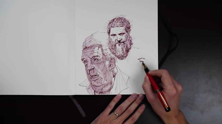
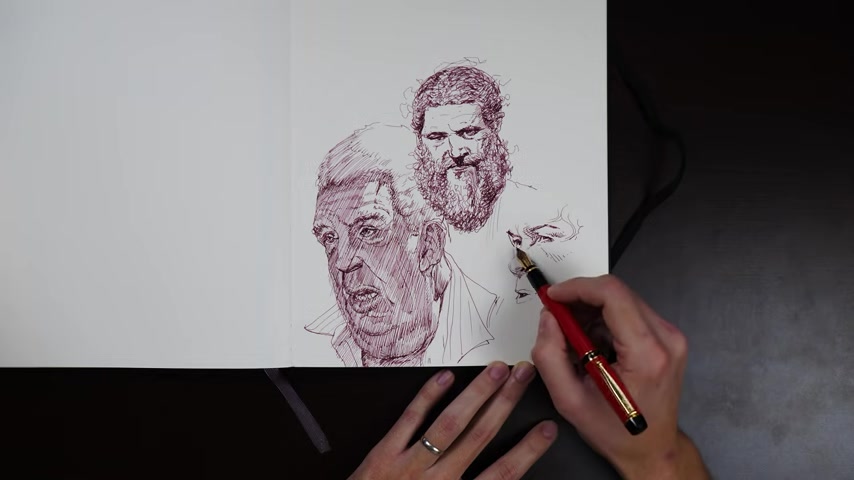
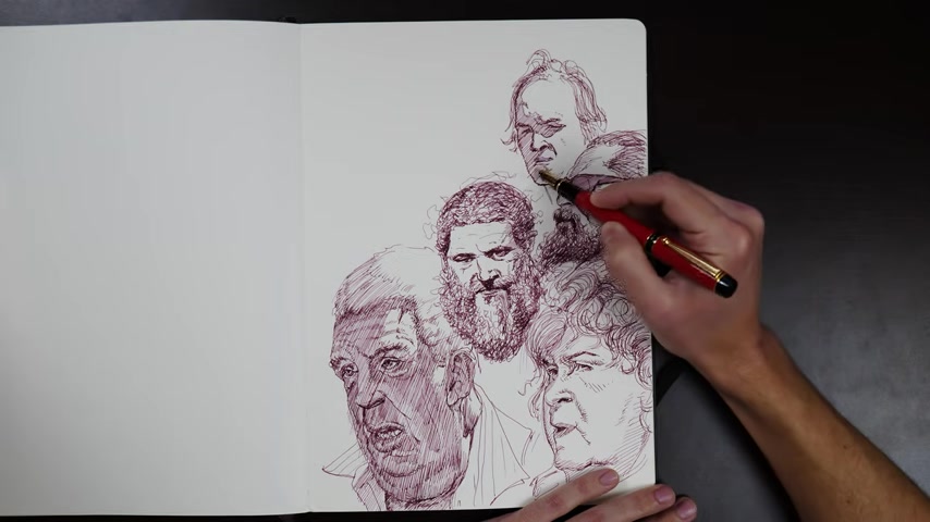
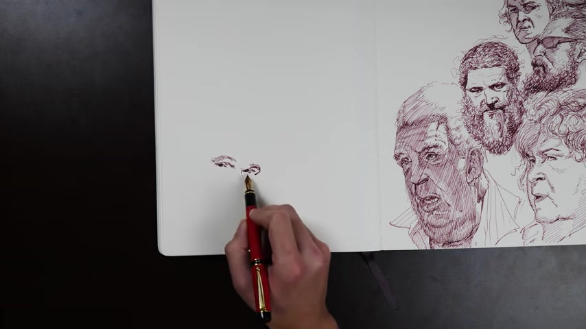
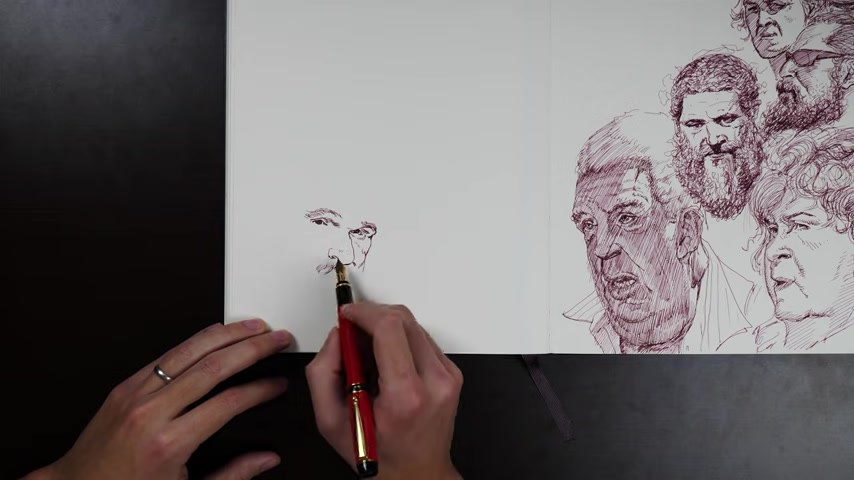
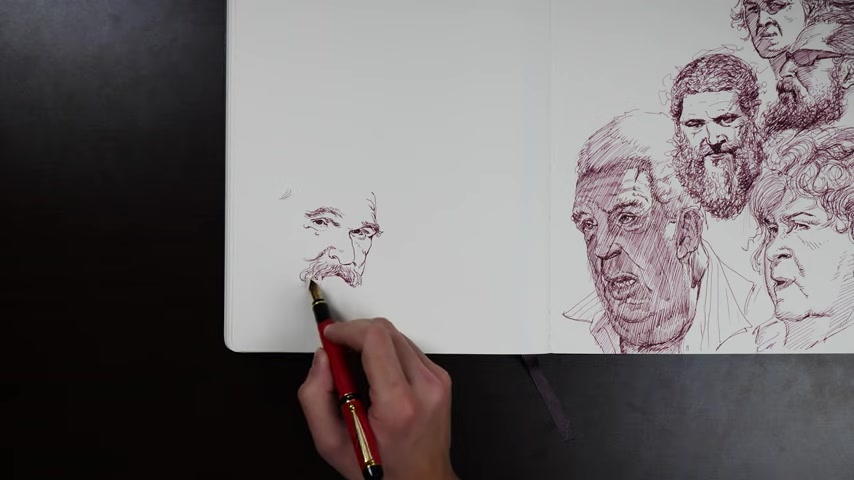
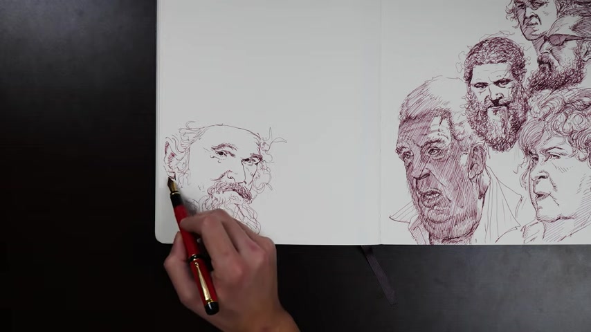
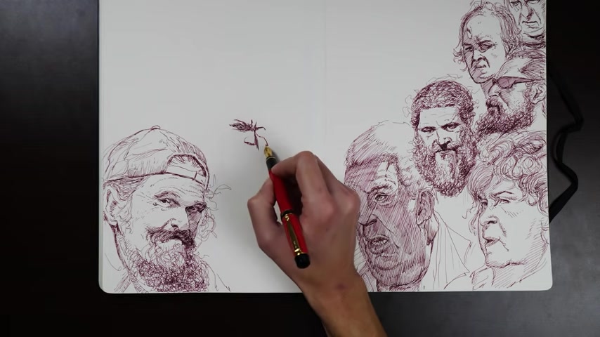
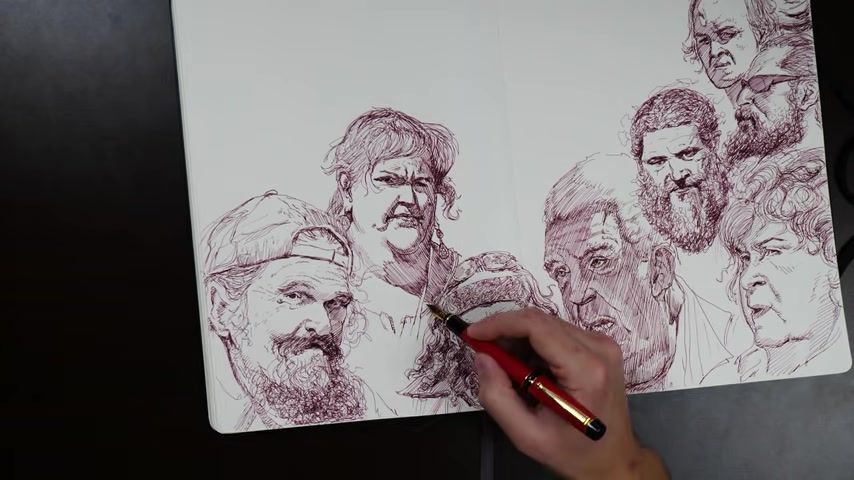
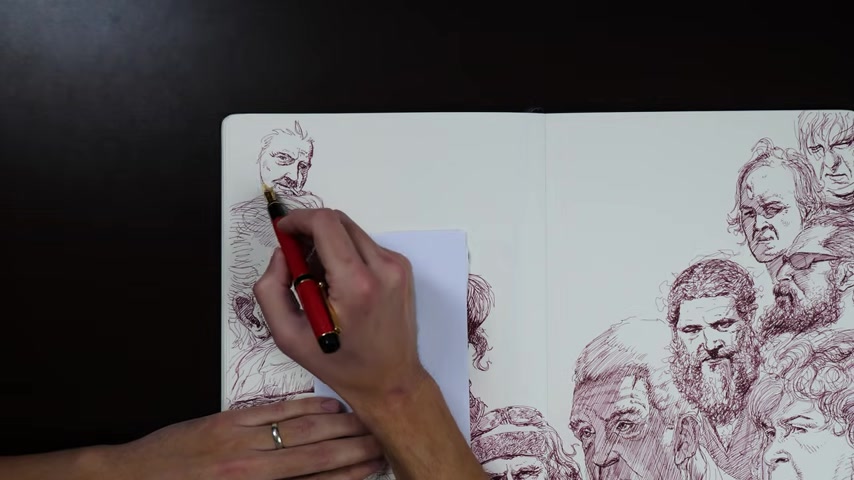
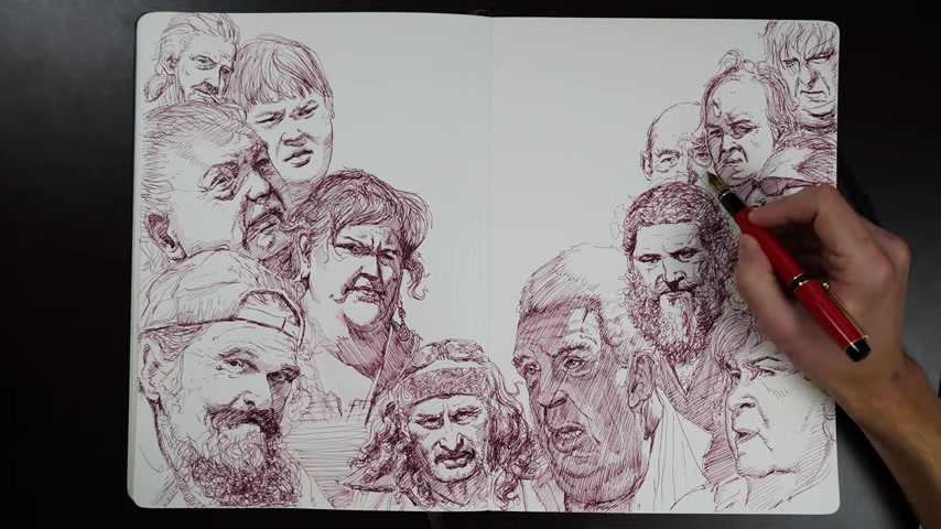
Let's fill a page in our sketchbook with some portraits in ink , fountain pen ink to be accurate .
This is my , this is my pilot Lucia Fine point which sounds like a sports car or a airplane , but it is a drawing implement and that makes me very happy .
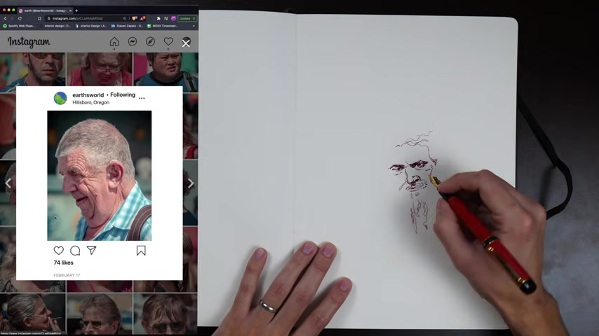
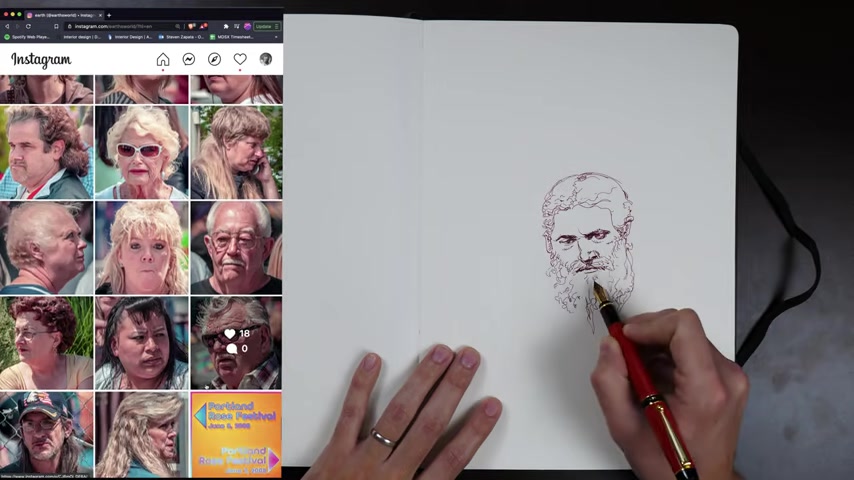
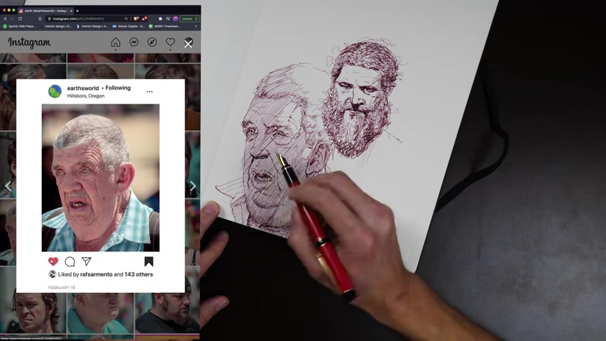
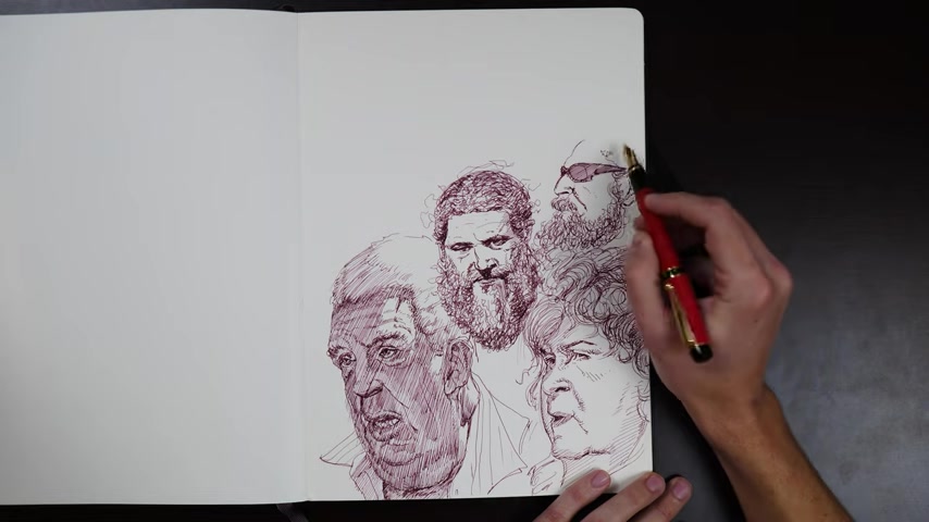
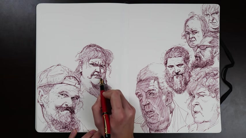
So for this spread in my sketchbook , I pulled up a bunch of references from one of my favorite Instagram accounts called Earths World .
You can see it right there on screen .
Great account .
It's all candid real world photography of people at county fairs and you can tell it's very interesting looking people .
Uh I love the page so I couldn't resist just uh pulling up a bunch in different tabs and then just filling a sketchbook with the gold found there in .
I love doing stuff like this in ink because well , first off , it keeps you from getting fussy , but it also makes you simplify things down to a very clear statement , especially all of those little graphic shapes that people have around the eyes , underneath the nose , around the corners of the lips , all those complicated shapes inside of the ear , especially in direct light , all of those graphic shapes become very strong and iconic and explanatory of the anatomy in that particular spot .
Another great reason to love these earth's world photos .
They are usually shot in direct sunlight , which is hard to expose for .
It's not easy to get great photographs out of direct sunlight with all of its shadows and really wide contrast range .
But a photographer who can nail it like this account does .
Uh I think it makes my favorite reference .
It's the best stuff because yeah , the form is so clear .
The shapes are so clear and the graphic pattern of the light versus the dark is so dynamic and does so much of the heavy lifting for you .
You can definitely still use harsh pure ink to draw something that is shot in very soft even lighting , right ?
I just feel like then you wind up walking on eggshells very carefully trying to avoid putting any errant dashes and spots where they don't belong in the light and instead forcing all of your darks into these very small specific areas around the eyes , under lips , corners of the lips like it it doesn't let much get out from that area .
Or else you lose the feeling that you're in a washed out almost studio lighting situation .
For sure though , I think this winds up feeling very holistic .
What do I mean by that ?
I mean , I feel like the lighting , the nature of the lighting , the strong contrast , the very bold shadow shapes aligns with the subject matter .
They're not in conflict , right ?
The vast majority of photos from this particular reference pool are people who have really strong shapes on their faces , right ?
They have really memorable noses , lips , eyes , brow ridges , ears , it's all very bold and strong and statement making .
You know , it's not the usual stuff that you see and to sort of wash all of that out with soft studio lighting that we might usually consider to be appealing for taking someone's photograph .
I think that that works .
It drives together that strong lighting highlights the intensity of these people's facial features as they would anybody's and I think that that works , it makes everything tie together holistically as to why do a study of this sort at all ?
I think that this is one of the best ways to wrap your head around the anatomy of the face in some sense , but even beyond the anatomy , just what is possible with the structure of the head and the face .
I mean , you , you saw the scroll , a lot of these faces if you just saw a drawing of them and it was like pretty 1 to 1 you might think .
Oh God , that's so pushed .
Oh , that's totally exaggerated .
Oh , that's not a real person .
No , that's a real person .
So , doing studies like this is a really good education in what is possible , how flexible the head is , how much intense variety there is in what people actually look like .
Right .
There are people walking around who just look like straight up cartoon characters and that is something very valuable to know just on its own .
So I think this kind of study is a great thing to do for that reason .
And also , and some people might disagree with me here .
I actually think that drawing people who aren't trying to look good , you know , drawing people in lighting situations that aren't trying to make them look appealing or beautiful or young or anything like that .
I think that those are often some of the best education in the structures of particular parts of the face .
When you see 100 different noses that have a strong light and shadow pattern on them that produces 100 different shapes , maybe subtly different but definitively different shadow shapes across all these noses .
You start to pick up on little plane changes , subtle bevels , subtle , filing off of edges , subtle overall bends and curves and these features that are for the most part completely washed out and removed in softened appealing , studio lighting .
It can be hard to find references that allow themselves to just highlight the structures in these , in these ways .
But I think man , when you can find them really hold onto them , same goes for everything for the eyes , you know , letting strong shadows get cast onto the eye from the brow , for example , really teaches you how far out some people's brows can project just how much they can plunge somebody's eyes down into shadow .
It does the same for upper eyelids , seeing how big a shadow and upper eyelid can cast down onto the lower eyelid and beyond even down onto the cheek , seeing how deep the seeing how deep the pockets of the eye sockets next to your on either side of your nose can become , seeing just how punched into the face .
Those can be on people of different types and the differences in those depths from one type of face to the other great education .
And yes , like I said , when you see that in tons of different variations that starts to give you a natural grasp for what that structure actually is , right ?
For the most part in appealing studio lighting , it's just too subtle .
You're lucky if you're ever , if you're ever even going to notice those very soft , very subtle plane changes or bevels or especially uh flatter parts on forms .
You're very lucky if you're even gonna notice them much less , notice them over and over and over again and be able to distill out of them .
What is the actual sort of average version of that particular form on the face ?
So , yes , in general , I think it's a great idea .
I think it's a really good idea to draw people shot in situations that is not trying to make them look as appealing as possible .
Sometimes you got to let the light get a little harsh .
You've got to let those shadows get a little strong , a little bold and let them reveal where the heck people's faces actually take corners and plunge and turn and roll and pinch and buckle and overlap themselves and slide under themselves .
There's all sorts of crazy things that people's bodies do that are missed when you just blow it all out with a strong front light .
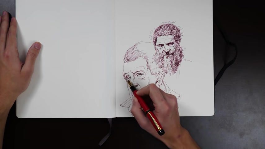
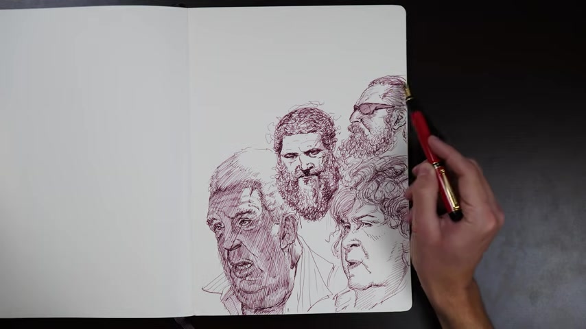
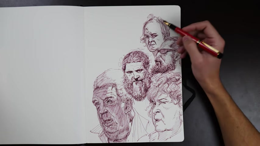
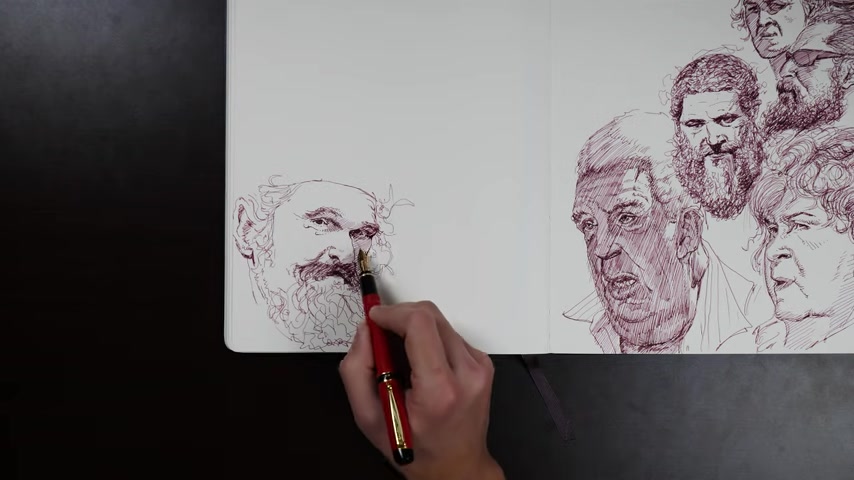
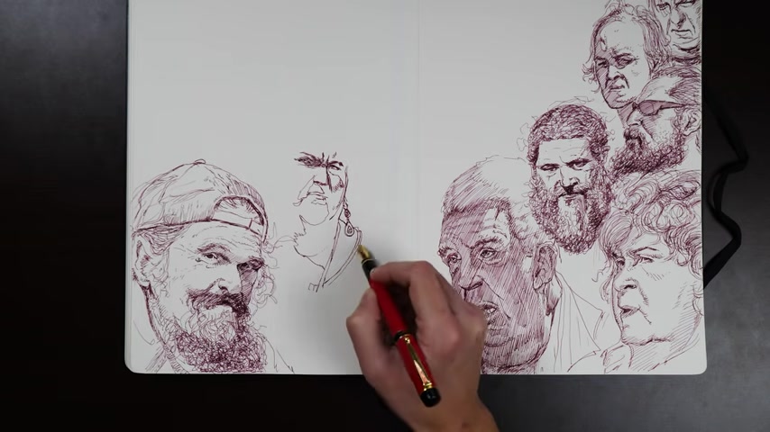
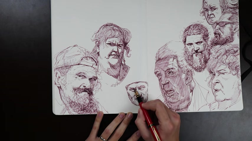
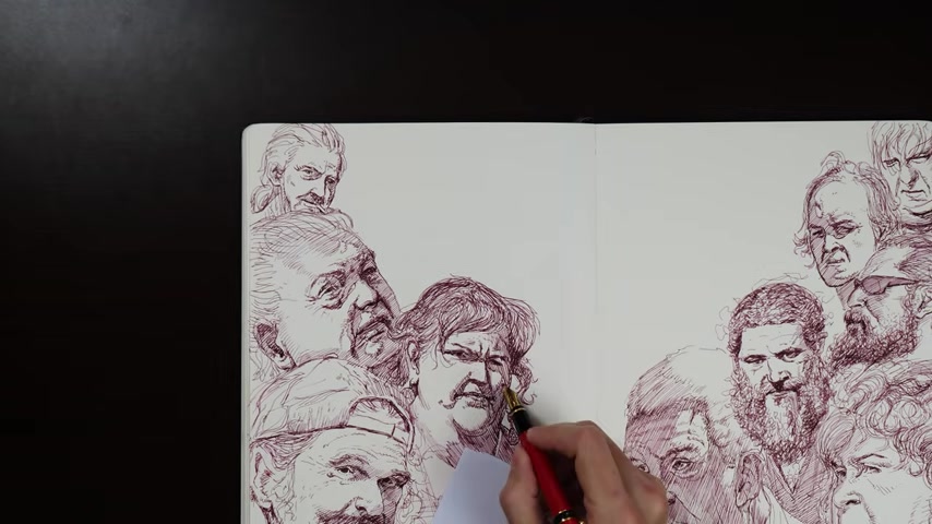
I mean , look at the guy that I'm drawing right now , right ?
That big , big overhanging neck fat that presses down against the top of his chest .
That is such a specific and beautiful form and a very fun form to draw that just out of a self selecting set kind of a thing is not the sort of thing that you will often find in a professionally lit studio environment .
You know , there's just less representation of people with that body type in that environment .
It's a self selecting set , which is a shame because that's a very common occurrence on real human beings .
And it's quite explanatory drawing wise .
It really that that shelf and the depth of that shelf and the dark accent of that shelf actually tell you a lot about the nature of the form .
It tells you so much about how thick that neck is , how much of the top of the chest is being overlapped and occluded by that .
These are , these are very beautiful niceties of anatomy and just the human form that are excellent draftsmanship challenges and so , so , so fun to draw .
So it's a shame that they're so often lost .
And here I am making a choice about a classic pen drawing problem .
How do you deal with the light question ?
Number one ?
Do you just ignore it ?
Right .
You saw the references , they're very strong on lighting , they are well exposed , they have a much wider exposure range that is available to you with something like straight fountain pen , which is really just putting down a line of a uniform value or not , right ?
So you have to ask yourself , how are you going to translate that this goes for any ink like medium ?
And there's a lot of options .
So like I said , you can ignore it , right ?
You can just go for the contours and try to imply the light direction with a little bit of line weight , for example , right ?
Any form that is turning away from the light , you can try to thicken the line as it turns away from the light and let it get thinner and maybe even lost as that form turns towards the light source and maybe you just leave it at that and you don't do any interior , your indication of a strong light and shadow pattern or maybe at worst , you just drop some dark accents around important areas like the eyes or corners of the mouth as I did on that first portrait that is now in the top , right compared to the one that I'm drawing now .
But there are other options .
One of them is the one that I just did on this drawing .
I decided to jump in and just make a choice and try to make it work on this one , which is that I made a choice to put down the overall light and shadow pattern as I saw it .
And this is not an easy thing to do .
Actually , it takes a little bit of understanding and discernment to pull this off .
I looked at the reference honestly and said , what is being struck directly by the light and what is technically in shadow , ignoring reflected light .
So I just the reflected light was included in the shadow and in something like direct sunlight .
And at at the particular angle that this reference was shot , it was most of the face being in shadow and that requires a pretty bold statement of hatching completely over most of the face and just leaving that part of the forehead in the top , right as blank white and a little bit of a caught like circular shape next to the ear and trusting it and leaving it there .
That takes a little bit of practice .
You just need to get used to rolling with the dramatic and bold truth of a reference like that .
And committing and just saying .
All right .
Well , that's the big shadow shape and I'm throwing it in , it gets a little bit more comfortable , the more and more that you do it .
And you can see that what I'm doing now is I'm working back in to that overall family of hatching that I put over the whole shadow area .
And I'm doing a second layer of hatching , not in a new direction , not cross hatching , right .
I'm doing ha I'm hatching all in the same direction , but I'm darkening those hatches by doing a second pass in between them on top of them in the same direction .
And I'm darkening up near the tops of forms where they roll away from the ground .
And then that is giving me some indication of the classic outdoor sunlight shadow pattern because in this lighting situation , typically , there is a lot of reflected light bouncing back up into the face from underneath , either from the floor around the person or especially from their clothing often .
And it makes a secondary , a secondary shadow pattern within the overall shadow pattern .
So much of getting your drawing going and knowing your process is handling all of these patterns overlaying on each other .
They're all different series of shapes that contain different kinds of information and what you need to do as an artist is to hold in your head .
What each pattern that you're laying down contains , right ?
Does this shadow shape contain the core shadow and the reflected light is this shape just the core shadow .
Is this light shape the entire center light and the specular and the half tone or is it just the half tone , is it just the center light ?
All of the shapes , the overall shapes that you sketch can often contain different parts of the structure that you're conveying .
I think most artists at some point start to build up a very personal set of short hands that they understand very intimately .
So , you know , at the beginning of your process , if you're putting down shapes like this , for the shadow , you know that in your particular shorthand , they contain the half tone of the light and the core shadow and you're prepared to just for that when you move into other parts of your process .
Uh That's what I do , for example .
So I know that my initial shadow shapes generally when I sketch are capturing the dark half tone , the core shadow and the reflected light all in one big shape .
But that doesn't mean that that's how you need to draw .
Everyone's short hands are very individual .
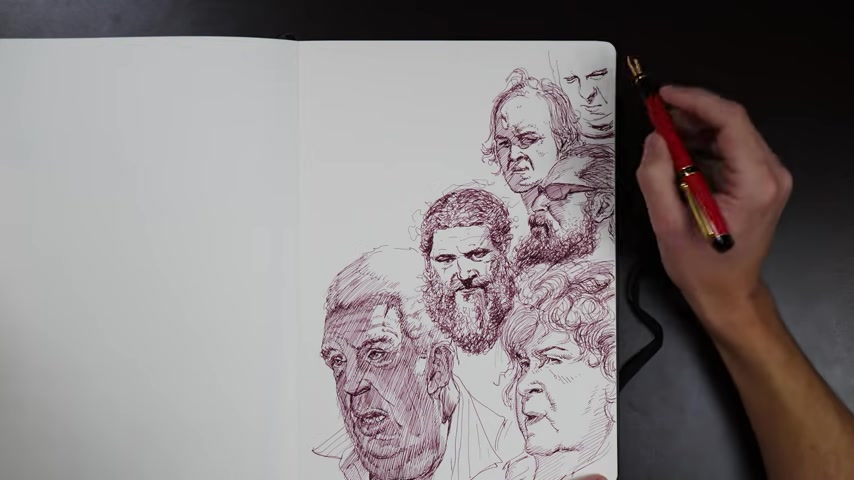
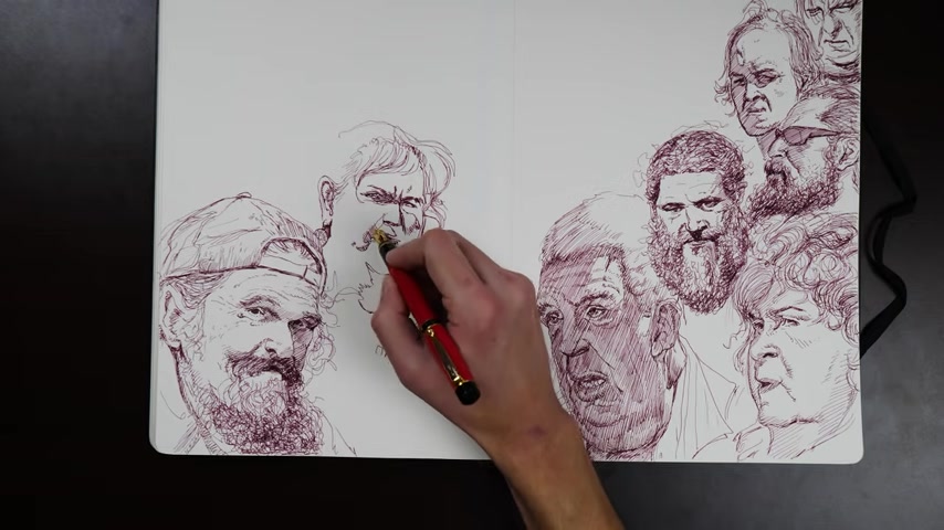
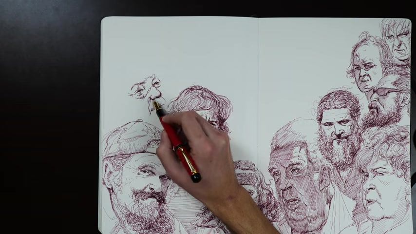
I believe moving on to another head here , you'll see that I don't make the same choices for all of the heads either .
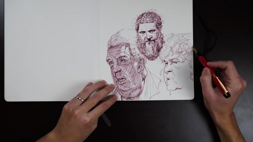
I don't wind up putting the overall shadow shape on all of the heads like I did on that last one that I drew I bought back and forth for a couple of them .
I do that .
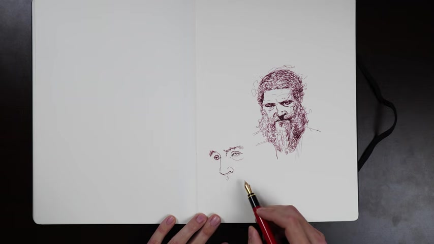
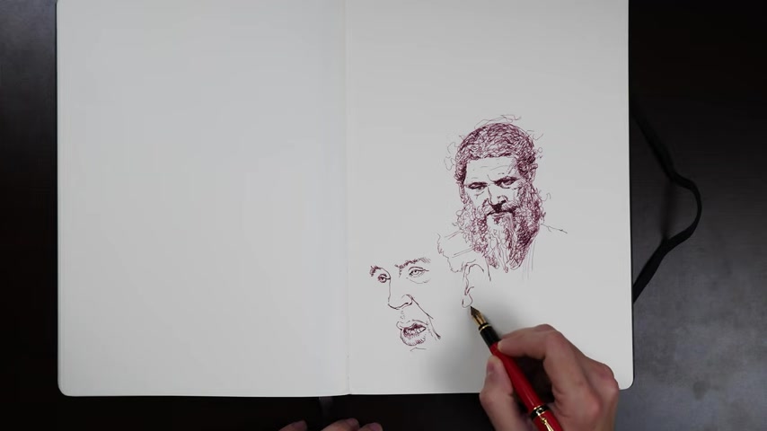
And then for others , I do more what I'm doing now where I'm ignoring the overall shadow shape that I see in the reference and letting it indicate to me truths about the form and the structure that I am then translating into a more spare , a little bit more trimmed down indication of those truths that focused around points of focus on the face .
So I'm keeping them around the eyes , around the nose , around the lips .
And then you can see over there on her cheek that's pretty open .
There's very little going on in her cheek , right ?
I only indicate major landmarks like that Zygomatic arch underneath her eye .
Uh That's the only thing that I've indicated in that big open cheek area .
I think I come back in a little bit and bungle that completely trying to get her jowls to roll under .
But maybe that was ill advised .
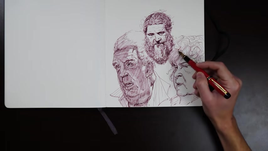
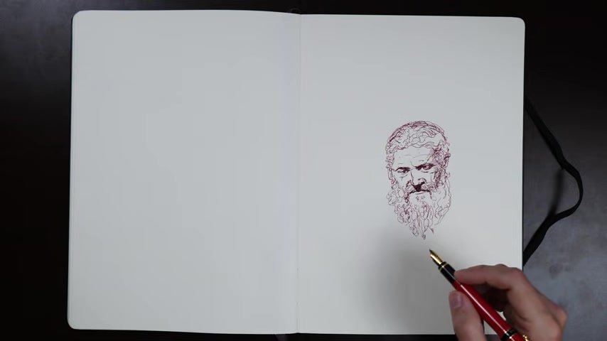
All the different textures you can do in people's hair is so much fun , like her sort of swirly curly Q art Nouveau Arabesque lines compared to the first heads random scraggly all over the place , Jack uh frizzy hair lines .
I love those contrasts .
I really do .
And then some people's hair is closer to the head or so dense that you can just treat , treat it like a sculptural form .
Instead , pen is so fun for that .
It forces you to sort of find a linear , almost cartoonish shorthand for all of those different textures and surfaces .
And that's one of the , that's one of the greatest joys of drawing .
That's so fun .
I'm drawing all of these just straight in with the ink .
I'm not using any like pencil underlays , but I'm also not sketching like construction forms , right ?
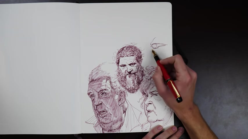
Like I'm not putting even in the ink , I'm not sketching like a ball with the ink first and then laying my features into that or anything like that .
And there's a couple of reasons for that one .
The references are very clear and they're not super complicated for someone who has a lot of experience drawing , right ?
It's just heads for the most part .
Sometimes there's a little bit of bust in there , but it's pretty straightforward .
The other thing is that the way that you draw tends to change what you focus on in your reference or what you're drawing .
So what do I mean by that to go in straight with the ink tends to make you focus on the little weirdnesses like the little jangles and jauntiness is that you can find in your reference .
It's just natural for that kind of work .
The ink pen wants to trail around and take little turns and dive this way and jump up that way .
And that happens to align with what I wanted to study from the references I was focused on and wanted to remember and make study of the little individual niceties of each of these pictures and focus on people's craggy skin and their wild hair and the way that they wrinkles overlap each other and the weird twists and turns that the contours of their faces make .
That was what I was interested in in these references .
And in my experience , not for everyone .
But if I had started these sketches by sort of laying in a little armature of the head and then trying to build my features onto it , that would tend to make me draw in a more generalized manner .
I would have taken a lot of those interesting detailed contours and just simplified them down into more generalized curves and geometric shapes .
And surely if what you want to study from your references is their graceful quality that does tend to make it easier to access the grace and solidity of structure of your references .
But like I said , in my experience , it would tend to make me miss the fun jazz ss of all of the little weirdnesses of the sketch .
Now that , that presents its own problems , right ?
It's not like that's necessarily easy to do while maintaining a structural feeling , but that's where the art of it comes in and that's where experience comes in .
You to pull that off .
You need to compensate effectively , you need to know that you're going to need to compensate effectively .
And that just asks you to take a little bit of a pause before you jump in on any section and remind yourself .
All right , I know I'm gonna wheel out of control here and take a , a roller coaster ride around the Helix and the Antihelix and the Tragus of this ear .
And I just need to remember to , as I'm doing that , try to organize them slightly into some Arabesque rhythms that catch each other and feed into each other and not just let them completely that turn into blobs that have no straight against curve , no variety of shapes .
That's easier said than done .
Like I said , it has to come with experience , but that is what's happening there .
And having that solidity underneath is what lets you take the fun little uh hiking trail , marching ant line all around that here and enjoy it .
And the inverse goes for when you're working in a structural way .
If you want everything to be in balance , then you know , OK , I'm going to throw a circle , a nice clean circle to give me the skull of this person's head .
But you take a little breath right before and you say right ?
But I'm gonna try to throw a circle that is also characteristic of the proportion and shape of this person's head .
So if they have a more elongated elliptical skull , I'm gonna try to get , make it a little bit elliptical .
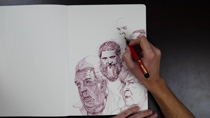
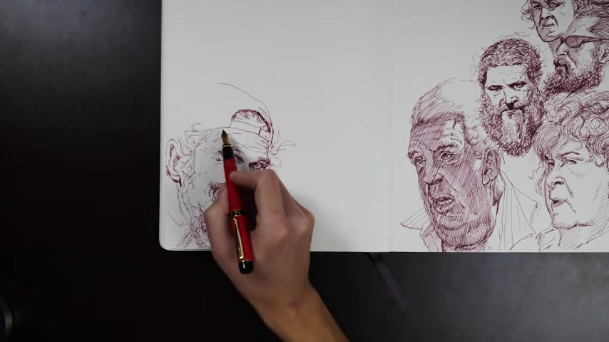
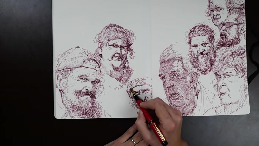
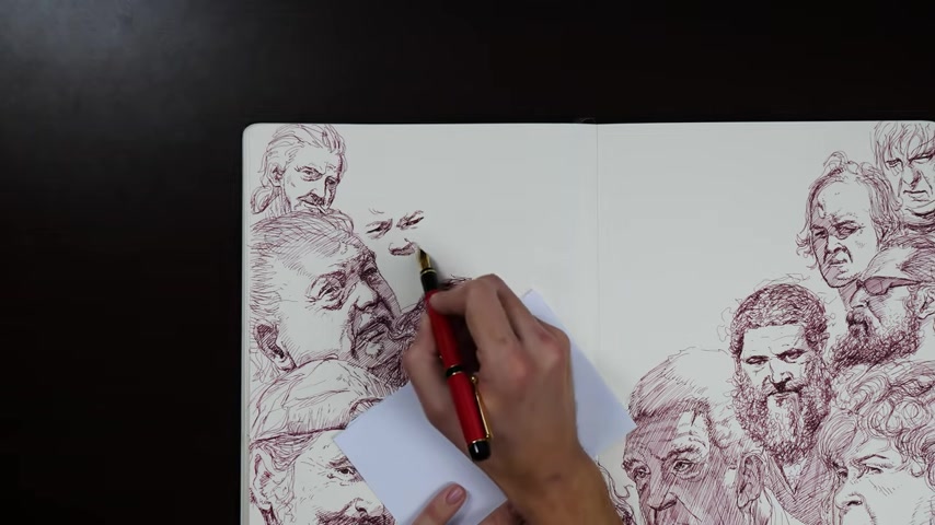
And if they have like a perfectly round dome head , then maybe I can hit it with the perfect circle as best as I can do here's another head where I'm doing an overall shadow pattern on it and you can see that I'm doing it a little different than I did on that bottom left head , right .
I actually drew it in with a contour line uh as its own shape on the face .
And it's weird even though it's not filled in because it follows the structure of the face .
It still like adds something .
It still explains the anatomy , doesn't it ?
Isn't that so freaking weird ?
It's like your mind is so used to looking at that terminator for information about what's actually happening with that form .
That oftentimes if you just give the viewer that their mind is so used to looking and deriving information from that terminator line that they just will , it'll still do the work .
It'll still explain itself in the mind of the viewer .
That's really weird .
Can anyone explain that ?
Is there any explaining that that is just the oddest thing and who needs magic ?
I just filled it in whatever , screw it , forget magic .
And then I'm working back into it and getting those little graphic shapes around the eyes , right ?
The graphic shapes around the eyes are so subtle and the negative spaces between all of those little graphic shapes .
The little ways that the corners of like a triangular graphic shape in the eye , either points up or points down tells you , oh God , everything about the mood of the person their age where they're looking , it's really kind of harsh how specific it can be in an area like the eye and it's not like that everywhere on other things .
It's just because our species has been staring in awe at other people's eyes for Milen uncountable .
So we kind of have a lot of experience at deriving information from those eyes and we have a high bar for them as well .
I guess you could count the millennia , right ?
I mean , scientists do have a guess .
I don't know .
It seems like every piece of cave art we find pushes the years back , doesn't it ?
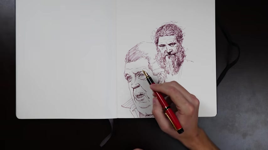
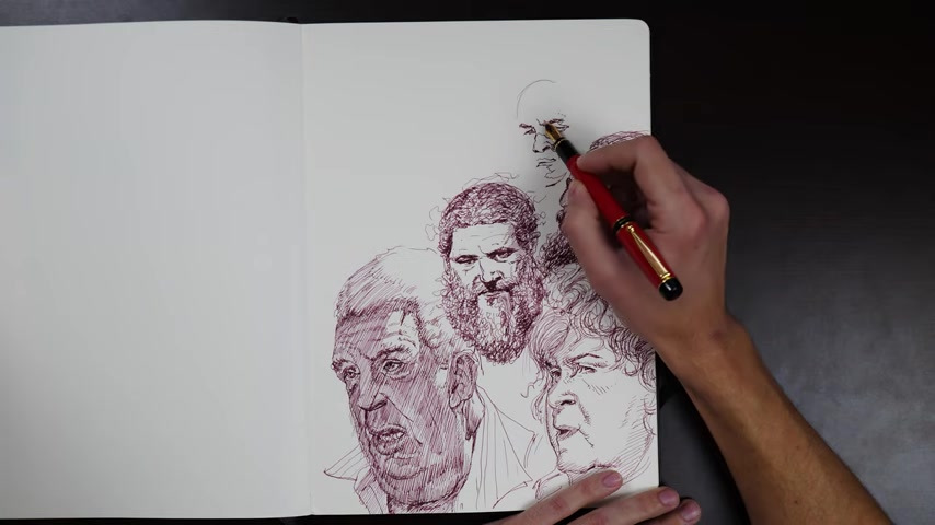
It's kind of weird another face up there .
Why not ?
It's filled with faces .
A steady sheet , isn't it ?
You know how complete a picture feels is directly proportional to how many heads are in it ?
Just kidding .
That's my gimmick .
That's what I like to do .
If I don't know how to finish something , it's just like put a head there , put a head there , put a head there , figure there , figure there , you know , then you don't have to draw any props and no one's .
Everyone thinks you still weren't lazy .
Right ?
It's great .
I wonder if I'll do anything interesting soon so that I can talk about it .
No , pure bread and butter stuff here .
Hatching , hatching , hatching ?
00 , that's hair .
You know , I , I can't trust myself on the hatching stuff .
I , I tend to get really , I switch my modes .
A lot with hatching , you know , there's cross hatching where if you want to darken an area , you turn your hatches at an opposing angle and you can layer that over and over and over again until things get quite dark .
I do that sometimes I honestly don't do it a lot .
I more prefer single direction hatching , which to me gives uh more of a sense of softness in the form and I'm a form person .
So it makes sense that I align with that .
But that's a little bit more tricky , tricky to make , look nice to make look finished because to darken an area while keeping the hatches going in the same direction instead of an opposing direction , it requires a few tricks .
But one you need to be able to nail the angles of your first patch of hatches so that you can follow them .
All right .
And then two , you need to either effectively do the hatches in between the hatches that you put last time , which is possible if you're uh if you're practiced at it enough or you need to similarly hard go right over exactly over that last hatch that you left .
I don't really sweat hitting one of those two things ever really , I just would , I'm fine with just being a little messy and just getting the overall effect of an area darkening or lightning .
But if you really wanted to make that single directional hatching feel finished and refined , you would kind of need to hit one of those zones , which is not easy , not easy .
Crosshatching actually makes it a little easier to keep that stuff straight in your head and doesn't require nearly as much uh finger dexterity .
Well , no , it does .
It's just not , not matching dexterity .
It's a different kind of dexterity to turn the hatches and beautiful subtle curves against each other and things like that , that does require its own kind of dexterity .
But ultimately , a mix of both is often very effective and being able to do both is very useful because if a patch of single directional hatching didn't quite get dark enough , but you don't want to excite that area with super dynamic cross hatching or roll out of its main terminator by doing super exciting cross hatching , then you can instead go into single directional hatching mode and just buckle down and try to darken that area just by nailing those lines that you put down on the first pass or again going between them .
You know what makes that a lot easier is working big .
Obviously , the smaller you're drawing is the smaller and more precise area between hatches is .
So if you want more flexibility to pull fancier tricks or to recover from problems with hatching , I would recommend working as big as you're comfortable that makes it much , much easier and demands much less precision .
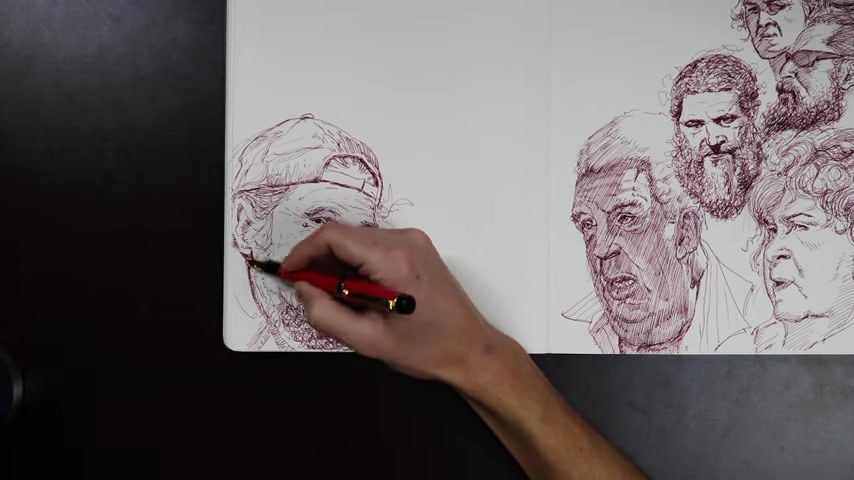
When you're trying to do fixes , make edits that require you to dance in between lines , this face I feel was exceptionally good , such a good face .
But I think that is a really tough one .
And I think that I failed to capture what I really liked about that face because I think this is one of those ones that when you see the photo , the structure of this gentleman's mouth , like the way his lips went really deep into his face right underneath his mustache and produced this really beautiful and subtle shadow shape that was in part of his mustache .
And then also in part of his lip or on part of his lip was oh , it was just so graceful and yeah , subtle and weird and so unusual you don't see it .
And it explains so much about the very particular form of his mouth that his jaw had like a very um caved in structure .
It was , it's really weird to see it in the photograph .
And then even though I tried to capture it in the drawing , it's such a unique form in that area that it it was very hard to communicate .
And I don't think I quite captured it .
It instead looks like I sort of got caught in the middle or made like a shadow mistake or something like that .
The more aberrant and special features get especially on the face , the more they demand either a super high fidelity solution or a super graphic , stylized almost cartoonish solution that just very clearly communicates that particular weirdness about that facial structure .
And it's very hard to communicate them while being stuck in the middle , while being in some sort of half realistic , half stylized kind of zone .
So I gave it a shot and basically failed and then started to put a generalized shadow pattern over the area of his face that was in shadow .
And then he's got one of those beautiful beards as well that you can kind of build up by doing random zenned out hand movements .
A really fun thing about that texture is that because it's structure less , it's kind of like veiling with a pencil .
You can put form into all of that scraggly random jagged beard by just staying in an area a little longer and putting more and more of those squiggles .
So if there is like a shelf on a beard like that , you can communicate that that shelf , that part that goes under and away from the light is darker and has like a form change to it .
You can communicate that by just hanging out longer in that shelf area on that down plane and adding more and more squabbles and all of those wiggly lines are so chaotically overlapped that it feels airy .
And for me , because you can't really tell like where one line starts and where another ends and what's hair and what's value it does ask you to do a little bit of mental organization , you know , you need to decide where you want those darker shapes .
And then there's also other tricks you can pull .
It actually came up in this sketch where I wanted to darken the beard , which is obviously from his lower lip down .
I still wanted it to get darker outside of where I imagined the outline of his jaw was underneath it .
So that's a really fun trick that you can do to try to sneak some , uh next level form into something like that because I could , you could just black it out and do it all as one strong value .
But since you're using a fine pen and you have a lot of room to create values by building up the layers of hatching and scratching , you can pull a trick like that and it still will read as an overall beard shape because it has a generalized darker value than the rest of the face .
But within that generalized darker value , there is then this even darker value that you can use to well explain whatever you want as an artist .
So like , like I said , you can choose to turn a shelf and show that the form that the beard itself has structure or you can do a gag like the one that I did where if you kind of squint at it , even though the beard is there , you can still see what the normal outline of his chin and jaw would be underneath the beard .
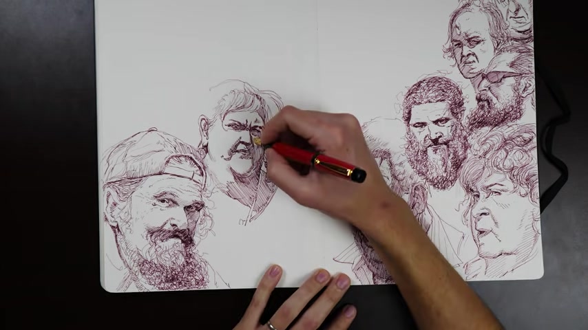
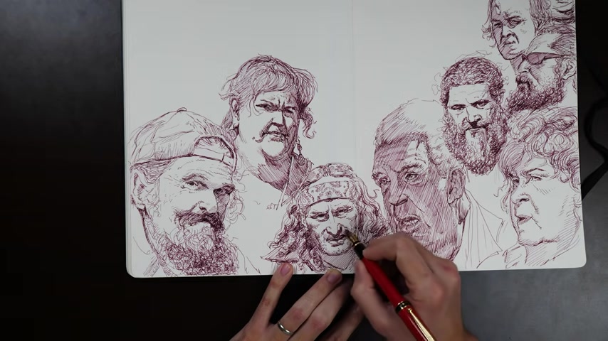
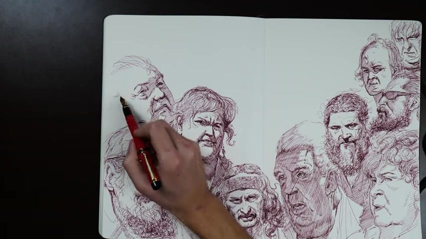
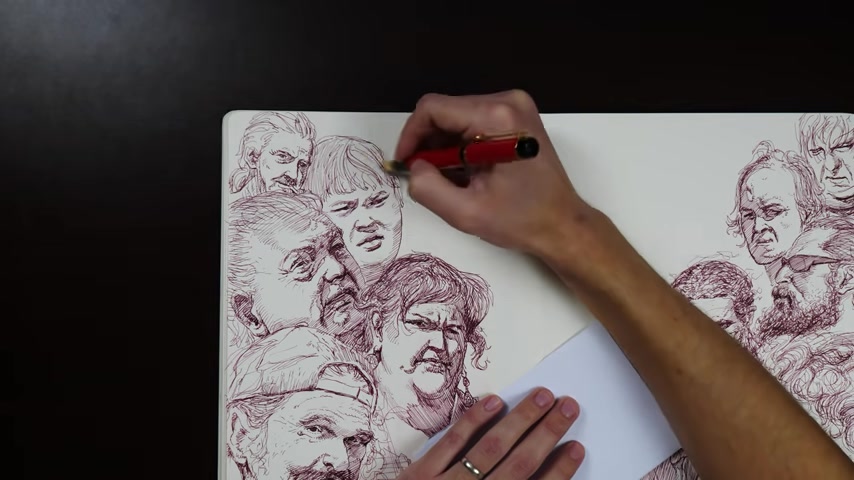
Now I do all sorts of wacky stuff on this one .
You can see that I start with the graphic shapes of the eye .
Then I do a little bit of indication of the far side of the face , the contour and then I jump into the inside and start demarcating a core shadow that snakes down the nose , the lips and then down this big uh roll of a double chin underneath her neck .
And it's just like , again , it's very improvisation .
I'm just , it's like following a map a lot of the time .
It's like if you were trying to produce an exact copy of a very detailed map of the coastline of an island or a country , something like that , that's the level of specificity that a lot of these shadow shapes tend to have .
And that doesn't mean that when you draw them from imagination , they need to be specific in the same way , right ?
It doesn't mean that they , this very specific shadow shape is the shadow shape of a chin in this lighting or something like that .
It's not really about that .
You can actually get a very similar feel when working completely from imagination .
If you just have the benchmark in your mind of how specific those shapes are , you can do something pretty different and out there and not like what that shape would be in reality .
But if it has the same surprising flavor and the little niceties of variety , it will trigger in the viewer's mind .
Ah That's a natural looking shadow shape .
That's the level of detail that I'm familiar with .
So you can see it looks very abstract in its current form , has a very uh graphic and sort of floating feel to it .
But the structure is actually contained already even in just what's there .
Again , it's doing that effect that we had in the other drawing where if you demarcate that shadow shape , even without filling it in , the viewer can read that edge and edges are very important to the way that we see the world and they can extrapolate from it .
And deduce what the overall structure is , that little line , that thin line is like an ant marching over and under and into hills and crevices and over swells and valleys .
It does so much of the work for you .
And then in my classic graceless style , I don't know where to quit .
So I just draw the rest of it and I will eventually fill in that shadow because uh I'm a hack , love that big shadow shape under her chin .
That's a lot of fun .
And those little crescent moon shaped shadow shapes for the jowls and the extra fat that's building up around the corners of the mouth .
Now , this effect while very useful for zoning you in on the specificity of those shapes does produce a few interesting problems like and you can see this happening to me here on the double chin .
How do you get softness in an area that is actually a very soft , very diffuse formal when you've been s crying out these shapes with hard edges .
And I tried to fight it a little bit by doing that little zigzag waggle there on the bottom of that roll on the double chin .
But there's other things you can do .
You don't have to demarcate that area .
I could have just known that somewhere in there is that terminator edge and I could have left it undrawn .
And then when I come in and the next step and I start doing this diagonal hatching into the shadow area , I could have let the diagonal hatching hold that edge .
And then usually that makes it look a little softer .
The the feather of those edges makes it feel more like a half tone or even a slight change in the light .
You can see that I'm getting that effect a little bit on the left side there .
Uh where I wanted to indicate a little bit the form of her chin and jowl and the double chin uh in the light area .
So in those areas , I didn't demarcate those out because they weren't true shadow .
I interpreted them as dark half tones if anything .
And so I indicated those just with the hatching .
And you can see that it tends to mean that a spot like that the shape isn't as specific .
It could be , you could pay a lot of attention as you lay down those hatchbacks and make that shape very specific .
But what you lose in specificity , you gain in softness into that field of diagonal hatching .
I'm blobbing in graphic shapes for the pupils of the eye corners of the eye where the brow overlaps the eye socket , corners of the mouth .
These are very key , high contrast areas of the face .
I talk a lot about the contrast hierarchy .
It's something that I'm always thinking about when I'm trying to arrange the values in a picture and I've discussed it in more detail elsewhere , but generally number one on the contrast priorities .
When you're doing a portrait is going to be those tight , dark accents in the eyes and the lips , you generally want those to be darker than everything else .
It brings the viewers' attention to the place that you want .
So if you're interested in trying this process out of just freely sketching an ink , which I think is great , practice , great discipline teaches you a lot about what you're drawing and how you're organizing it , just go for it and I would do it with just about anything .
Um Actually a regular ball point office pen is one of the best ink drawing tools you can find .
Even just like if you don't get the bottom of the barrel one , if you get like a nice uh zebra pen or a pilot pen or something like that , anything from staples .
Just a simple office ballpoint pen .
They are great drawing tools .
You can , you can make drawings as detailed as a pencil drawing with that .
They're actually easier to use than something like a fountain pen .
In my opinion , fountain pens have a little bit of uh an interesting quality of variety that they can get .
Um they also look sick on camera , which is the main reason that I use one .
But if you want to try out ink drawing , just go for a regular ballpoint pen .
There are , there's very few , there's very few steps up in the ink world that feel much better for doing detail work .
They're fantastic , fantastic tools and you can hatch to your heart's content .
You can do extremely light work with a lot of ballpoint pens .
If you just barely graze them against the paper , they will leave ghost hatch lines that you can actually get a lot of form out of .
So I would advise you to try it out .
I drew with ballpoint pen for a long time .
It was a favorite sketching medium and it actually trained me up for pencil drawing in a lot of ways .
I found that a lot of it transferred directly .
So even if you are a pencil focused , a artist , a dry media artist , uh I would advise spending a little bit of time with ink .
It is great , great training and a lot of it transfers .
Like I said , with a ballpoint patent .
You can get super fine detail work .
Fountain pen forces you to give up more than something like ballpoint pen does .
I couldn't do a really full value range with a fountain pen like this .
It forces me to stylize things into graphic shapes and trains me to look for a variety of touch and texture , which is what I wanted to practice with a page like this with a ballpoint pen .
I could have rendered these things , you know , I could have made them look pretty damn round if I wanted to , uh it's up to you what you want to do with one of those .
So if you're interested in ink at all , just grab the nearest ballpoint pen and know that it's probably a good tool .
If you're using a really bad one , a little tip is just to keep a uh paper towel next to your drawing board .
And every time you pick up a little piece of paper , like a , the ballpoint pen will pull thread out of the paper and that will make it put down an uneven line .
You can just spin it on that paper towel and that will clean it off really good ballpoint pens avoid that .
They don't get clogged up as often as cheap ones do .
But that's really all you need to do to get a lot of good work out .
A ballpoint pen , headbands , hair , sunglasses , crackles , leather coats .
These earths world people are an infinite source of fun forms to draw .
So if I were you , I would look for resources that really align with you .
You know , don't just draw any old reference because it's a reference or it's an official figure drawing or it's what people say is a good thing to draw .
I can do some of that while you study up and things like that .
But draw the things that you really like , you know , I know that that can be a little hard because you have to decide what you like , right ?
But look for it , try to figure out what you really like .
Are you a form person ?
If you're a form person , look for , for me looking people and try out all the different body types and look at animals as well .
God , animals have some of the freakiest moments in form history .
That's my new TV show , by the way , freakiest moments in form history .
I should write that down .
I should do a youtube video about that , but animals have amazing shapes on them and amazing interactions of their forms rolling on each other , rolling under each other , pinching , traversing interlocking wedging .
It's just beautiful and the great thing about looking at animals for those forms is that they're completely different from the kinds of forms that you find on people .
Might I recommend if you've never looked into it .
Um , pigs and lizards , pigs and lizards are the wildest looking things .
If you want to get good at painting or design .
Look at birds , but if you want forms , look at pigs and lizards , man , they are the best .
Those are some freaky animals with some really incredible shapes on them .
Birds are all right .
They're ok .
They definitely have amazing shapes and values and colors and can teach you everything about how to add variety to those .
But I don't know , there's something about that .
They're just , they're perverts , you know , every time you turn on your TV , it's like nine times out of 10 , it's a video of bird doing some sort of mating dance .
They just , you know , it doesn't sit right with me this second to last head here has some great forms on it with a really bold shadow pattern .
Look at that , like lightening bolt shaped light shape that is starting on his upper lip right under his nose and then it crawls over to the top of lip and then it goes into shadow and then there's like just a demarcation for the lines between the lips and the teeth and then it comes back out into light , like halfway down his lower lip .
And then there's a little bop back into shadow under the lower lip and then back out for the chin .
It's like , ah , that's some good variety right there .
That's so fun .
That guy's face is great .
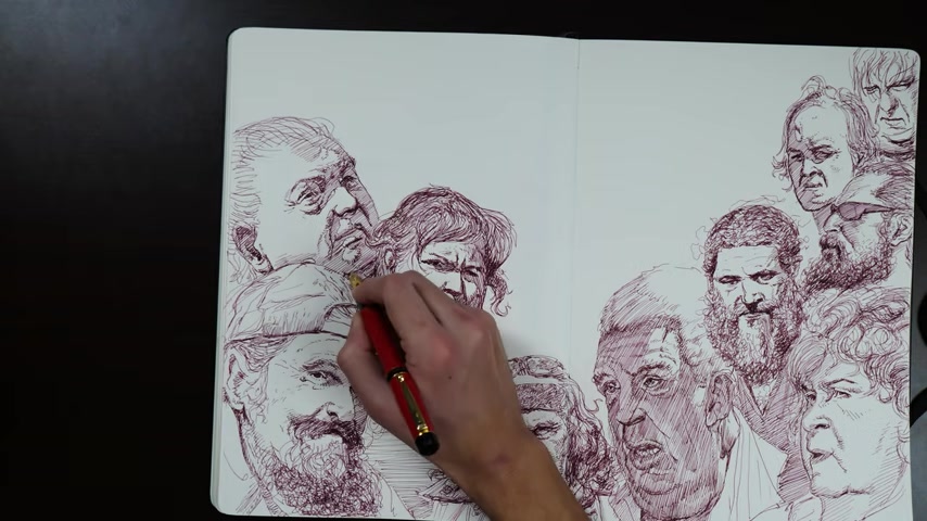
And then all the stuff going on on the , uh , uh , nasal labial line and the , everything going on around his eye .
Good God .
His crow's feet and everything like that .
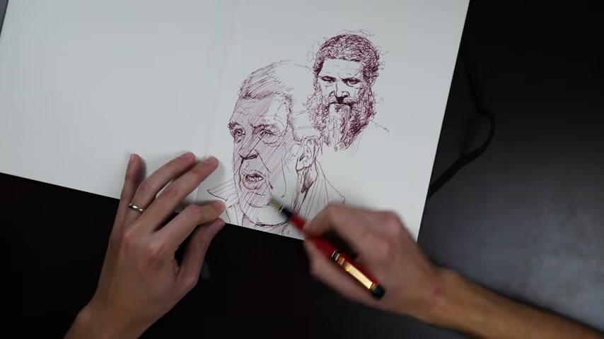
Just so good , so good hatching in a bunch of stuff here just lowering the value in a bunch of people's hair , cleaning up little things .
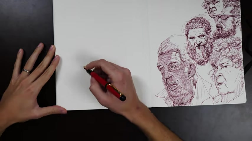
I think I got one head left that I throw in there at the end .
But for the most part , I think you get the picture , of course , after an hour and a half or two hours of warm up , that last head there in the top left winds up being the most structurally sound , I think .
And no surprise .
There ain't that how it goes .
If you don't have a discipline of warming up before you dive into your main picture that you want to do in any setting , I would recommend you try it .
There is a certain little hump that you need to get over where every session you start a little rusty , you know , it builds up no matter what .
Even if you've been drawing day after day after day , it's just a little bit of time to reconfigure your mind , to think in terms of , well , the illusion of drawing , right ?
It's a very particular mindset to be in and to sort of flow in and out of that state effectively and be able to improvise well , in that state requires a bit of adjustment .
Um at any time , if you know what you're trying to work on that day , usually the best warm up is to just do more of that , right ?
If you know , you're going to be drawing a figure doing a bunch of figures for your main project , just throw a lot of figures if you know that you're going to be rendering something , do some basic shapes and shade them up in the same medium that you're gonna be working in .
If you don't know , then just doing something that requires a lot of flowing dexterity tends to work for me .
It reminds me to think in grace .
It reminds me to think in long statements and it just is a mechanical reminder to move your whole arm to be dexterous with your fingers .
It sort of shakes off the actual like mechanical rust that builds up um in these old aching joints .
So if you don't know what you're gonna do that day , any series of long flowing lines , you know , drawing full figure drawings from head to toe as little gesture sketches that make you define a big flowing curve , even just doing abstract arabesques on a piece of paper and turning them into forms or resolving information into them .
After you throw a basic outside shape , these are all great warm ups that one especially is good for drawing from imagination because you're not trying to hit anything in particular .
It's not as intimidating as saying , OK , now I'm drawing faces from imagination .
You're just starting your session by drawing blobs just weird shapes that can look like anything and then you're detailing them and adding anatomy on the inside or turning them into a little cartoon creature that's not necessarily practicing exactly what you're going to do in your imagination drawing session later in the day , it's only practicing the imagining part and that's super , super useful .
It gets your mind into this Zen spinning leaf mental mode of being comfortable just making things up , just dreaming things up and putting them down on the paper without feeling any pressure to nail it or to be bound by the structures of reality .
That's a very important mindset to be able to drop in and out of .
So yeah , that , that abstract shape exercise of just throwing things on a big sheet of paper , looking for some big overall flow and then working details and information into them .
Uh I've done that a lot and it is one of the best warm-ups for doing an imaginative drawing session afterwards .
And I had to just sneak one more creeping old man in there , just his little eyes ducking out behind these other faces .
He's just showing up for the party right at the last second .
But he goes down super fast .
I'm super warmed up at this point and he , he , he really just sort of comes together .
No problem .
All right .
I hope you enjoyed that .
Thanks for drawing today .
Go get him .
Are you looking for a way to reach a wider audience and get more views on your videos?
Our innovative video to text transcribing service can help you do just that.
We provide accurate transcriptions of your videos along with visual content that will help you attract new viewers and keep them engaged. Plus, our data analytics and ad campaign tools can help you monetize your content and maximize your revenue.
Let's partner up and take your video content to the next level!
Contact us today to learn more.