https://www.youtube.com/watch?v=J-LDUK-XhRM
2023-06-14 18:15:31
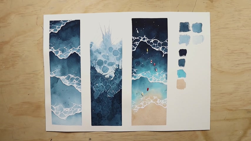
WATERCOLOR TUTORIAL _ How to Paint Waves
Good morning .
Good morning .
How are you doing today ?
First off , Happy New Year to welcome the new year .
I thought I'd start off with a video on how to paint water color waves .
And so that's what we're doing today .
But before we get into it , a thank you to Squarespace for sponsoring today's video .
If you're looking to make a professional looking website or an online portfolio , Squarespace has got all the tools you need to make your website today from scratch .
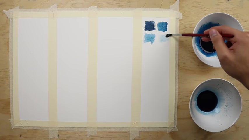
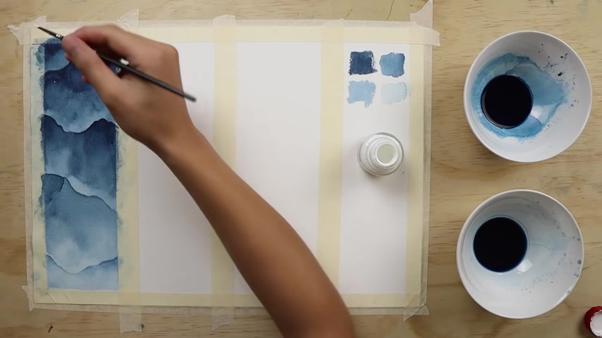
Let's talk materials for this exercise .
We're going to need some paper brushes , paints , masking , fluid , white ink and a pencil .
In this video .
We're gonna try to tackle three different watercolor wave effects .
The first one we're gonna look at is a simple bird's eye view of waves crashing .
And for this , we'll only need one color indigo here .
I'm mixing two bowls of different dilutions of indigo by adding water .
One's a darker mix and the other is a lighter mix .
Please ignore the two swatches on the right side though .
Those were just tests of what each mix would look like if it were diluted even further .
So let's get into it .
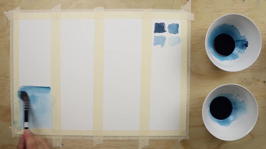
The first step we're gonna do is build a gradient wash starting off by applying the dilutes of indigo paint and slowly working our way up darker as we work our way up towards the darker end of the gradient , start adding more paint and eventually using the darker mix of indigo .
Ideally , you want the surface to still be wet by the time you get to the end just so you can still rework the paint to smooth out the gradient if necessary .
Like you see me doing here a quick tip though , make sure you always wet the brush generously throughout the whole entire process and try to work loosely and quickly .
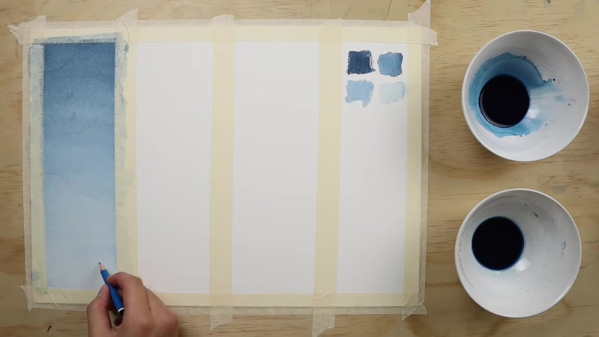
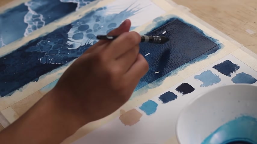
And once that all dries lightly sketch in where you want the wave breaks , try and be really , really loose with these lines to create natural looking shapes .
And once that's done , we can start defining those ways by painting them in , start painting along the wave break line that we just drew using the darker paint .
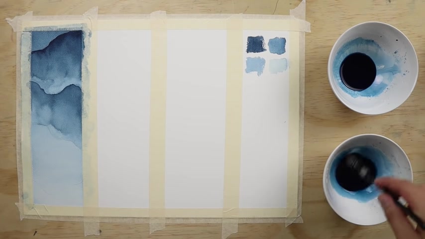
Then you're going to want to dip the brush into water to get a lot of clean water in the brush and start pulling the paint downwards like soap .
This pulling technique will allow the paint to have a gradient effect .
As the paint starts to disperse downward into the clean water , you'll really want to make sure each wave break is completely dry before going on to the next .
Again , we're using that same pulling technique where we apply the darker paint along the wave line first , then with a really wet brush , we go along the edge of the already laid down paint .
Now , we just continue repeating the same process for each of the wave breaks as we start working our way downwards , we use increasingly lighter washes .
And that's because the overall aim is to create waves that get lighter down the page .
And the lighter areas are obviously meant to imitate shallow areas of water and vice versa .
With the darker areas with those first layers of wave breaks done .
Now we just go over the wave break washers again to deepen them and build a bit more contrast and just a heads up working with so much water will allow for water effects like blooms and bleeds to take place , try to loosen up a little and let this happen even if by accident as they'll actually add to the overall effect .
And I think they look pretty cool .
Now that we've defined those wave breaks with some contrast , you can already see the effects starting to take place , but we're not quite done yet .
So now let's get out the white ink with white ink and a brush , go ahead and paint over the outlines of the wave breaks like so try to vary the thickness of your lines as this will actually make the waves look a little more natural and realistic .
Then we can go ahead and start detailing the waves by adding the little foam ripples .
There's no real rule for this , but I like to think of it as drawing wobbly shapes of varying sizes and connecting them .
Once the waves are all done , let's add some little splatters just for a finishing touch .
If there's any excessive or unwanted splutters , you can easily just remove them by dabbing them with tissue paper .
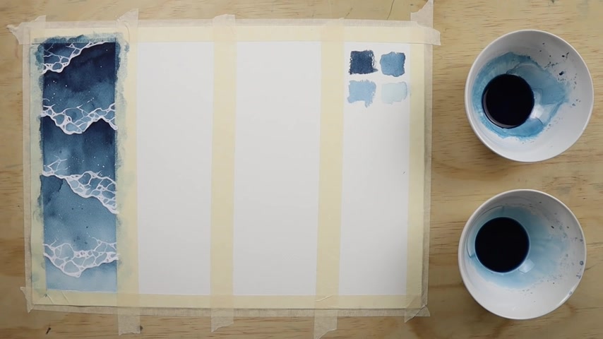
And that's the first exercise .
The second exercise we're going to try is an abstract wave effect .
So first off , let's apply paint to the page , try to be loose with your brush and create some random shapes like .
So also you'll really want to make sure that there's a lot of water and paint on the page because the next thing we're going to do is blow .
This butter effect only works well if there's enough paint and water on the page .
Now , with a loaded wet brush , use a pulling technique to start pulling the paint downward , fading the gradient to clean water with the paper still wet , apply some dark paint in patches like this to create blooms and then let it all dry .
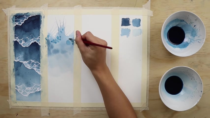
Now , we can start creating foam ripples with the lighter diluted paint , start painting in some random wobbly shapes of varying sizes leaving a small gap between each of the shapes .
Basically , we're trying to achieve a similar foam ripple effect to the first exercise that we did .
But of using white ink , we're actually using a negative painting technique to build the foam ripples .
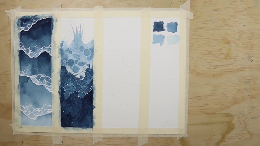
Once that's all dry , we can repeat the same process lower down .
So again , apply the paint blow , blow , again , pull the paint downward , paint , the ripple shapes and then repeat one last time .
Finally , let's get out the white ink and start adding some white details .
Here .
I'm just outlining some parts of the splatters to define the shapes a bit more and then finishing up with some flicks of white ink .
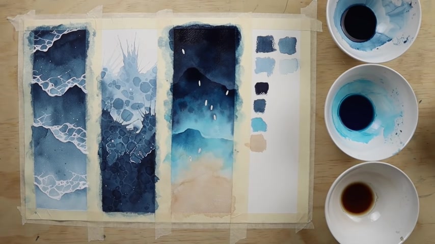
And now the last exercise for this one , we're going to do something similar to the first but a bit more advanced because this time , we're going to be using color transitions to create a sandy beach scene .
First off , lightly draw in some wave break shapes with a pencil and don't forget to keep loose with those lines .
We're also going to draw in some little oval shapes which will be boat decks from above .
And now we can get up the masking fluid and apply that to the oval shapes that we just made for this scene .
We're going to need three colors indigo tho turquoise .
I think that's how you say it .
I don't know and be with these colors .
We're going to mix four bowls of paint , a darker mix of indigo by only adding a little bit of water , a lighter mix of indigo by diluting with a lot of water .
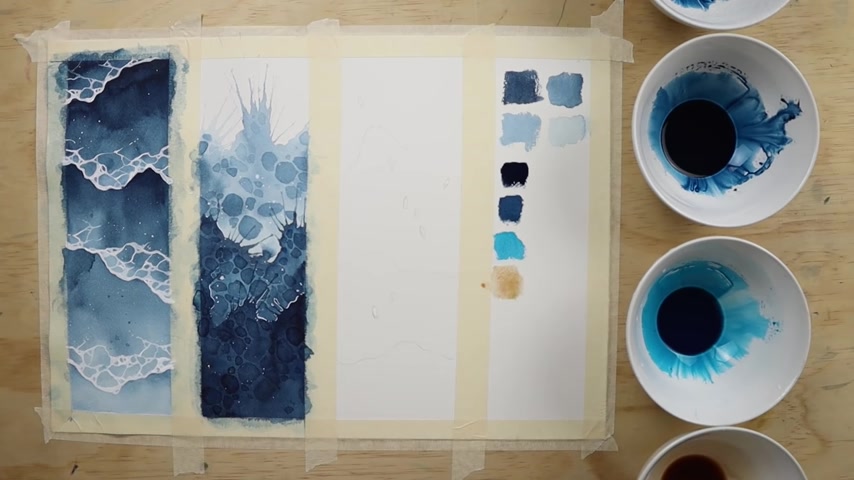
A bowl of diluted thal and lastly a bowl of burnt Sienna diluted with a lot , a lot , a lot of water , you have to keep adding water until it's a light sandy color .
And so your color palette should look something like this .
So let's start off by loading our brush with a lot of water dipping into our diluted Benna and then creating a gradient from dark to light while everything's still wet , quickly clean the brush and dip into the tho turquoise .
Now , we can start applying it to the page and blending it to make a soft transition like soap .
Once we're about midway , we can start adding a little bit of indigo to our brush and transitioning from the turquoise to the indigo .
By the time we get to the top , if the paper is still wet , we can go over to smooth out transitions or to add some blooms to deepen some areas .
I'm adding some turquoise to the shallow sandy areas and some indigo to the deeper upper areas you may have already noticed by now .
But the indigo and turquoise dries a lot less vibrant than what they look like when they're wet .
So let's go over it all with another wash to build some saturation .
We're going to do the exact same thing as before , but we can be a bit more bold with our application of paint .
Once that oil dries , it's time to start defining the wave breaks .
We can begin by adding tho turquoise along the first wave break like this .
Then with clean water on the brush , start blending it all onto the sandy shore .
And again , while it's all still wet , I'm just tweaking by adding some more indigo to the upper deeper part , which is just to build a bit more contrast .
In the next wave break .
We're going to start off by using indigo this time and pulling downward with clean water .
Again , basically , these exercises just require a lot of repetition .
So we're going to be repeating the same step for the last wave break .
I also decided that the brace could use a bit more contrast .
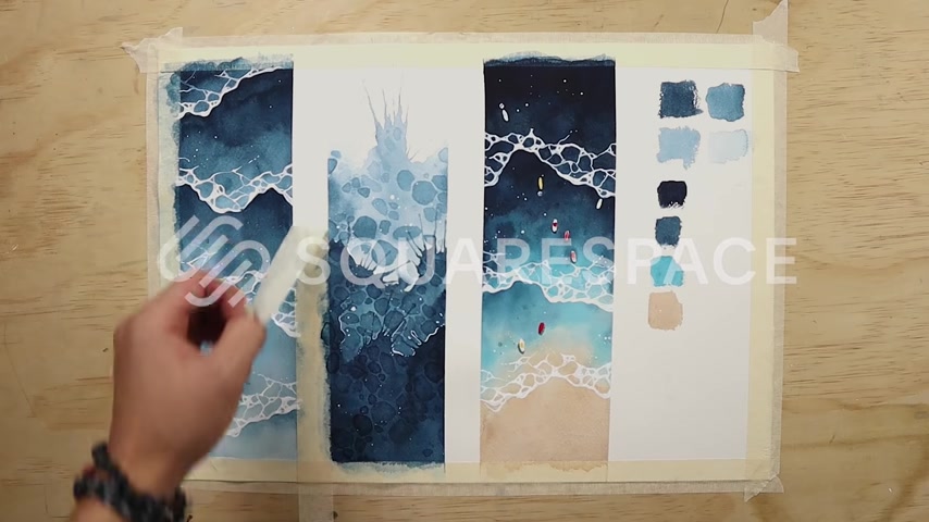
So I went over a few sections with indigo and lastly , just as before now , we get out the white ink and start painting some foam .
Once the outlines are done , then we can start adding the foam ripple details and of course a few flicks of white if you're feeling it , but we haven't completely forgotten about those oval boat shapes .
We masked off earlier paint over the shapes like this to create cast shadows using indigo .
Once the shadows are dry , we can peel off the masking fluid and then paint the boats in with any color you like .
I'm just gonna be using red and yellow cos those stand out a lot and look really cool against the blue backdrop and ta da all finished .
And before we wrap up , I want to thank Squarespace again for being the sponsor of today's video .
If you're someone in search of a platform to build a website of your own from scratch .
Squarespace has tons and tons of tools and features that will allow you to easily build anything to suit your needs .
Whether you're an artist in need of a professional looking website , to showcase your artwork or a business owner looking to sell products on a clean online shop .
So if you'd like to try your hand at designing your own dream website , Squarespace does offer a two week free trial and also a 10% discount off your first purchase just by visiting the link in my video description .
And also the last thing I want to do is encourage you all to experiment with these techniques as much as you'd like and even feel free to adapt them to your own style and make it your own .
These are techniques I had fun making up and experimenting with in my sketchbooks so much so that I even ended up using these waves for some of my exhibition pieces .
So go nuts , go crazy .
Maybe even try your own spin on painting watercolor waves .
Anyway , that wraps up today's video .
I hope you guys are having an awesome day .
Make more art and I'll see you guys soon .
Partnership
Are you looking for a way to reach a wider audience and get more views on your videos?
Our innovative video to text transcribing service can help you do just that.
We provide accurate transcriptions of your videos along with visual content that will help you attract new viewers and keep them engaged. Plus, our data analytics and ad campaign tools can help you monetize your content and maximize your revenue.
Let's partner up and take your video content to the next level!
Contact us today to learn more.