https://www.youtube.com/watch?v=nm09cQSskn8
How to Make a Great Website _ What No One Tells You
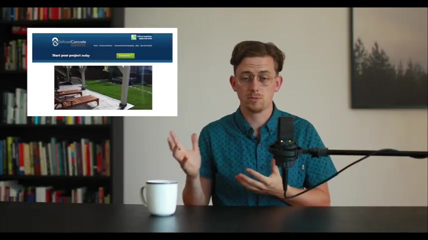
Building a great website is not about technology .
It's not about choosing wordpress or Wix for squarespace .
Instead there are some , some , there are some simple principles that make websites great .
You probably already know these principles intuitively , but I just never thought about them before .
Don't build a website because you need one , build a website because it accomplishes a goal for you .
For example , a clothing company wants to sell products .
Uh a landscaping company wants to sell wants to generate leads or a publication might want you to sign up for its newsletter .
A goal is a clarifying thing .
Once you have a goal , you can make decisions about adding or removing elements based on one question , does it help me accomplish my goal ?
Navigation is meant to be used ?
So it should be simple and conventional think of it like elevator buttons , people are using these buttons to get somewhere .
So don't make it confusing .
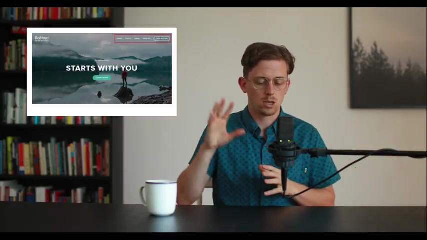
Navigation should always be found in a typical location .
Most commonly the top right corner or occasionally vertically along the left when you write the titles to your navigation links , try not to be too creative .
Instead use conventional link titles like services contact or about finally keep navigation simple , four or five links is ideal um resist the urge to have more than seven links .
You really don't want to have a wall of links .
Always remember , navigation is meant to be used .
You never want your visitors to have to think in order to navigate the secret to great looking websites is typography .
I mean think about it .
Websites are mostly made up of text .
So it makes sense that a beautiful website has chosen strong fonts that are well arranged .
Don't feel like you need to choose an unusual artistic font .
Your best bet is going to be a popular font , something like open sands or Roboto uh or Merriweather or Laura .
Keep things as simple and clear as possible .
White space is good .
Don't stop your website full of content .
All that extra content is just gonna be ignored .
Remember , people don't read websites , they scan websites , visitors have short attention spans .
So right with that in mind , edit text down to the bare minimum pictures are greater than words .
Apple is great at this .
They're always showing not telling .
Um And this is gonna be doubly important if you're an e-commerce website , don't hide behind technical language and and uh jargon , people will glaze over when they read words like specialize uh think outside of the box operations leverage , resonate .
Don't use those words , speak humanly and plainly .
If you're not a large corporation , don't pretend to be one own .
Your smallness small and human works really well on the internet , make it clear that there's a real live person behind this website .
People will respond to that .
A good way to act .
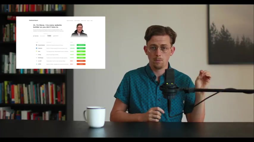
Human is to include a picture of yourself .
Pictures , build trust and people trust people .
Not websites always make contact information obvious .
For example , if your a restaurant makes your hours of operation and holiday hours and your phone number and location , make sure they're displayed prominently .
I know it seems obvious , but it's just an easy thing to forget when you search uh best website builders in Google .
My website comes up first .
It beats major brands like Go Daddy and Wix .
Now , I don't have any secret advice for ranking in Google .
Here's the best advice I know , create really , really valuable uh content for your visitors .
That's the best long term seo strategy .
Don't roll your eyes .
This is simple but Devilishly hard .
Of course , there are some basics you should learn .
Um You can start with this guide but there are no shortcuts and that probably doesn't surprise you .
So does it matter what technology you use to build your website ?
No , or at least it matters way less than most people think .
Choose something that you feel comfortable using .
My full time job is running site builder report where I've spent hundreds of hours testing website builders and there are definitely good and bad website builders , but do you know what the truth is .
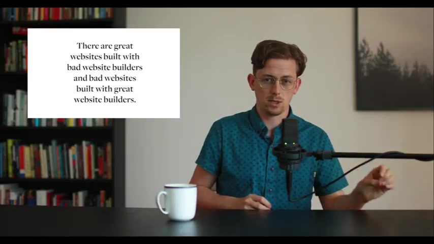
There are great websites built with bad website builders and bad websites built with great website builders .
You honestly don't need a custom web design .
95% of websites should be built with wordpress or a website builder .
Unless you're reinventing the wheel .
And I would caution you against trying to reinvent the wheel .
You don't need a custom web design .
I've purposely avoided talking about technology in this video .
But if there's one part of your website , you wanna make sure it's modern .
It's this , it should be mobile friendly .
Mostly this just means your website should work on phones .
A easy way to test this , load your website on your phone .
Um Does it look like the desktop version or is it a version that fits your phone ?
If it fits your phone , you shouldn't need to pinch in zoom .
We design websites on our computers , but mobile is clearly where most visitors are accessing our websites already .
More people spend time on mobile devices than they do on computers .
One last tip .
Perfect is the enemy of good .
Your website is not a work of art .
It's meant to accomplish a goal for you .
So try to remember that being published is like oxygen for websites .
Once it's out there , the sooner you can find out whether your website is accomplishing a goal for you .
And that's the most important thing your website is here to accomplish your goal .
Thanks for watching .
If you want to see the written version of all these tips , you can go here .
If you're curious , my day job is running site , build a report where I do in depth reviews of website builders .
You can find site builder report right here .
Are you looking for a way to reach a wider audience and get more views on your videos?
Our innovative video to text transcribing service can help you do just that.
We provide accurate transcriptions of your videos along with visual content that will help you attract new viewers and keep them engaged. Plus, our data analytics and ad campaign tools can help you monetize your content and maximize your revenue.
Let's partner up and take your video content to the next level!
Contact us today to learn more.