https://www.youtube.com/watch?v=HY_WudtmnYc
7 Ways to Make Your Website Look More Professional

Hey guys , welcome back to my channel in today's video .
I'm going to share with you seven ways that you can make your website look more pro if you're new here .
My name is Louise of solo sidekick dot com and I put out new videos every single week to help you grow your online business .
So if that's something that you're looking to do , make sure that you hit , subscribe .
All right .
So number one is to use a custom domain and email address .
This is a very noticeable distinction between a professional site and a not so professional one .
So this is the difference between having your biz dot squarespace dot com , which is more unprofessional versus your biz dot com .
So , rather than having solo printer sidekick dot squarespace dot com , my domain is just solo printer sidekick dot com .
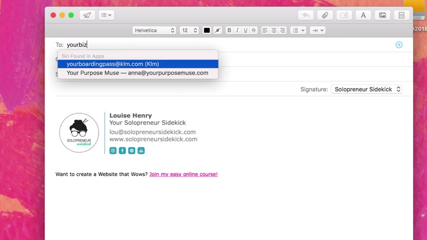
And with email , it's the difference between your Biz at gmail dot com versus your name at your biz dot com .
So , rather than having solo printer sidekick at gmail dot com , I have lou at solo printers sidekick dot com .
So , how on earth ?
Do you do this first ?
You purchase your domain from a website like name cheap dot com or go daddy dot com .
And this is going to cost you about 10 to $15 per year .
And then for your custom email , you can either purchase it as an add on from one of the sites above or you can sign up for G suite by Google , which is just $5 a month .
Number two is to upload a custom facon .
Not everyone will notice this , but I do right away .
So a facon is a small logo at the top of your browser window though the icon is small , it has a big impact on how professional your website appears .
And if you leave it blank , then the icon of whatever you've used to build your website , whether it's squarespace , wordpress or Wix is going to appear , which is just plain confusing .
So you'll either need a small version of your logo or take a part of it like the first letter of your business name or just the graphic part of your logo and turn that into your facon .
Have a look at popular sites like Facebook , which just uses the F or Twitter , which uses the bird as examples .
Number three is to get rid of or seriously limit the amount of ads on your site .
Yikes , flashy ads can both date and clutter your site .
Plus there are better ways of making money online .
Now , if you must keep them be selective about which ones you show and put them in your sidebar .
Not your header .
Number four is to use white space .
Sometimes D I wires feel like they need to fill up every empty space on their website .
Let your site breathe white space or negative space is the easiest way to do this .
So for example , leave enough space in between paragraphs so that your content is easier to read and doesn't look like this .
Number five is to make it mobile responsive .
Many of your website visitors will be looking at your site for the first time on their phone .
Make sure to test your website to ensure that there are no formatting issues .
I use squarespace for my website and all templates come mobile responsive , which is a huge plus .

Number six is to use a professional photo view that old super grainy photo is not working anymore .
So it's time to upgrade and get a pro photo if you can't afford to hire a photographer right now .
Not to worry , grab your iphone , find some good lighting , try facing a window if you can stand in front of a plain white or colored background and ask your BFF to take a few shots for you .
And the final way that you can have your website look more pro is to keep your image tone consistent .
Mismatched image tones is another warning sign of a non-professional website having a black and white photo next to a color popping .
One simply throws the eye off , try placing all of your website images next to one another and see how cohesive they are .
So those are the seven things that I recommend you do in order to make your website look even more professional .

If you are currently building your website , then I would love to work with you .
Come and join my free challenge , get the website you want .
And if you like this video , make sure to hit , subscribe so that you don't miss another one and I'll see you guys soon with another video .
Are you looking for a way to reach a wider audience and get more views on your videos?
Our innovative video to text transcribing service can help you do just that.
We provide accurate transcriptions of your videos along with visual content that will help you attract new viewers and keep them engaged. Plus, our data analytics and ad campaign tools can help you monetize your content and maximize your revenue.
Let's partner up and take your video content to the next level!
Contact us today to learn more.