https://www.youtube.com/watch?v=8G4D9cKZ4Cs
How to Draw 3_4 Face LOOMIS Method _ Cintiq 16
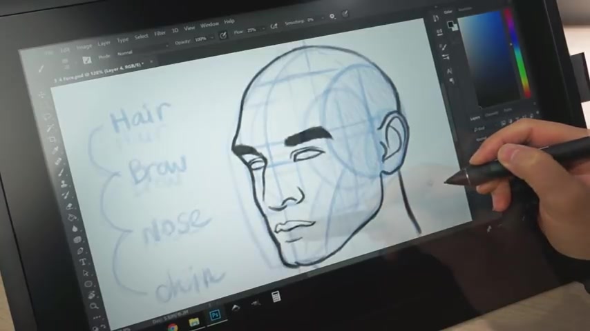
Hey , I'm Darlene .
And you're watching a rapid fire art tutorial in this video .
I'm going to cover the Luis Method for drawing ahead in the three quarter view with a few minor differences .
I'll show you how to change some of the facial features so you can create a variety of unique characters .
And finally , I'll give you a few quick shading tips .
I'm going to use not the Syn Pro 16 this time , but instead the brand new Syn 16 , which is Waco's newly released entry level pen display .
It currently retails for less than half the price of the Pro version .
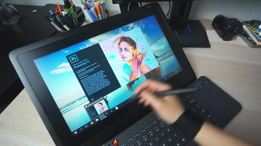
This is my first go at it and I'm just discovering all sorts of neat things if you want to learn more about it , links are in the description and as usual , I'm drawing in Photoshop for my construction lines , I'll use blue paint and for the drawing itself , I'll use black , the Photoshop brush I'm using is called pixel stains .
Anything that I mention will be linked down below .
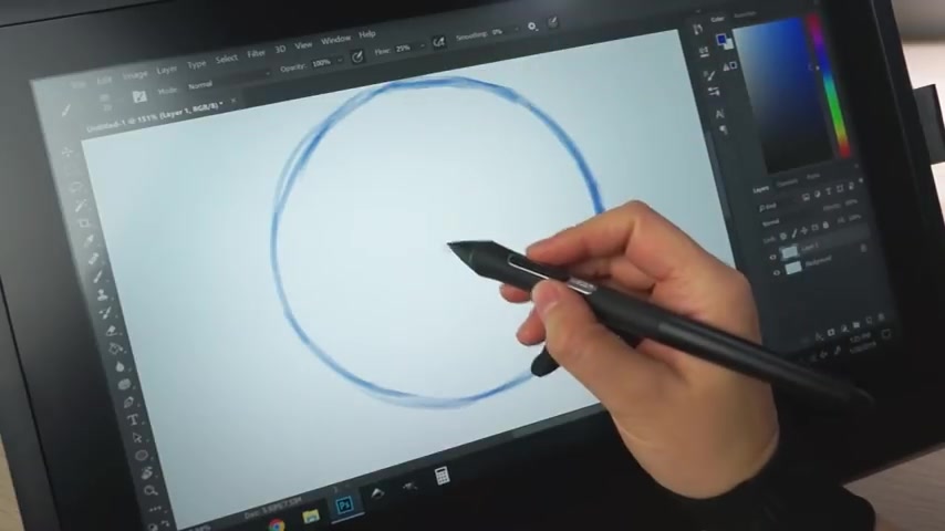
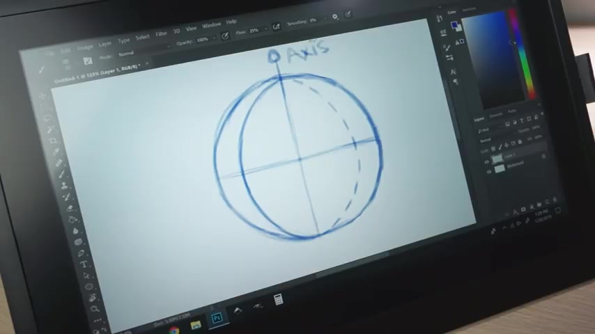
Let's get started , start with a circle .
It doesn't have to look perfect and it certainly does not need to be drawn using a single stroke you can use many tiny strokes to construct it and erase bits to carve it into shape .
Of course , you can also take a shortcut by using the ellipse tool .
Next , draw a vertical and horizontal line going through the very center of the circle to turn the head to the three quarter view .
We'll need to draw an oval that is balanced evenly along the vertical line .
Let's draw the oval about this wide , make sure the top and bottom of your oval touches the edge of the circle or sphere in that it's well balanced along the vertical line .
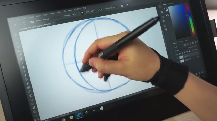
This is the front of the face .
The other side of the sphere is the back of the head .
I'm using a dotted line for that side .
So the oval we just drew is called the middle line which runs down the middle of the face .
This line will help us balance the facial features .
The horizontal line is called the brow line and the vertical one is called the axis on which the head rotates .
Since the side of the human head is quite flat , we'll need to slice the side of our sphere off to cut off .
Just enough .
We'll need to make a few measurements .
Divide the top half of your sphere in thirds .
The top third marks the beginning of our cut , split the bottom half of the sphere in thirds as well .
The bottom tick marks the bottom of our cut , draw an oval within this space and make it about this wide .
This is called the side plane extend the axis .
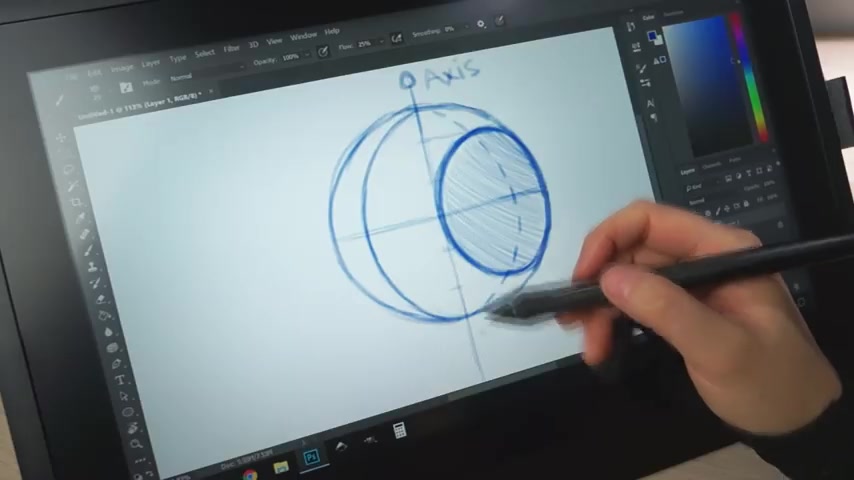
So we can use it as a reference , drop your middle line down off the sphere to form the front of the character's face while making sure it's somewhat parallel to the axis .
Now , we already know that this is the brow line .
We'll need to find the hair nose and chin li next for the average male face , these will be spaced evenly apart .
The top of the side plane marks the hairline , the bottom of your side plane marks the nose line or you can measure this space and bring it down here to get the exact same outcome .
This is helpful when drawing heads in more extreme positions .
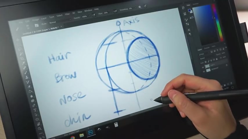
If you take your measurement and bring it down here , you'll get the chin line double check that your spaces are equal and that the lines are all parallel to the brown line .
I've partially erased the bottom of the sphere to reduce distraction , connect this side of your sphere to the chin , creating the far side of the face .
Since the head is turned , we see less of this side and more of this one .
So the chin will appear wider on this side than the other .
That's probably a little too wide .
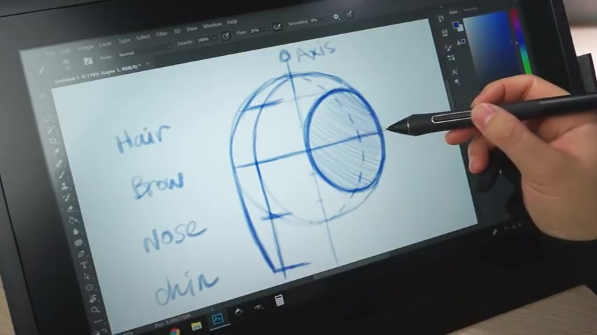
In order to draw the jawline , we need to create the ear line first through the center of your side plane , draw a vertical Earline extend it down a little creating the jar and connect it to the chin .
Next draw an optional curve that goes from the chin to center of the side plane .
This sections off the side of his head , which will help us down the line with drawing facial features and shading .
Mhm .
There are two more feature lines that we need to draw .
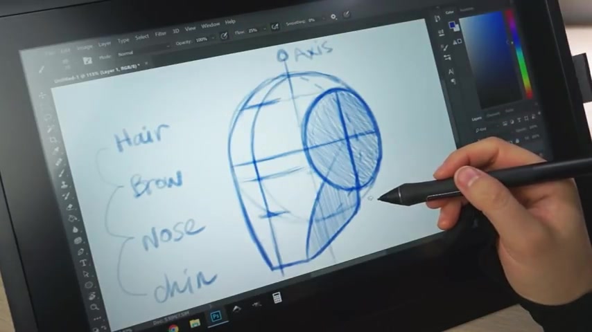
The first is the eye line which is a third of the way down from the brow to nose and then the mouth sits between the nose and chinn .
But it's slightly closer to the nose where the nose line and cranium base intersect , draw the back of his neck , the front of the neck can be drawn directly under his chin .
Before we draw our character , I want to mention three ways you can improve your face drawings .
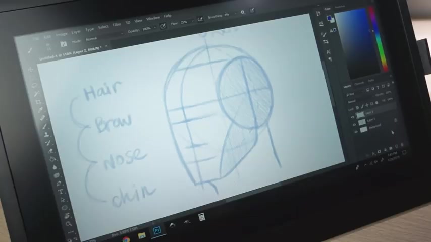
The first one is to learn about the bone structure under the skin and what it looks like from different angles .
This knowledge will help you draw more realistic looking faces .
There are plenty of free apps to use as a study reference .
The second is to learn about the muscles of the face and neck where they are and what they look like when they're tightened and relaxed .
You can find many reference images on Google .
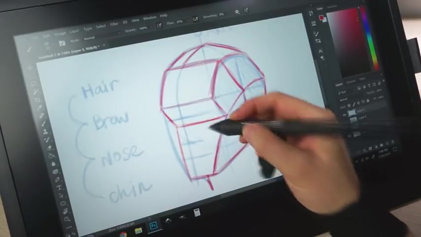
The third is to learn how to break the head and face down into a more simplified blocky structure called the planner head .
Hold on .
Let me pause right here because I actually should have drawn this line at the eye line .
Instead just pretend that I did for the rest of the video .
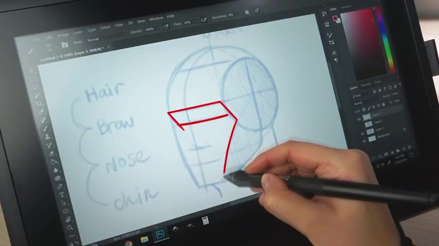
It's not that important until we get to the section on shading and it will be fixed at that point .
So don't worry , let's continue on these planes help us get a feel for the structure in 3D .
And it also helps with shading because we can clearly see which planes are turned away from our imaginary light source .
It's very easy to draw the face .
After this blocky planar version has been drawn because you can already visualize where everything goes .
Now , there are many reference images on Google that you can use to study from and many ways to draw a planner head .
The Lummi one is quite different from what I'm doing here .
A complex facial feature such as the nose can be simplified into this shape .
You don't have to draw these every time you draw faces .
Instead , you can visualize it in your mind .
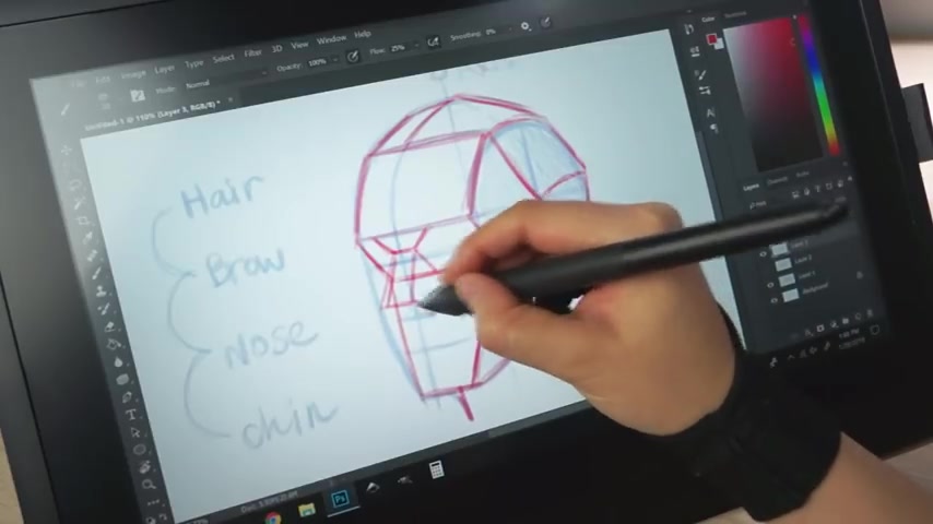
619.919 --> 681.919
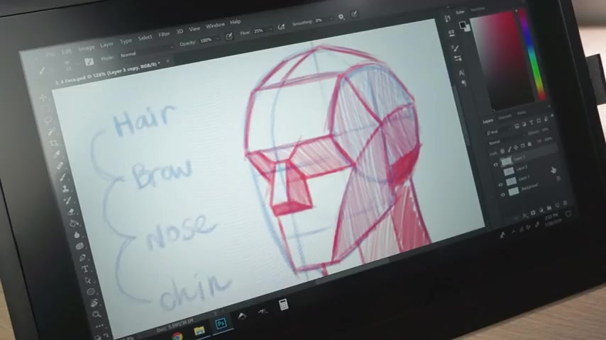
You can angle it down by drawing your trapezoid or the bottom plane more narrow .
We've just brought the tip of the nose down , you can elongate the nose further tilting the bottom plane until it's no longer visible .
Just for fun .
Here's an example of an extremely long nose .
Ok .
I'm gonna go with version two .
Let's start drawing our character over our handy construction lines and planes using black paint .
I'm gonna start drawing his eyebrows along the brow line with the planner head reference .
It's easy to see where the eyebrows fit .
If you want your character to have a strong brow elongate this eyebrow past your construction lines .
We'll come back to that later .
Let's draw the second eyebrow .
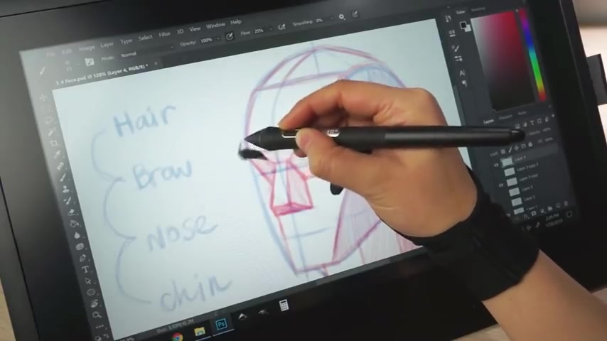
We can draw the forehead and brow by loosely following our construction lines , draw his brow starting at the end of his eyebrow , angle your stroke toward the forehead and shape it .
However you'd like for his nose , follow your planner sketch loosely .
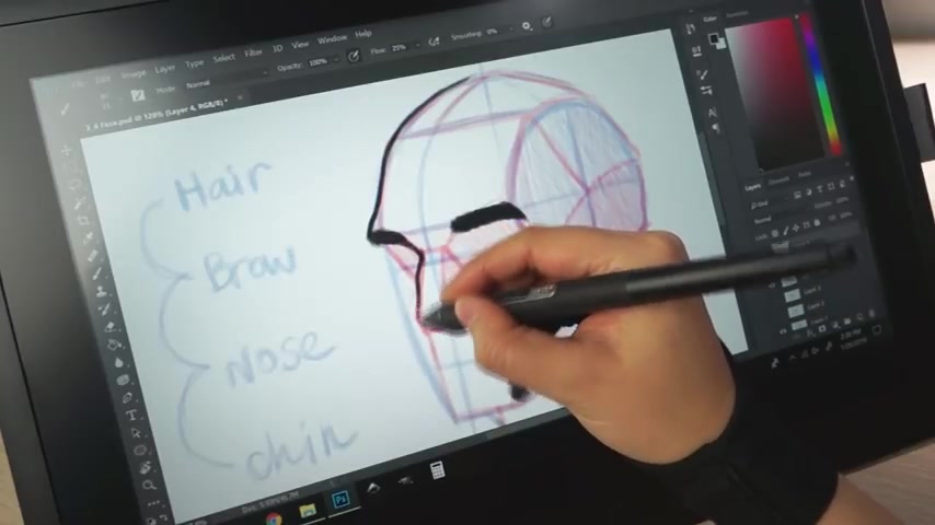
805.58 --> 894.169
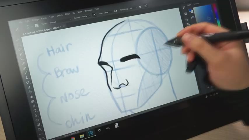
The rest I like to draw after the mouth has been drawn .
So I'll go back to that later .
Let's move on to his eyes to place his eyes , draw a line going from the side of his nose to the eyeline .
That's where the eye will start .
It's hard to do the same thing on the other side because that side of the nose is hidden .
So it will just have to take a bit of a rough estimate from the front view of the face .
The eye is about the same width as the nose .
But since this head is rotated , we will once again need to make a rough estimate on the width of the eye to learn how to draw the eye from odd angles .
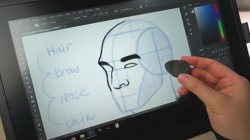
Such as this , use a piece of play doh , flattened and cut in half , wrapped around a ball to use as a drawing reference , rotate it in any way you want to learn what the eye looks like from any angle .
A play dough recipe will be provided in the description .
I want to give him an eyelid crease .
It roughly follows the shape of the eye .
The other eye is about the same size and takes on roughly the same shape .
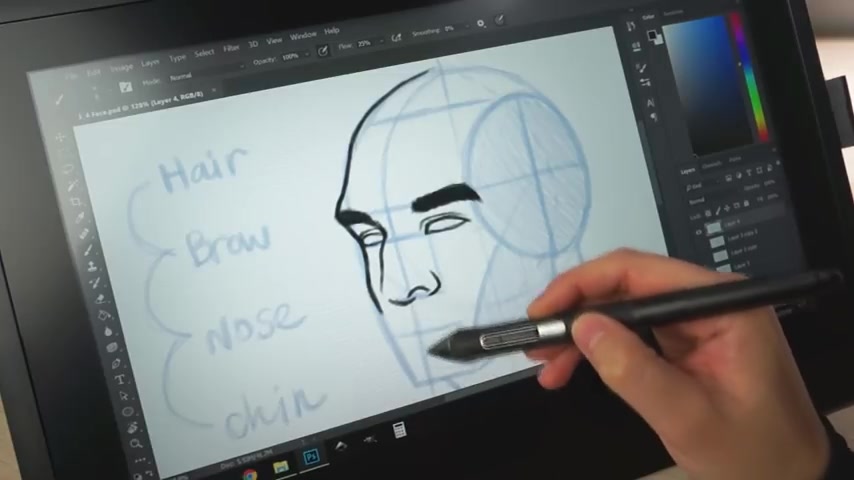
Now , we can draw his mouth along the construction line preserved for the mouth to the left of the middle line , draw a small curve on each side of this .
We're going to draw the corners of his mouth using a small tick to mark the spot .
I like to align this tick anywhere between the end of his nose to the middle of the eye on the far side , try not to go past the nose .
Once you have all three of these in place , just connect the dots using a wavy line of your choice .
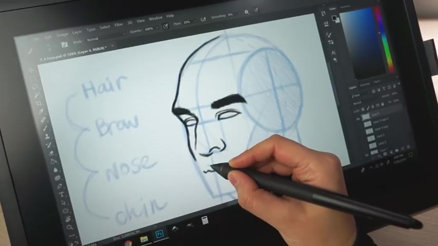
Decide on how big you want the top lip to be and then draw a curve right above the first one you drew , connect it to the corners of the mouth .
Same thing for the bottom lip except I prefer not to draw the full outline .
I think it looks better this way .
Ok , let's finish drawing the side of his face .
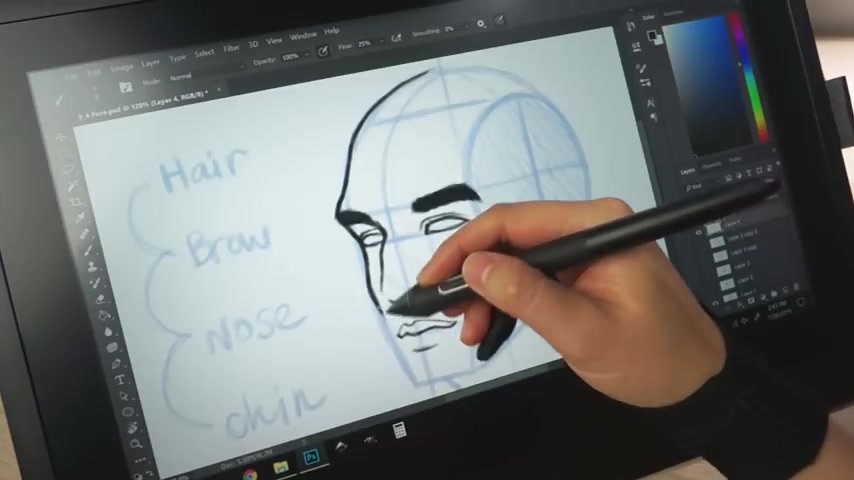
I'm drawing a slight bump around the mouth area because the mouth does stick out from the face a little when you get down to the chin , you can curve it in out or straight down .
I'm drawing a dimpled chin while using the blue construction line as a rough guide .
It doesn't need to be followed to a t before we get to the jawline .
Let's draw the ear first that requires a few construction lines of its own .
So the ear sits in this quadrant here between the brow and nose line .
Instead of drawing it straight up and down , we're gonna slant it back slightly and it takes on sort of an oval shape .
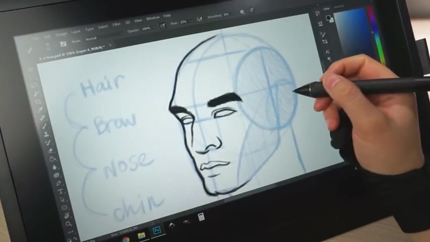
So you can also draw an oval here .
If you want extra guidelines , I'm switching to black paint again , so I can draw the actual ear , start your stroke near the eye line and draw up towards the brow line , continue following your construction lines loosely till you get to the bottom between here and here , draw a bump that extends down up to the right and then to the left , we're going to use this part of the ear shape as a guide to draw a similar shape that runs close to the edge .
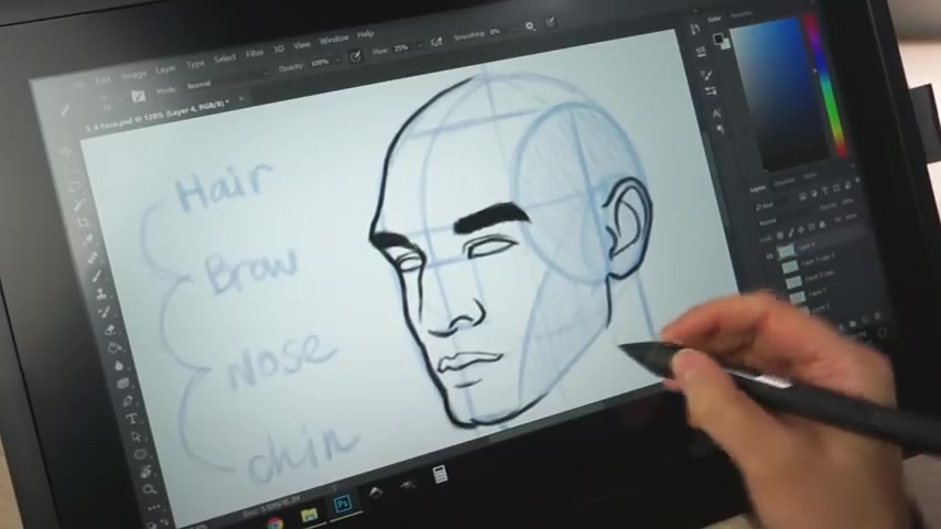
The jawline can be drawn from ear to chin , draw the rest of his head and neck just so his head doesn't look like a ball .
Let's angle this part in slightly .
The last thing to draw is the hairline , which we sort of have guidelines for already .
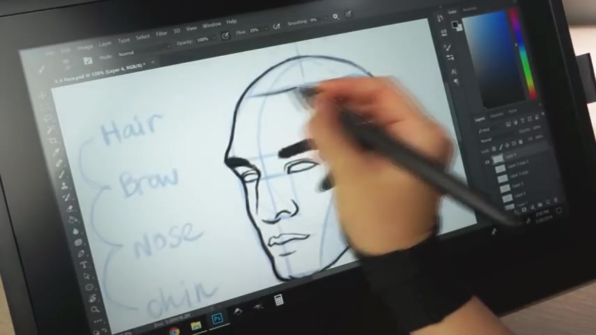
So let's loosely follow that way before you reach the eyebrow angle down toward the ear , then along it to create his sideburn and then finally around the ear , you can leave his hair like this .
So it looks very short or give it more volume .
The further your lines are from the head , the more volume there appears to be now that we've completed his phase , we can have a little fun with it .
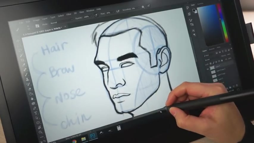
Let's swap different facial features to see how much we can change him .
I really love doing this .
I'm gonna make his cheek higher and draw a straighter line here .
How about a bigger mouth ?
Just move the tick out further and reconnect your lines .
What about a more angular jawline or softer appointee ?
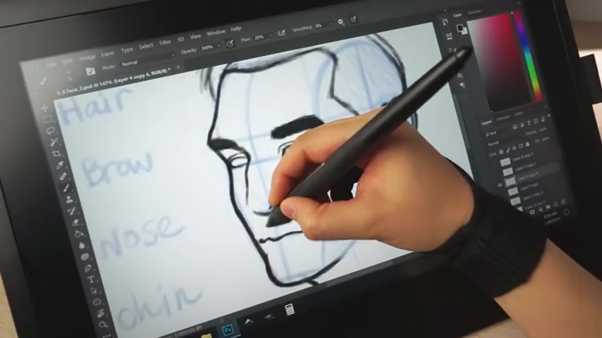
Let me cycle through a few lip shapes , draw his top lip higher if you want it thicker , draw the bottom lip lower for the same outcome .
I'm just experimenting with as many shapes and combinations as I can .
Even if you think it might look weird , just try it anyway , it could look pretty cool .
The modifications are really endless and I haven't even touched the forehead , eyes , eyebrows or ear yet .
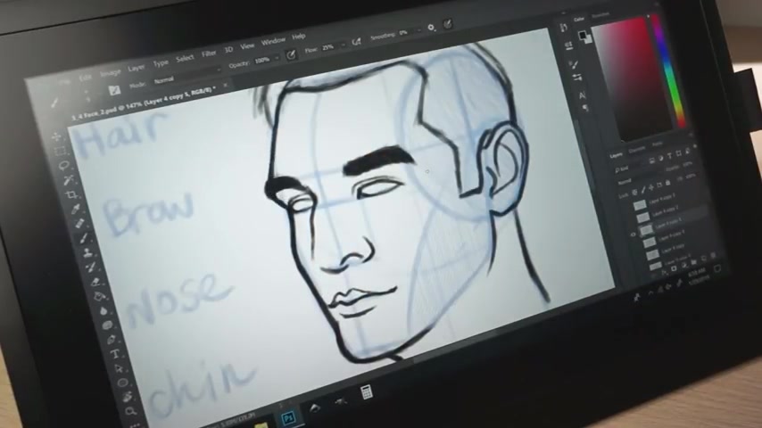
I love drawing faces because of how fun it is to just mix and match creating new characters and personalities by simply changing a few characteristics .
Remember the planner noses from earlier , let's see what they look like drawn on his face .
Not really a fan of this one , but it was pretty fun to draw this one's pretty interesting .
Let's have a look at all three of them in a row .
All right , let's not get too carried away .
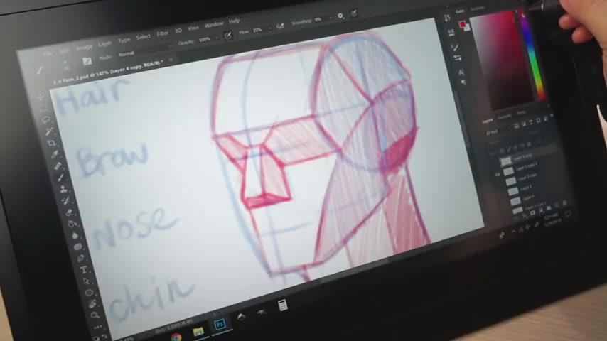
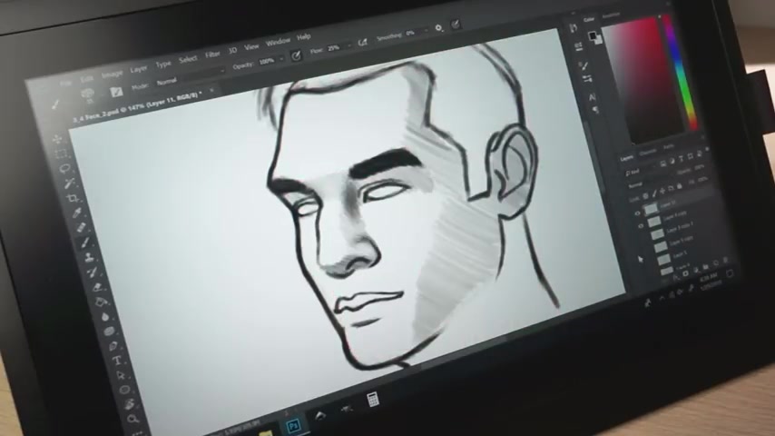
The last thing I want to sort of gloss over and share a few tips on is shading and that's where the planner head comes in again .
As I mentioned earlier , I drew this line too low .
It should be moved up to the eye line .
Ok .
So we have our planar head that is shaded .
All the planes that are facing away from the imaginary light source are darker than the ones that are facing the light .
Basically , the more the planes angle away from the light , the darker they appear because of the lack of light .
These are pretty large planes , you can always break them down further for example , draw an extra plane for the chin or two additional planes for the forehead .
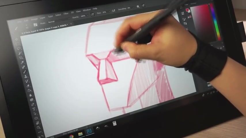
Here's an example of how you can use this to actually go about shading the face .
So once you determine the light source of the scene and shade the planes in , you sort of have a road map that you can refer to .
So you can keep your patterns of light and shadow fairly consistent .
Let's start with the nose .
So I know I want the bottom of the nose to be darker than the side .
Let me just shade them in keeping that in mind .
I'm just shading flatly , not thinking about the bumpy and detailed terrain of the nose just yet .
I always shade in layers .
So my first pass isn't as dark as I plan for it to be in the end because I find it's easier to build up to it instead of having to erase it .
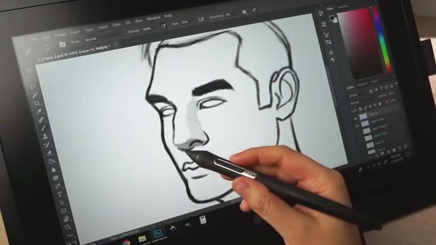
Now , we've only shaded two sides of the nose , but it's already starting to look 3D might as well shade this one too .
Once you have your shadowed areas filled in , you can start considering details like the crease of his nose wing and how the shadows should appear in this specific area .
This is just one approach to the initial shading process .
I think it's great because it helps us think about the big picture instead of focusing on the tiny details right out of the gate , which can be very overwhelming just take it slowly and build up the layers of paint as you go .
That is if you're shading the same way I am , which is pretty much exactly the traditional pencil and paper approach .
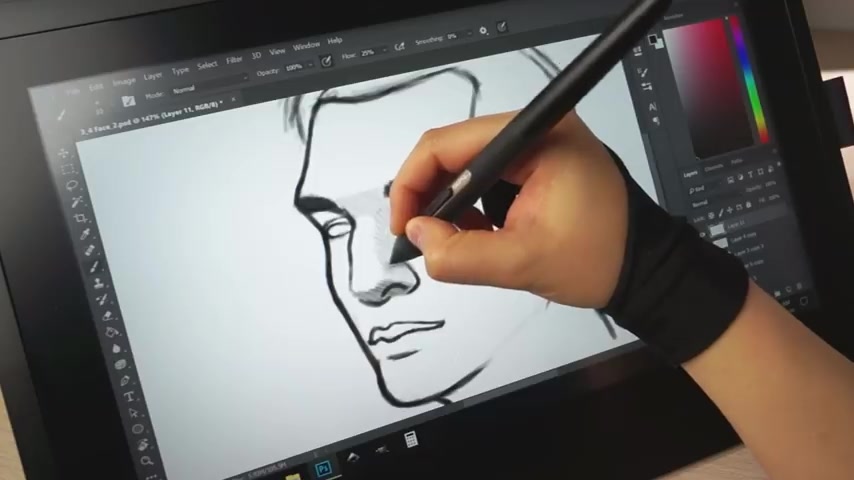
I'm just pressing harder for darker strokes and lifting to feather them out like I would with any pencil , you can use any shading method .
I just prefer this one because my background is in traditional pencil and paper art and the Sinti allows me to comfortably draw the way that I'm used to like I'm working with traditional materials .
Another area to shade could be the shadow where the side of his nose might pinch in right here at the top .
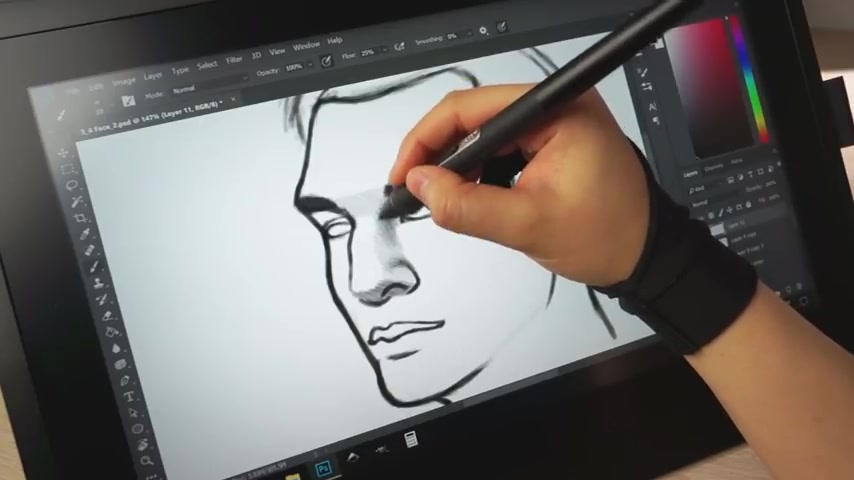
Maybe you'd also like to soften the edges of your shading so that each section or plane blends into the next go along and repeat a similar process for the rest of the face and head .
Again , the planner head acts as a reference to the lighting decisions that you've made and it provides a more broken down simplistic view of the head , making it easy for you to compartmentalize and take on the drawing section by section without getting too overwhelmed .
This can be an actual piece of reference material that you draw out or something you visualize in your head .
It makes shading large areas like the side of the head and cheeks .
A task that is much easier to take on .
I hope you found this tutorial fun and easy to follow .
If you did , please like comment and subscribe to my channel for more tutorials like this and other art related videos .
If you want to see a speed drawing and review of the antique 16 like I did for the pro version .
Let me know down below .
Thanks for watching .
Are you looking for a way to reach a wider audience and get more views on your videos?
Our innovative video to text transcribing service can help you do just that.
We provide accurate transcriptions of your videos along with visual content that will help you attract new viewers and keep them engaged. Plus, our data analytics and ad campaign tools can help you monetize your content and maximize your revenue.
Let's partner up and take your video content to the next level!
Contact us today to learn more.