https://www.youtube.com/watch?v=RzUrAfRFTsA
Sketching Animals - How to Draw a Realistic Cat
hi guys .
And welcome to this week's video .
This video is a little different to what I usually do , but let me know what you think .
Today I'm going to show you two different ways to draw a realistic cap , a less good way and a better way .
Of course , this is all subjective and my own personal opinion on what looks more realistic and convincing .
So if you draw using the process that I use on the left side and you are happy with your results , then you can .
You can completely ignore my advice .
The things that I'll point out today are common mistakes or things that detract from a realistic outcome .
And these things I've seen in my own work and from art from other artists looking to improve their realism .
The subject matter of this video is a cat , but a lot of these tips can be applied to other furry mammals .
I'll also just be showing a basic foundation sketch in this video , and if you like , I can do a follow up video where I show how to complete this drawing and show how to draw fur .
The reference photo that I'm using is in the description box below if you're if you're interested in following along .
But I've sped up some of the footage to make the video a reasonable length , but you can click on the link in the top right now if you'd like to see the real time footage of the sketch , so let's get started .
First off , we'll start with the basic head shape .
So the left hand side I'm drawing a very round and smooth blob .
There's no real definition here , just a slightly squashed circle .
But on the right , I'm going to take my time , pay attention to my reference and look at the overall shape in terms of individual curves and blinds .
Notice how I'm using a light hand to pencil this in .
This will make it easier to correct any mistakes .
Next up , I'm going to draw the ears .
I noticed that a while ago I was drawing cat ears much too far apart and also too small , So that's how I'll draw them here .
It's also common to see ears being drawn in as two basic triangles .
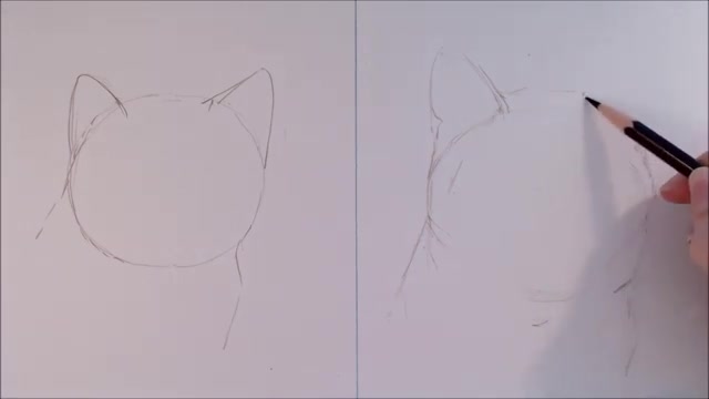
My ears on this cat are going to be larger and closer together .
I can see in my reference photo that the ears are about one ear width apart from each other , so I'll consider that when working out their size .
The ears of this cat are also sort of curvy triangles , and the tips come to a smooth point .
Of course , different cats have different features , so look at your reference photo and see what shape your cat's ears are .
The bottom corner of the ears here come down lower than the top edge of the cat's head , and you can see a kind of triangle fur behind the cat's ears .
There are also some little folds on the outer edges of the ears , so don't forget to mark those in paying attention to how far up on the ears they go .
And I'll also draw a curved line at the base of the ear to suggest the anatomy and where you can see the edges of the first .
I'll also pay close attention to the shape of the ear and the right because it's twisted to the side a little bit .
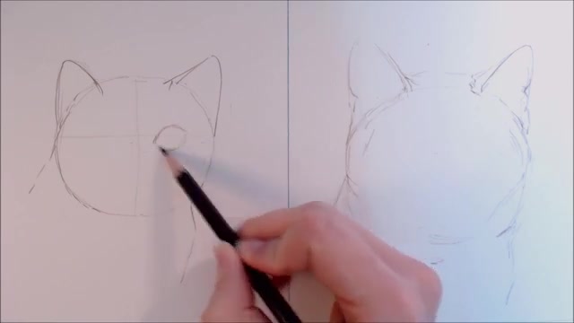
I'm drawing in the eyes next .
There is a lot to consider when drawing eyes and because they really catch your attention .
It's easy to see when they're not quite right .
It's common for us to assume that an eye is just a one size fits all eye shape .
So that's what I'll draw here , a sort of pair of stubby almond shapes .
Another common mistake , I see , is drawing them in too high , too close , together and too large .
So that's what I'll do here .
To some extent , it's normal to draw animal and people features too large when you're starting drawing because it's the details of the face that we look at , um , and perceive to be the most important .
So they have a tendency to fill the page .
Symmetry can be quite a challenge if you don't take your time .
So I often used to draw eyes where one was larger or higher than the other .
But on the other hand , eyes shouldn't be mirror images of each other , either , because that's not true to life here .
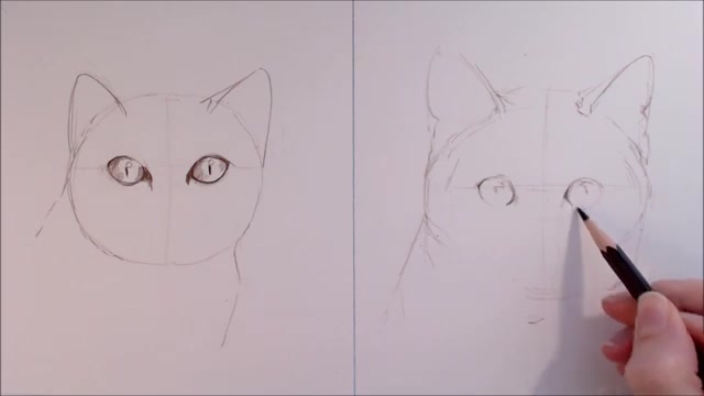
I've drawn in highlights and shadows in the exact same places for both , which is also not accurate .
On this sketch , I'll use a rough guide to check the anatomy of the cat from cheekbone to cheekbone .
This cat's face is five eye widths apart .
I'll draw a quick indication of where the middle is on the cat's face , and then I'll work out where those eyes need to go .
This cat is looking head on at the camera , so that makes it fairly easy to spot .
If anything is asymmetrical .
When a cat is looking head on like this , their eyes are usually halfway between the top of their head and the bottom of their upper lip .
Don't be afraid of the large blank areas that occupy the space between the features .
Those distances are important .
I pay very close attention to the actual shape of the eye .
If you find this difficult , I really recommend tracing over the eye on your reference photo a few times so you can get a feel for it .
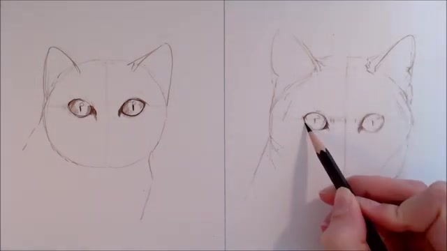
Really pay attention to how thick the line around the inner corners of the eyes are .
A lot of cats have this , and neglecting this feature can skew your anatomy and make the eyeballs too wide .
The actual iris , the coloured bit of the cat's eye , is almost circular , and there are no harsh points or angles .
I also like to indicate shadows and highlights on the eyes putting a hint of these in early can help you check to see if the eyes are the right shape .
The highlights and reflections on eyes are rarely ever circular in natural lighting , so I'm making sure that they are the right shape and follow the curve of the eyeball .
I've also made sure that the dark lines around the cat's eyes aren't the same width and colour all the way around .
I need to be a little bit of variation here .
Next up is the nose and muzzle .
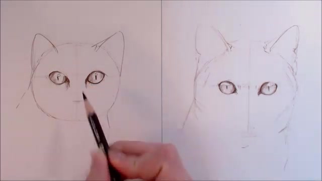
I found that it's easy to overestimate how long the nose needs to be , so I'll draw in the top part of the nose a bit too long here , and I'll heavily outline it as well .
It's something that I see a lot in all sorts of drawings , of animals and people to try and define this future and for the nose itself .
I draw a triangle and I'll heavily outline it , something I see often because it's a sort of exaggeration of that detail that we see in the reference and the nostrils are two black circles .
So on this side I use the reference to check , but the top of the nose is about one eye height below the bottom of the eye .
When drawing caps , I'll often draw in those tear stains to help place the rest of the features , as well as give an indication of markings for a rough sketch .
I think loosely blocking in these give a better sense of dimension on the nose and muzzle instead of just outlining it and the nose .
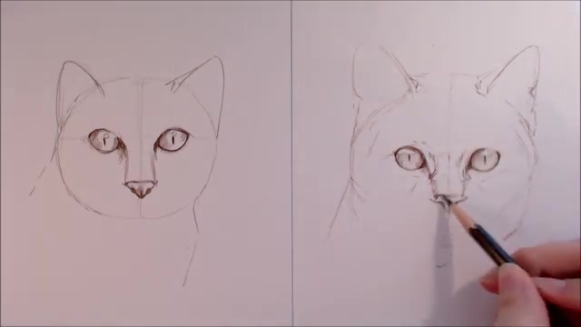
Although it is a rough triangle , the top corners fold down a little bit .
I won't give a hard outline to the entire nose .
Sure , there is more pigmentation at the bottom and the top , but the sides are pale by comparison , and the nostrils are more like little crescents .
It's important to get the lines of the nose to be very slightly curved , as this helps to define the anatomy and give some depth .
So on the left here , As for the round cheek part of the muzzle , I'm drawing these in heavily curved and are also really heavily marked in that mouth , similar to how we drew the eyes in earlier .
This method of drawing comes from drawing what we think we see rather than what's actually in the picture we're using as reference .
We imagine cats to have this cute little sideways three as a mouth , so that's how we might draw it .
As a beginner , I also find myself drawing the fil trim , the line between the lips and nose a little too long .
In reality , it's a bit shorter than I personally perceive it .
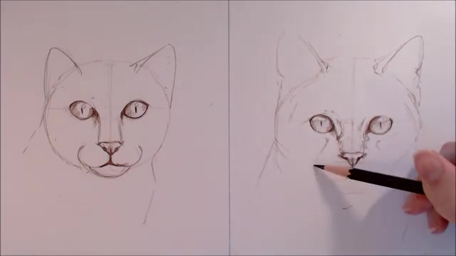
In comparison on the right , I'm only lightly marking in the muzzle .
The edges reach out to about halfway into the eyes , and the overall shape is more softly curved .
I barely draw the mouse in .
I'll only give a slight hint of where the darkest areas are , where the shadows lay and the chin is slightly curved but also slightly flattened towards the base .
It's really important to follow your your reference photo in this area in order to , in order to correctly place the highlights and shadows , because this will give the muscle form and make their mouth look like a convincing part of anatomy rather than just a line that's painted onto the cat's fur .
So now let's tidy up these drawings and add some light shading in and a suggestion of fur .
Like I said in the beginning , I won't go too in depth here because there's a lot to talk about .
So when I'm doing an an initial sketch for an animal portrait , I like to block in where shadows and highlights go , as well as mark in recognisable patterns that the animal might have .
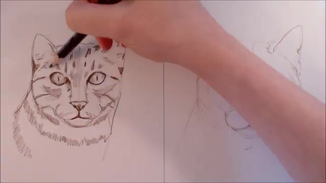
So here I've noticed that this tabby cat has some stripes on his forehead , so I'll go ahead and block these in now .
I won't pay too much attention to the positioning , though , Um , and the same goes for the cheek stripes .
On the right hand side , though , I look at each marking as an individual shape as well as a space of between markings .
So I'll carefully place those eyebrow markings in , and I'll also give a suggestion of fur length and direction .
When I start working the fur later on , this will help to remind me where the fur direction changes .
Keeping the strokes in line with fur direction will also make it easier to cover up the sketch when I'm colouring in notice .
How these markings aren't just straight to consistent lines , though , and they also aren't just vertical .
I consider their angle carefully .
The same goes for the stripes down the the sides of his face and cheeks .
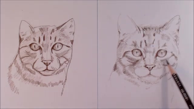
Make sure that these are a little bit curved and that there's a suggestion of F direction , and this will give this simple sketch a little bit of form .
I will also do some light shading where the cat's fur is darker , either because the fur is a different colour or because it's in shadow .
Now .
I'm not trying to draw in every ST strand of fur here , but I'm paying attention to fur direction and length .
I find this particularly important around the muzzle and cheeks , where there are lots of curves in the anatomy .
I find that value is more important than detail when drawing in fur , and the difference in shades helps to give the face form and make it recognisable .
I don't usually draw whiskers in at this early stage of a drawing , but for demonstration purposes I'll do it now anyway .
So I'm drawing those Muggle spots in in no particular pattern , and then I'll quickly pencil in some hard lines to depict the whiskers .
I've drawn them in very heavily and all sort of in the same direction , so they look kind of stiff looking .
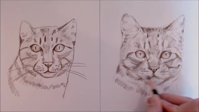
But on the right hand side , the muscle spots are following the contours of the muscle , and they sort of arrange themselves in lines .
The whiskers then sprout from these spots , and they come out curved and slightly tapered .
So I'll look at my reference photo carefully to judge the angle of each whisker , and the ones at the bottom tend to be slightly thinner , shorter and more curved than the ones on the side .
Don't forget the whiskers on the eyebrows and high up the cheeks , so I think that about summarises it .
As I said at the start , Although a cat was drawn here , the ideas that are discussed apply to a lot of different animals .
So , um , that being said , if there's another animal that you'd like me to draw this way , Um , in this style video , don't forget to leave a comment below , and also tell me if you're interested in seeing a video similar to this for drawing fur .
If you found this video interesting and helpful , please leave it a like Follow me on my social media .
If you want to keep up with my work , don't forget to subscribe .
If you're interested in seeing more reviews , tutorials , speed pains and challenges .
Thank you very much for watching , and I'll see you next week .
Are you looking for a way to reach a wider audience and get more views on your videos?
Our innovative video to text transcribing service can help you do just that.
We provide accurate transcriptions of your videos along with visual content that will help you attract new viewers and keep them engaged. Plus, our data analytics and ad campaign tools can help you monetize your content and maximize your revenue.
Let's partner up and take your video content to the next level!
Contact us today to learn more.