https://www.youtube.com/watch?v=S_jW2ymXgcM
How To Create A Blog In Your Wordpress Website
Hi guys , my name is Freddy .
And in this video , I will show you how you can create a blog area into your wordpress website .
Let me show you what we will cover in this tutorial .
I will show you how to implement a blockage and blog posts into your existing wordpress website .
Then we will create our blog post using the Gutenberg editor that comes with wordpress .
We will create paragraphs , headers at images videos and we will use advanced free add ons to get more functionalities into the Gutenberg editor .
We will also talk about styling the blog post so we can get the most out of it .
Then we will talk about how to publish the blog post or how to schedule it .
We will walk over the settings of the blog post , like adding featured images , categories , tags , excerpts , display settings and more .
When we have a few blog posts , we will talk about themes because every theme has their own block settings .
I will use the free extra theme in this tutorial .
Then we will create the block page using the extra theme settings .
And after that , I will show you how to design your block page using the free page builder called Element to wrap it up .
I will show you how to show the latest blog post on your home page .
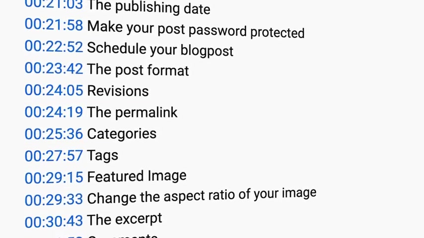
And in the widget area of your footer in the description of this video , I have time stamps .
So if you want to follow a certain part of the tutorial , you can click on the time stamp and you will go directly to the part .
If I go to quick for you , you can slow down the speed of the video like this .
If you like what you see so far and please like this video .
Feel free to subscribe for more upcoming wordpress related videos .
And I would like to say , let's get started .
So what you see over here is my website which has a home page and about page , a services page , a portfolio page and a contact page .
If you want to learn how to create this website , then you can go to 30 corp dot com tutorials how to make a website for free and there you have it .
But what I want to add is a block page with block posts .
How can I do that ?
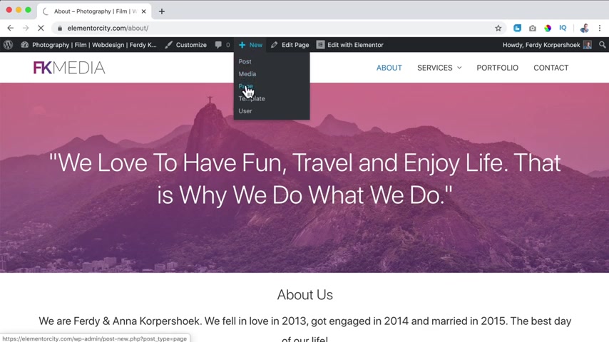
Well , first I hover over new while I'm logged in , I click on page and I call this the blog page or news or whatever you want to call this .
I call this blog .
Then I click on publish and I publish .
Now I go to appearance menus and I want to add the block page to my menu .
I have a menu over here .
I select it and I click on , add to menu .
Now , if I scroll down , I see block over here and I want to put it in front of contact .
So I bring it over here .
I click on save .
And now if I take a look , the block page is in our menu .
What I want to do now , I want to assign the blog posts of this website to the block page .
We need to do that manually .
So I go to the dashboard to settings reading .
And I want to use a static page which is the home page and as a post page , I want to have the block page .
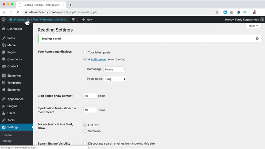
So I click on save changes .
Now , then I go to the website .
And if I click on the block page , you see nothing .
Why do you see nothing because we do not have a blog post yet .
So we need to create a first block post .
Let's do that by hovering over new and clicking on post .
Here .
We need to create a title for the blog post .
And that is really important because you will be found on the title of your blog post .
If I search for seven or the seven best free logins or seven best three plugins for wordpress .
What we see over here , seven best free update plugins for wordpress .
This is the title of this blog post from Darryl Wilson .
And if I scroll down a bit , you see videos , 47 best plugins for fall 2019 , most are free seven best free update plugins for purpose .
There is again .
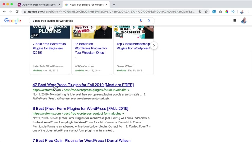
So you see when I search for something like this , people will be found based on the title of their blog post .
So the title of your blog post need to have a few keywords .
In this case , it was free plugins , wordpress seven .
So title is really important .
The title for this blog post is as a man thinks in his heart .
So is he that's a phrase from scripture .
And I like that to be the title of the blog post because it contains the summary of what this blog post is all about .
So if I search for this , you see it's from the Bible , what does it mean here ?
You see it as a man thinks in his heart .
So is he so I could be found over here in a few months or a few weeks depending on how active my website is or how much people read my blog post and like it and share it .
So the title is important .
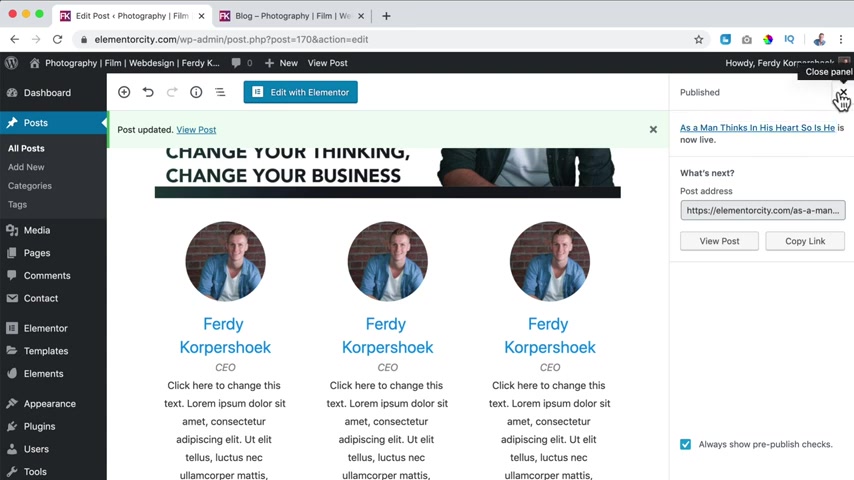
What I can do now over here , I can click on publish and I can click on publish again .
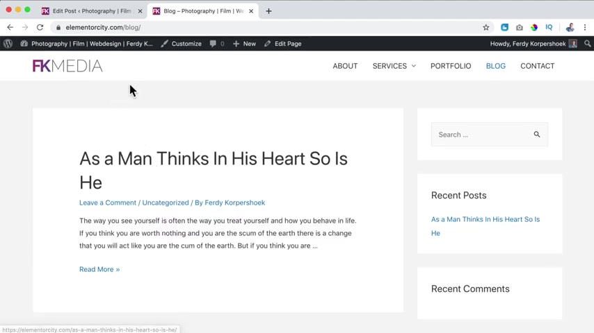
And now my blog post is published .
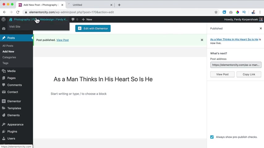
So now if I go to the website , I hold control or comment on the Mac to go to the website and New tap , I go to the block page .
What do you see as a man thinks in his heart ?
So is he , you see the title ?
You see that you can leave a comment .
There's no category and it is by the author Freddy Corpus .
The author is Freddie Corp because over here if I click on edit my profile , I filled in my first name , my last name and here at display name publicity , I said select for Corpus .
So that's how I am seeing .
So there's so much more we can do right now .
We have a title , what I want to do now , I want to create the content for the blog post and it can be text images , a poll , it can be whatever you want .
So what can we do over here ?
I can start typing .
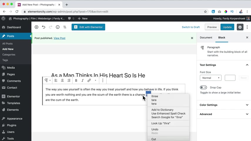
So I have a paragraph over here here , I can change the word and if I want to add a new paragraph , I just hit enter and I can continue to type .
So I have the second paragraph .
And how can I see that because you see a line around it .
So in every paragraph , we can change the style for this paragraph .
I can say I want to bring this to the center or to the right or make it bolt or make it a heading .
So now this whole area is heading .
Well , I want to bring it back to a paragraph but there's so much more .
If I hit enter , I open a new block , it's called the block .
So this is a block , a paragraph block , another paragraph block .
But this time I can do something else .
So if I click on the plus , I see what I use the most paragraphs , headings , images gross .
A list gallery audio cover fell .
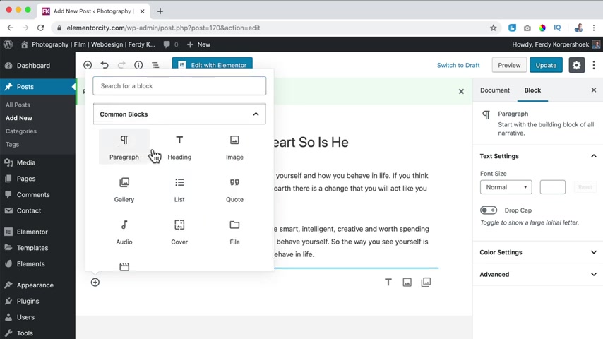
Then we have common blocks , a lot of the same ones , but I can also add a video .
Then we have formatting , add some goat , a table a verse , then we can add columns .
There's so much we can do over here and widgets weekend at an more stuff and bad things .
So if I would click on youtube , I can add a URL .
So I go to youtube and I search for Bio 01 mindset .
There it is right mouse , click , copy the link address .
I go to the new post and I paste it over here and then I click on embed .
So now this is not the paragraph , but this is a video , an embedded video from youtube .
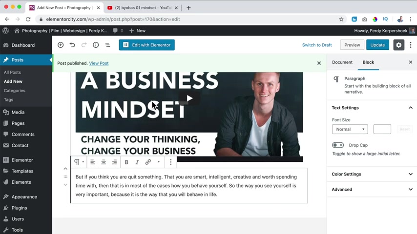
What I can do now over here , I see those handles .
I can bring this down this paragraph and now this paragraph is below the video .
So that's how you can create blog posts .
So over here I can hit , enter , I can start typing the fruit or the roots I hit , enter , this is a new paragraph and I can click over here and I can change it to a heading .
I like to use H two because you can use H one only once and the header is in H one .
So I use H two .
So there's a title and below it , I can add a new text like this .
Ok .
Awesome .
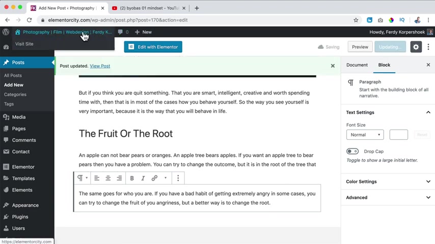
I click on update now .
If I go to the website , I go to the block page and I click over here and this is our blog post , the paragraph , the video , another paragraph , the title and two paragraphs .
Oh , it looks better already .
But I think it's a little bit boring .
So how can we make this better if I want to over here ?
I can click and I can say , you know , the word yourself , I want to emphasize it .
So I make it bold and this word behave in life .
Those three words , I want to make them idyllic in that way you can change things or you select it .
And there are more options over here strike through like that .
If I don't like it and this back to how it was , there can also be a link , select it .
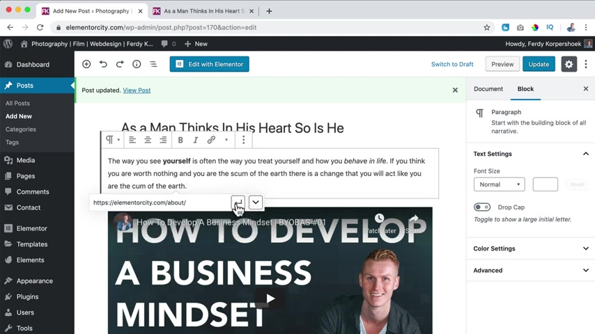
I click over here and then I say HD bs earth dot com or maybe you have a different block post , then you can type the different blog post .
For instance , in my case , the about page I click on it .
Now this word Earth is linking to elemental city dot com forward slash about .
I can also open it in a new tab and then I click here or here and the link is implemented .
Maybe I want to make it bold .
I don't do that .
I just click on update , refresh the page .
Now , if I click on earth , I go in a new tab to the about page .
So that's how it works with linking .
So if I click over here here at the right , I see some options , I can change the font size to medium or change the size over here .
So if I would say 10 , it is really small .
I can click on reset , I I say drop the cap .
So the first letter of this paragraph , it looks like this .
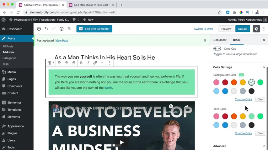
Then there are settings I can change the backgrounds , do something else .
I can change the thick scholar .
So I say white color and a dark background .
I can go to advanced and I can add CS S classes .
I don't use that .
I click an update .
So now we change , look a few based on the settings of this paragraph block .
So if I go to a different kind of block , for instance , the youtube block here are different settings .
So based on the block , you have opened , this is a heading , you can change the settings of the block , you can align it to the right , to the left in the center , you can add HML anchors .
So people can link to this area in your website .
And again , additional C class which we do not use .
So in that way , you can sell your blog post .
What I will do , I will go over here hit enter and I create a new title .
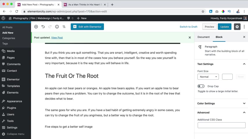
Five steps to get a better self image .
I hit enter .
So there's a new block .
I click on the plus and I go for a list .
So there's a bullet point and I say start reading books about self improvement .
Second one , I hit enter , speak out out who you want to be .
For instance , I am great .
I am awesome .
I can do this over here .
Hit , enter , fill your life with positive people around you .
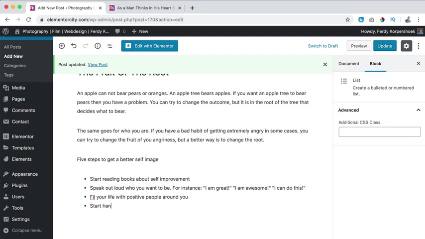
Enter , start hanging out with people that like you and the latest one don't watch too much TV .
OK ?
So over here I click , I changed it to a heading H two .
Perfect .
And what I want to do with this video , I want to bring it all the way down .
So I click over here .
That's all the way down .
I click on update and that's all the way here .
So if I refresh the page , we have stellar paragraph , we have our second one , the title , a few paragraphs and then the list and the video .
Well , what else can we do ?
We can add a few images if I want to get images for free while getting into problems with copyright stuff .
I go to Pixar bay dot com and since the subject is as a man thinks in his heart .
I search for thinking man .
And if I think something , I like this one , for instance , I click on free download , download it another robot click on downloads and then I like to rename this to think or the same text as a man thinks in his heart .
So is he enter over here ?
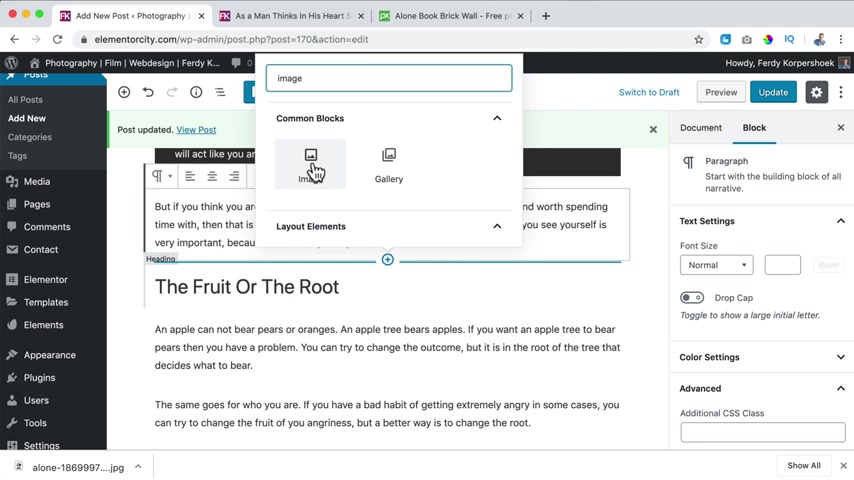
I click on the plus .
Let me see .
Where is it ?
Here's a plus .
And I want to search for an image and I want to add an image upload .
Then I go to the downloads and I click on open .
If you want to know more about images , how to optimize them and all that stuff , you can click over here .
Now we'll go deeper into that subject right now .
I just want to use this .
So what can I do now if I would say align it here at the right ?
And I can make it smaller , not that much happens .
But if I bring this up , look at that now it's interfering with this paragraph .
So in that way , we can sell our website even better and make it smaller .
And then here at the settings of this block , which is an image block , I can say the width , the height , link it to something .
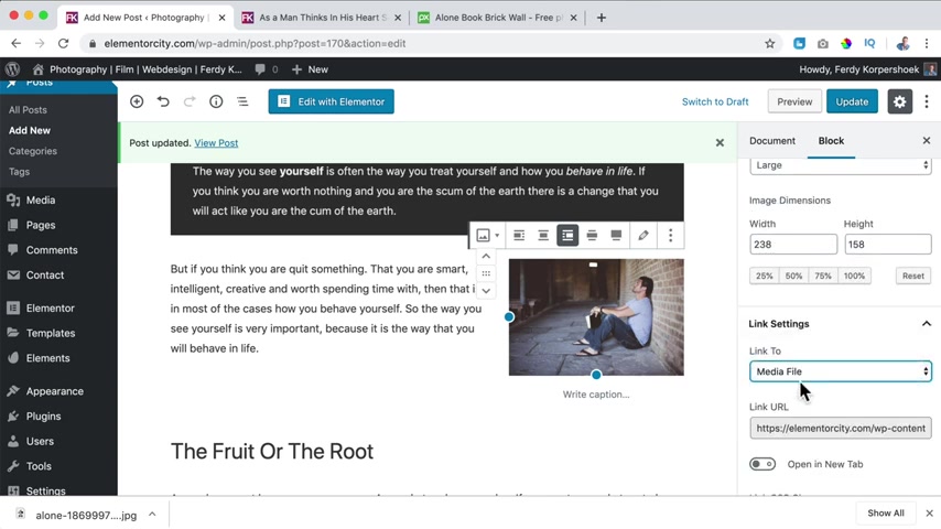
For instance , the media image itself open in a new tab or not .
So there are a few options .
You can have a caption if you want to .
I don't want that right now , I click on update and we can find more images .
For instance , happy people .
I grabbed this one free download , download .
I'm still not a robot download showing finer I renamed this too freedom in your mind .
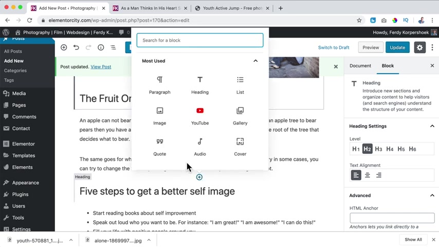
And then here I can click over here on the plus image , upload freedom in your mind .
And maybe I want to align it to the left this time , make it smaller and bring it up like that .
And then here I can have a caption freedom in your mind .
So now if I update it and I refresh the blog post , where are some images which can make our blog post look better .
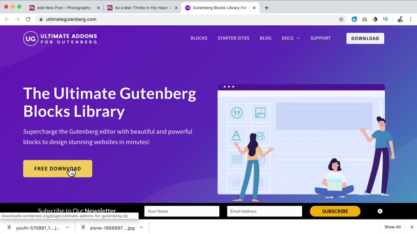
So what we also can do if you go to 30 corp dot com forward slash UAE , then we can use ultimate advances and for elementary data cost money .
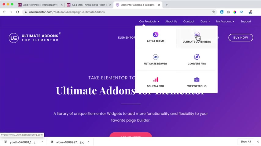
But here at our products for Gutenberg , which is the page builder , we use it is free , we can download this for free .
So I click on free download and now it's added to our computer .
Now I go to my post , I click on update .
Then I go to plugins at new upload plug in and I can drag this over here .
Ultimate Announce for Gutenberg .
I click on install now and now I click on , activate the plug in and close this .
So now it says edit , I go to the website to the block page to the blog post and I click on edit post .
And what we all see now .
So I scroll down and if I click on the plus over here .
Alright , let me see over here .
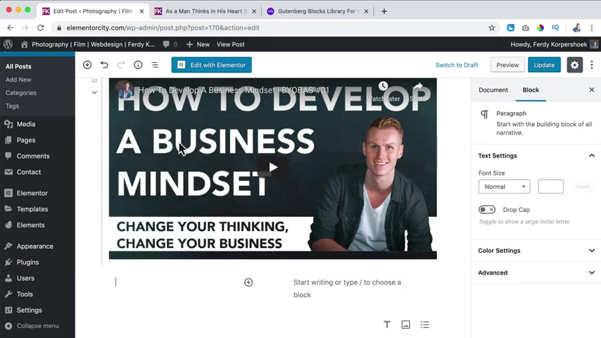
Plus I close this , I scroll down here .
We see ultimate Anno blocks .
It's for free .
But you see there are so much more possibilities right now .
So what I can do , I can go to formal or let me see layout elements and I can say I want to have three columns .
Well , here's the first one I click on the plus and I go to an and I say I want to have a team member .
So you can change the name F Corpus Hook .
I am the one and only CEO and you can have some texts about yourself .
You can link this to your Facebook page .
And then here at the right , we have all those settings so I can have a team member image , select it .
This is who I am select it .
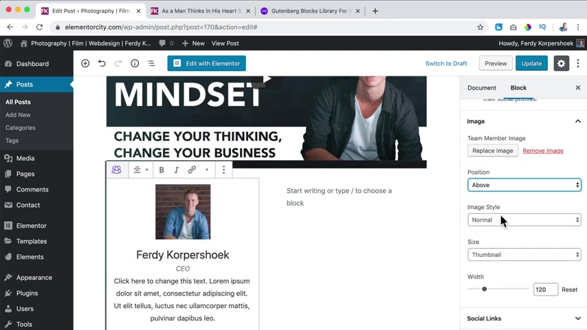
And then it looks like that I can say I want to be above or left from the text or right image style circle .
We can change the width of this image .
And then for all the things social links , we can enable them open them in a new window .
You can add our Twitter icon ulh TV S 30 hook dot com or Facebook .
So Facebook dot com forward slash Freddie Corpus Hook , linkedin .
I can say , you know what I don't want to use it .
So now it's gone .
The color settings , I can change the colors .
There's so much you can do and it's all for free .
How great is that ?
Well , if I like this , let me see , maybe I can duplicate it .
Yes , I can .
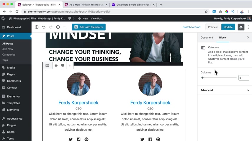
And then I can maybe drag it here .
Yes , like that .
Maybe I can go to the settings of the columns and there I can say I want to have three columns and then I can duplicate it one more time and then I direct this or I drag this one .
It's easier like that update , refresh the page .
So with a free page book called Gutenberg and the free add-ons from , they are called the Gutenberg Ultimate .
We can create something like this for the Corp shook .
So the sky is the limit with Gutenberg and creating blog posts .
But now we only discussed the content of this area .
There is so much more we can cover .
So let's do that .
I close this and over here let me show you one more time .
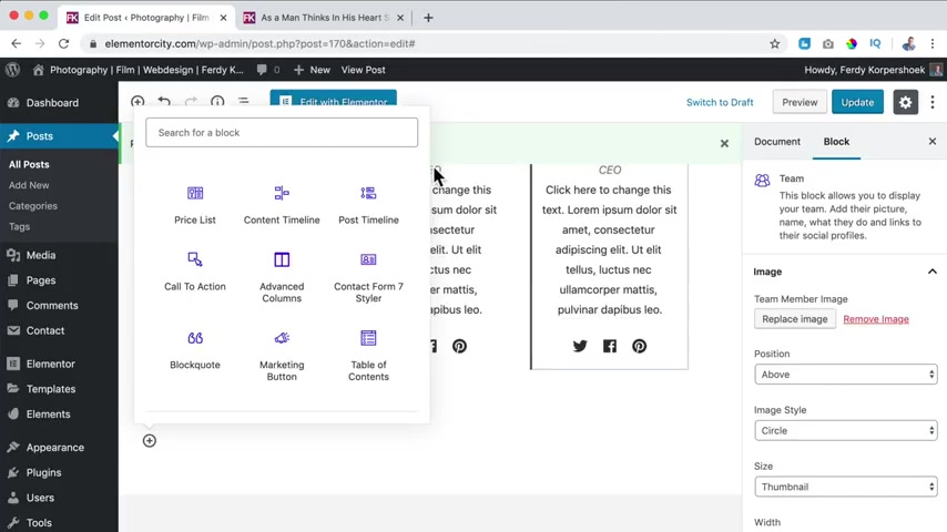
We can add a youtube video , a list , a gallery uh We can have so team members at advance heading both grid sections , both info box testimonials .
And you can also search for free Gutenberg blogs and then you see more of that and you can import it and make beautiful block pages and all that stuff .
But what I want to talk about now is other options within the Gutenberg Builder as I said before , if I click over here , I see here at block the options of this area .
And if I click on image , you see different settings .
If I click on them , you see different settings .
But left from that , you have the document options .
So what it says over here that is that our blog post is visible .
It's public .
If I click over here , I can change it to private .
Yes .
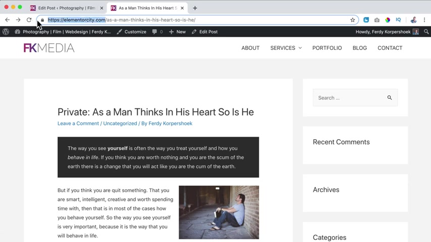
And since I'm logged in , I still can see it .
But if I would go to this page with safari , so I go to the block page .
You do not see it .
Why ?
Because it is not public because we said it should be private .
So I put it back to public .
You can also protect it with a password .
So people need to fill in their password and then they can check it .
So if I would say 1234 and I click on update , I go to safari and I refresh the beach , I can click on it and says it protected .
So I say 1234 enter and now we can view the whole block post .
So that's how it works .
Then what else ?
Right now it says it is published the this date .
If I would bring this back to the first of November 2019 , what did we say ?
Then here at block ?
Well , you don't see that when it is published , but you can see it is published and it's not protected anymore , but you see it's available over here .
So you don't see the date , you can change it in the customized settings .
We'll talk about it later .
But if I would say that this will be published the next month , the first of December 2019 and I click on update , then you don't see the post .
Why ?
Because now it is scheduled to be published in the future .
And that's the great thing about wordpress , you can schedule blog post .
So if you have a really good day , you can create 10 beautiful valuable blog posts and can schedule them for every next Friday .
And then you've done 10 weeks of work of blog posts in one day .
So I bring this back to today and then if you see tomorrow , it says schedule and if it's today , it says publish .
So when you publish it , it is available , when you schedule it , it will be available on the time that you schedule .
I close this .
What else ?
The post format is standard .
If you have a blog post , that's all about a video that you want to show .
You can say video , I just say standard and that's ok .
If it's an important block post , you can also say stick this on top of the block .
So this will also be visible as first block post , even if there's a more recent one update and you can put it to the trash , then there are revisions .
If you click on that , you can take a look at earlier versions and maybe you say I want to restore this revision , but I don't use it .
So I click on return to the editor , then we have the Perma link .
If you go to the settings and Burma links , I don't save it .
You should use Bo's name because then , then it's called elementary city dot com forward slash SMN thinks in his heart and not all this ugly code .
So Bo's name and then if you go to the posts , all posts , I click on our block post here .
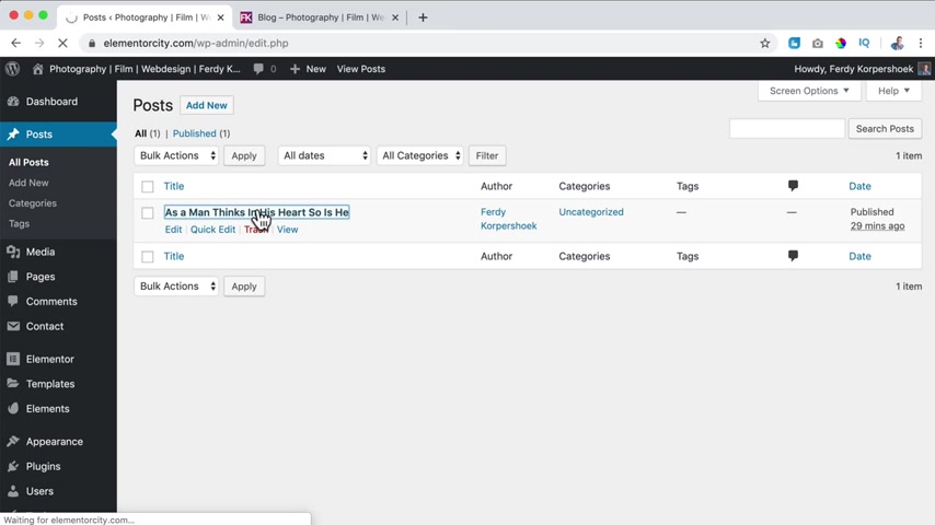
It said the slug is as a man thinks in his heart or the link as a man thinks in the heart .
So is he ?
So if I take a look at the block page and I click over here , it's called a things in his heart .
So is he , I can also say after that 2020 .
And if I update it and I go to the block page and I click over here now we see 2020 .
So you can change the link over here .
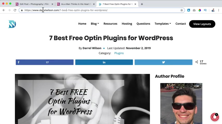
And this link is also important because if I search for seven best free plugins for wordpress and I click over here , then you see over here that's also in the title .
So the domain and then this stuff .
So that's really important that you do it the same way .
So I close the Perma link .
What else categories ?
Especially when you have a big website .
Categories are so important .
If it says UNC you have a website with 100 block post , they're all unc there's no structure in it .
So with categories , you can create a structure .
So what I want to do maybe at Elemental City , I want to talk about web design , about photography , about self improvement .
Well , then those are all categories .
So I can say this one is self improvement and then I click on add a new category .
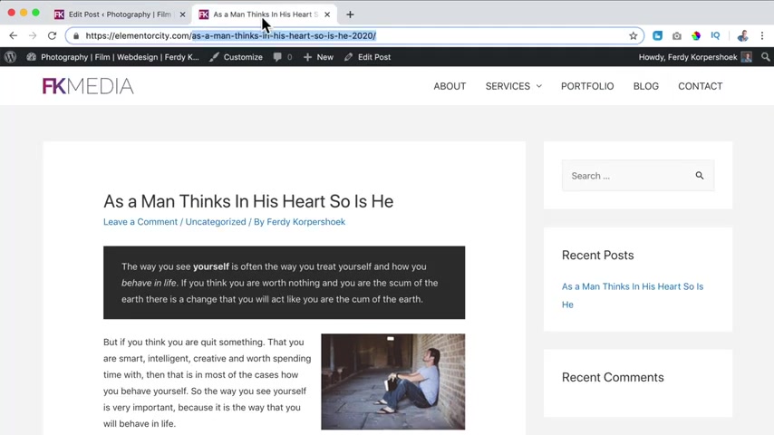
But if you have a really big website , then you also can create subcategories .
So below self improvement , I can also say since this scripture from the Bible , I can say teachings from the Bible , something like that .
I don't know .
And then you can have a parent category which is self improvement .
And now if I add the new category , it look like this , they're both checked .
What does it mean if I update it and I refresh the page over here , you see two categories and what happens if in the future , you will have a lot of new blog posts and they have the category self improvement .
When you click on self improvement , then you see all the blog posts that contains the category , self improvement .
So that's really nice .
And then that way you keep your website structured even though there can be a lot of block posts in it .
So that's with block posts .
If I take a look at 30 Corp dot com , you see , I have categories .
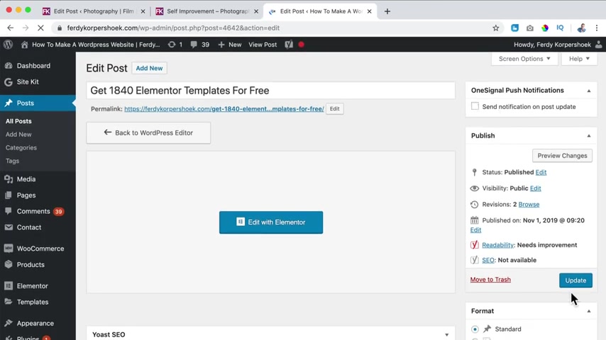
So if I click over here and I scroll down , I see , you see , I have three categories , blog , post , online , business or tutorials .
By the way over here , you see , send a notification on a post update .
So when I check this and I update it and all the people that are signed up for my website .
So if I go to Safari , so if I go to F Corp dot com , it can be that .
They will ask if I want to subscribe to every news item .
And when I do so , then I will be put on this one signal list .
And then the visitor gets a notification over here when I upload a new blog post or I update one and I check this .
So right now , a few 1000 people will receive a message when I upload a new block .
So I have a tutorial about that .
You can watch it over here .
Let's continue now with our tutorial .
So that's categories we have also text and text is actually almost the same principle as categories only with text .
You cannot nest them .
So you cannot have sub text or sub sub text .
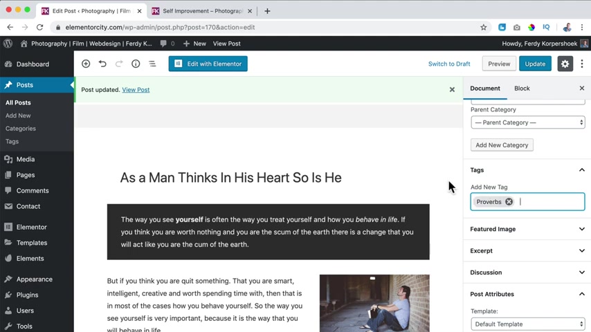
So what I can say over here , I can say Proverbs comma and then you see it becomes a attack .
I can say self improve , comma and freedom .
Now , if I update it and I refresh the page , you probably do not see the text .
If I click on it now , you don't see them .
You see the categories over here , but you do not see the text also , not below or I can go to the customizer .
I use the theme , which is in my opinion , the best free theme to use .
I click on blog archive and there I can show text .
So if I click on publish , I close this then go to the block page .
Now I see the tag over here .
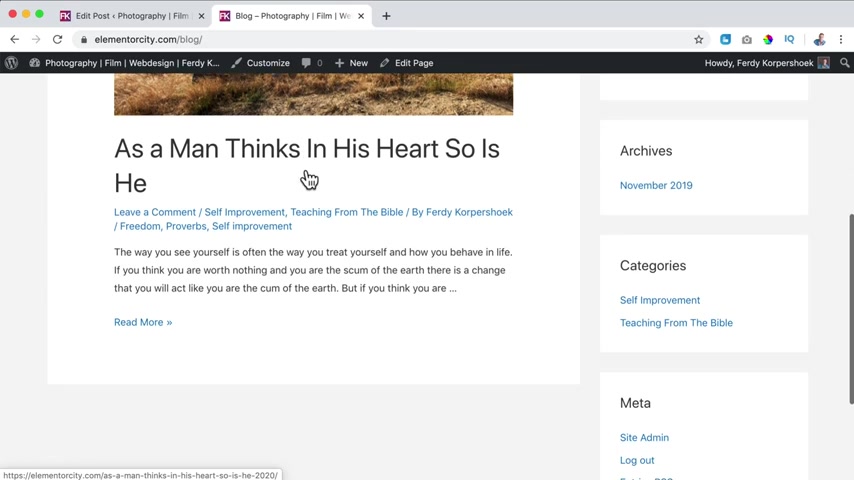
It does not look that appealing , but it makes a point if I click on Proverbs and if I have more blog posts about Proverbs , you see all the block post that contains this tag .
So in that way you can use categories and tag .
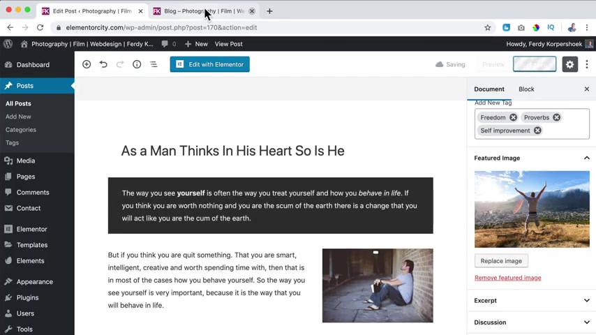
So let's go to the featured image .
If I set a featured image , for instance this one or this one is me in South Africa on honeymoon , I click on update now it becomes more appealing .
So if I go to the block page , I see this image over here .
What I prefer is that all my images of featured image have the same aspect ratio .
That's not the case with this image .
So I can click on it , I can click on edit and then I can say 16 by nine , then I want to make a selection .
I select the area , then I hit this area .
This I can I click on save So now the aspect ratio is 16 by nine .
I click on update .
I close this and now I can close this , remove , selected again .
And now it's 90 20 by 1000 and 80 I selected update .
And now if I refresh it , you'll see it looks like this .
So that's better .
I want to get rid of those texts .
So I go to customize blog AFI DEX .
Publish , close it .
So what else I go to the back end , scroll down and there's an excerpt .
What is an excerpt ?
Well , here at the block post overview , you see a text and then after the word R , you see three dots , that means that this is just the beginning of the blog post .
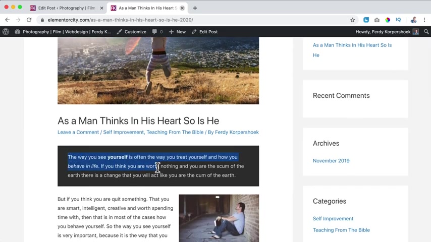
So if I click over here , I see it starts exactly with the same text .
What you can do over here at the excerpt is you can create your own text .
This is an amazing block post .
You should read it and share it update .
Now , if I go to the overview page , the block page , it does not show the beginning of the text , but it shows my excerpt .
This is an amazing blog post , you should read it and share it .
So what I prefer is to use the first line and then people can read more .
So I go to the document options to the excerpt and then paste this text .
If I update it and I go to the block page , you see the first paragraph .
I prefer to use the first paragraph .
I copy it and then use it .
Ok , then there's discussion .
Do you want to allow comments ?
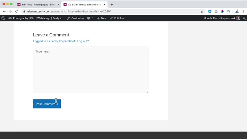
Well , if that is the case and you click on the blog post , you scroll down and there people can leave a comment .
I'm logged in already so I can type here .
But if you're not logged in on my website , then you can fill in your name , email address , website and your text and then I need to approve it .
Then there's the post attributes .
Right now .
We have a side bar here at the right and here at the left , we see the text , the content of the blog post .
I can also say I want to change the template to full and then it looks like this without a sidebar .
I really don't like this or we can even say , and then you do not see a heather or a footer .
Well , I really don't like this .
I don't use it .
So I just say default template .
Then we have the settings , the sidebar .
Do I want to have a sidebar ?
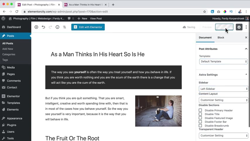
You can say I want to have the sidebar at the left refresh than it is at the left .
I can say I want to have no sidebar .
I can say I want to change the look a few of the block page .
So now it looks like this no sidebar and the content is fully from the left to the right , I bring it back to customizer settings and right sidebar over customizer settings , then I can disable the title over here .
So if I disable it , I can disable the Heather over here .
The featured image , this one , the food or bar and the bread crumb .
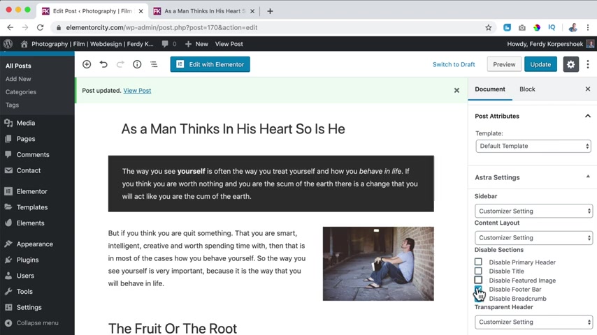
So if I disable everything , it looks like this , no header , no featured image and no food .
So you can decide what you do not want to show .
I want to show everything we can have a transparent header enable it .
But you need to adjust a few settings if you use extra theme to see a nice result .
So right now I don't use it .
I don't like it if I say customize the settings update .
Awesome .
So we have created a block page .
Let me refresh this a block page where we see the latest block post we see over here , our title , our Bread Crump , the content .
We have used the blocks from Gutenberg , but also from Ultimate Gutenberg .
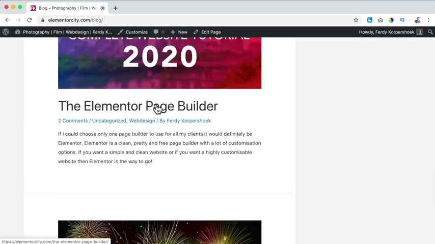
We discussed a few settings over here how to publish it .
So now I will add a few more block post and then I will show you how we can configure the block pages and the block post pages .
So it's a bit later I added a few block post just as I did with this one .
So if I go to the block page , I can close this .
Now , you see recent posts .
There are five blog posts .
If I scroll down , you see an image , there's already a comment , there's the category , the author , there's an excerpt .
So that's how it looks .
And if I click on it , it looked like this .
And below you see the comments those look like and I can reply on them .
So that is great .
So if I take a look at the block page right now , we see our blog post .
I added some others to illustrate something because I want to talk about themes .
If you take a look at this area , it is displayed this way because of the theme settings .
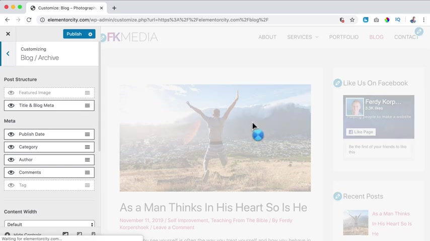
So if I click on customize , then I go to the theme customizer .
And if I go to block , I have block single post settings over here and block archive settings , we'll take a look at this later .
But I just want to illustrate that every theme has their own settings .
So if I turn this off , you see there are no featured images anymore .
So if I close this , OK , and I go to the back end to themes , appearance themes , I can choose 2020 activated .
My website will probably look like a mess right now .
So if I open this , I go to the block page , this is the overview of the 2020 theme .
So you see it's displayed in a totally different way .
So if I would go to the customized settings , then there are no block settings .
So every theme has their own settings .
Let me give you one more example .
I close this and I say Ocean WB for instance , it's not found because I need to click on add new and then I need to search for it .
I install it and I activated , I click on blog again or I refresh the page .
And now it also looks different .
A little bit more like this is displayed a different way you can click on .
Continue reading .
The sidebar is displayed a different way with the titles in this area over here .
So if I click on , continue reading , you see the title over here , you see the bread crumb .
So every theme has their own settings .
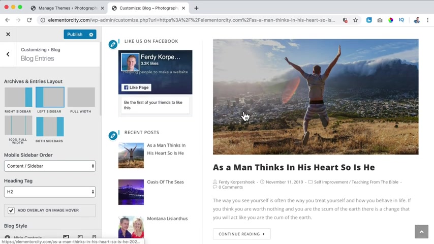
So let's take a look at the customizer of the ocean WB theme .
Then I scroll down and I go to block .
And if I go to the blog entries , I can display where I want to show the sidebar .
So if I say sidebar here at the left , and if I click on the block page , because right now you see the sidebar is here at the left or you can have two sidebars .
So you see every theme has their own display settings .
So I like to use the extra theme .
But then you know that every theme , if you use a different theme , the display settings can be different if your theme has not much settings , but you don't want to switch your theme to a different one .
No problem .
I will also show you in the tutorial how to use element or to create a beautiful block page overview .
So let's go back to the block page in the extra theme .
So if I take a look at the blog post , we can configure this .
So in order to do that , I click on , customize what I want to do .
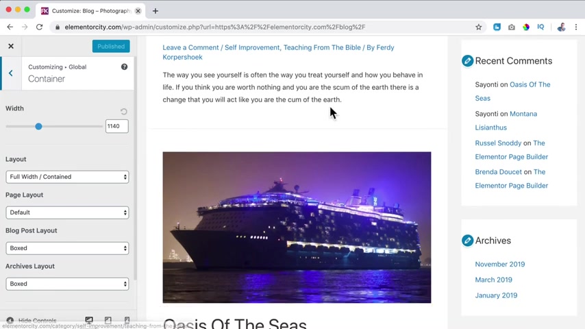
First , I want to go to Global to Container .
Here , we have the block page .
There's an overview of the recent block posts and we can configure this and there's also the individual block posts and there's a difference between them .
There are one full block post will be shown .
So here is the page layout and then there's the block posts layouts , but there's also the archives layout and the block page is an archive page .
So if I change something over here , for instance to content box , it changes .
So what does it say ?
Content box ?
It means that the content , this area is in one big box , this white background over here and the rest of the sidebar is not .
So if you say box , everything is in boxes , also all the widget areas , then we have full width contained .
That means that there is no box , everything is full width , but the content is contained between the width of 11 40 .
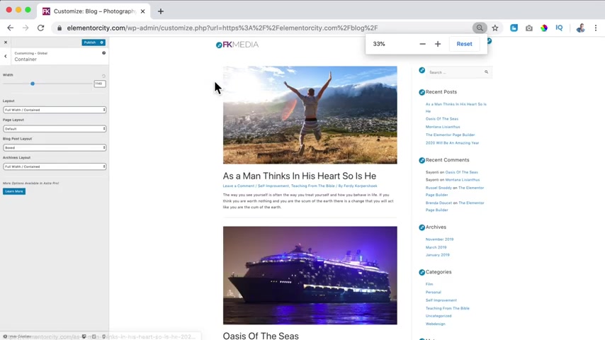
So if I make this site smaller , you see the content goes not more to the left over here and here and not more to the right .
I like that .
What I also can do , I can say I want to be fluid and stretched and that means that the content will adjust to the screen size .
So it will be here totally at the left and here the sidebar totally at the right .
Well , I don't want that .
I prefer boxed .
So everything is in boxes , the sidebars and the background , awesome , the sidebar widgets and this content area .
And the same goes for me for the block post .
So if I go to this particular block post , I also want this to be in boxes .
So also here it says boxes I click on publish and I go back , then I go to the block page again , I go back , then I go to blog over here , then went to blog archive , which is this page and I can decide not to show the featured image .
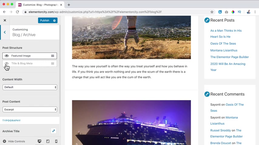
So I check this or I uncheck it and then these featured images will be gone .
Well , I like them .
So I turn them on .
I can also say I don't want to show this .
So I turn this off , I turn it on and I can change the order you all see it change in real time , which I really like I put it back .
So what do I want to show in the metadata ?
This is the metadata .
If I turn this off , you see no comments so I can turn it on .
People can leave the comments .
Then there are the categories , two categories over here and then the author by Fred Corpu .
I can also show the publish date and I can drink it up and I can show the text .
I don't do that and I'll leave a comment here below .
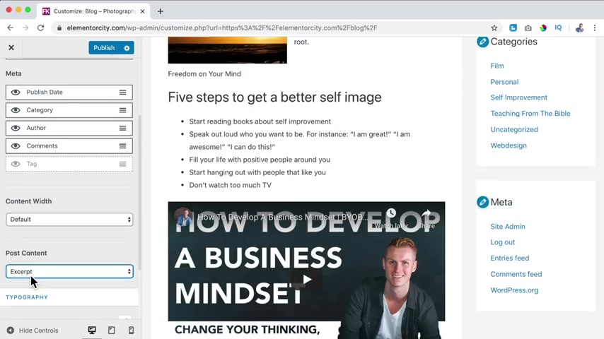
So that's how I like it .
Then over here we have the content with , you can change it , you can make it smaller if you want to .
But I like it as this .
So I say default and then the post content , do we want to show only the excerpt or the whole full content ?
So now you see all the block posts in its entirety .
Well , I like this show .
Excerpt only .
I scroll down , we can change the archive title .
I think it's too big .
So I click on the post title and then make it smaller like that , you know , 35 .
Well , how can you see the archive title ?
I click on publish first .
If I would go to self improvement , I see all the blog post that has the category , self improvement .
It's only one but here you see the title and here we can change the archive title size so I can make it smaller .
I can make it bigger , let's say 50 .
So that's how I can change the argive title .
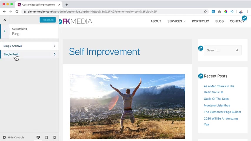
I click on publish and then I go back and I go to the single post .
So I go to this blog post here .
Again , we can change the width , we can make it smaller .
I can show or height the featured image I can show or hide the title Unblock Meta .
And then here , what kind of meta do I want to show ?
Well , again , the same things , the date over here , the comments below and here , I also do not want to show the text .
I want to have the text in the sidebar .
I will show you later how it is done .
Do I want to change the size if I want to ?
I can do that over here .
Publish .
Then I go back and I go back and I go to the side bar .
Well , I can say where on the website , I want to display a sidebar .
The sidebar is this area over here with those widgets .
So a sidebar contains widgets .
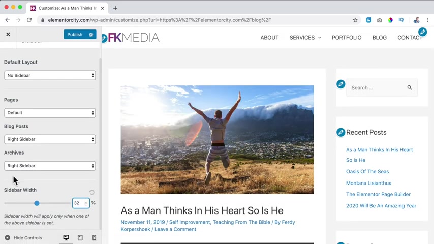
So where they want to show the sidebar , default , no sidebar on all the pages , but on the blog post , right sidebar , a graph pages also right one .
I can also say left one or no sidebar , I can change the width of the sidebar so I can increase it .
So now it's a bit bigger , let's say 27 .
No , that's too small , 32 like that publish .
Then I go back and then I can go to the widgets over here .
There's the main side bar .
But what I prefer is closing this then here at the back end , go to widgets .
So we see the main sidebar here .
This is the cyber that will be shown on every page that has a sidebar in the website .
So if I take a look at the website , the block page , you see search and then a recent post and that's also what you see over here , search recent post .
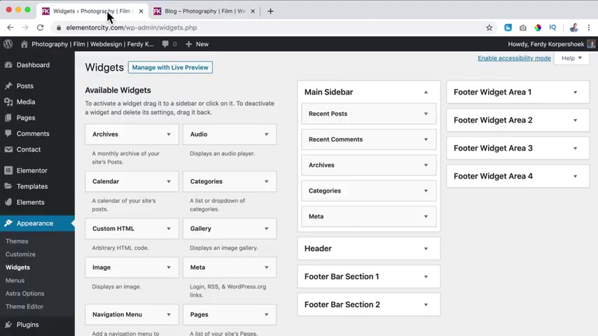
I don't want to have a search area .
So I click over here and I say delete and now if I refresh this , it is not there .
Do I want to have recent comments , archives , categories , meta .
Well , I do not want to have recent comments or archives .
I do want to have categories .
I do not want to have me .
But over here there are more cyber widgets that you can add over here .
So let me see .
I can have a gallery navigation menu .
I can show videos .
Let me see what I want to show here is stack but I cannot find them .
So what can I do now ?
I can go to plug ins at new and I searched for the cloud .
Uh Here something like this .
Maybe I like that .
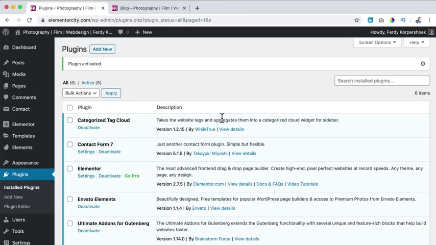
So I click on category stack cloud from well , true in store activate .
So now I have an extra functionality within my website because of this plug in .
So now if I go to appearance widgets here at the left , I should be able to find the tech cloud .
So I click over here .
I want to add this to the main cyber .
It's already checked .
So I click on added the widget .
So now it's over here , I can say tag cloud or tags .
And the taxonomy is I can also say categories , but I prefer show the tack count how many items are stacked with the stack .
Well , I uncheck this , I click unsafe and now if I refresh the page , it looks like this .
Thanks .
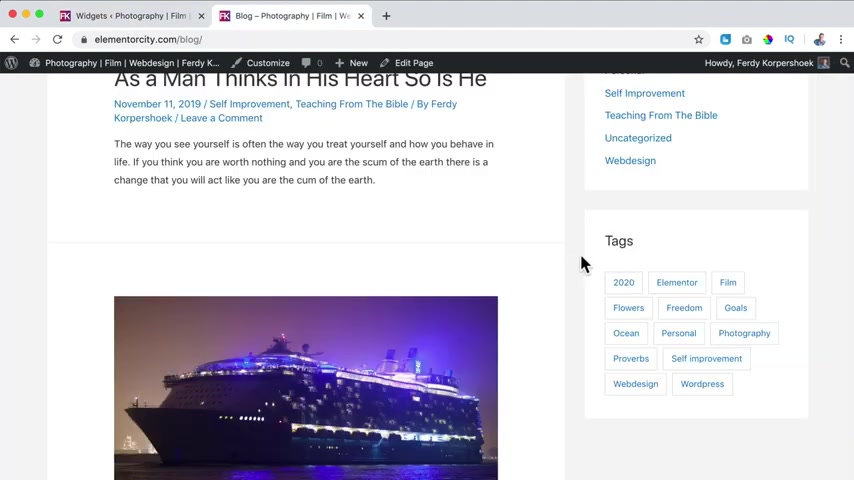
So if I go back and I say I want to show the tax accounts and I refresh the page , there are only and there's only one for everyone .
So if I click on ocean , I see all the blog posts with the ocean .
So in that way , everything is also linking better in the website , which is good for the Google search results .
So use as you see , I use personal goals , flowers freedom element or film , et cetera .
So be creative with it .
I like this .
It's a free and for the website .
So here we see categories and if we go to categories , I can also show the both accounts , save it refresh .
And here are two for personal .
So if I click on personal , the category you see category personal , I see two block posts , the first one and the second one because they are both in the category personal .
So in that way , you can categorize your website and link pages to each other .
What else can we do over here ?
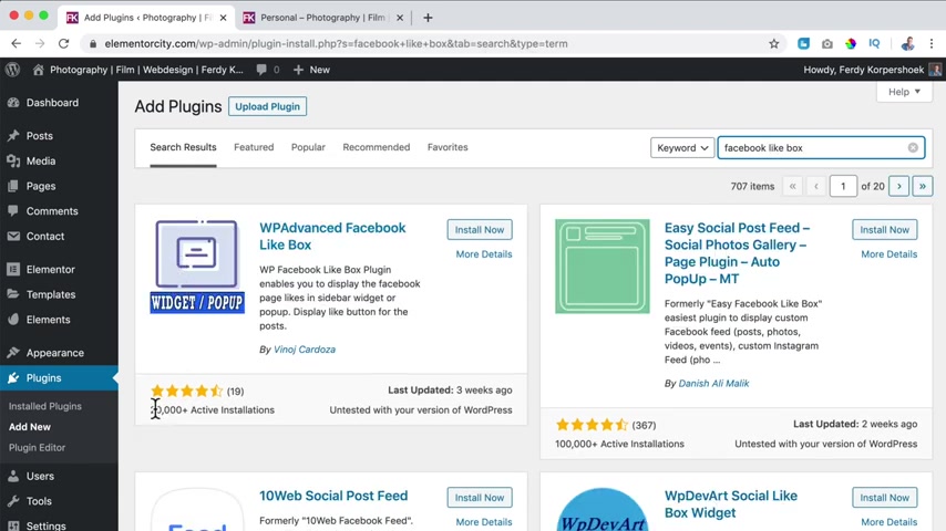
Go back to the plug-in area plug in at new .
I can add a Facebook live box or an Instagram live box or Instagram .
Follow area or show your latest Instagram images .
I search for Facebook like box .
Let me grab this one .
I take a look at a lot of installs , a lot of likes and last updated a short time ago .
I click on install now and activate it .
OK ?
The title is like us on Facebook .
Then I go to my Facebook page over here .
We move this copy the link .
Do I want to have a border color ?
No , the width .
You see the result over here .
So I leave it as this uh show faces if you want to .
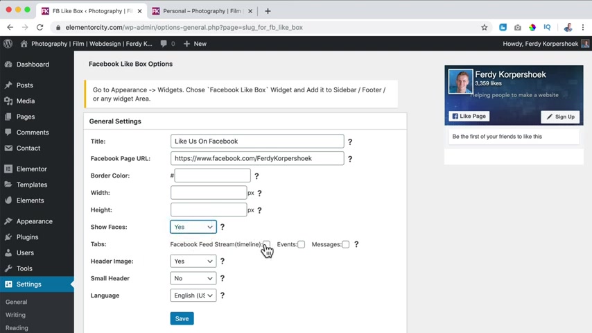
Yes , you want to show my feet .
No header , image , yes , small header .
If I say yes , then smaller I say no .
And the language is English , I click on save .
Now it's saved .
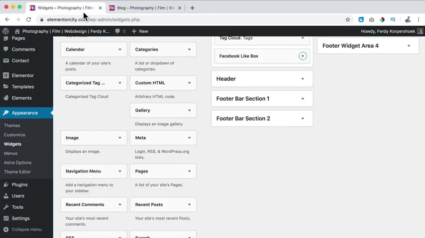
I go to appearance widgets , so appearance widgets and then I scroll down here is the Facebook like box and I bring it to the main sidebar .
I click on add a widget or you can just drag it like this .
Um Now I refresh the page and on every blog page or blog post , you see our Facebook like box .
So that's how it works with plugins .
I have a video about the 10 best plugins for wordpress free plugins .
You can find it over here .
And now if I go to the block page you also see it , it also can change the order .
So I can say I want this to be on top .
If I refresh the page , it looks like that's awesome .
There's also a different way how to create a block page .
So I will show you how it is done .
First , I go to the back end to the settings and then into reading and here we sign the block page as a post page .
I will click on select so it's not linked anymore to the block page .
I click on , save the changes .
So now if I go to the home page and then to the block page , you will see the block title .
That means that from now on , I can create a block archive page using element in order to do that , I want to make use of a few free extra elements from element or that comes from a third party .
So I go to the back end to plug in at new .
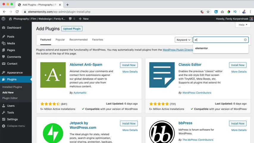
Well , first of all , if you don't have element or you can search over here for element , it's an amazing page builder and then you click on install now and activate , then I click on add new and I search for essential element or elements or essential elements should also be fine , I think .
Awesome .
So I click on essential element or a lot of installations already .
So updated two days ago , I click on activate and since I see something else I saw something about happy elements .
Excuse me , I should go to add new for plugins , then search for it .
And I will add those two .
Those are new .
And I want to see how it looks .
I say no thanks .
No thanks .
And they close it .
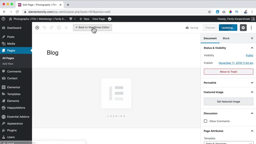
So now I want to go to the website again to the block page .
I click on edit page and I click on edit with element or so we have the basic elements over here .
Then we have the general elements also from elemental itself .
And now we see essential allows so advanced accordion advanced des caldera forms call to action content thicker .
So there's a lot of stuff over here all for free .
Then we have Happy Elements , an info box , a card , an item box , a review justified grid .
That's awesome .
So what I want to do over here , I want to have the most recent blog post so I can search for block .
You see nothing .
So I will search not here at basic because that's from element or I think it's from essential adults .
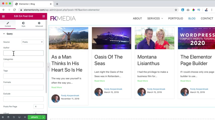
Let me show you or is it E A post timeline can be a possibility or E A post grid .
Let me see .
Let's go for the E A boast grit .
I drag it over here .
And what we see now we see our most recent blog posts and the source is suppose you can also say pages or manual selection .
I click on post or select post , I can say I only want to have them from author 30 .
If you have a multi author website , I can say I only want to have a certain category , self improvement , but I want to show them all or I can say I only want to have something with a certain deck .
So in a format , we can exclude both and pages .
I can exclude as man thinks in his heart and then it will not be shown .
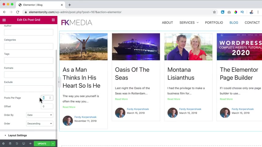
How many posts do I want to show per page ?
Well , how about all of them ?
I say 12 .
If I say offset one , the most recent blog post will not be shown , it will be gone .
That is because if I want to , I can create a new area and only show the most recent blog post in a different way .
I do not do that .
So I click over here again and let me see offset zero .
So the most reason block post will be shown over here , order by date or by post ID or , or random , but I like it to be by date descending .
So the latest one is first , then we have the layout settings , four columns .
I like to say three columns because and they're a bit bigger .
I like that .
I can say a little more .
So yeah , that's what I prefer .
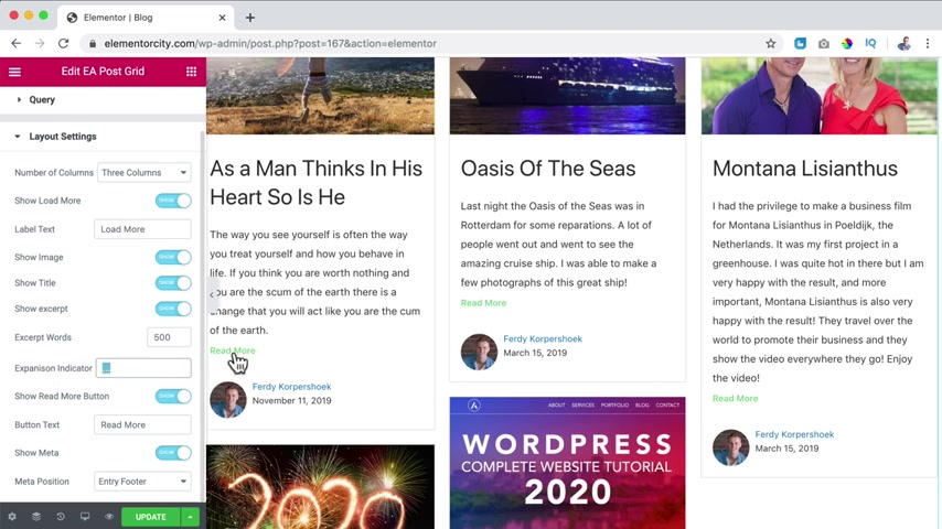
If there are more block posts , I can click over here and more block post will be loaded .
Show the image .
Yes .
If I turn this off , it will not be shown .
Show the title .
Yes , show the excerpt , the text over here .
Yes , excerpt words .
Well , if I turn this off , say nothing .
So if I would say 500 it will show the whole excerpt which I prefer expansion indicator .
If I say there are only 10 words allowed , then you see those three dots over here while I say 500 here I say nothing .
Show the read more button over here .
No people can click over here or on the image show to read more note show the made out information that's OK .
Made a position at the entry or at the footer , entry header , let's say entry footer .
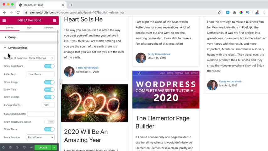
So just the date , the author and the image of the author .
OK , I close this , then I go to the ST we can have a background color .
We can have spacing between all the items .
So if I would say 40 it looks like that , let's say 10 or 20 .
No , then it's fine .
Do I want to have a border ?
Which color like that's I don't want that .
So I say none , we're gonna have a border type , change it to something else .
We can have a radius .
So if I would say 20 it looks a little bit weird .
You see the routing over here but here you don't see it .
So I don't use this , I say zero then we have color and typography .
The color of the link , I can change it to one of my favorite colors .
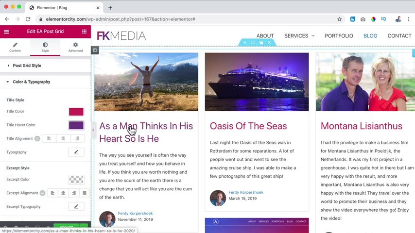
When you hover over it , it changes to a different color .
We can change the title , we can bring it to the center .
We can change the topography except this area , excerpt typography .
We can change the text of the meta data hover car still .
When you hover over it , what should happen ?
There's a fade in with the color .
I like the color to be the purple one .
And I changed the icon to let me see .
Check .
Is there a check ?
There's a check , inserts , you can change it to whatever you want to have , you can change the size , make it bigger a little more button style .
Of course , you want to change the color too .
A purple one .
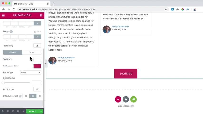
So it maintains the style of our website .
When you hover over it , it should be the darker purple one and then we can update it and what I want to do now , I want to go back .
Let me see .
I want to check it .
Then I go to the about page .
I want to copy this area .
So I click on edit with element or and I want to save this area as a template .
How can I do that ?
Right ?
Mouse , click , save as template and I call this about Heather or Hero .
Save it .
Awesome .
I can also save this whole page .
Then I click over here on the arrow up .
Save a stamp about page Rio because I use a background image with Rio de Janeiro .
Now I open the page in the new tap .
I go to the blog page .
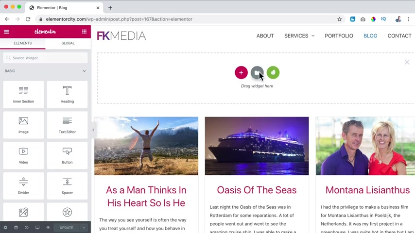
I click on edit with element or and now I can click on the plus over here .
Click on this icon , go to my templates and I want to have the about header or the about page Rio insert .
I am sure .
OK .
Awesome .
I click on it to change the settings .
I go to the , I don't want to use the image but I want to use the background overlay .
Make it fully like that , change the angle to 90 .
And then over here I say blog , of course , I want to be a bit less .
Hi .
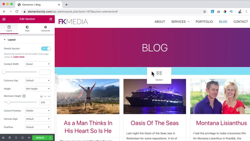
So I go to the layout , I say 200 update , then I can duplicate this area , track this down or if I cannot do that , I can go to the Navigator and drag this section down like this .
Wow .
Isn't it getting better and better with mentor ?
I'm in contact with these guys from Element or they say in my own words that we've just scratched the surface .
There is so much more that is coming .
So that is a really amazing .
Let me call this blog version two two and there's also a pro version of element .
Let me show you what element or pro is capable of with elemental .
You can create an amazing website using free elements with Element or pro .
You can get a ton of extra elements to take your website to the next level .
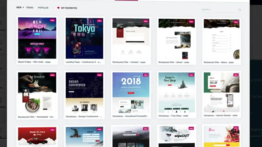
Besides that , you can create custom headers , custom footers , block layouts based on category , import premade templates .
You can even create custom v commerce , product pages and archive pages .
And we think this is all Element pro has to offer .
They come with an amazing pop up builder .
What about creating pages with dynamic content , a role manager , motion effects , mouse effects and 24 7 support the sky is the limit and they keep creating amazing new features .
And the great thing is I have a tutorial about all these features now is the best time to get Element of Pro and create websites like you never have created them before .
So in order to get Element of Pro go to 30 Corp dot com forward slash element that will bring you to element dot com and then you can go to pricing and choose your package .
All the three packages have the same features .
But the first package is for one website .
The second one is for three websites and the third one is for 1000 websites .
When you get Elemental Pro through this affiliate link of mine , you don't pay more and I get a commission .
So thank you for that .
So grab your copy of Elemental Pro today if you want to and let's make the world a better place by creating better websites .
My name is Freddy .
I want to thank you for watching this video .
Have a great day .
Bye bye .
So let's continue with the free version , which is also really amazing .
I click over here and I search for posts .
Now we have the word reason post , I can drag it over here , but it looks a little bit ugly in my opinion .
Then what else post ?
This one is the one we have used over here and there's a different one .
E A post timeline .
So that looks like that we can change it to pages or something else .
Let me go to it really quickly .
How many posts I want to show ?
I want to show them all .
No offset is all fine layout settings .
Show love more .
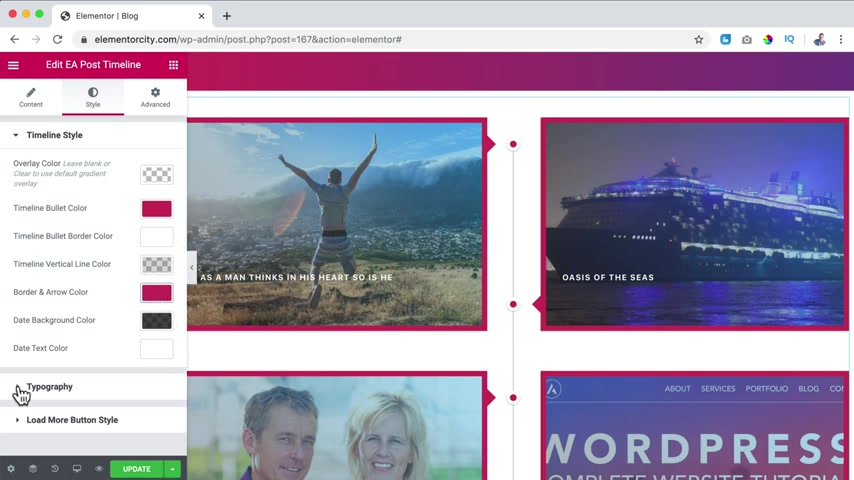
Yes , love more .
Show the image , show the title if you want to , you can do that over here .
Show the excerpt .
No , only the title .
Then I go to the timeline bullet color .
Well , I like it to be purple .
Everything that seems to have a nice color .
I wanted it to be purple and I go to typography .
The title color is OK .
I want to bring it to the center , make it a bit bigger , change the line out .
Turn that way you can config is like this the more so of course change the color update .
So there's also a way to show your block post .
So there are three ways .
So there are , of course , more ways there are other blocks that can show block post a different way .
It's up to you .
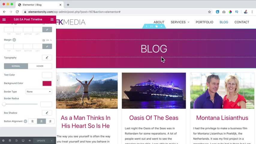
But these are a few free ways to show it like the normal one or the sr one with the right side bar and stuff .
Then we have this one and we have this one and if you go to a certain block post , it will still look the same as it was before with the right sidebar and all that stuff .
So since we talked about it , let's go to the home page , I want to show you a few more things over here .
And now I click on edit with element or , and if you want to , you can click on the plus over here or here below or over here .
I want to duplicate this and then here I want to click on the plus .
So what I want to do , I go over here , I search for both widgets .
What I want to do .
I want to update it .
I want to open it , clicking on the I , then I go to the block page .
I click on edit with element or so over here , right ?
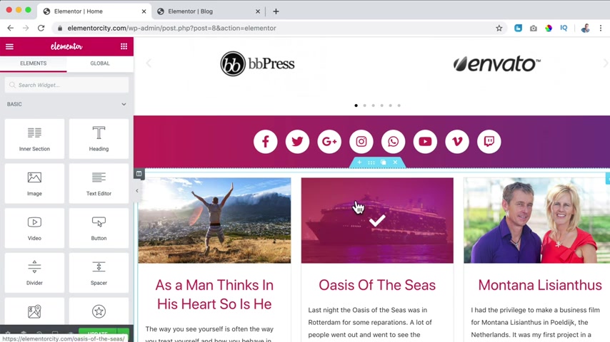
Mouse , click copy over here , right , mouse , click paste .
So that's how easy it is .
You , you copy it from here and you paste it somewhere else in the website and now we can configure it in that way .
We save ourselves a lot of time .
Because we don't have to make this from scratch again .
So what I want to show is the three recent blog posts .
So I want to show three posts by date and that's it .
No load more button .
So let me see .
Layout settings , load more .
No .
What I personally do not like is that this title is too long because now it's in two lines and here's one on one .
So it's not aligned perfectly .
But you know what I'm fine with it .
Then I click on the plus over here and I want to go for a header and I say most recent blog post , bring this to the center .
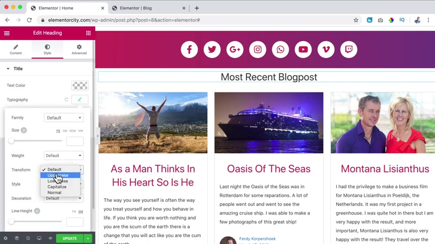
I changed the style to capitals , change the color to this one and give it a bit more space 20 like that .
I can go to the back end to plug ins .
I add a new one and that one is recent boasts with thumb nails and it is from Martin , a lot of installations , a lot of likes .
So this one is great .
I click on install now activate .
So there it is .
Now I go to parents widgets which is area three .
I removed their recent posts .
And then let me see over here recent posts with thumbnails .
I go for food area three at the widget area .
So there are a lot of options .
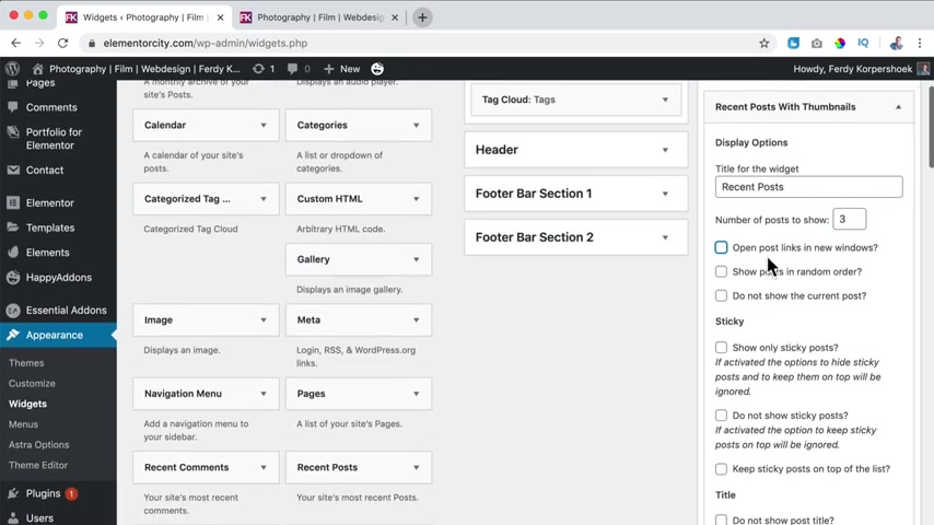
The title can be recent posts .
Number of posts show how about three open links in the window ?
No , showed him in the random order .
No , do not show the current post .
So if you are on a certain block post , that post will not be shown in his widget , which is really nice .
You can take a look at how you want to configure this .
I think it's all perfect .
All categories show a thumbnail .
Of course , if I say this and I refreshed the beach , it looks like this and it's a lot better so we can wrap this up if we go to the block page , this is what we have made .
If I go to the blog post , as a man thinks in his heart and I click on edit post , we have created this post using the Gutenberg editor .
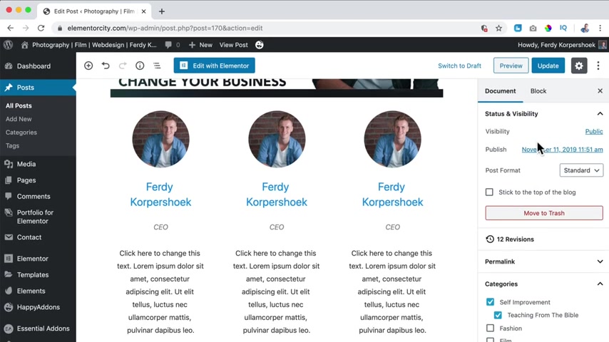
We talked about paragraphs , blocks , images , styling your block post , adding different plugins that will give you more functionalities in your website .
We talked about the settings of all the individual block elements but also the document settings like categories , tags featured image schedule posts , the excerpt comments , the templates and the extra settings over here .
Then we create a block page using the theme , something like this .
And I've shown you how to create a block page using the element of page builder , something like this or something like this .
And then I showed you how to end that late three blog post in your home page .
I want to thank you for watching this video .
I hope you learned a ton of stuff .
Feel free to leave a comment to like this video to subscribe for more upcoming videos and then you'll see me in the next video .
Bye bye .
Are you looking for a way to reach a wider audience and get more views on your videos?
Our innovative video to text transcribing service can help you do just that.
We provide accurate transcriptions of your videos along with visual content that will help you attract new viewers and keep them engaged. Plus, our data analytics and ad campaign tools can help you monetize your content and maximize your revenue.
Let's partner up and take your video content to the next level!
Contact us today to learn more.