https://www.youtube.com/watch?v=VArISvUuyr0
8 IMPORTANT Composition Tips for Better Photos

This video is sponsored by Squarespace .
If you need a website , a domain or an online store , make it with squarespace .
So you're looking to improve your photography , and you're rightfully told that composition is the key to a great photo .
You proceed to read up on compositional rules , and you realise that there's a lot to learn .
The rule of third seems quite simple , but then there's the golden spiral , and you're not entirely sure how to use that .
And then there's a grid that looks a bit like the third grid , but it's slightly different , and people call it the five grid .
It's got something to do with the Fibonacci sequence , but you're not quite sure .
Leading lines seem quite simple .
But then there are arabesques and leading lines that aren't straight .
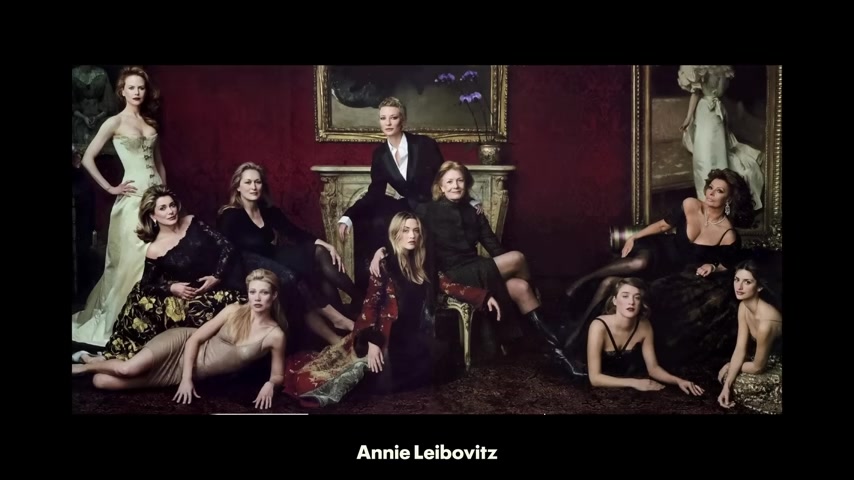
And then there's dynamic symmetry , and you're told about some maths that you don't quite understand , and you're not quite sure how to use the Baroque diagonal and the sinister diagonal and the reciprocal lines , and you're shown in Annie Leibovitz picture that seems to be overlaid with three of these dynamic symmetry grids in a row .
And it all looks very complex and confusing so you decide .
Maybe it's best to look at those photos that inspired you to take up photography in the first place and see how these rules apply to them .
You examine bodies of work taken by a variety of well respected photographers .
You also look at contemporary photographic journals and a wealth of exciting imagery they offer .
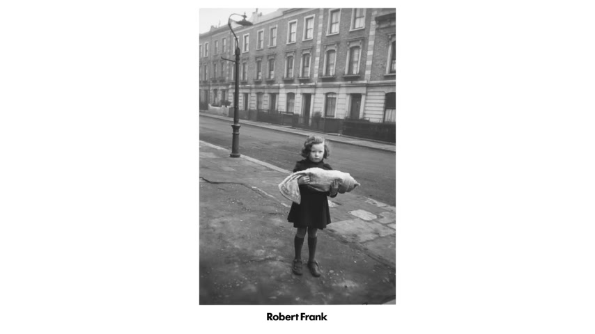
You look at shortlists for prestigious photographic awards , but you rarely find any examples that fit with these rules .
In fact , most of these images almost seem to read like a case study of what not to do .
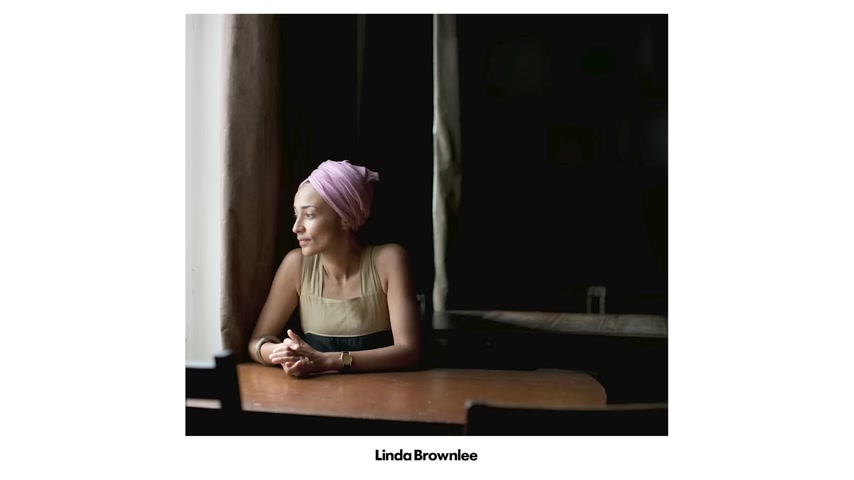
Weren't you told not to centre your subjects ?
Why is there so much empty space above this person ?
Surely this background doesn't help this subject stand out at all .
By this point , you're confused and you're overwhelmed and you really don't know where to start .
Maybe you should just go buy a new lens and see if that helps you take better photos .
The problem is that composition is a massive subject , and learning all the grid systems and ratios is only one tool in your visual toolbox .
I'll probably make other videos focusing on specific elements of composition in the future , but for now , Let me give you eight simple tips that will hopefully get you started on improving your composition .
Number one .
Get your position right .
Every representational photograph has two key factors .
Firstly , the position of your subject or subjects , and secondly , the position of the photographer and by extension , the position of the viewer now changing .
Either one of these can change how your shot feels , what it means , what story it tells now .
This may sound simple and obvious , but a lot of people really do overlook trying the same shot from different positions .
Don't always default to shooting at eye level .
It's how we see the world every day , and there's nothing wrong with that .
But it's not always the most interesting angle .
Once you've composed your shot , stop evaluate everything in your frame .
Is everything exactly where you want it to be ?
Are there any elements or areas that shouldn't be there ?
If not , change it now ?
This may mean just taking a side step to the left or to the right .
It may mean climbing up something to get a higher vantage point .
It may mean crossing the street , be vigilant and rigorous with yourself .
A small bit of effort here can mean the difference between a mediocre shot and an absolute masterpiece .
Remember to shoot portrait aspect ratio as well .
Portrait Aspect ratio draws attention to objects in the foreground and use landscape format for a more natural field as we often use our eyes this way , unless we're looking up at something tall , take multiple shots in a variety of different ways .
Push yourself out of your comfort zone a bit .
It's all about finding that position where all the elements in your shot work together to create the feeling you are aiming for .
Two .
Use your phone .
Most of us have a camera phone these days , and one of the biggest hurdles you have to overcome when learning how to compose and visualise an image is being able to translate what we see moving in 3D without these borders into a still flat , two dimensional image .
Because we have two eyes , we see three dimensionally , and so we have a great greater perception of depth than a photograph can communicate .
Our brains can easily philtre out distracting background elements because we can see them as further away .
But when you flatten that down to a two D image .
Those distracting background elements can become much more prominent and take away from what you want the viewer to look at in your photograph .
Using your phone screen to compose an image can be really helpful when shooting on my Pentax 67 , for example , If I'm using a black and white film , I'll often set my phone to black and white and I'll pinch into the screen to match the field of view that my 105 millimetre lens offers , which is around about a 50 mil equivalent on a full frame camera .
This way I can see the world framed and in two D , I can see how colours translate into tone .
And I can also tap different areas of the screen to see how the image would look if exposed for the highlights or for the shadows .
This isn't cheating .
It's using tools at our disposal to help us get the best shot possible .
Think of this more like an exercise in learning .
The more we practise shooting like this , the more we'll start to naturally translate what we see into a two decomposition .
It's a great learning tool if you want to improve your ability to naturally visualise a photo in your mind's eye number three .
Beware the rule of thirds .
If you look up any tutorials articles , tips on photographic composition , you will likely be met with the rule of thirds right at the top of the list .
Now the rule of thirds is a great little shorthand to start you thinking about composition , but understand , just because you place a subject to one of those intersecting points of the grid , this won't guarantee you a balanced composition .
You must think about your shot as a whole .
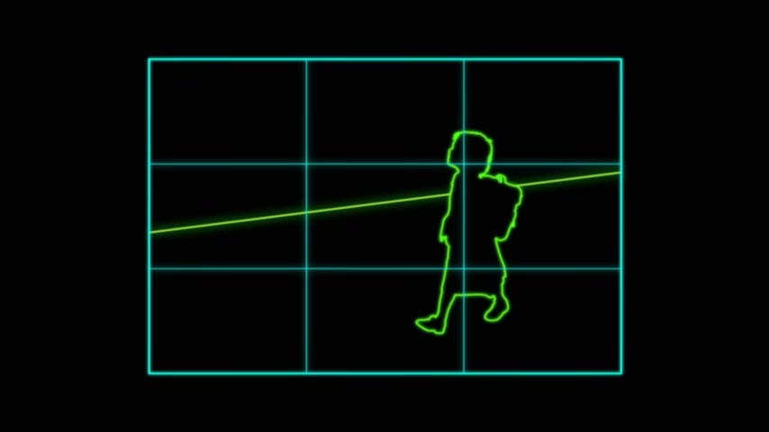
One thing I see a lot when the rule of thirds is used is too much empty space on one side of the image .
It can lead to the image feeling unbalanced .
And there's also more to balancing your shot than where you place elements within the frame .
Tone , colour and contrast also all have weight .
Darkness feels heavier than light .
Saturated colour feels heavier than pale hues .
Areas of extreme contrast draw the eye when composing a shot , as well as lining things up mathematically , look for where the areas of contrast are .
Look for where the darker tones are .
Consider how your image feels as a whole .
Does it feel like it's tipping too much to the left or to the right ?
Consider compositional rules when finding the perfect place to take your shot from .
But don't go against your gut feeling .
If something feels right in a certain place but doesn't immediately make sense to you , then just go for it .
There's probably a reason it works that you're not yet aware of .
Compositional rules are like a scientific formula .
You can use them in art , but first you must know why .
If you want your image to look classical , use a classical compositional technique like dynamic symmetry , but you don't need to use these all the time .
Learn them .
But be mindful about when you use them .
Don't fall back on them just because you know them .
Think firstly about what you were saying before you decide how to say it .
Number four .
A nice simple one .
Whenever you you're setting up a shot , squint or blur your eyes .
This will help you see abstract colour and shape and form .
We're so used as human beings to reading the world around us that sometimes it's very difficult to take that step backwards and look at it in a more abstract way .
But or blurring your eyes will help you see where the Contras the areas are .
They'll help you see where the most saturated and the light areas are , and this can really help guide you in setting up a nicely balanced shot .
Five .
Think conceptually as well as aesthetically .
Why are you shooting what you're shooting ?
What do you want your viewers to think when they see your shot ?
What do you want your audience to feel ?
Everything about the way you compose an image will tell part of a story .
For example , the angle you shoot from can change how a subject is represented .
Being up high looking down can detach the viewer .
Emotionally .
It becomes more of an overview shot .
Very matter of fact , it's a slightly godlike position looking down on the world below .
The viewer is a privileged observer and not part of the scene .
But if you shoot from ground level , then you are part of the scene and by extension , anyone viewing the shot a low shot looking up at a subject can give that subject a sense of dominance and of power cropping in close to someone's face can make a shot feel more intimate and more claustrophobic .
Having a subject surrounded by a lot of space can make them feel more vulnerable and more defined by their environment .
Sometimes moving further away or using a wide lens can add some wider story to your shot .
Decide whether context is important .
Are you making social or political commentary about the subject you're shooting ?
You might want to consider showing something in relation to its surroundings .
But when making your subjects smaller in the frame , be careful as your subject should probably still be the focal point of your image .
You can achieve this by using light contrast , colour , leading lines or any of the other tried and tested techniques to draw the viewer's eye to your subject .
Maybe employing those mathematical compositional rules will make your image feel perfectly balanced .
But what if you don't want it to feel perfectly balanced ?
What if you want your viewer to feel uneasy because of the subject matter of the photograph ?
Always consider what you want your homies to say before you decide how to say it .
Six .
Keep it simple in slight contrast to my previous point about showing wider context .
A really common compositional mistake I see , is people including too much irrelevant detail in the frame .
Everything in the frame should be relevant .
It should be part of the story .
If it's not , get rid of it .
Look for simplified backgrounds for fewer distracting elements .
Try making your subject .
Fill the frame .
The act of composing a shot is in itself a form of editing .
Your audience won't know what they can't see .
Throwing stuff away can be difficult , but it can also be very liberating .
Seven .
Watch the edges .
Pay particular attention to the borders of your frame .
Try not to cut off people's elbows or the top of someone's hair or the top of trees or buildings or whatever it is you're photographing .
Distracting elements of the edge of the frame can draw the viewer's eye away from your point of focus , so try and keep them clean .
Eight .
Work in post .
Don't be afraid to also work in postproduction .
To get that perfect composition , you can crop you can relevel your image .
Of course , it's better to do it in camera , but you have quite a lot of options in postproduction .
Taking time to compose your shot is important , but so is not missing the moment .
The more you crop in post , the better you will become at judging composition in camera , try testing your shot by flipping the image into a mirrored view .
Try inverting the colours .
Try turning it upside down .
Does it still feel balanced ?
And while cropping in post is great ?
Also , don't be afraid to Photoshop out elements that are making your shot unbalanced or creating tension by being too near the edge .
If there's something brightly coloured in the background that's drawing your eye from the subject , change its colour , desaturate it or simply clone it out .
That's why the clone stamp is there .
Steve McCurry does this all the time , and you could argue it's cheating .
And by all means follow your own set of ethics and values .
But be aware that you are making things harder for yourself .
It's up to you .
But the key thing here is practise .
There are so many compositional rules that you can't possibly consciously think about every single one every time you take any photograph , but do take time to learn them .
Do take time to practise them , learn one at a time , go out and try practising that particular one , and eventually you'll kind of absorb them all .
And they will become kind of a natural part of your intuitive visual understanding .
So a massive thank you to everyone who supports me on Patreon .
You guys are the absolute best and also a big thank you to anyone who's bought my lightroom preset packs because those both help fund this channel and keep me making videos .
If you want to have a look at my presets , then I'll put a link down below this video , which will take you to my website .
My website was built on Squarespace , which is the sponsor of this video .
Squarespace is an all in one Web posting platform .
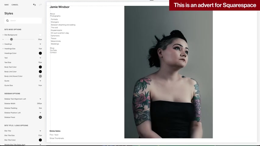
I've been using squarespace for many years , and so do many professional photographers , designers , filmmakers , et cetera .
There's no software or patches to install .
It's all done through your browser so you can easily update your site from wherever you are .
As long as you have an Internet connection , you can easily keep up to date with your analytics , or you can even manage sales through your site .
as they offer a range of eCommerce tools .
The website templates are really nicely designed and are customizable , but you can also paste in your own bespoke CS S code if you want to add some extra functionality like I've done here with this before and after slider to show my lightroom presets .
So if you want to give squarespace a go , they offer a completely free trial .
So you just go to squarespace dot com and you can start building your site and see how easy it is .
And if you like it , you can go to squarespace dot com forward slash Jamie Windsor To get 10% off your first purchase of a domain or a website , I'll see you next time .
Are you looking for a way to reach a wider audience and get more views on your videos?
Our innovative video to text transcribing service can help you do just that.
We provide accurate transcriptions of your videos along with visual content that will help you attract new viewers and keep them engaged. Plus, our data analytics and ad campaign tools can help you monetize your content and maximize your revenue.
Let's partner up and take your video content to the next level!
Contact us today to learn more.