https://www.youtube.com/watch?v=QBuxoWHXtOA
Sketching Animals - How to Draw a Realistic Dog
hi guys , and welcome to another tutorial video .
Today I'll be going over some DOS and don't on how to sketch a realistic looking dog .
I've made one of these videos before on sketching a cat , So if you haven't seen that one , I'll leave a link to that in the cards and description box .
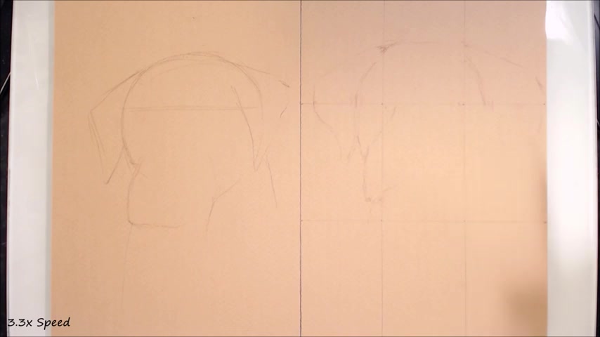
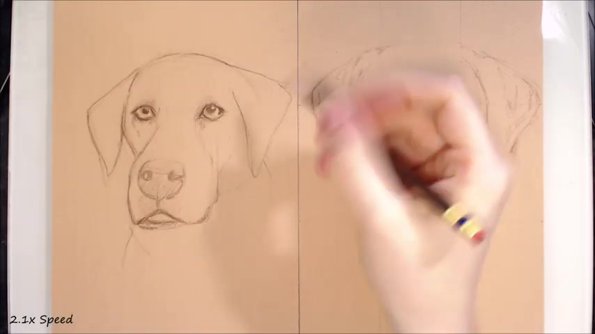
So I'll be drawing the same subject matter twice on the left hand side of the paper .
I'll be demonstrating some common mistakes .
Others and myself have made , uh , when trying to draw realism , which detract from a realistic outcome .
And on the right side of the paper , I'll show how to avoid and overcome these challenges to produce something much more realistic looking .
If you'd like to draw along with me , I'll also be uploading a longer , real time version of the sketch and turning it into a more completed drawing .
So check out that video when it comes out .
And , of course , a link to the reference photo that I am using is in the description box .
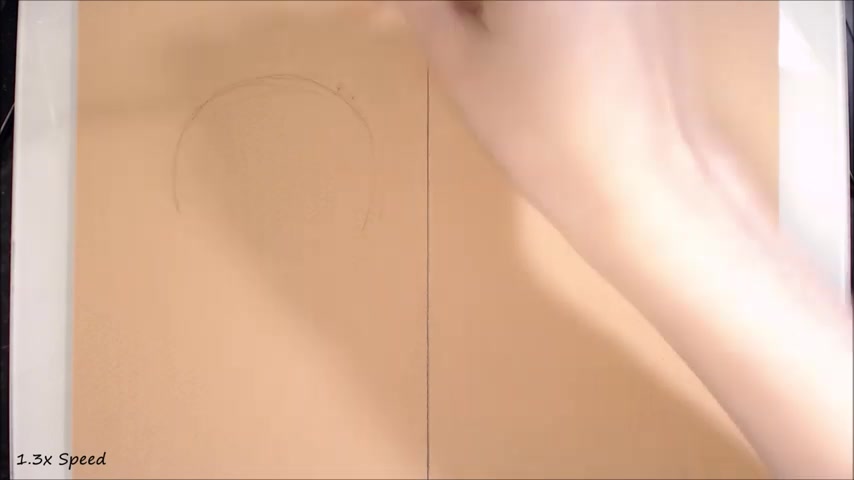
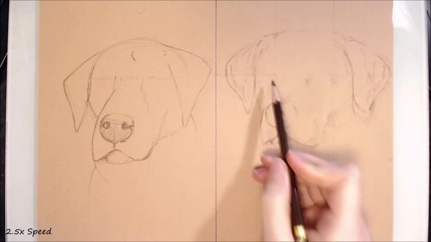
So starting off with the basic outline , I'm beginning with the don't side here .
So rather than judge the anatomy and angles of the dog , I see a lot of people start off with a very simple geometric looking base , for example , a circle or for the main part of the skull , triangles for the ears and a boxy shape for the muzzle .
Now there's nothing wrong with this if you're going for a very simplified , cartoonish look .
But this will not give you realistic or accurate looking results .
And that's true to all the drawing choices I make for this side of the page .
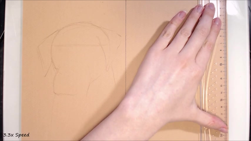
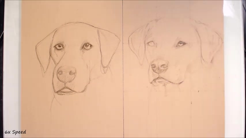
That being said , even if your goal is a more stylized and cartoony result , knowing how to depict realistic looking anatomy is going to be really helpful in making stylistic choices that are replicable and look convincing moving over to the other side of the page on the do side , the first thing I do here is draw out a grid .
This is a simple three by three grade , which I find to be a good balance between time spent on preparing it and the level of support it gives me .
So to get this three by three grid , I simply put my reference photo in a photo editor either on my computer tablet or phone , and I found that if I go to crop the image .
A three by three grid will appear over the photograph .
I make sure to choose an aspect ratio that I can replicate on my paper , and then I take a screenshot when the grid is showing .
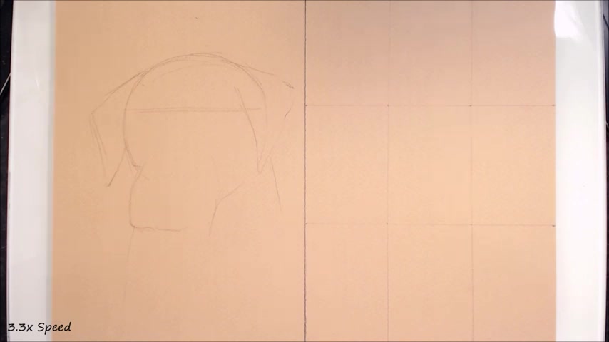
And then I just divide each length of my paper by three and lightly draw out the grid .
If you want a realistic looking drawing , I really recommend using as much support as you find helpful .
Use more squares in your grid if you find that this makes things easier , and I'll also leave a link to a video .
I did a while back on a few different methods you can use to improve your drawing accuracy .
So if you don't like grids , I'm sure there are other methods I've explained there that you'll like instead .
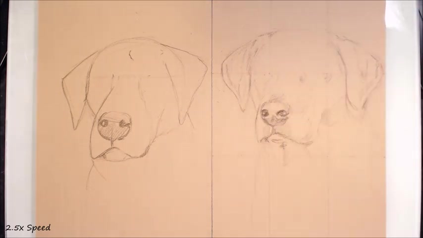
But anyway , as you can see , I'm taking a lot longer sketching out the outline of this dog .
I'm judging the length and angle of each line that I see .
The subtle nuances in shape will really help to create the anatomy of the dog , and I use the grid to find negative shapes in the drawing and to help judge distances I look for where features intersect with the grid lines and map those out first add Additionally , compared to the Don't dog , I'm pencilling in the outline very lightly , so I can more easily adjust and erase .
Some differences to note are that the dog on the right has a much flatter top of the head , and the muzzle is shorter .
So a common mistake that I see is drawing the muzzle in too long , moving back on over to the Don't dog .
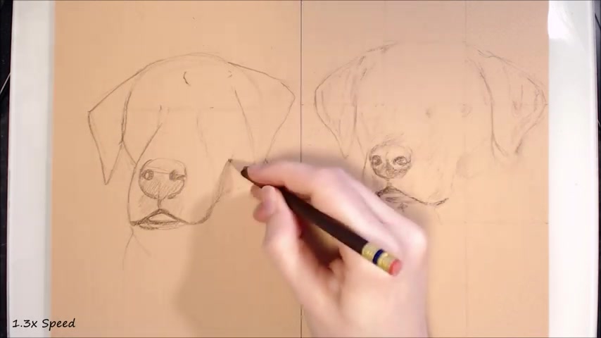
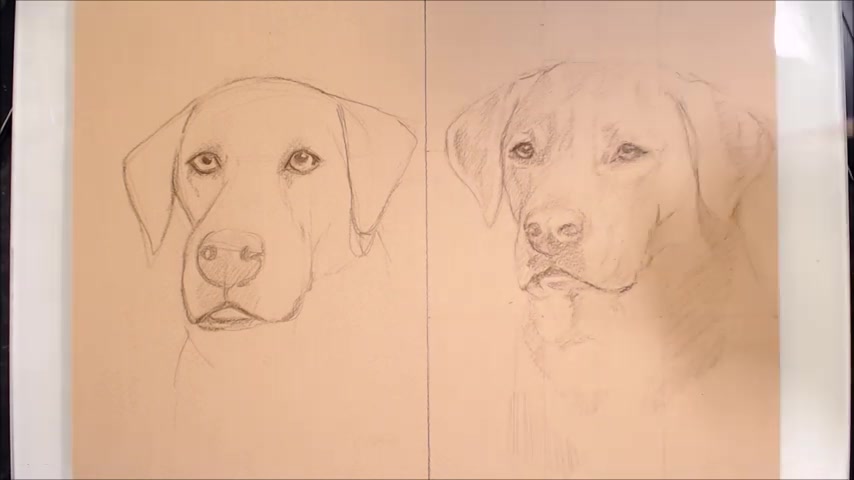
I'm trying to better define the ears here .
I'll use a triangle that I've already drawn as a sort of skeleton for my final lines .
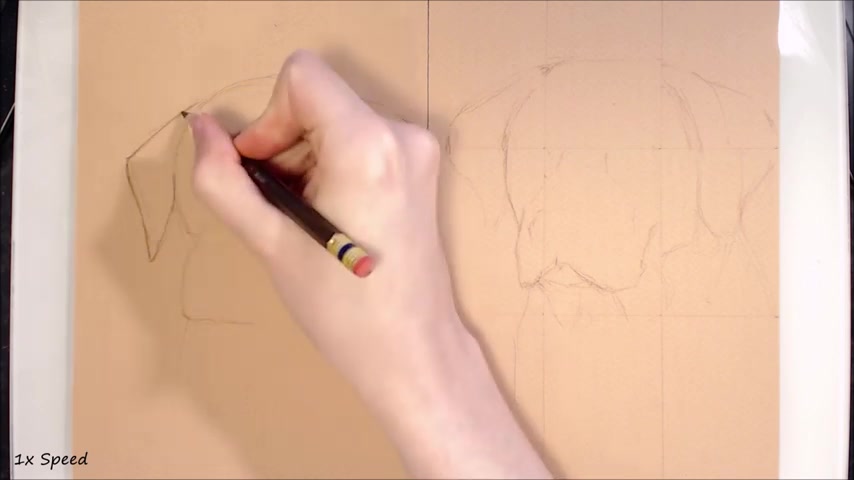
Now I've personally found that this is a very rigid way of drawing and that the end result will still look very triangular and flat as I'd feel like I need to follow the shape I've already drawn in rather than analysing the reference in how the ear actually looks .
Another anatomical mistake I see is , uh , people drawing the ears so they join at the very top of the dog's head .
But from this angle , the dog's head and ears should sort of flow into each other .
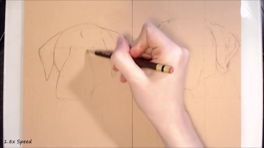
On the other hand , when I adjust the ears on the dog on the right hand side .
I had already spent time making sure that the overall shape is generally accurate , and it's just some small tweaks and a little bit of shading that I'll need to add to correct shape and to help me plot out the form .
Next up , I'll work a little more on the muzzle here with the don't side .
I've made the muzzle very smooth and shapeless towards the front .
Um , I've drawn it as a very long , smooth line rather than a complex shape .
So another common anatomical mistake that I see being made , especially with dogs in this type of three quarter position , is , um , how much of the far side of the face is showing now ?
Often , I'll see that there'll be too much showing , and the angle where the muzzle joins the um the cheek is too harsh .
Moreover , I'll often see that the top of the muzzle is very heavily defined and paired with too much of the far side of the face showing .
It gives the skull a very flat look , like there's no transition from the cheeks to the snout , so on the other dog .
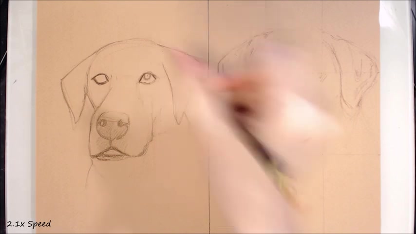
I'll use careful shading to help define the anatomy and planes of the dog's muzzle .
I really want to avoid hard and dark lines to define the anatomy , particularly on areas that will be pale fur , as these can show through in the final product .
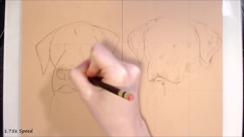
And , of course , any harsh dark lines would detract from that realistic feel back on over to the don't side .
I am drawing in the nose now , and I'm simplifying this down to a square I circle with two smaller circles inside the nostrils .
I didn't take much care in the placement of the nostrils here , so they're sort of lopsided and not at the same plane as the rest of the face .
So when you see me drawing in the eyes , you'll notice this a bit better .
Um , the eyes and the nostrils won't be sort of parallel to each other , and here I also didn't consider the angle of the nose , so it appears to be more front facing than the rest of the dog .
This , along with some other anatomical mistakes that I've made on this dog , means that the perspective is off and it just doesn't look quite right .
Speaking of right on the right side , I'm being more careful with the nose .
Noses are something that I personally struggle with as they are very much defined by their value and have lots of little folds and curves .
But because they're often a very dark colour , it can be difficult to get the right value for the right part .
Additionally , I did myself no favours with this photograph that I'm working from , where the nose is very underexposed , so a larger part of it is just flat black .
So here I'm going to have to use my previous experience from drawing dogs and work that into the picture .
Anyway , I carefully choose curves to draw in the outline of the nose .
I then place the nostrils and lightly shade the darkest area as a rough guide .
This helps me to see the nose as a form rather than a flat shape .
I find that with a touch of shading , it can be easier to judge if I need to make any adjustments With dogs , you'll often see a couple of different planes to the nose , such as the top and the front , and sometimes part of the side such as in this case , because the dog is in three quarter profile , Um , and they seem to meet at softly curving right angles .
I also work on the mouth here , and I'm just looking in the areas of shadow underneath the lips , being careful to consider the folds and where the top lips hang over the bottom .
So now onto the mouth for the left hand side .
So here I draw in the mouth as a thick line to separate the top and bottom jaws .
This doesn't result in a very realistic look .
As I'm not considering the form of the face here , dog lips aren't consistently the same colour and thickness all the way across .
Either .
There'll be areas where some parts are more visible than others , and drawing in a flat line like this will just look like the dog has a sort of upside down Y shape painted on its face rather than an actual mouth .
But now , on to the most exciting part for me , at least , the eyes on the left .
Here I'm drawing the eyes far too large and a little high up .
These are two things that I have observed in beginner artist work , and that also includes my own .
It's easy to get lost in the eyes of an animal or a person , I suppose .
Um , I think we often consider them the most visually important and detailed , and because of that , we have a tendency to draw them .
Big spacing and size is going to depend on the brood , of course , just like any of the facial anatomy .
But a very rough guide for most dogs is that the eyes are placed about two eye wits apart .
These sorts of rules are helpful , but don't become reliant on them .
Always check your reference photo .
Another mistake I've emulated here is mismatching pupil size , which gives the dog an odd expression .
Something else to consider is pupil shape .
Make sure that the pupils you draw are round , and if they're obscured by eyelids , that the curve of the pupil that is visible does make sense .
For instance , when the eye is squinting , it's easy to make the pupil too wide or the curve of the pupil very wide and loose .
So if you were to complete a circle using that same gradient , the pupil would be huge , and maybe not even fit on the eyeball .
In addition , like the majority of the face , I also didn't consider perspective where the left side of the face is a little further away , so the eye should be a touch smaller and a little narrower .
And as I draw these eyes in , suddenly nothing looks quite right .
This used to happen to me all the time , and then I'd go through the whole drawing , erasing things and moving things around like I'm doing here just to try and get things looking slightly better .
The problem is , the whole drawing is full of inaccuracies because it was built on an inaccurate base , so realistically , there's no way of making it look accurate without starting over .
And finally , with the dog on the right , I take my time to look at the reference and my grid and measure with my eyes where things should be positioned here .
I really like to do some light shading to help place the anatomy , such as cheekbones and the furrows in the forehead , to get a better grip on things as well as any pigmentation or pattern that might help because eyes are so important and attention grabbing if they don't look quite right .
The viewer will feel that something's off .
Like in the reference photo .
There's quite a heavy shadow from the top eyelid on the dog's eye , so I'm careful to take notes so that I draw them in separately .
Or else there's the possibility of the dog's pupil appearing as a strange shape or too large as it merges in with the shadow .
And now I'm approaching the final finished sketch here .
I hope you found this interesting and helpful , so I'm approaching the finished sketch here .
Like all my videos .
These are , of course , built up of my own personal opinions .
What I've experienced and what I've seen others have problems with .
So if you'd like to point out something that perhaps I didn't mention or something that you disagree with , please leave that down below in the comment section , and I'll try and get back to you one more thing before you guys leave .
If you didn't notice , I didn't have music on this video , and I'd really appreciate it if you could tell me if you prefer it this way , there will be a pole in the top right of the video player .
If you click on the little eye symbol and that's just about it .
Thank you very much for watching if you found this tutorial helpful .
Please leave it a like And like I said earlier , if you didn't please tell me why .
So maybe I can do something different next time .
I'm always open to constructive criticism and video suggestions .
So please leave those below and I'd really appreciate them .
Hit that subscribe button if you haven't already .
In order to keep up to date with my latest videos .
Hope you all have a lovely week and I'll see you in the next video .
Are you looking for a way to reach a wider audience and get more views on your videos?
Our innovative video to text transcribing service can help you do just that.
We provide accurate transcriptions of your videos along with visual content that will help you attract new viewers and keep them engaged. Plus, our data analytics and ad campaign tools can help you monetize your content and maximize your revenue.
Let's partner up and take your video content to the next level!
Contact us today to learn more.