https://www.youtube.com/watch?v=0QpeKGfvKy8
How to Create a Transparent Sticky Header in WordPress with Elementor

There .
Welcome to tips and tricks .
Today , we'll go over the new sticky features .
Sometimes you don't want a plain old static header in this video , you'll learn how to make your header stand out more with some animation .
Now it's possible to determine how the sticky feature behaves when users scroll .
That means you can add effects and animation to make your header much more stylish .
But first subscribe to our youtube channel for more videos to take your skills to the next level .
First set up your sticky header in the element or editor in your header .
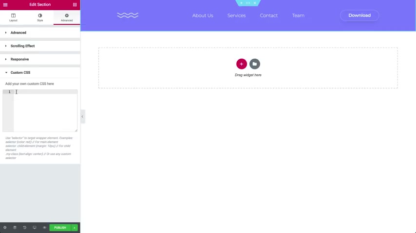
Click on the section in the panel , go to advanced and open the scrolling effect .
Choose sticky top or bottom .
I need top , select the devices .
You need desktop mobile , et cetera .
Now go to offset here .
You can move the header or any other sticky element up or down in pixels .

The offset effect lets you determine when the effects or changes will occur according to the scrolling distance in pixels .
Let's set it to 100 pixels but you won't see anything yet .
First , we need to add CS S in the CS S tab .
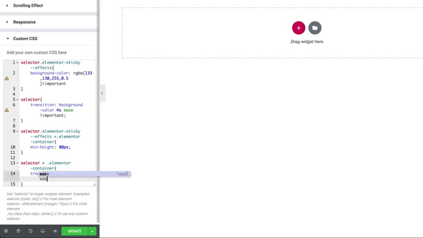
We'll add a new CS S class that affects the elementary sticky .
The last name is effects .
So let's add some CSS here .
I'll add a background color with 0.5 opacity .
No , don't freak out .
You can copy the code needed just below the video description .
Click , publish and set your conditions .
Let's preview what we did looking good , but we'll also add a cool animation to it .
So the menu bar will scale down a bit when we scroll back to our code here .
Let's add a min height of 80 pixels to our effects CS S class .
And again , don't panic .

You can find the CS S code in the video description below update and let's check it out .
Cool .
This is amazing .
So try it out , engage your visitors more by adding effects to your sticky elements and don't forget , subscribe to our youtube channel for more fun videos .
Are you looking for a way to reach a wider audience and get more views on your videos?
Our innovative video to text transcribing service can help you do just that.
We provide accurate transcriptions of your videos along with visual content that will help you attract new viewers and keep them engaged. Plus, our data analytics and ad campaign tools can help you monetize your content and maximize your revenue.
Let's partner up and take your video content to the next level!
Contact us today to learn more.