https://www.youtube.com/watch?v=Hm9xCZdPKOY
COLOR TRENDS LIVING ROOM _ Interior Design

Hi guys .
Welcome back to designers .
I'm Sarah , architect and interior designer .
In this video , I'll show you five perfect and trendy colors to be used in any living room .
I will provide you with some ideas on how to use it and combine each one depending on your style .
So this video is to get inspired to add a touch of color into your space .
I want to .
Thanks today's sponsor , which is Milano the new easy to use tool to organize design projects while staying creative .
Milano is a bit different from other software you may have used before because you can create your mood boards , color palettes , shopping lists with direct links to buy material boards or anything you need to organize and visualize your ideas all in one place .
This app has become my favorite so far because it feels just like working on the wall of a creative studio except it's entirely online .
I'm using it for a current project .
I can share my mood boards and ideas with my design team or clients .
They can leave comments , feedback or suggestions we are working together virtually .
So give Milano a try on your next creative project sign up to Milano for free with no time limit .
I'm sure you'll love it .
Ok , guys .
Are you ready to get inspired by the color trends for living rooms ?
Let's get started .
The first on the list is one of the favorites for upcoming year .
It's green .
The color of life , nature and healing green is the most stressful and relaxing color of the spectrum .
So it's common to use as a background in residential spaces because as human beings , we are used to seeing it in large quantities .
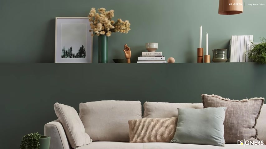
There are a lot of green shades to choose .
But one of the favorites right now is sage green , a kind of gray green perfect for small spaces or when you're looking for a fresh appearance , since green is the color of nature , you can get inspired by it to create the entire color palette for your living room .
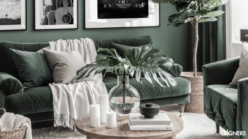
Pair your green tone with warm neutrals and materials like wood jude seagrass , golden details , linen leather sofas or armchairs as green is on the side of cool colors in the color wheel .
I recommend combining it with warm materials and texture to create a balanced color palette .
Also black accents are perfect to create contrast , use them in lamps , coffee tables , handles or accessories .
If you're looking for an elegant appearance , I will give you a sneak peek of the color trends in interior design for next year , Sherry William has chaired the color of the year for 2022 which is evergreen fog , a soothing shade .
Perfect for freshen up any space .
By the way , guys don't forget to subscribe and to turn on the notifications bell because you don't want to miss out on all the content .
I'm preparing about the upcoming trends .
Also , don't forget to smash the like button if you enjoy this kind of content .
The second color is dark gray .

The favorite one if your living room has a contemporary minimalist industrial or Scandinavian look , this color is elegant and dramatic , but before using it , ensure to have a good amount of natural light in the space and a good lighting plan for the night time .
Since it's a neutral color , we have an infinite choice to combine depending on your living room style .
If you're looking for a or Scandinavian look , you can combine a monochromatic color scheme with other neutral tones like white and light gray .
If you want to use this color scheme , I recommend adding some elements in wood , natural materials and greenery sparingly in the room to create a cozy atmosphere .

Dark gray is a good choice if you're looking for an industrial style to achieve this look paired with other neutrals like white , beige tape , brown , lighter grays and textures like rustic wood brick brush , gold and tan leather .
Another way to use dark gray , especially if you're looking to have a contemporary glam style is to play it with vibrant colors such as mustard emerald green , orange or pink .
Use it as an accent in your pillows , arms accessories or sofa .
Let's continue with the next color which is the timeless white .
Yes .
When talking about colors for the living room , we can't forget to talk about white .
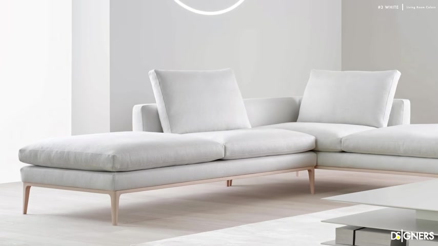
White is the most versatile color in interior design because you can change the mood of your space using your furniture , decorative items like pillows , flowers , ottomans or by painting an accent wall in your favorite color , a wide living room doesn't have to be dull .
Some of the most popular color palettes used in white are the contemporary color palette .
This is versatile and elegant .
Combine your white walls with warm neutrals , black and wooden furniture .
If you prefer a relaxing look , you can go for all white .
No , it's not a boring palette if you use the right texture and materials .
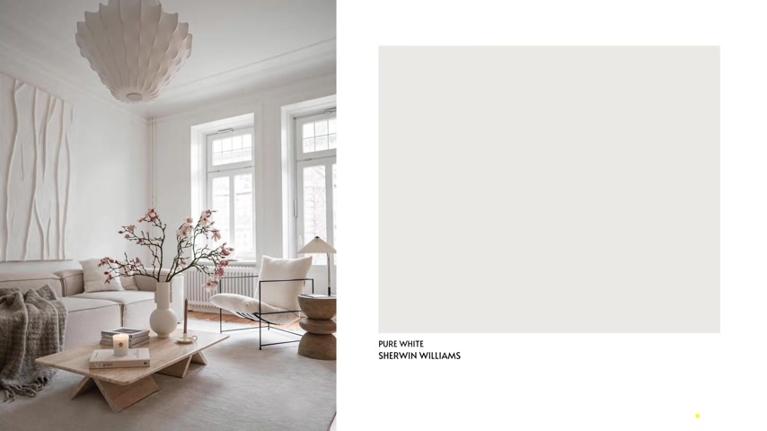
This color scheme is convenient if you're looking for a minimalist and timeless living room .
When using all white in interior design , they keep is to include tactile texters and warm materials like wood to create contrast include patterns and texture fabrics in your sofa , armchair , pillows and dry wall coverings like molding or panels to give dimension to the room .
Another way to create a color palette using white is by pairing it with your favorite color as an accent .
You can have all the background and essential pieces in white and include small accents using your favorite color skin .

For example , use white and two contrasting colors like blue and orange or green and pink for your pillows , armchairs , ornaments or artwork .
Guys combining your favorite color is very easy .
I will leave you the link below to my video and free guide on combining colors using the color wheel .
I'm sure it will be beneficial for your decorating journey if you like neutral colors because of their versatility but want something other than white while still maintaining a timeless look .
I think you'll enjoy the next color gray .
A color that is the perfect balance between cool gray and warm beige .
This tone is very popular for residential spaces because it's versatile .
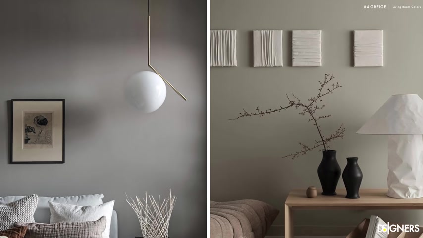
Also trendy design styles like and contemporary Scandinavian use it as the primary color of the space because it helps achieve warm and inviting dead calm and serene rooms .
Since it's a neutral and soft color , we can try different color palettes depending on your taste .
If you're looking for a warm candy look , carry a warm gray stone with other neutrals like white gray or beige .
In this case , adding touches of black mat through the accessories will anchor the composition also , wood and natural materials will create a balanced living room .
The gray is a perfect tone for people who love neutral spaces .
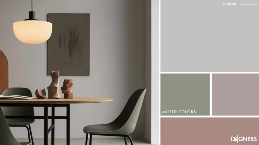
But if you want to add a pop of color , you can do it but make sure to pick muted colors like sage green or dusty pink .
A piece of advice is to be careful when selecting a gray stone for your backdrop .
Some can look more beige and some can look more gray depending on the mix of the two colors .
Select the best one to complement your furniture and Decor .
The next color is blue .
This color doesn't need a long explanation by green .
Blue is a favorite in residential spaces because it has a common effect and goes well with many colors and styles .
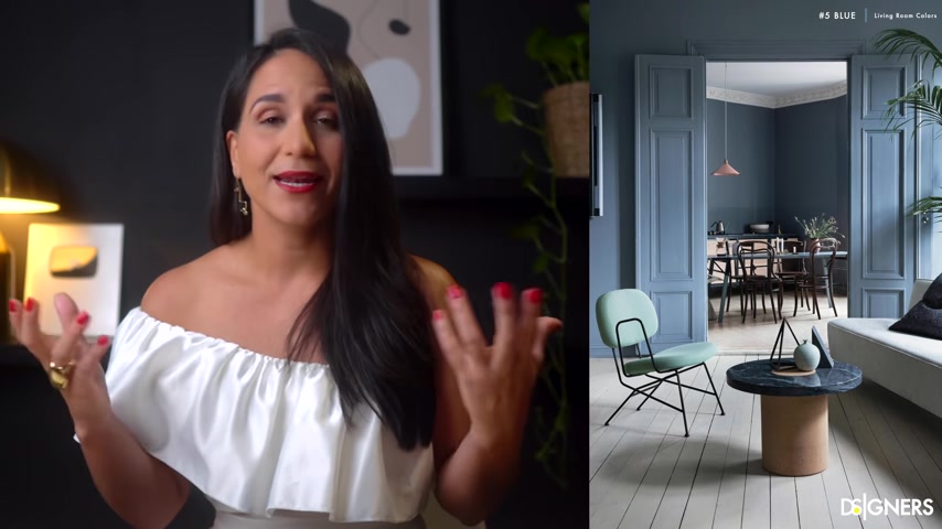
Most importantly , it's a color that doesn't go out of style blue is a versatile hue that can move from dark and moody to soft and calming .
It's a good color for contemporary traditional bohemian to more fancy styles like art deco and glam .
Depending on the style , you must pick the blue tone for your space .
If you're looking for a clam , elegant look , pick a dark blue tone and combine it with materials and textures such as velvet , golden metals , marble or crystals .
If your style is leaning toward contemporary , combine dark blue with neutrals like gray beige or white .
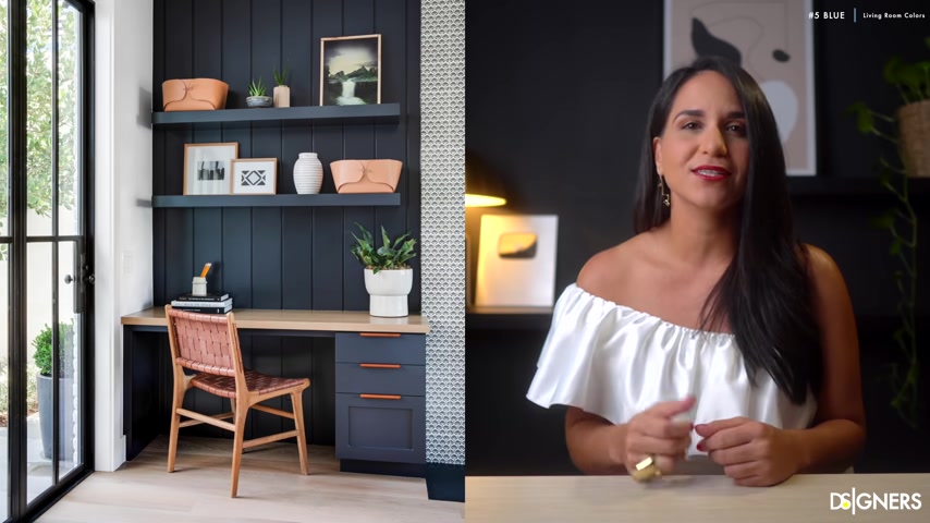
In this case , touches of natural materials can work very well to a warm and modern look .
If you prefer a fresh and calming feel , balance a light blue tone with warm neutrals and materials such as wood , jute sea grass , rotan cane weaving and fabrics like cotton or linen .
In this case , a black accent could work very well to maintain a humble and a slick look .
Natural materials pop against this shade of blue , use it evenly in all the living room to get a cohesive space .

Guys , remember if you're planning New York color palette , designing a space , creating mood boards or organizing design ideas .
I invite you to sign up for Milano for free using the link in the description box below .
I'm sure Mila node will make the process easier and enjoyable for your design journey .
Now , it's your , you know that I love to know about your taste .
So please don't forget to share with me in a comment below .
Which color combination is your favorite one ?
If you like this video , remember to smash the like button .
Subscribe to be part of our design community .
I will appreciate it a lot .
Have a wonderful week .
See you in the next one .
Are you looking for a way to reach a wider audience and get more views on your videos?
Our innovative video to text transcribing service can help you do just that.
We provide accurate transcriptions of your videos along with visual content that will help you attract new viewers and keep them engaged. Plus, our data analytics and ad campaign tools can help you monetize your content and maximize your revenue.
Let's partner up and take your video content to the next level!
Contact us today to learn more.