https://www.youtube.com/watch?v=ToyLX_B4aS0
✅ TOP 16 SMALL LIVING ROOM Interior Design Ideas and Home Decor

So you want your small living room to look like this in this video ?
I'll share simple but amazing ideas and tips to make your small living room look stylish , functional and elegant .
If you're new to my channel .
Welcome to our design community .
I'm Sara .
Don't forget to subscribe and turn on the notification bell .
So you don't miss out on the upcoming in charities and lessons .
OK .
Are you ready to know how to maximize your small living room that get started ?
Use colors smartly light colors such as white , gray and neutral tones are the best option to make the most of a small room because they make the space more bright , spacious and area .
However , that doesn't mean that everything must be neutral .
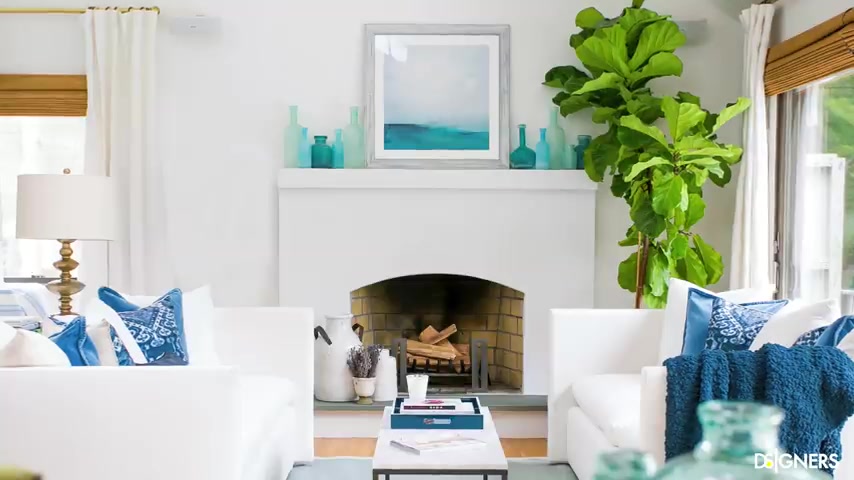
If you love colors , use richer tones in small and medium items such as cushions , blankets , vases or flowers and leave the light colors for the walls and big pieces which as the sofa and rocks , you'll have a colorful space representing your personality and taste while feeling larger .
Look at this example .
The dominant color are light , neutral tones such as white and gray .
These colors are used in areas and significant elements such as wall rock and furniture .
They have introduced color through smaller scale pieces .
The accent colors are soft and stand out in the space without creating high contrast .
Remember that the sense of uniformity unifies the room making it appear larger .
The room is bright , colorful and full of personality .

Pick a proportionate sofa , the smaller the furniture , the bigger the space will appear , right opt for comfortable furniture with simple lines and a structure that follow the proportions of the space as much as you like a family sofa .
Evaluate if it will occupy too much space before investing in it .
Choose a sofa that allows you to leave space between other objects and the adjacent walls visually .
This allows the room to feel more fluid and balanced .
Another possibility is to opt for modular sofas that you can join and separate according to the function and needs depending on the activity .
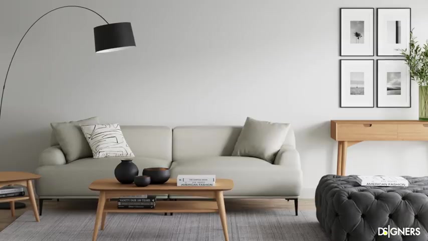
It's better to have a smaller scale sofa and complement the space with armchairs , benches and Ottomans giving you the versatility that a small living room should have use layered coffee tables , a coffee table that is too small is not functional but a larger um bulky coffee table is not an option in a small living room .
Either in order to have the best of both .
You can opt for tables arranged in layers which can overlap or extend it while complementing each other .
This has multiple benefits because we have more surfaces to support objects .
It looks modern and it like makes it easier for us to accommodate them depending on the activity .
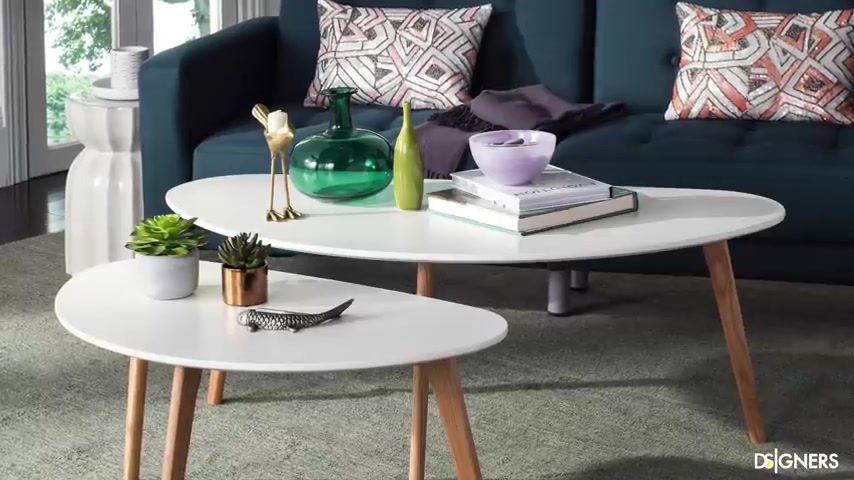
Sometimes one of these pieces can be turned into a side table or moved to another room when needed in small spaces .
Versatility and mobility are critical use Ottomans with hidden compartments .
Another piece that I find useful is an ottoman .
They support your feet while reading or resting on your sofa .
At other times , they can serve as a side table if you put a tray on top and if it has a hidden compartment , you can use it for storage .
There are also an excellent option for adding a pop of color texture or pattern to a small space .
Look at this functional ottoman .
Apart from having a hidden compartment and serving as an additional seat , you can flip the top and it becomes a side table entry .

You can imagine how versatile this Ottoman is in a small room , include multifunctional Ottomans and take advantage of your space follow your style .
But keep it simple when designing a small room go with simplicity .
That doesn't mean that the only style suitable for small spaces is minimalism .
However , this style can serve as inspiration or to complement your style .

For example , if you like the Bohemian style , try to create a hybrid where you can use those elements that you love from the bohemian look , but guide your design by the concept of less is more try to keep your large pieces simple and compliment them with details and colors such as colorful cushions and exotic art pieces that characterize the Bohemian style .
More importantly , avoid clearing the space with many elements .
Let the room breathe and the energy flow make the walls function , facilitate circulation by using your wall to mount bookcases , shelves or hang the TV .
When you use the wall , you free up floor space and enhancing the circulation .
Apart from giving a cleaner and more spacious space .
A TV , hanging on the wall is a much more sophisticated and modern look , avoid visible cables that create visual noise .
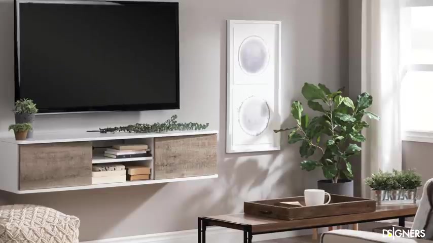
If your cables are not hidden in the wall , organize them , put them in a white concealer and paint it the same color as the wall .
Unify the space with the right rock .
I recommend using rocks with similar tones to your flooring to create visual uniformity .
Let me explain if you have a light color flooring opt for rocks on a similar tone .
If you have a dark floor opt for rocks that blend better with that color , that doesn't mean that you should use a rug in the same color as your floor .
But the contrast between the two tones should be soft and unifying .
Look how an intense and vibrant rug on a light floor strongly defines the space in a large area .
It can work .
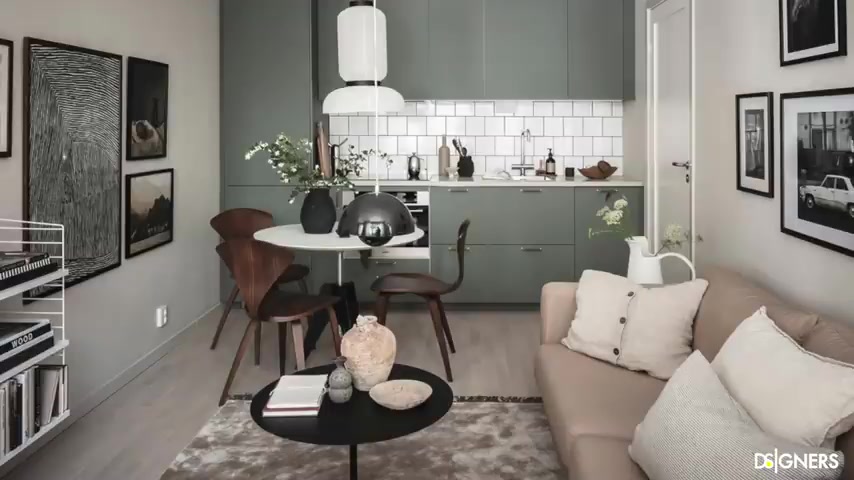
But in small ones , it take us away from the opportunity of unifying the composition on the other hand , look at this small space that uses a rock similar in color to the floor , but with a different texture , the living room differs from the dining room .
Yet it feels like one space compliments the other .
You can use your rocks to visually separate or define different spaces in the same room without compromising the sense of unification .
Try playing with texture or patterns to gently define different areas in this small apartment .
Notice that the rug is similar in color to the floor , but it has a pattern .
It defines the living room area .
Yet at the same time , the entire space feels cohesive .
Think about curtains .
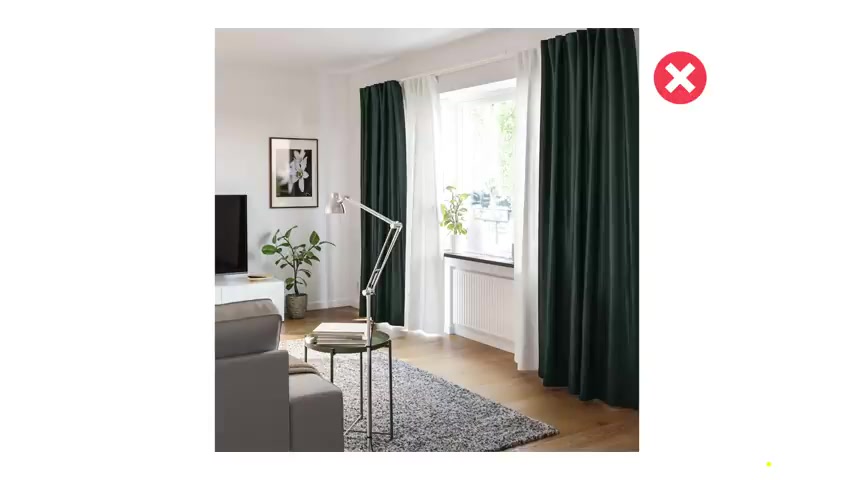
A visual trick is to choose a similar color for the curtains and wall to create uniformity , dark color panels over a light wall can make a room look overwhelmed due to the harsh contrast created also up for light curtains that float or keys the floor among the curtain rod high enough to emphasize the vertical lines to reinforce the feeling of hide in the room .
If curtain panels don't go with your style or you're looking for a more clean minimalist look , you can opt for blinds and pick a similar colors to your walls .
By the way , if you're in the process of mounting or selecting curtain panels , I recommend that you watch this video there .
You'll find all the information you need to get the perfect look .
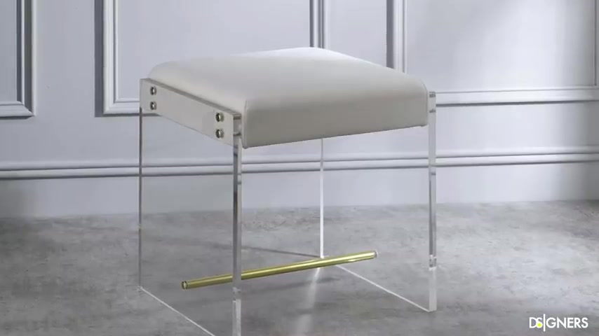
I'll leave the link up here and in the description box below use glass or acrylic to lighten specific areas when the living room feels clutter go for glass or acrylic furniture and accessories .
These materials are friendly to small spaces because they have no visual weight .
For example , if you already have a heavy dark sofa in your living room , make it feel lighter with a glass coffee table for glass spaces if you have a credenza if you need more sitting pieces , but the space feels saturated .
Try to pick a bench or ottoman partially made with acrylic .
As we can see through these elements , we can manipulate how we perceive space , use it carefully in a limited number of pieces .
Too much acrylic and glass may unintentionally change the vibe of your space .
Duplicate the area with mirrors , mirrors are a must have in small spaces .

It gives a feeling of spaciousness because they reflect light and double the room .
They help us elevate the aesthetics of interiors and create focal points , round or organic shapes .
Mirrors with bold or large dimensions can be a perfect ally for your living room .
Also , you can use mirrors as wall covering or have a big one that extends to the ceiling to create a feeling of spaciousness .
Look at this small living room , they covered all the wall behind the sofa with mirrors and moldings .
This is a trick that immediately expands the space in this other living room .

They did something similar but with a cleaner look notice that the simpler the composition , the cleaner and more spacious the room will appear , make the living room interesting .
By introducing nature .
Nature adds color texture and movement to the space .
One or two tropical leaves or a few branches in a simple class space on the sideboard or coffee table is an element that captivates the eye .
A great idea is to have a tall plan to emphasize the room's height .
If you don't have space on the floor or tables hang your plants or use your walls in the same way , it will attract your eyes upwards , emphasizing the vertical lines of the space there to bring your spaces to life with plants and follow your style .
Using a planter , use patterns as an accent , don't exaggerate with patterns but don't hold back from using them either because they give personality and style to the room .
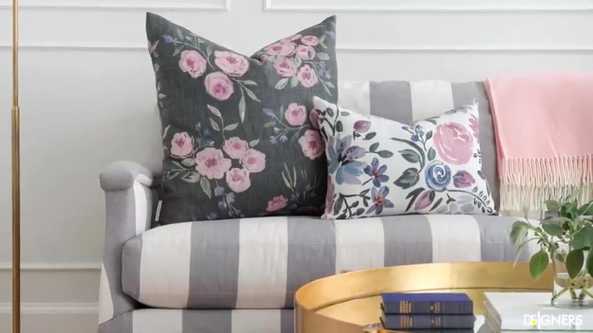
I recommend using it on small axent pieces such as cushions , armchairs , ottomans or throw blankets , don't use more than two or three patterns and balance them with solid colors .
If you use patterns in large pieces such as rocks , the four soft colors that blend in with their surroundings , look at this tiny living room , it doesn't look boring , right ?
Look how interesting the pattern on the rock is .
It gives a lot of authenticity to the room .
However , since it has a similar tone to the floor , it seems to be part of it , unify your room with the adjacent areas .

If your living room shares the area with other spaces such as the dining room or the kitchen island , try to unify it , define or give character to each space by playing with texture or colors .
Instead of blocking the visual connection with book shelves or high ceiling cabinets , let the areas complement each other .
You can define areas with furniture but make sure that these are so low that they don't interrupt the visual permeability , ensure that the furniture , colors and details of both areas are consistent to make the space look cohesive .
Choose your lamps smartly in a small living room .

It's better to avoid overloading the space with different eye catching lamps on the ceiling floor or tables .
If possible use architectural lighting such as lamps or led strips that become part of the architecture apart from being disc it illuminates very well compliment architectural lighting with decorative lamps in specific areas .
If they hide allows it , you can put a pendant or chandelier in the center of of your room or mount a wall lamp near an armchair where you like to read using the ceilings and walls is a great way to free up your tables and floor .
By the way , if you want to learn more about lighting design and how to select lamps , I recommend watching these two videos .
I'll leave you the link up here and in the description box below , create a customized furniture .
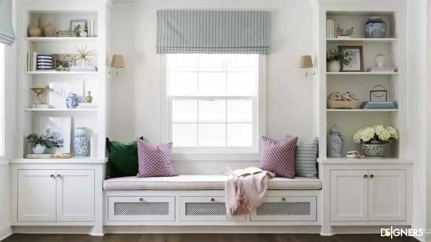
Another option to take advantage of your small living room is to opt for customized furniture .
For example , a customized TV unit with hidden compartments and open shelves .
Take advantage of a corner or wall to design a bookcase adapted to the architecture or take advantage of a window to create extra seats .
These solutions are clean and blend with the architecture .
Making the space much more organized , unified and functional , create a seamless transition to an outdoor space .
If your small living room has an a decent outdoor space , connect both areas , choose matching furniture to decorate both areas .
So when you move from one space to one other , the space feels unified .
A great trick to expand the interior is to illuminate the outdoor .
If you , you have a small balcony or garden illuminate your plans .

If you have a wall , create a vertical garden and illuminate it , you'll enjoy your outdoor area at night while making your interior space , connect with the exterior and feel unified .
Perceiving it as much bigger than it is .
This video is part of the small space series .
If you want to learn about other small areas such as bedrooms , bathrooms or other general tips , I'll leave you all the links in the description box below .
If you like this video hit the like button , don't forget to subscribe and turn on the notification bell .
So you don't miss the upcoming design lessons .
That's all for today guys .
Have a beautiful week .
See you in the next one .
Are you looking for a way to reach a wider audience and get more views on your videos?
Our innovative video to text transcribing service can help you do just that.
We provide accurate transcriptions of your videos along with visual content that will help you attract new viewers and keep them engaged. Plus, our data analytics and ad campaign tools can help you monetize your content and maximize your revenue.
Let's partner up and take your video content to the next level!
Contact us today to learn more.