https://www.youtube.com/watch?v=1khCH0Rz2cU
ENTRYWAY & LIVING ROOM MAKEOVER _Moody French Provincial_ _ XO, MaCenna
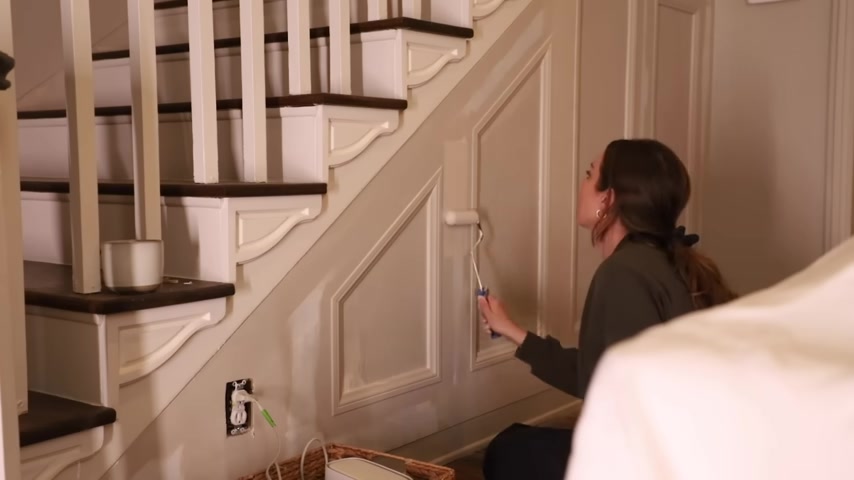
Hello guys .
Welcome back .
Welcome back to our entryway formal living room that we've been working on for the last month .
We are finally to the stage where we have all of the foundational elements completed .
So first we tackled doing all of the archways .
I really wanted to round out um those odd corners that just personally I didn't love and they were kind of not matching .
So they drove me crazy .
So rounded them out , we added even more by coming back in with some trim and now you can see that .
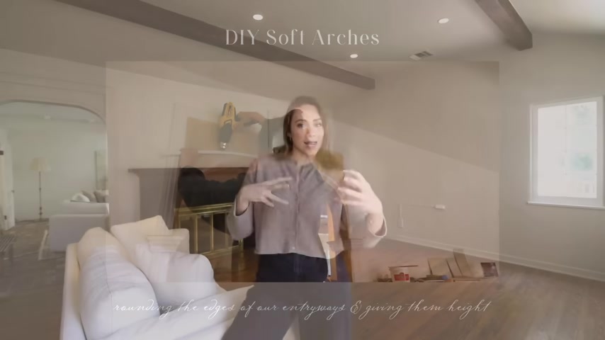
Uh It's not so mismatched with the wood and the white and the wall color now that they're all tonal and I color drench them .
It just adds a nice visual texture .
Then we tackled painting the room .
I really wanted the white walls in our house to start going away .
I'm not a big fan of having my whole house painted in white , pure white .
I like tones that are a little calmer .
So we went with sculptor clay by bear .
It's beautiful , it feels warm and calm and inviting without being like dark .
It still feels bright and happy and airy in here and then we started our four if not more day adventure of stripping layers of paint and stain off of the original 90 year old beams .
Our home was built in the thirties and these beams are thick .
They've got a lot of texture .
They're beautiful .
Totally worth the effort .
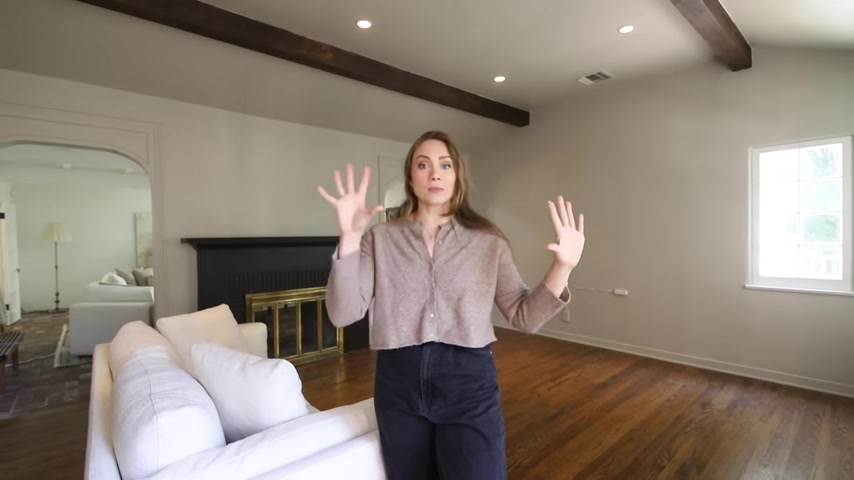
The mess , the goo , the , everything in between , it was totally worth it to see all of the beautiful rich wood tone and the beams .
It warmed up the space so much .
So we really did take a blank white room , a blank white canvas and brought some character and some warmth back in it .
So this week is finally decorating week .
So we brought everything in here .
We took everything out for the couch .
Now we can bring everything back in and now that we've really warmed up the space in here , I feel like having a lighter rug might really work , you know , because we do have dark floors and now a dark fireplace and now the dark beat , we didn't have any of that before .
So having a light rug before was like everything in here is like really light .
The walls are white , the rug is light , the couch is light , the everything is too white .
So let's see what this looks like because it is pretty .
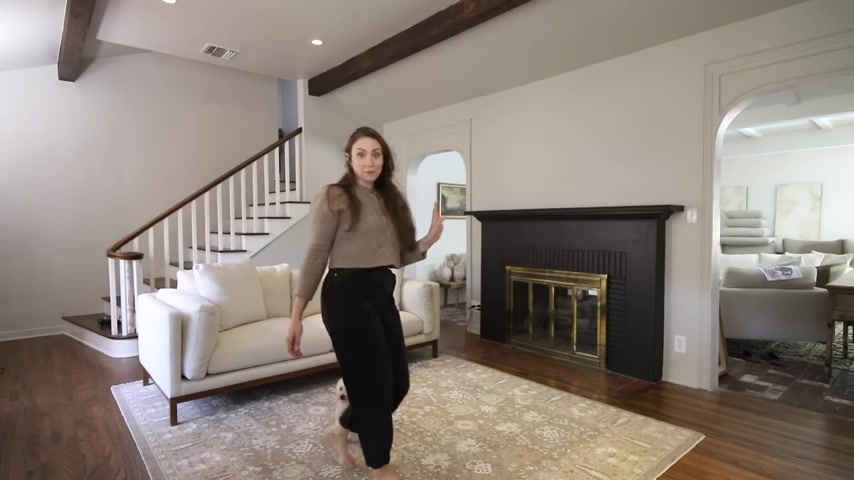
Where's this going the way ?
Yeah .
Ok .
That placement of the cat looks really good .
What do you think about the rug ?
It's ok .
It's ok .
Right .
Yeah , that's how I feel , I feel like it's ok .
I feel like too , but I haven't found it yet .
Every flea market I look , every , everyone I , I like look through , I make them pull back everything .
So this would be a work in progress .
But I , I did like it .
That's why I kept it and it was on a budget , it was just a few $100 .
So it's like in terms of like ros this was like , not expensive , you know .
So it's like , ok , I can keep it for here or maybe a bedroom .
Um but we're gonna keep looking , but I do .
It's not , it , it's like icy or something right in the entryway is where I got that beautiful antique cabinet .
It's very pretty .
What are my pet peeves ?
I don't want to see plugs like coming from an outlet underneath furniture .
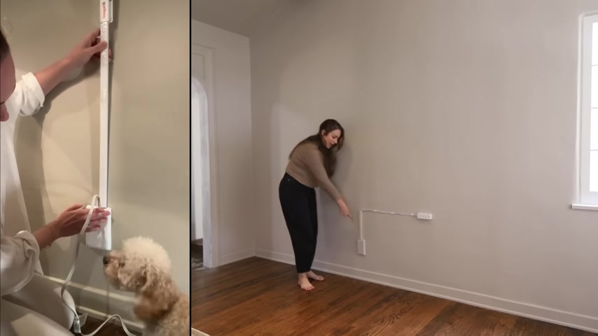
And occasionally in the past , I've like covered them with baskets or anything really , anything that I can cover with .
I have .
Well , I went on Amazon and I found this like thin out cord cover that has a power strip on the end of it .
So I added that and some cord covers and attached it to the wall .
So when we move that cabinet back in , you're not even going to be able to see that the outlet is coming , that dish plugs or anything and then the lamps can plug into the power strip .
Kind of brilliant .
This is game changer .
When it comes to like making your home just feel that much more and thought about and elevate it .
It's like taking it that much further instead of just seeing those cords around and then I painted it the same color as the wall .
So it's like really disappears from your eye .
It doesn't call attention at all , but the cords would , something that this room was lacking and is lacking is lighting .
We have very soft recess lighting in this house .
Um It creates a great feeling when you're in it because the home feels really cozy .
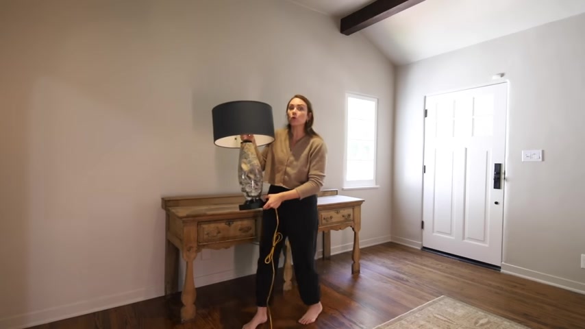
But when you want to do something like where you want to turn some light on , it really lacks it .
So I knew we needed to bring in lighting in this room .
I thought the entryway was the perfect place .
We could create like a really beautiful moment on this wall and I've already kind of zip tied the the cord so that they don't hang down and then we can just plug them into the power strip light .
You see this that hangs off the back of the cabinet , like the cord just kind of like just goes over this ledge .
I don't like that at all and I have a solution for it .
We're gonna make some , if you follow me on Instagram , you saw that I did like five ways .
I hide cords in our home because they bother me so much .
And one of my tips was to do a diy cord cover .
Uh You could also buy them .
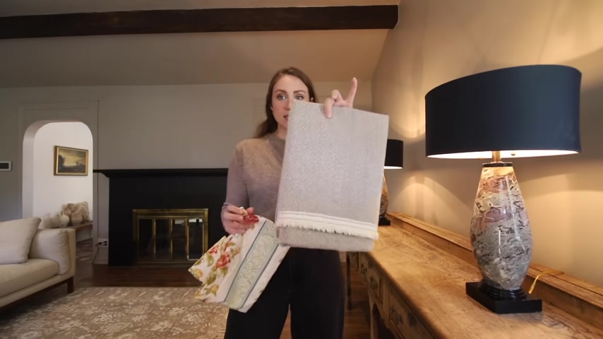
I think I'll put together some of my favorites , but I had this leftover fab brick from a chair recovering project and it's really pretty and textured , but it's calm enough to disappear and to blend in .
So I want to make some cord covers out of this because I did it for our floor lamp in the other living room .
It's basically just a tube of fabric .
Uh You want it to be longer than what you're covering .
So I have about 10 inches of cord .
So thank you .
I have about 10 inches of cord showing .
So I'm gonna at least make it 20 inches long so that it kind of has like a nice bunch to it if not more .
So my roll of thumb is kind of like 2 to 2.5 times .
I cut six inches of fabric wide .
Um because once we have like it sewn together , it will leave us with about a five inch tube or so , first we're gonna focus on the short edges .
This is what's gonna sit next to the lamp base .
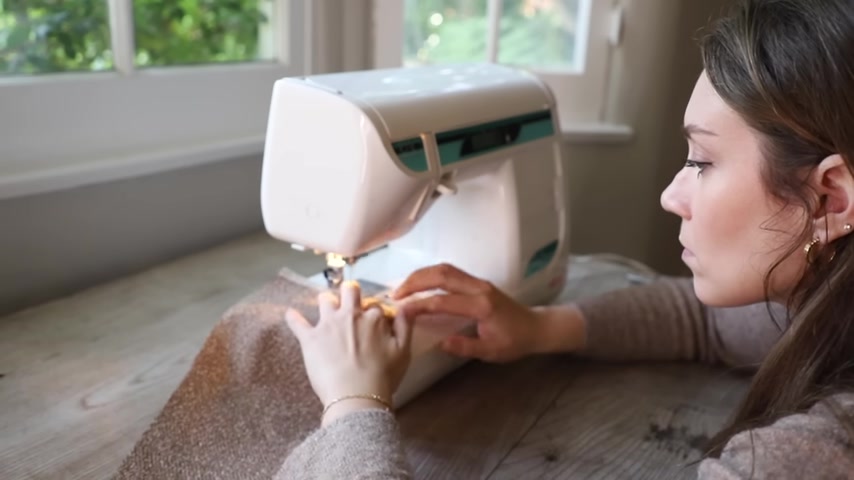
I'm just gonna fold it under one time , about quarter to a half inch , probably about a half inch because this is thicker fabric and I'm gonna sew it down .
So it has a clean edge just like that super clean just then just fold the front sides together .
So the pretty sides that we want to show we want on the inside , matching up the edges and then sew it and then literally the hardest part of this whole process is turning these tubes inside out .
I used to have some tools that I would use to do this .
Like we used to use them in , in fashion school , but you've got to sew it together inside out .
So you don't see the seams .
We're just gonna feed the cord through the tube .
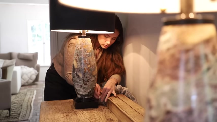
Now we just bunch it up so that it kind of looks good .
We also had some chairs that I was playing around with for scale .
We were just experimenting , but I found some chairs , some really pretty ones and I ordered them .
Um So if you follow along over the vlog channel , you saw one of them , but let's bring them in now that everything is put back together and we can actually see what they're going to look like .
Obviously , you guys know that I wanted to go the French Provincial route .
So I started looking online .
Um , and I was looking at every flea market that I went to for a set of chairs that I felt like went with the vibe I wanted to go with , went with this beautiful antique French vanity thing that we bought .
Um , but still kept it neutral and light and had the right scale .
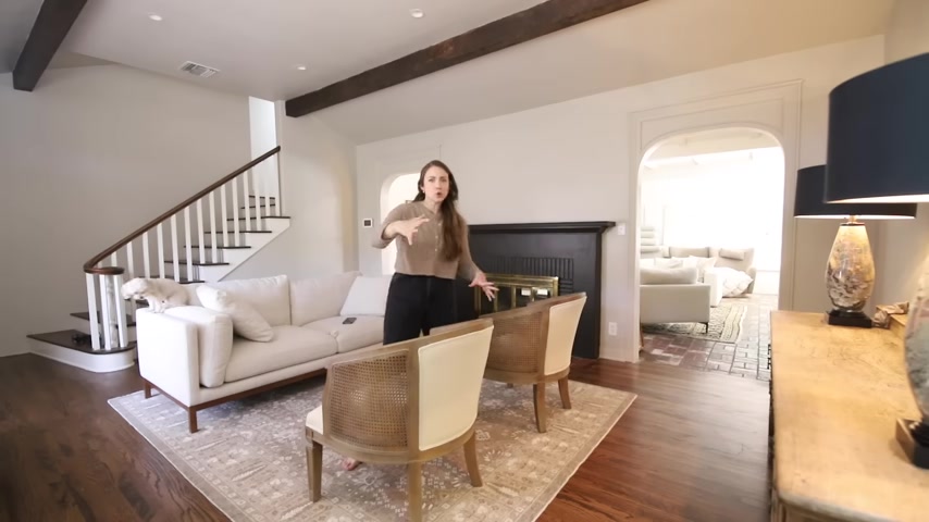
I've been dying to put them in here just to see what they were going to look like scale of these much better for the room .
When you walk in , you don't feel like you're running into a large piece of furniture .
Um It creates enough space kind of , I felt like the furniture was getting too larger than life .
Another reason why I love them is that they were pretty from all sides .
They have a barrel shape .
So when you walk in , you're not walking into like a squared off piece of furniture .
Like you would if like the couch was on this side and makes it more fluid .
You know , you can easily walk from this side over here without walking into anything sharp .
Let's talk about the stairs and the wall kind of around the stairs .
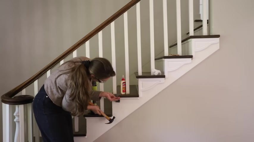
So I feel like , and I felt like that there is a missed opportunity on the actual uh risers of the stairs or you know , how , how you walk up all this .
It's just flat detail with just a quarter round .
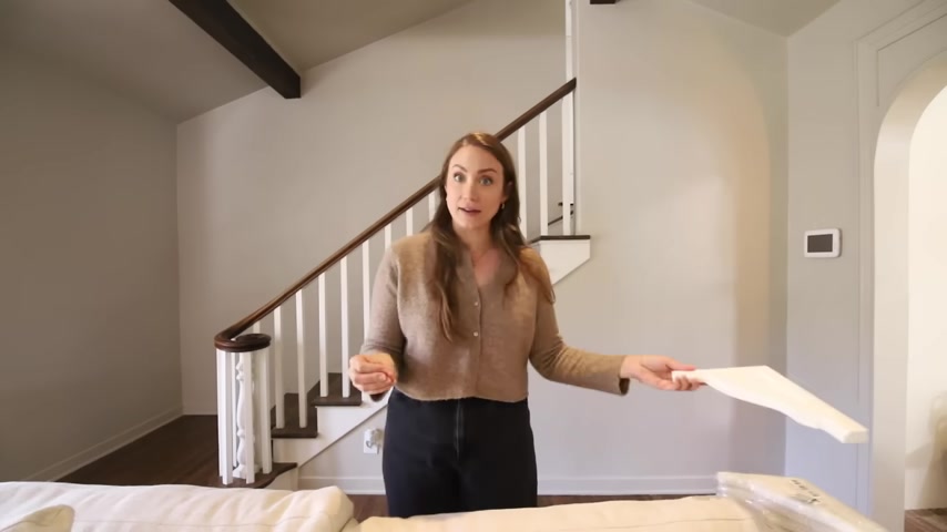
I felt like there was a missed opportunity to add a little bit more something .
So I started looking online .
I looked at all the different stair brackets that I could , that I could order online .
We need to keep it on the simple side of being detailed .
Uh So this one I found on Amazon , it was delivered overnight .
Look at this to me , it looked a lot like the detail that I had already added over the arches .
And I'm like , this is perfect .
This is bringing that same kind of like design and idea into another detail in the room to kind of further tie it all together .
So essentially what we'll be doing is taking off this quarter round and putting this detail .
This is the large , I felt like the small one , this detail in the center went really small .
Like I was like , oh , I don't think I love that , but it did fit here .
You see how this is like longer ?
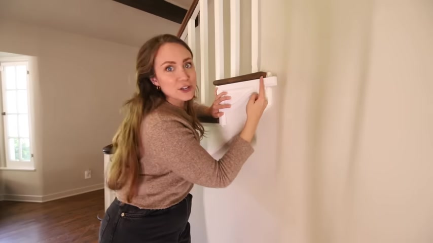
I was hoping that this design would meet right at the edge of my step .
I'm actually gonna cut it straight right here .
Leave some of the quarter round that comes around the edge so that it's kind of a continuous seam here .
I'm gonna use my jigsaw .
I did some markings on it where the stairs stopped like the actual step stopped .
So I knew what I was going to be cutting .
Oh Cuts really easy .
Could probably cut it with the knife .
There's also also this little edge that I left that I want to kind of shave down to make this design .
I feel like I'm just gonna try with a box cutter and let's see .
Oh , yeah , I could totally cut this by hand just when I thought I was done making a mess .
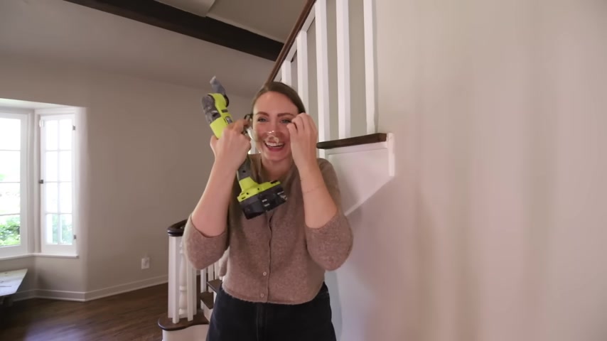
We do this stop every night just to one more glimpse of his skin beautiful .
We're gonna come back and we're gonna put Hawk , you know , in the seams to make it look extra special .
Look at us , look at us doing cool things .
Now , I just need to do 64 .
I can change that .
I Yeah .
Right .
That looks so cool .
Me , shit .
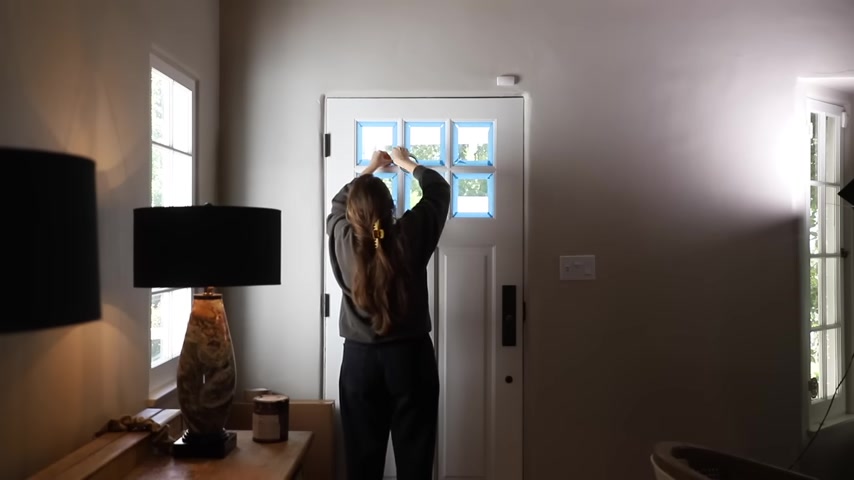
So while I have my painting supplies and my brushes out and things , I'm going to go ahead and paint the door , I want it the same color as the fireplace .
So it's going to be really pretty and also , you know , kind of not be too toned because the outside is actually black and I think it a nice contrast .
So the only uh trim work in here that will be white , uh will be the window trim and also the stair trim .
So I feel like that's kind of enough .
I'm very into leaving the windows white on the inside in this house .
But this , um , this color is the black mocha .
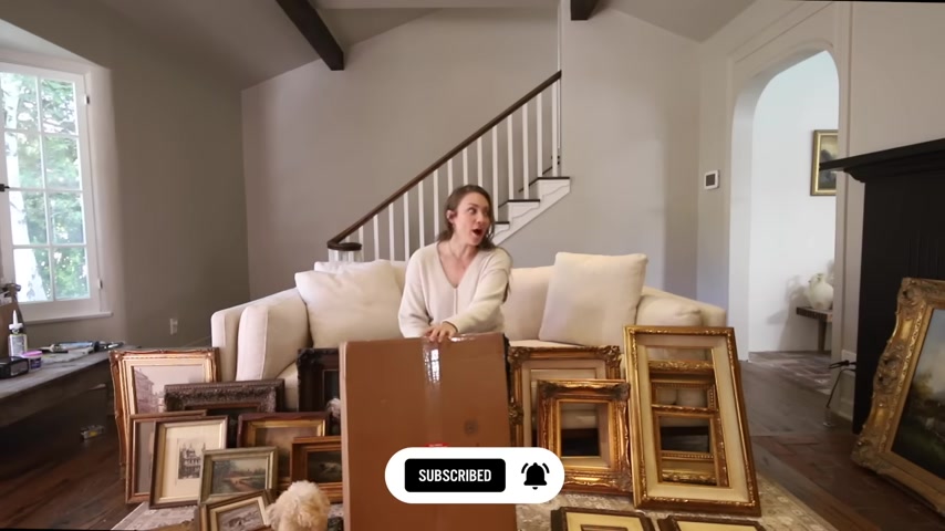
I have been collecting , collecting art for a while .
I feel like some of these are from our last apartment .
Uh Some are from state sales , thrift stores , more so estate sales and flea markets than thrift stores , um , from frames that are empty that we need art for .
And then also art pieces .
I got these in an estate sale recently actually like florals .
I was cleaning up the linen on these two and I , I got it better .
It's not perfect , but I got , I got it better landscapes for sure .
Florals .
Um Love hunting dogs , architecture , buildings I don't normally gravitate towards ones with glass or that I can tell that I can take the glass off because I don't like the reflective quality .
I like more paintings .
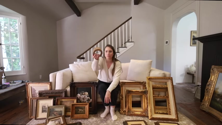
But when in doubt , like when I have frames like this , that I don't have art for and I already have my mom painting so many for me right now that I was like , OK , for these specific frames , I'm just going to pick and select some art that I really like and then have it printed .
So I got a box , I have some um craft tape too so that we can put the new art in .
So I want to open this box .
I tested a whole bunch of companies .
Um I ordered from staples .
I ordered from walmart dot com .
I ordered for pickup .
I ordered for delivery .
I ordered from different like , you know , different online places until I found a place where I could know that it's going to feel quality and that they're going to actually print really well .
I always use the stack house .
I have a coupon code for you guys too .
I'll leave it below .
Um So that you guys can get a discount on your first order if you want to print some art because I love them .
This is not sponsored .
I just love that .
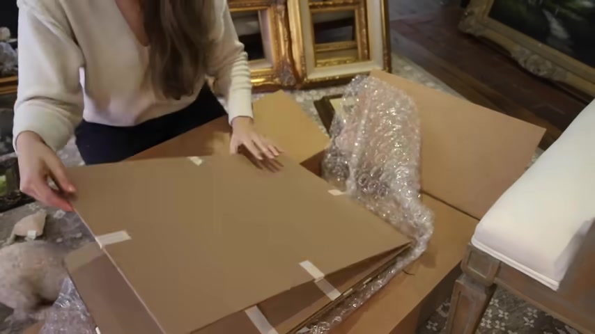
I ordered four this time in different sizes um because I had like a few frames that were in like eight by 10 size .
Oh , these are so pretty .
Look how pretty this is .
You guys look at that .
I got this eight by 10 for this chunky frame where we got it .
Um If you saw over my vlog channel , I went to the flea market and I found this frame for about I think $20 .
This one just looked like me outside with my roses .
I just like needed this .
You can see the little doggie , which is so cute .
So this one the 11 by 14 , I got that for this frame with the pretty matte .
Oh , wow , that is so pretty .
This one ?
Oh my gosh .
So heavy .
How pretty is that ?
Oh , that's so pretty .
I'm gonna show you how we mount art .
I'm gonna flip it over .
I just ordered this stuff on Amazon .
It's um craft paper tape .
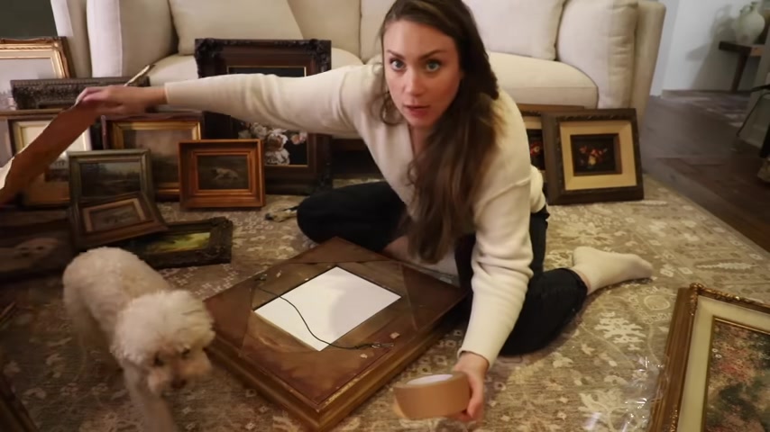
They usually use it in like just packing materials like , you know , shit packages .
So I'm going to use this tape to tape down the actual piece of art .
Then come back .
I'll just reuse the paper that came with the art .
It's a little bit crumpled but I'm going to cover most of it up with the tape um to cover the backing and make it nice and like seamless and smooth .
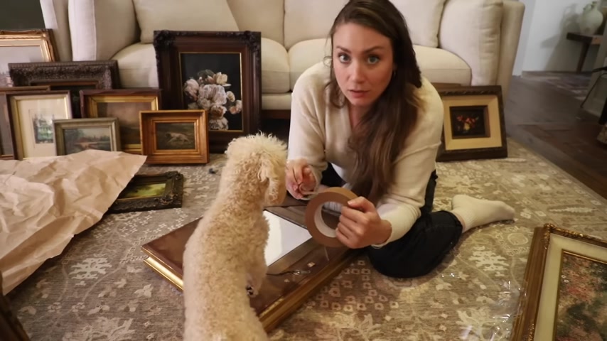
But you can also get craft paper like that to use in various , it's a little bit wrinkled because I use recycled paper but look how much better it looks .
I mean , it just will make it cleaner when you look at it from the side .
If you were to see it , it just makes it really clean and keeps the art and everything inside and protected .
Ok .
So a lot of this art , the little ones especially are going to go into the gallery above the stairs , right .
But we have two I two or more ish walls in here that need big art .
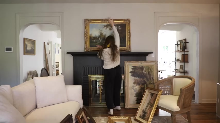
So I've got two options for above the fireplace .
Uh So this is the one that I had up here for a while while the room was white .
Just I found it at a flea market .
I was like , ok , let's see what this one looks like .
So that is option one .
I think it looks too much like the brass underneath .
It's like brass square , brass , square kind of thing like gold and brass .
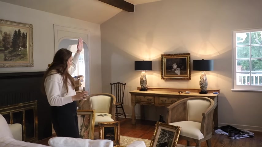
I'm thinking and I've had this idea for a while to move this one into our bedroom and steal the one from the bedroom for here .
A little bit simpler of a frame still with detail though .
And it's not so gold .
It just has absents of brass .
I feel like that works better .
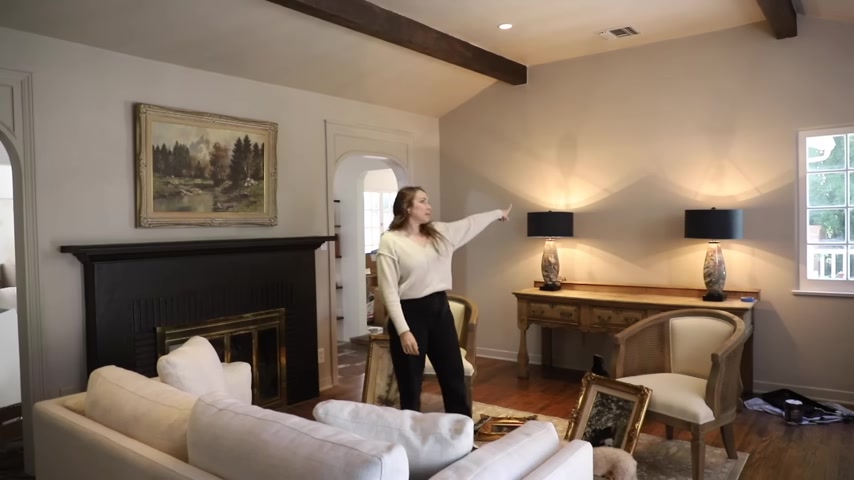
That's so pretty when I found it .
I loved it , but I felt like the color palette that I had before with .
It was all very like light .
I love this now with like something darker , you know , it adds like a lightness to the mood .
Ok .
That looks great .
Now here I love the lamps .
I love the whole entryway thing .
Um , I just need the right art to go there like I have this .
But I don't , I don't think that this works .
I have this one that my mom painted .
That's a good like size for the center .
We put one above it or something .
Oh , wow .
Chunky .
Oh , I don't know .
It's like so many could work .
I'm gonna hang this one because I think it looks really good and I'm hung on a special place in the house because my mom painted it .
So this one's more horizontal .
I'm thinking I want the other one going up and down .
The junky one is just like , whoa , you know , like this , that's a moment .
OK .
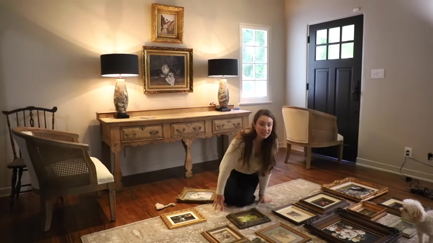
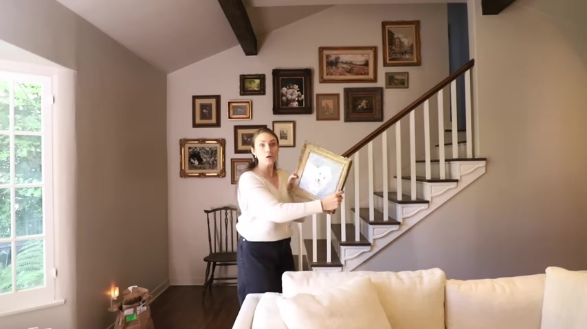
I'm over here trying to make sense of the gallery wall .
I just part of me wanted to just like start hanging like just don't overthink it because I feel like that's when it looks best when it's not all planned out .
But then the other part of me knew that I had so many different types of frames .
I've got dark brown , simple ornate gold detail .
Like there's so much that I wanted to make sure that there was a balance of them .
Like and that I didn't have like a cluster of flowers or , and then the architecture ones or like , you know , the dog and the people like I wanted there to be some sort of balance .
So I just started laying them out and I'm like , ok , now what ?
And I feel like I want Kinsley in here so bad , but she's so blue that my mom , I was just talking to my mom .
She said that she could antique it and also maybe change her background or something .
I feel like I'll start with this one .
I'll put this one up since it's kind of like the center because it was only the only one really like it dark like this .
I think I'll start with this .
I'll put it up right in the middle , upper , up high so that I have some for below and then we'll kind of just like feed off of it .
So wish me luck .
Yeah .
OK .
That looks really good .
The great thing about gallery walls is you can continue to add to them and I want it to feel like so like , whoa , like you walk in and you're like , what is this like ?
Uh , like just uh , it's already getting there .
I feel like Kinsley will be like so good like here .
But the , the call , the background color , I feel like the tones are off , but I feel like she would be pretty there .
So I'm gonna have my mom work on her a little bit and we can put her there .
But that is a great start .
OK .
Now that we have elements in the room , art on the walls , things I'm less focused on the rug for sure , because this is a great rug .
It's just like , I feel like it could be better .
We're gonna swap this one or at least just bring the diamond one down so that I could see it .
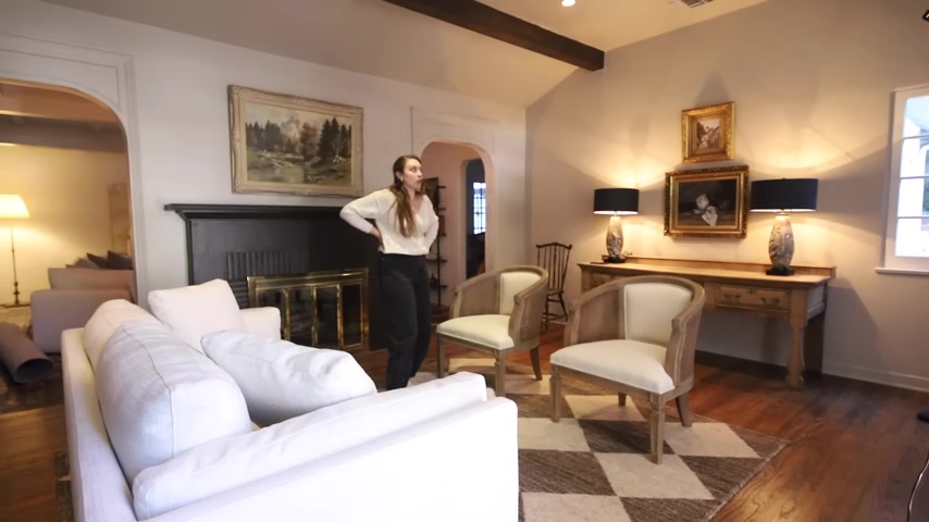
You don't like it ?
No .
You think it looks better ?
Really ?
It looks really busy .
It looks , it calls a lot like the other rug .
Once I put the art up , it kind of like became like a non factor .
Like you didn't even really pay attention to it .
I like the rug .
Maybe not in here .
I think it was , it looks really good in the bedroom .
It really does .
I feel like it's like making like a lot happen .
Like it's , it was worth a shot .
You guys , all the details were really coming together in this room , having the gallery wall up and the art just the art in general is giving so much feeling , you know , to this room .
Um It's , oh my gosh , ok .
Now , now that the gallery wall is up , it has further pushed my gut into telling me that I need to do something with this wall .
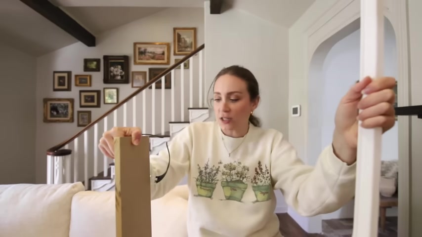
This one , this one something's missing and , you know , I love detail .
You know , I love things that , you know , have a little bit extra and I feel like I wanted to get the gallery wall up to make sure I ran to the hardware store and got supplies for this .
So all the supplies I really needed for this Diy was a half inch MD F board .
You can see that it's about a half inch , it's a half inch thick .
I just got the project panels .
I feel like they're so much easier for me to handle , you know , like big sheets , especially half inch is going to be pretty heavy of NDF , these are already pretty heavy , so they were about $24 a piece for the two by four panels .
And I'm going to cut them into five inch thick sections .
So I'm going to get four pieces out of each board .
And I also got some of this like casing more trim molding .
This is called a casing similar to what we did on the sides .
It's two inches though .
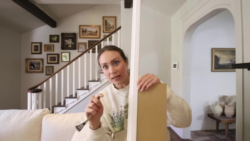
So the inside of the panel is going to be boxed out in this prettier trim .
This is a dollar 44 a linear foot .
Why I chose to make the sections five inches .
I was kind of going back between four inches and five inches .
Yes , I went with a more complicated design because I just think it's going to give me the look that I really want .
Um why I picked five inches is because that's the width of the star design .
So it has some consistency , you know , I kind of like to pick a point of reference .
It's like , what do I already have ?
What are those measurements and how can I use the same measurements ?
To make it all look cohesive and consistent .
We're gonna have a solid piece that kind of comes off of that stairwell straight and then we're gonna have five inches on each side , five inches in the middle .
And then the design , you know , in the , in the center , cross your fingers that I have enough of this material .
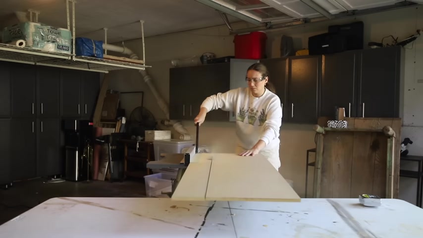
So I'm gonna go outside and cut the MD F to five inch strips and then we'll bring them back in and make the angles and start mailing them in place .
I mean , I don't really know if it's proper to put the , you know , vertical pieces first or the horizontal pieces first because I don't really think it matters .
You're gonna seam everything together really nicely .
So you're not even ever going to see where they join together .
So I'm just gonna go for it .
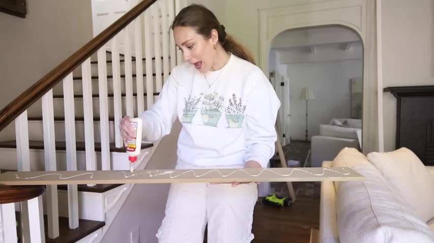
I'm using glue and inch or an inch and a quarter , uh brad nails and my brad nailer to nail them in .
But the wood glue is gonna make it um last over time , you know , this is gonna hold it into place for sure .
But I hope this turns out to be like a really cool detail .
You know , when you go through your house and you just feel like that's missing something .
You know what I mean ?
Like that's just how I have been feeling about the staircase wall .
1719.88 --> 1803.05
This whole area is a little tricky .
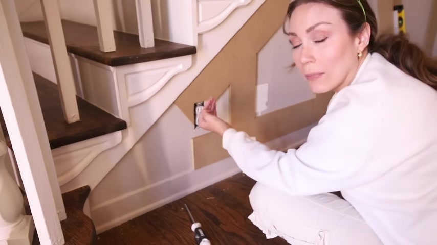
It's even if this continues and then it meets , it's not gonna be very big for the trim because the trim is so large , So it's not really gonna work and then there's a plug .
So I'm thinking about just making all of this solid , just go to solid in this little corner , bump out the outlet with a spacer because you can buy outlet spacers .
So if you're doing this , you can , it's basically just like a border spacer , really like a little plastic border that you can get and you can build it out .
So that then it'll come out to this level , need to build this out and make all of this just solid piece .
Of course , I wanna do this to the most complicated wall in our home .
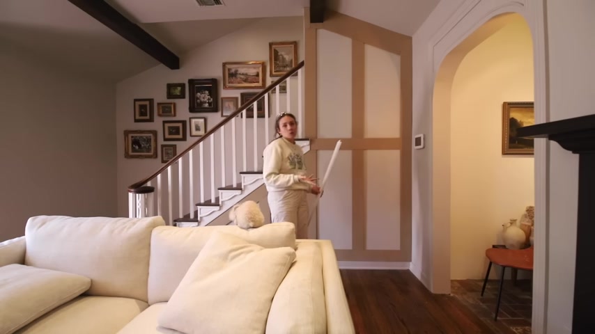
The one with the most angles around a beam , a round of outlet , you know , just all there were so many angles I had to cut .
That's really what took me the longest .
So now this part is up the panel like the , I guess the board and Batton part , I did a similar treatment uh with boards going from floor to ceiling and it makes the room feel so much larger , it makes the ceilings feel taller , it gives this illusion , you know .
And so that is exactly what it's doing in here .
It's making the room feel even larger .
Now , our ceilings in here aren't low , but this is giving so much more like , just like visual , like feeling , you know .
So now this part is up , we've got seam it all , cock it and make it , you know , match like some pieces stick out .
We're just gonna glue and tack these in like that in the top and the bottom .
Kinsley .
How are you hoping ?
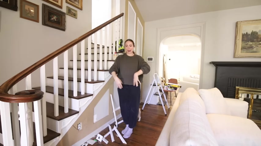
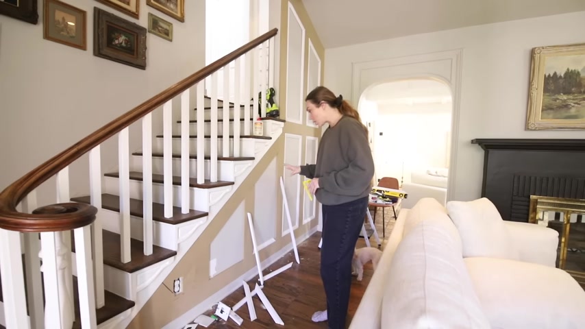
But any time I've ever added trim , it's always been at 90 degree angles , you know , like the walls are straight , you know , windows are straight , baseboards are straight .
Oh no , this was like barely any 90 degree angles .
I had to buy a protractor to figure look at .
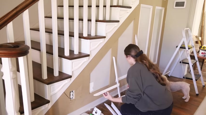
Of course , I bought the inexpensive one because I was like , I don't need a digital or like , I mean , yes , but like whatever this was cheaper , I had to buy a protractor so that I could figure out the angles because there are so many angles on this thing .
Angles here , here , there's a couple of there going down .
These were the only two that were perfectly , you know , like square that I just needed to cut 45 degree angles .
Um Some of the I had to do it by hand because some of these wouldn't even the angle .
I couldn't even get in the minor saw .
Oh , it was an interesting night .
You guys , but I finished it this morning and I got them all cut .
So I got pretty good at it as time went on .
But , but it's already adding so much detail to this room .
I can't wait to just see it .
Like not different colors , you know , like all in the sculpture clay is gonna look really good .
2004.66 --> 2104.26
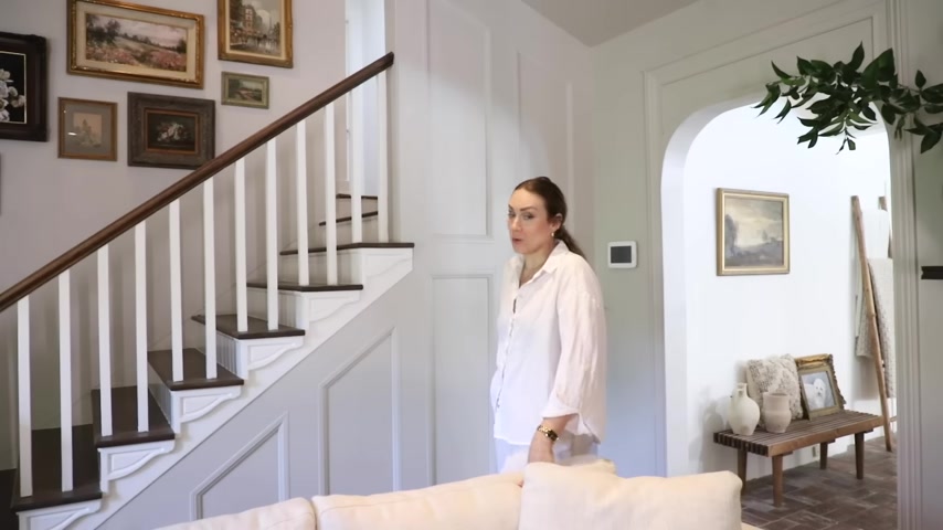
I of course spent way too much time seeming joining all of the different parts and things that all the seams me and a gun , you know , have a really great relationship .
We're very close .
So this adds so much detail .
I did play around with the idea of adding another piece of art to it , but I don't think it needs it .
It just was so much happening with the gallery wall .
It just needed to have some subtle texture .
It does exactly what I need it to do .
So we're gonna add a little bit of decor pieces into here .
One thing I thought and I definitely want to be on the hunt for is a vintage brass coat rack .
I think that it would be great for the entry way .
I kind of have three spots for it if you go here .
Although this is for this from the door , but I felt like a coat rack here would be really cool to kind of block this , I have this chair that we got at the flea market that , um , you know , I just like chairs kind of sitting randomly .
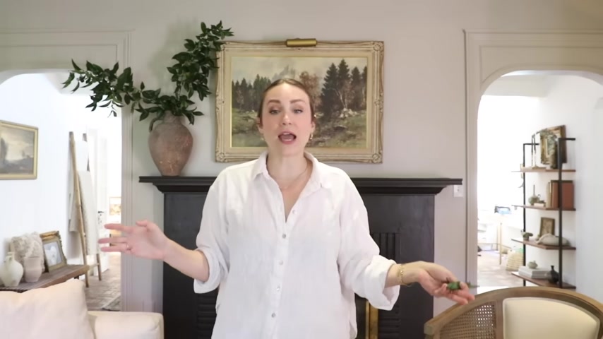
So I put this here , but I thought also a vintage coat rack right here would be so pretty , you know , just kind of in the corner .
We have some spaces for it .
Last night .
I was kind of playing around and I brought some of these pots that I got from all of it in here .
And I was like , oh , I love these .
We don't get near as much sunlight in here to have real trees and I'm not a big fan of faux trees .
So I'm in this weird predicament of , I just need to forage branches when I want it to look really good .
That's literally where I'm at because there's no way a tree or if you have a recommendation of a tree that will like thrive in no direct sunlight , none zero , like thrives in darkness .
You let me know and I have so many other things that we can kind of play with wishing and hoping for years now of a place that I could put this Cloche with matches for a fireplace because we've never had a fireplace before and I finally have one .
It's so pretty .
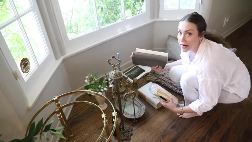
I mean , look how pretty this is with the striker and then you take out the matches here .
Isn't that gorgeous ?
I love the texture .
I thought that this would be pretty on the fireplace .
Some books , I always love books .
I've gotten , I've collected some , like , really good decor and architecture books .
I love to nestle things together , like put them together .
I'm also a more , is more kind of person .
So you'll see me adding a lot more to places .
I love this Cloche because it was tall , you know , tall and textured .
I felt like that was so pretty .
We're obviously not gonna light our fireplace in summer , but come fall and winter .
Just wait , I got this stone egg from a flea market or an estate sale one .
It was just like this is so pretty .
I actually think I got it in Texas .
It brings in that marble stone art organic look that I really wanted in this space like the with the lamps and things .
So I think that looks great .
I feel like that's enough .
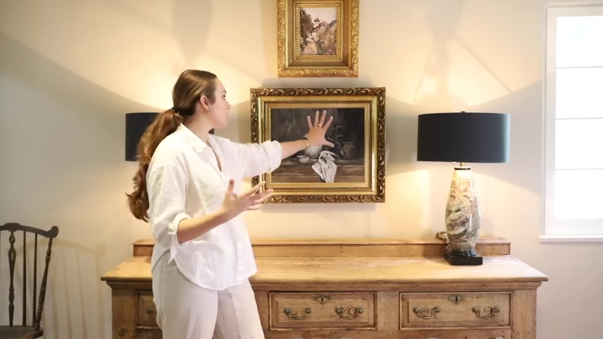
It's actually a bit of few days now since we brought all the art in here , you guys , it brings in so much character and warmth and feeling to it to the space and I love this .
I love that .
My mom's art has like a very special place like she painted me that and I'm like , I was holding on to it for like a really special place .
I mean , obviously we come in and for practical , you know , kind of use everyday use .
We come in and I put my purse here , my keys , things like that so we would need space .
Oh , maybe I have like a tray .
This is perfect .
This goes with that stone look I wanted in here too .
Um and the green kind of really pairs nicely with the lamps , you know , for my keys and things just like when we walk in be a stack .
Oh , I like this like the coloring .
I found some good books at the flea market recently for cheap .
She did not want to take them back home with her .
So she was like , please a dollar $2 each .
It was perfect .
Some flowers from the garden .
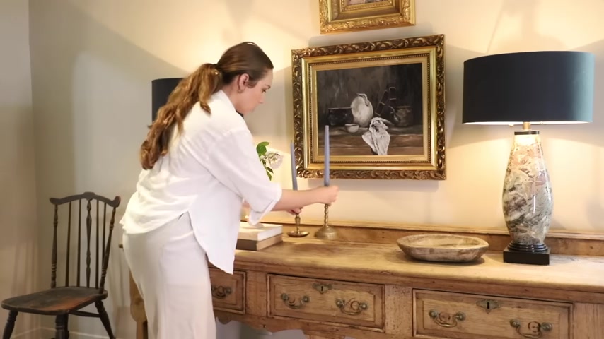
If you've been following along on the vlog on our many flea market adventures , you've been seeing me gravitate towards blue light blue , cornflower blue .
So I love to bring in a color for the season .
They're like the perfect color , like accent color , subtle pop to bring into a really moody room to like make it feel more like summer and spring , you know , just like give it a little bit of , of seasonality .
So in the first episode , we tried two different coffee tables .
One I found that was too large .
It wasn't the right vibe and these , these nesting tables .
And I love these .
They're like perfect .
But I went around to a couple of places to look for stone toppers because I wanted a stone , not glass , couldn't find anything already made .
So we're gonna be on an adventure to actually go to a stone yard to have round pieces cut .
I also found this set that we definitely need to clean up with some brass .
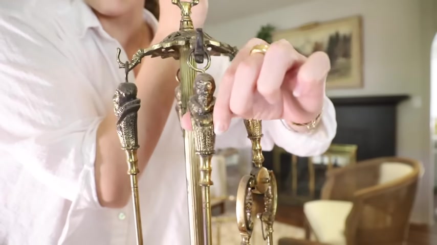
So it's a solid brass fireplace tool set and all the details .
Like look at this guy .
It just needs to be cleaned up and brightened .
So I thought it would be gorgeous right here .
You know , just off to the side , I was looking for a throw blanket that would pick up some colors that are in the rug .
And I saw that there's some like subtle hints of caramel , like a like a golden caramel color .
So I I found this throw look how pretty at our house .
It's so pretty .
It was on sale because they're not cheap .
I thought the chunkiness of it was really pretty .
And then I have this pillow in Texas , not in a lumbar but square and I love them .
So I was there at our house and got this one .
It's like the quality is just like so beautiful , but I thought it would be pretty , you know , like right in the center and I like to put my throes like over the sides , not touching the floor just off and then have it come off this way too .
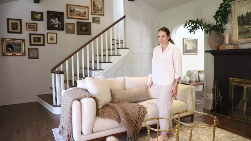
I feel like that looks so pretty , so pretty guys .
I love it .
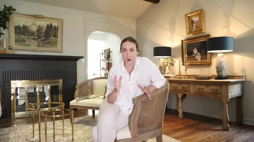
I hope you guys enjoyed this series of making over the very first room when you walk in our home .
It really shows you kind of the direction that I want to take the whole house .
And it shows me the direction that I want to take the whole house .
And just the potential of what adding that character back into the white rooms can be .
There are obviously still a few things that I want to do in this space .
I feel like rooms are never really done for me .
I love curating , even finding things , maybe I'll swap things out , add to the gallery wall .
We need to find toppers for these little nesting tables that I got from the flea market .
I also want to clean them up , like shine up the brass .
I want to find a bench for the bay window , maybe add some curtains and just continue to transform this house into a home .
And Romeo said something to me when I was working on the side wall that made me so happy and I had it all up and I started to prime it .
He was like , whoa , that looks like it's always been here .
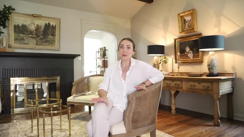
That is like the greatest compliment to me because not only did he feel like it was always there that it really felt like it was part of the house already .
Um But also I did a good job .
Look at it .
Look professional .
That's that , that was my take away uh from that .
But I hope you guys enjoyed it .
We will be doing some smaller projects very , very soon .
I'm gonna take a little bit of a break for my birthday , uh which is actually Friday .
I will be posting regular vlogs , if not even more vlogs through the summer over on my vlog channel .
So make sure that you're subscribed and I will see you guys very soon .
Bye guys .
I love it pretty epic .
Now that it's the most styled room in the house , I kind of want to sit in here all the time .
Do you know what I mean ?
Are you looking for a way to reach a wider audience and get more views on your videos?
Our innovative video to text transcribing service can help you do just that.
We provide accurate transcriptions of your videos along with visual content that will help you attract new viewers and keep them engaged. Plus, our data analytics and ad campaign tools can help you monetize your content and maximize your revenue.
Let's partner up and take your video content to the next level!
Contact us today to learn more.