https://www.youtube.com/watch?v=zfHQdZh2pjQ
10 WAYS TO MAKE YOUR HOME LOOK EXPENSIVE _ DESIGN HACKS
Get it just right .
Let's talk about lighting in those rooms with high ceilings versus low ceilings .
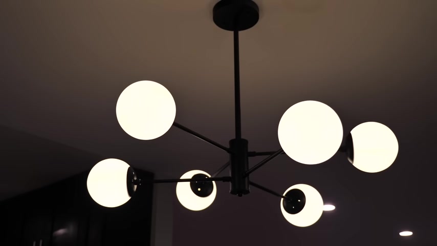
If you have high ceilings , you can start by anchoring the entry with a pendant , installing wall sconces up the stairwell and anchoring the living room with a chandelier , some table lamps , a floor lamp , maybe a pendant over the dining table and single light fixtures over the island .
Here's an example of another space with high ceilings and just the right amount of lighting instead of a chandelier in the living room .
Think about recess light fixtures instead of one central fixture over the dining table .
Think about spanning the layers of light with two identical pendants .
If you have low ceilings in your open concept home , you can layer the light with one pendant fixture over the dining table or the living area and layer the space with floor lamps .
Instead this will help minimize the amount of visual clutter that you see in the space .
Be strategic with your lighting , a single or cluster pendant over a dining table or kitchen island frees up floor space and it's great for down lighting the food underneath use a chandelier to anchor the living room .
So it adds warmth and ambiance .
You can then layer with overhead recess task lights for general lighting , floor lamps to light a reading nook and table lamps to add more lighting to the middle of an open concept space .
A successful lighting design allows your eyes to travel all around the room and land on different surfaces , good lighting , adds a sense of drama and gives the room a moodier feel even if it's an open concept plan and your room flows from one space to the next .
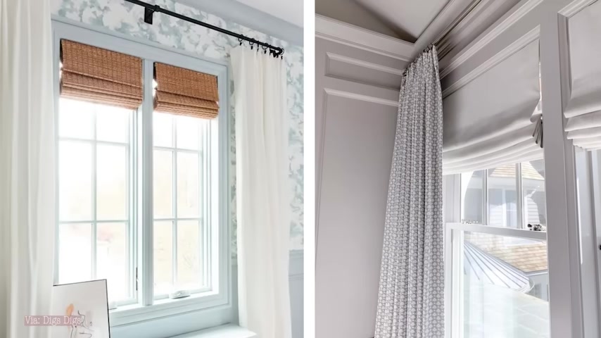
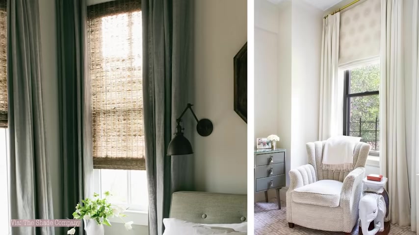
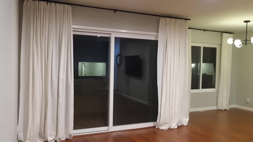
And finally , step eight is to coordinate all of your window treatments .
Now , does this mean that the window treatments have to match or be exactly the same ?
1024.06 --> 1148.25
I'll be dissecting these individual rooms and talk about the things that I like and I don't like about it .
There are some aspects that I find very successful and some aspects I would probably switch up just as a personal preference .
Let's talk about this open plan , studio space , this open plan , studio space is typical in what you would find in an apartment , you enter this space and you're greeted by the kitchen , a small dining area , an open living space .
What I love is that even in the small space , you see the success of layers of lighting , there's two unique pendants over the island , one single pendant over the dining table and the living room is anchored with this beautiful floor lamp on the far end .
This will allow your eyes to travel through the space and all the way to the back of the room .
I love that there are grand , bold gestures of color and pattern .
The small space , it makes it feel unique and dynamic .
You can see the variety of textures , colors and patterns used where orange is the predominant color in the dining space .
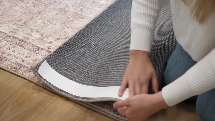
Well , it's pretty much just a large double sided piece of tape that doesn't leave any residue behind and it hasn't ever damaged my floors or anything like that .
So it's the final step I always use when putting down a rug .
It's even great when you're layering rugs so that everything stays in place .
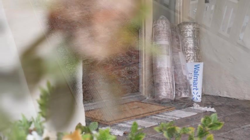
So Walmart is the place to find stylish affordable pieces .
I love that they have two day shipping as well because when I have a decorating idea , I want to get it done quickly .
I've linked all three runners and my favorite rug tape down below in the description box .
You guys can check them out as well .
If you're styling any flat surfaces around your home , always remember to stack your decor .
This is such a designer trick and it goes a very long way anyone can do it and it will instantly make your space look designer and luxurious .
Even if you're using very affordable decor , it's all about stacking two or more Decor pieces and this is all about stacking things that are different sizes and different shapes .
I love how the dining area is defined by a difference in wall paneling when everything else is predominantly white , the single dining area is clad and wood paneling .
The space feels open , bright airy , yet still warm and inviting .
Let's talk about the key aspects in the open concept plan of this Lakeside home .
I love that the living room makes great use of space .
You see that the main sofa is spaced directly across from the focal point and the love seat and accent chairs float in space to help ground the room notice how the seating was specified in a variety of different colors , upholstery fabrics and framing .
You have a leggy love seat over here , a fully skirted sofa in the middle and low profile accent chairs .
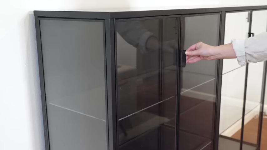
This works for dressers , sideboards , store cabinets , glass cabinets , anything that has a completely flat side so that you can put two pieces together and get a large look instantly .
You can save a ton of money this way and get the look of a very luxurious piece on a budget .
I even finished off my friend's cabinet with a little decorative box on top that helps hide that seam down the middle so that it looks like one seamless piece .
So if you're seeing those gorgeous large sideboards and huge coffee tables , and you want to get that same on a budget , push multiple items together and that will give you that exact same look for less .
If you want to make your dining room look more expensive , look more designer and lux make sure that you coordinate the size and shape of your dining table with your light fixture .
If you're hanging a chandelier above your table , make sure that it matches that same overall shape of your table .
So you don't disrupt the view .
The overhead lighting on the dining table is minimal yet still very unique and different for this space .
The kitchen is the wow factor .
You'll see that the back splash is textured and runs all the way from the countertops to the ceiling .
This helps draw your eye back into the space and up towards the beams of the lofty ceiling .
You can see that this is a lakeside home , but there's no need to let your environment dictate the mood and vibe of your space .
If you have a beachy property , that doesn't mean you have to decorate in all whites and blues and greens unless that's a vibe that you're going for .
Just do what you love .
Lastly , let's dissect the studio apartment floor plans .
So I can help you determine the size of living room , furniture and dining tables that you can fit in the space .
The appeal of an open concept floor plan is that it's a large and area room .
It's a place where the entire family can still go about their individual business but feel connected and together .
When you get an open plan design , right , you'll have more space cut down on having a weave from room to room and increase the natural light , which only adds to the appeal .
But when you get it wrong , you risk having a disordered and cluttered space that's far from warm , comfortable or inviting .
Before you start to design your awkward open concept floor plan .
Do some research , get some inspiration and think about your overall goals for the space .
If you need more tips and inspiration on how to design your open concept .
Floor plan , definitely check out my how to create your Dream Space series .
I help you design parts of your home , either room by room or if you're starting from scratch .
That's it for this video .
If you like this type of content and you're enjoying The Awkward Space Solution Series .
Give this video a thumbs up , comment below and let me know if there are any other awkward spaces that you would like for me to help you resolve .
We will be back with more awkward space solutions .
And this time I want to hear from you this new portion of The Awkward Space Solution Series is really meant for my long time viewers and subscribers .
So make sure you're subscribing to my channel if you haven't already and hit that little notification bell to be notified of new videos that we drop every Tuesday .
Thank you so much for following along the Awkward Space Solution Series .
I will see you next week .
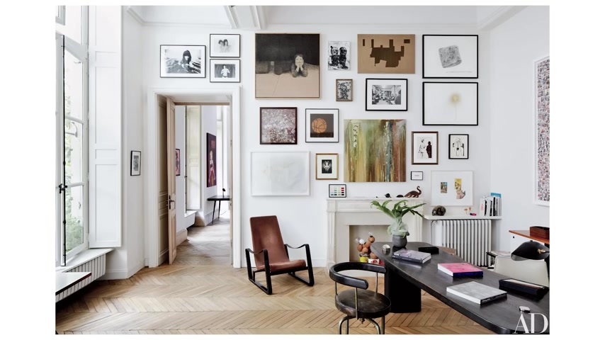
They kind of add a little bit more contrast and they just create this uniform look in your home .
If you're hanging a bunch of different artwork , maybe there are different colors or different styles .
You can create some kind of uniform look to your gallery wall with the matted frames so that everything looks very similar , but it's also different .
At the same time , there's even some great frames out there that have more unique mats in them that are maybe asymmetrical or large mats that really shrink your image size so that you have more white around the outside .
It's just a different style .
It adds this really clean look to your home and it's something you can try out if you want to go for something a little bit different .
Now , something that every space needs large or small is a little pop of grease .
Every room could use some life through plants , branches stems , flowers trees , some kind of green element in every space will absolutely bring it to life .
You can do this with faux greenery , faux florals .
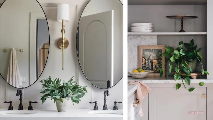
There's so many incredible options out there now that look extremely luxurious and will add such a designer touch to your space .
So bathrooms , kitchens , living rooms , dining rooms , hallways , entryways , every room could use some and it will add that designer touch without putting in much effort at all .
Sometimes room designs don't look as luxurious if they don't have enough soft elements in them .
If everything is hard and solid and shiny , it's not going to give a very warm cozy inviting feeling .
So I think every room needs some soft furnishings , pillows , throw blankets , rugs , curtains , ottomans .
This is why runners in kitchens work so nicely because they add that soft detail in a very hard solid space .
Also throw pillows on sofas , if you have a leather sofa or something , a little bit more modern looking , adding throw pillows really softens the look of those pieces and makes them feel more approachable , welcoming and comfortable .
So you can add soft furnishings and soft decorative details in almost every room of your home .
And it's actually going to elevate your space even more .
All right .
So that's it for today's video .
I hope you guys enjoyed watching and I hope this gave you some ideas that you can start implementing into your .
Let me know down below in the comments .
Which one of these decorating tricks do you think you could really use in your space ?
And if you missed the last makeover project ?
Definitely go check out the apartment makeover .
There's a ton of ideas in there that are really going to help you elevate your space as well if you enjoyed watching and found this video helpful , make sure you give it a big thumbs up and hit that like button and make sure you guys subscribe to my channel so you don't miss the upcoming videos .
Click that red , subscribe button down below and make sure you guys have my notifications turned all the way on .
So you're first to see the next video .
Love you guys so much and I'll see you in my next one .
Bye .
Are you looking for a way to reach a wider audience and get more views on your videos?
Our innovative video to text transcribing service can help you do just that.
We provide accurate transcriptions of your videos along with visual content that will help you attract new viewers and keep them engaged. Plus, our data analytics and ad campaign tools can help you monetize your content and maximize your revenue.
Let's partner up and take your video content to the next level!
Contact us today to learn more.