https://www.youtube.com/watch?v=8oLRnEJpF9Y
10 THINGS YOU SHOULD STOP DOING TO YOUR HOUSE _ THE WORST INTERIOR DESIGN MISTAKES
Hi , everyone .
My name is Arvin Olano and welcome to my youtube channel .
So nobody asked .
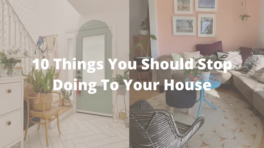
But in today's video , I am sharing 10 things that you should stop doing to your house .
And don't worry if you're already doing some of these mistakes , I'm going to be sharing my top tips and tricks on how you can fix them .
The first thing they should stop doing to your house is hanging mirrors that look like windows .
Ok .
Who are you trying to fool ?
You are not fooling anyone with that girl .
We know it's not a real window and I get it .
You might have a space or a room that doesn't have much light or windows .
I actually was searching on Instagram for inspiration for this video .
And when I'm telling you , I saw so many photos of fake windows girl .
No , no , no .
OK .
Instead of hanging a fake window , go ahead and just get a beautifully crafted mirror .
This will not only open up the space and give you that effect that you're looking for of bringing in more light , it looks like there's a window there , but it's actually thoughtfully designed .
It doesn't look kitschy .
It doesn't look , you can't go wrong with a simple and elegant mirror .
You can even go for something that's round , something abstract in shape or a beautiful gilded style mirror .
I'll link some of my favorites down below that are super affordable .
I actually found them on Amazon recently .
The next thing that you should stop doing in your home is Matchy .
Matchy accent colors .
This is when you pick maybe like a red accent wall and then you have a red accent pillow with the exact same color and then you have like a chair next to it .
That's in the exact same color .
No , OK .
Do not do this to your homes because there's just no transition color that's happening in between ladies .
I want you to think about when you're doing your eyeshadow .
Right .
Let's say you're gonna do like a purple smoky eye .
You're not just going to put a bright purple eye shadow on your lids and call it a day .
Ok ?
We don't do that .
You put a transition color in the middle , you put the darker color in the outer corner and then you put a highlight in your inner tear ducts , right ?
And you blend them all together .
You do little windshield wiper moment , right ?
Because you want those colors to blend seamlessly and you want it to have that smoky effect .
You want to think about the same concept for your home , especially if you're doing an accent color .
You want to blend your colors together .
Ok ?
You don't want just a strong color on one side and the same matching color in the end , you want something in between to blend them together when you do something with color and you do it right .
It can look really good .
So don't think I'm like hating on color .
I think just most people get it wrong .
So the next thing that you should stop doing to your home is trying to make it look like your favorite show rooms .
Ok .
Just , just stop .
Let's just stop it right there .
A showroom is not a home .
Nobody lives like that .
If you're watching this video , you're probably like a regular person like me and you don't live in a showroom .
Showrooms are meant to give you inspiration and give you ideas .
Do you really want to have your guests come to your home and say , wow , your house looks like a pottery barn or do you want your guests to come and say , wow , this is Arvin's home .
This is so beautiful .
You tell me , OK , and the easy way to fix this issue is to stop buying all the things that look like .
It's from a singular showroom mix and match your pieces .
There is an endless amount of possibility of getting inspiration , furniture pieces decor than just one showroom .
Life is more than just making your home look like a pottery barn .
The next thing that you should stop doing to your home is overloading that texture .
I'm speaking to design styles other than boho and eclectic .
And if you have those styles , you can do whatever you want , you can have your textured rug , you can have your tapestries .
But if you're not any of those two styles , there is such a thing as too much texture .
Texture adds this like tactile element , right ?
When you see something that's textured , you want to like touch it .
But if you have like a shag rug and then a tassel pillow and then a tapestry pillow and then you have like a woven pom pom blanket , right ?
There's just a lot of texture happening and there's no balance .
It looks very heavy on the eye , but think about match something that has a smooth surface with something textured .
You don't want it to just be heavy all the way throughout because it just could look a little messy .
What do you want ?
What is it ?
So the next thing that you should definitely stop doing to your home is painting those accent arches .
You know what I'm talking about ?
OK .
You might have seen it on tiktok , you might have seen it on Instagram and I get it if you're painting an arch over your headboard or your bedroom , right ?
Because you get that like effect of an arch headboard .
Those are OK , like I'm not mad at those , but I'm seeing them now everywhere they're in the dining room they're in the TV room literally where your TV is and it just , it just feels very disjointed and I , I see where you're trying to go with this accent wall .
You want to do a little color , you want to add maybe like an illusion of an architectural detail .
But the issue that I'm having is now that it's becoming like super trendy , people are kind of going kind of bananas with this trend .
They're painting arches everywhere where it doesn't belong .
I've seen arches painted over like a door and it doesn't look good .
You guys , it just does , does not look good .
If you want to add an arched element to your room , do it with a mirror , do it with a furniture piece , maybe do it through accessories .
Don't just paint random arches into your homes , you guys , because sometimes it just doesn't make sense .
It doesn't look good .
Ok .
The next thing that you should stop doing to your home is over decorating your surfaces .
I get , you're trying to get like maybe a cozy vibe by having layers and textures .
I get that .
I love a good cozy moment .
But when you're decorating , you want to think about that visual breathing space .
If there is decor and clutter in every square inch of your surfaces , it's just gonna look messy .
It's gonna look unintentional and an easy way to fix that is to follow the rule of threes .
This is a go to decorating tip any time I'm doing a vignette when you're pairing your objects together , pair them in groups of threes , think about three different height levels .
Ok .
Three different textures maybe .
Or you can even keep three similar looking items , but just make sure they're different heights .
That way your eyes are looking at something visually interesting .
And when you are looking at that surface space out your decor , you don't want everything to be smashed together because then it can look cluttered .
If there's at least some space in between your decor , you're creating this breathing room , you're creating this negative space for your eyes to be like , ok , I'm seeing some Decor .
It's nice and then there's some Decor over there and trust me , it's going to instantly elevate your space .
It's not gonna look cluttered , it's gonna look designed , it's gonna look chic , it's gonna look expensive .
So stop putting Decor on surfaces that just don't need them .
Ok ?
Just stop it , just stop it .
The next thing that we all need to stop doing to our homes are themed rooms .
Ok ?
We don't need a beach house sign .
We don't need sea shells .
We don't need the farmers market sign when you're doing a themed room don't go overboard because it just , it doesn't take a genius to be like , ok , I'm in a coastal space or ok , I'm in like a farmhouse space .
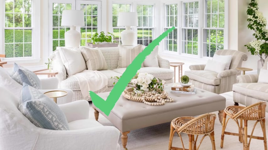
You don't need to overload on the accessories , but instead think about just a nod to coastal .
So maybe you're taking inspiration from the colors of the ocean , right ?
And maybe you have like a hint of a seashell or a vase that looks like a seashell .
Let's make it more modern , I think themed rooms are cool when done , right ?
And in moderation and the way to do that is to really just pair it back all the way .
The next thing that we need to stop doing to our home is buying fake scented products .
What I mean by that is like a candle that smells like apple pie .
Ok , let's stop going to a Yankee candle and buying those scents .
They smell cheap .
They don't smell real , they just like they're very artificial , right ?
When you think about your home , you want it to smell elegant and sophisticated , luxurious think of scents like like eucalyptus , Ylang , Ylang rose , those really natural beautiful scents .
One of my favorite ways to send a home is a diffuser .
This one is by , it's one of my favorite things .
It's actually their new um cordless diffuser .
So I can literally like walk around my house and sent the entire home and look how strong this is .
Do you see all of that ?
Um I'll link this down below for you because it's one of my favorite new things .
I also have a code you can save 20% off and then my favorite essential oil is Santal .
It's a very luxurious like hotel like scent and I'll link it for you as well because it's , it's b now if you don't like diffusing , I have a candle favorite .
That's super affordable .
Also a santal scent .
It's like $20 on Amazon .
I got you queen .
I'll link it down below for you .
That way your homes can smell beautiful .
It feels sophisticated , like , like an adult lives here .
The next thing that we should definitely stop doing in our homes is overcrowding .
Our sofas .
I'm seeing this all over social media .
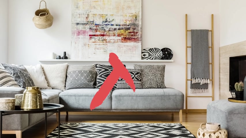
The sofa is beautiful but there are tons of square pillows and they're all the same size girl .
That is not how you layer your pillows , make sure that your pillows are kind of like facing a 45 degree angle .
You don't want it to be like this , right ?
Like what am I supposed to do with that ?
I'm it's gonna be so uncomfortable if I try to sit on it like that .
You want it to be at an angle like that .
That way your sofa doesn't feel crowded , it doesn't feel fussy .
Stop buying the same exact size pillows .
I'm seeing it all over Instagram .
You guys , it's driving me nuts , it's driving me crazy .
So next time you're doing your pillow plan , make sure you work your way from the back to the front , the largest in the back , smallest in the front .
Ok .
It's like taking a nice little school picture .
The tallest people always go in the back and the shortest people like me go in the front where we can all look pretty .
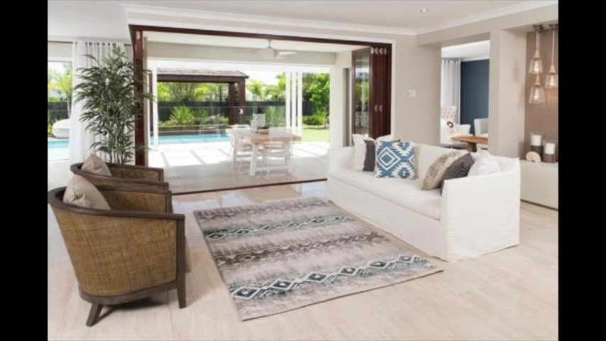
So the last thing that you need to stop doing to your home is buying the wrong sized rug .
Rugs are crucial for any space .
It's probably the largest piece in your space other than your sofa .
So you want to make sure you get it right when a rug is too small , it just dwarfs your space .
It feels like your furniture is just kind of like floating on the floor .
Let's think about it this way , your rug is like a little resting point for your furniture .

They all need to be on it .
When it comes to rugs .
You just want to make sure that you're measuring out your space , right ?
Get your painters tape and the bigger the better , right ?
Am I right ?
All right , everyone .
That was it for me today .
Thank you so much for watching .
I hope you enjoyed this video and if you did make sure you sound off in the comments down below and if you disagree with any of these things , let me know .
I love chatting with you in the comments .
Don't forget to hit that subscribe button before you go and I'll see you in my next video .
Bye everyone .
Are you looking for a way to reach a wider audience and get more views on your videos?
Our innovative video to text transcribing service can help you do just that.
We provide accurate transcriptions of your videos along with visual content that will help you attract new viewers and keep them engaged. Plus, our data analytics and ad campaign tools can help you monetize your content and maximize your revenue.
Let's partner up and take your video content to the next level!
Contact us today to learn more.