https://www.youtube.com/watch?v=GzQzUu7Ovuk
10 Home Decorating Rules that changed my life!

If you want to level up your home decorating , these 10 decorating rules will absolutely change your life .
Hey , there , it's Christina from the Diy mommy dot com .
Our first home was an 880 square foot garage that my husband and I lovingly diy with the skill set we had with the budget we had and turned it into a home for ourselves and our little family .
However , 17 years later , I feel like I have learned so much about interiors design about home decor just by doing it and renovating so many rooms and spaces and homes that I wish I knew then what I know .
Now today I want to share with you my 10 most favorite home decorating rules that are definitely going to make your home look so much more inviting .
So let's get started .
Rule number one is to use properly scaled furniture and accessories and by properly scaled .
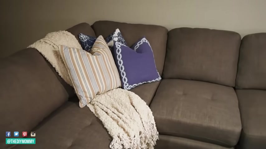
I mean , if you have a nice large room with really high ceilings that feels nice and open , you can get some bigger scaled furniture .
So maybe a large sofa , a very big sectional , make sure it fills up that space nicely .
However , if you have a smaller space , like a lot of us do with maybe some lower ceilings , not as much square footage .
You want to make sure you purchase a piece that makes sense for that space .
So maybe instead of that giant sectional , you're gonna want to look for a smaller set , a chase lounge , maybe a love seat or more of an apartment sized piece of furniture .
If you have a piece of furniture or even an accessory , that is just too large for the space it's in , it's going to make your room feel really disjointed out of place and not very cohesive .
You're just going to feel like something is off .
Plus you're not going to have the proper pathways for people to walk around the furniture and in and out of your space .
Also , when choosing pieces that go together , for example , you want to choose a piece of art to go over a side table or an entry table , you want to think about the same thing .
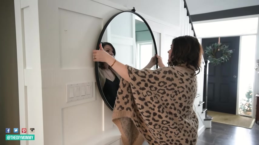
If you have a larger entry table , you want to think of a larger piece of art or a mirror on top of that , rather than a smaller one , you want to make sure that you have the same sort of visual weight on the bottom as on the top and that's going to make your space just feel more designer and better put together .
Rule number two , strive to achieve balance in your home decor and by balance , I don't necessarily mean you want to keep your Home Decor symmetrical and by symmetrical , you don't have to have a design that is completely mirrored on one side to the other .
You want to make your Decor feel balanced by using what's called visual weight .
So an idea of achieving balance through symmetry , this one is a little bit easier .
So this is the one I would recommend to you if you're just getting started with interior design with Home Decor and that's basically mirroring a design on one side to the other .

So on a Mantel , for example , you would put a large piece of art or a mirror in the middle and then decorate either side of the mantle exactly the same with the same candlesticks and maybe the same plant on either end , you achieve a balanced look by keeping everything the same on both sides of that Mantel , asymmetrical is a little bit harder .
So that means you don't necessarily have an exact mirror design .
Maybe you have the Mantel example .
Again , you have a larger piece of art slightly off center , you balance that by layering a smaller piece of art on that .
And then either side of your mantel maybe isn't exactly the same , but you have a bunch of smaller items on one side and you balance that by using some larger objects on the other .
So the visual weight of several smaller objects versus the visual weight of one or two larger objects , balances each other out decorating .
Rule number three is repeating elements , use repetition to bring order to your space .

I find it so amazing how you can make a whole home feel so much more cohesive by just repeating either a color , a texture or a shape over and over again within your home .
And it doesn't have to be on the nose .
I did kind of an on the nose version of this when I decorated our little lake house , I use lots of vintage and antique ducks everywhere .
So we have those , you know , everywhere from the kitchen countertop to in the bedroom .
That's a very obvious repetition example .
It can be more subtle than that .
So maybe you want to choose a color like metallic gold or a brass and you just want to repeat that color a few times throughout your home to make it look cohesive and balanced .
I find that repeating an element about three times in each room is about the perfect amount .
So if you're going with that brass example , maybe in one space , you have brass candlesticks , a brass mirror frame and a brass picture frame and repeating that three times is going to make everything look like it goes together .
Rule number four , create a distinct color palette for your home .
I am a huge lover of color .
As much as I love white walls .
I really love to add colorful accessories and furniture into my space .
And I have learned that it is extremely important to really define that color scheme for your room makeover for your home decor .
Before you even start , I like to refer to the color wheel .
When planning out my home decor color schemes , I will be a link to a free principle of the color wheel that I have for you .
Link that down in the description box below .
Essentially , there are three different color schemes you can go with for your home Decor when it comes to the paint accessories , furniture , et cetera .
The first one is called monochromatic and that's when you just choose one color and you can choose shades of that color and just use that color only maybe paired with some neutrals like white , metallic brown , black in your space .

This is a very minimalistic calming look and it's really easy to pull off the second color scheme you can choose is called analogous and that's when you choose two colors beside each other on the color wheel .
So for example , blue and green repeat those colors with a neutral thrown in throughout your space .
This also creates a common look , but it's a little more interesting than going solely monochromatic .
And the third color scheme you can choose is what's called a complementary color scheme .
That's when you choose two colors or two shades of colors opposite each other on the color wheel .
So red and green or just more subtle shades of those pink and mint green .
One of my favorite color combinations using this complementary color scheme is a little bit more exciting , more fun .
A little bit bolder , fresher .
And you can also pair those two colors with a neutral .
I also love this trick .

It's called the 60 30 10 rule where if you're using three colors or two colors and a neutral color , you choose a dominant color to use in about 60% of your space .
So usually I would choose a neutral like white , white walls , for example , and then choose a secondary color to use in 30% of your space .
So maybe I want to use some green like these green appliances in our tiny lake house and then 10% of your space can be a secondary color maybe with some accents using this 60 30 10 color rule , I feel really makes it easy to combine colors in your space rule .
Number five is use an abundance of textures .
I feel like this is usually the one thing that's missing when people are finished their space and they don't really know kind of why it isn't feeling cozy or inviting .
It's usually because there's a lack of texture , especially if you go for more of a neutral or monochromatic color scheme .

You want to add a variety of textures in your textiles and your furniture , maybe even in your wall coverings just to give your space more interest .
So some textures , you can look for are smooth textures like metal and glass .
You can look for bumpy textures like woven baskets like nubby blankets , go for furry textures like a faux fur blanket , a faux fur pillow and then maybe even some rough textures like some wood or some stone .
And if you add all of these together , you're going to create this very interesting cozy and developing feeling space .
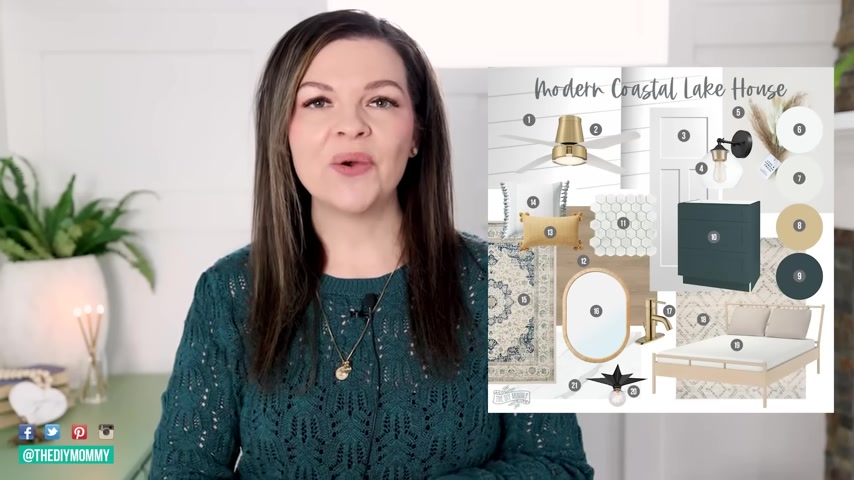
What I like to do to see if I have enough color and interesting texture in my space is create what's called a mood board .
So you can use a program like Photoshop or you can use a free site , like can to create a mood board .
Just a little graphic , you can make a square one pull in the paint colors that you might want to use the accent colors and then just copy and paste photos of maybe some furniture and accessories you want to use it all into this image .
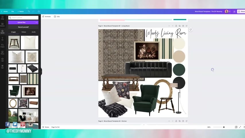
And when I pull everything in there , I usually see if there's maybe a lack of texture or a lack of cohesion with the colors .
And then I know how to keep going with my room makeover and maybe if I need to source some different items .
Speaking of mood boards , I am so excited .
I launched my first mini course and template pack .
So I have a whole template pack of Can a mood board template for you .
Plus I have a little mini course on how to start your CAVA account , how to create your mood board , how to source items for your space and how to pull everything together .
In one graphic .
I think creating a mood board is the best first step you can make to creating the room makeover of your dreams .
So this was an idea that I've had for the last few years to put together this template pack and this mini course because so many people have been asking how do you do your mood boards ?
Well , I'm gonna show you , I'm gonna walk you through it .
You're gonna get templates sent to you by taking this mini course and grabbing these templates .

You're gonna really , really start putting together that mood board that's gonna launch you into the room makeover of your dreams .
So I will leave a link to that down in the description box below and let me know what you think decorating .
Rule number six is establish a clear focal point .
This has been a fault of mine in the past because I do love decorating .
I do love stuff .
I do love interesting aspects to a space .
However , when you're decorating , just pick one focal 0.1 thing that the eye is going to be drawn to immediately in the space and then everything else to complement that focal point , some focal points are obvious .
So for example , in our living room , the fireplace is the obvious focal point .
It's darker than the rest of the space .
It's big .
We have a beautiful mantel .
So that's where I want to decorate first and I want everything in the space , the furniture , the rug , the accent pieces to really complement that fireplace and not take away from it .

If I had another piece of giant dark artwork in the space , it might make it a little bit confusing to know where to look .
1st .
2nd , 3rd , et cetera in some rooms , there's not really an obvious focal point yet .
So then you as the home decorator have the task of making one .
So whether you do it with a big piece of diy artwork , maybe with some statement drapes that are very floral or have an interesting color or pattern to them .
There's lots of ways to create that focal point in a space to really draw the eye home decorating rule number seven is make sure you lay out your space first before you even touch it .
And by that , I mean , it's a really good idea to put together a floor plan for your space .
It doesn't have to be fancy .
You can just do it with a pencil and some graph paper .
You can print out free graph paper online , just Google free graph paper principle or you could even use a program like floor planner dot com .
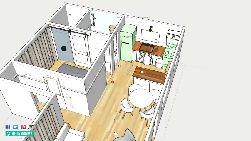
That's the one that I recommend if you are new to using the computer to design spaces or if you want something that's a little bit more , more tricky , but there's a lot more options to it .
I use sketchup dot com .
So floor planner dot com , a little bit easier sketchup dot com .
A little bit harder , but has more options when you design your floor plan first .
And I mean , lay out your room , the dimensions of it , put the furniture that you want in there with the same dimensions as the furniture on your mood board .
You're going to see if it's gonna work or not .
And so many times I have not laid out a room .
And in my mind , I know the dimensions of the room and I purchase things and they're the wrong scale for the space or I don't leave enough room for walkways in the space .
So if you lay it out first on paper or on the computer , that's going to save you so much hassle later on as you do this layout too , it's going to help you nail down maybe the focal point for your space , what it is or what you can put in the pathways that people are going to use .
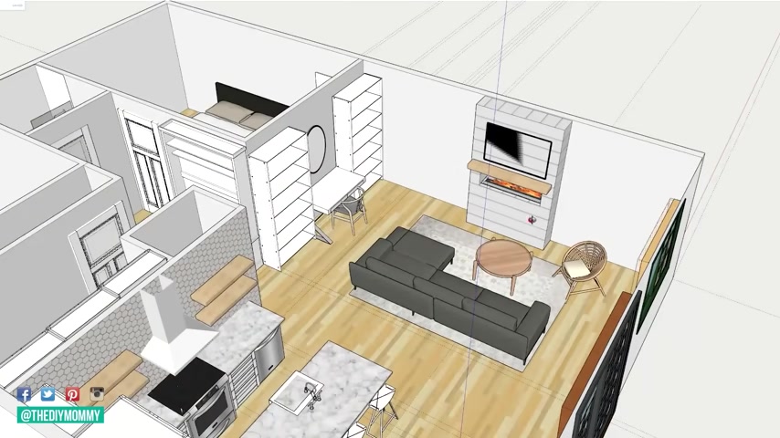
Maybe where you want to place a conversation area in the room where maybe you want to put some appropriate lighting in the space .
If you know where people are sitting , where could you put a floor lamp and the appropriate seating for your room ?
So whether it's a large sofa , small sofa , a set of accent chairs , et cetera .
Rule number eight is sourced from a variety of places .
And what I mean by that is don't just go to a big box store and you know , have a look at their showroom and buy the set of furniture and plunk it in your space .
That's gonna make your space , just look like a big box store .
So a way to make your home look a little bit more unique , more more collected is to look at a variety of different unique sources when finding the furniture , the accessories and all those little things you want to add to your space .
So of course , you can go to a big box store , buy a piece or two from there , but don't forget to look at the thrift store .
Think outside the box , think about if you could paint something or restore something , go to garage sales , go to antique stores .
Look on Facebook marketplace , pull all of those pieces or photos of those pieces onto your mood board .
See how they kind of converse with each other and match and then go from there that's going to give your home this more collected look just more interesting and so much more unique to match your personality home decorating rule .
Number nine , the little details can make a big difference .
So those little things that you might not really think about or you just don't take enough time to choose like the little knobs on your cupboards , your door knobs hinges smaller accessories , hooks on your wall , those can really add to your space .
So think about that rule about repetition , right ?

If you wanted to make your home feel more cohesive , choosing brass colored knobs , for example , to tie in some brass colored accessories and the rest of your home is going to make your home feel more cohesive , more high end and better designed .
Yeah .
Rule number 10 and this one is so important .
This one can go poorly if you don't actually follow .
It is make sure that you sample paint in your room .
Don't just choose paint by the paint chip .
Ok ?
I have done this in the recent past and it magically worked out for me , but I promise you , it usually does not work out to choose paint based off the chip and not sample it in the wall on your home .
Paint is gonna look extremely different in your location with your lighting and your exposure than it does on the tiny little chip in the store .
What I would recommend is grab a sample pot of the paint color that you want to try .
Usually around $5 each .
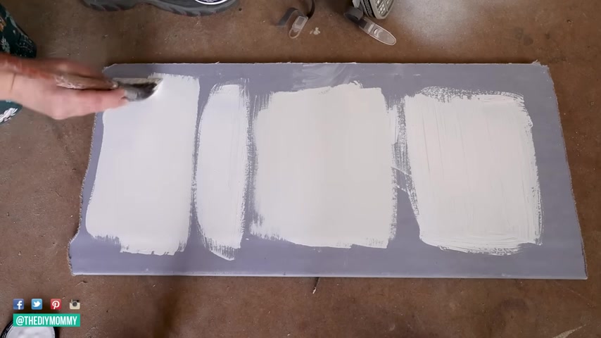
Grab a big piece of bristle board at least 3 ft by 3 ft or even 2 ft by 2 ft is a good size paint .
That whole piece and then tape it up on your wall .
You want to tape it up on the wall , you're actually going to paint , sit and stare at it , analyze it for at least a few days .
You want to see it in the morning , afternoon , evening , you want to see it with sunshine , you want to see it with your interior lighting and that will give you a far better idea of how that paint is going to act in your space .
You might be surprised at how differently the paint looks in your actual home than it does at the paint store .
Thank you so much for watching today's video .
I hope you found these 10 decorating rules helpful .
They certainly helped me over the past years become a much better home decorator and I'm just so much more happy with how my rooms turn out .
Don't forget to check out the description box below .
If you're interested in purchasing my new mood board , kind of templates pack and my mini course .
I will leave a link to that down in the description box below .

If you like this video , please give it a thumbs up , subscribe to my channel for more Diy and decor ideas on the budget .
I'm going to leave some more videos that I hope you will enjoy watching next right up here .
Are you looking for a way to reach a wider audience and get more views on your videos?
Our innovative video to text transcribing service can help you do just that.
We provide accurate transcriptions of your videos along with visual content that will help you attract new viewers and keep them engaged. Plus, our data analytics and ad campaign tools can help you monetize your content and maximize your revenue.
Let's partner up and take your video content to the next level!
Contact us today to learn more.