https://www.youtube.com/watch?v=RfYc0BUqkMs
Living Room Apartment Makeover • Laying Out Furniture Tips & Decorating Ideas
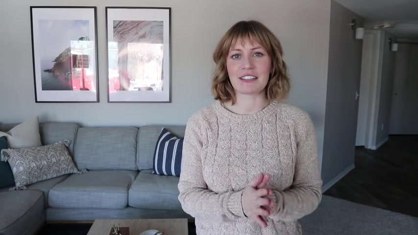
Today we're in my sister's apartment .
As you can tell by the backdrop , I am in a different location .
I helped her makeover , her living room and dining , not with article .
So this video is in collaboration with article as you guys know , I love article and have used them before and a lot of my videos and room makeovers .
So I'm happy to be working with them again and I'm going to give you a tour around Kimberly House and show you a bit of , you know , some of the concerns that were in this area and kind of the living and dining area and some of the design hurdles that we had to overcome to make the space function look nice and fit her like aesthetic and vibe .
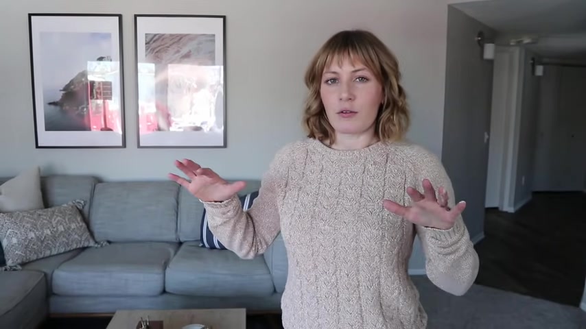
So this apartment is an old apartment but relatively like recently remodeled .
And it's kind of more like builder finishes , like builder grade finishes .
So the walls are beige , it just says brown beige carpet .
Um and then kind of like a linoleum , I guess they did , I feel like a little bit more trendy in the kitchen or maybe more timeless and they did like a , a darker kind of gray brown line lamb type of flooring and then she has white cabinets and a black um countertop .
So in the kitchen , it's pretty uh classic where the like design struggles mainly were in the living area .
And the reason for that is because this space is not just a typical rectangle , I think because of the way the building is and built it , all the apartments have these really cool kind of bay window , bump out areas which are beautiful but can be a bit of a hurdle design wise , figuring out how the heck do you lay out furniture in this the living room ?
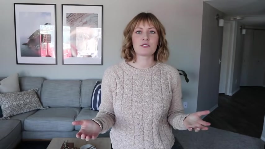
So this living room has to act as a place to relax , watch TV , over here to my left and then also to be a space where you can entertain and have friends and family over .
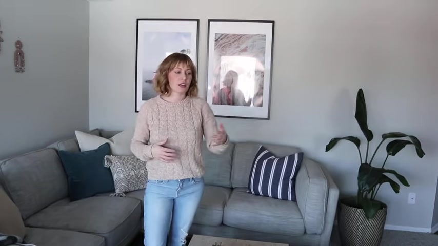
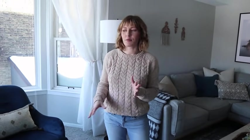
So we started with this beautiful sofa from article it is a more traditional L shaped sectional and this fits perfectly in the corner of this apartment .
This is really the only two like walls like this .
So it made a lot of sense to use a um sectional in this corner versus like a , you know , standalone , a sofa with like chairs , maybe it'll make more sense as I kind of walk you around this room and you get kind of a vibe .
But the section of it really helps to kind of anchor the space to create an opening to the rest of the room out this way because off to , you know , kind of over there is the kitchen dining area and then off to that side is that bay window that I was talking about .
And then just this way is the um TV .
So by placing the sectional off into this corner like this , it keeps it really open and inviting to the rest of the space .
So that if you were to have friends and family over , it's really easy for people to kind of mingle from the kitchen , dining area often to the living room and nothing feel like closed off or uninviting .
And it also makes it very , very comfy and cozy place to watch TV .
But you can also get a view out all of their amazing windows in this apartment .
So being going it with an L shaped sectional , we decided to use a square rug underneath the sectional .
Um just because it felt like it would ground this sectional a bit better and we weren't going to be floating more furniture off of it .
So a rectangular rug would have kind of jetted out a little bit too much .
So we stuck with a square rug underneath this sofa and then we anchored it with a coffee table with a rectangular coffee table .
It has some drawers in it , which are great for storing things like remotes and stuff out of site .
And then it leaves for a nice surface for drinks and you know , things that you want to put onto a hard surface .
So then over here , this is where it gets a little interesting design wise .
This is that bay window while it is beautiful and it just , it can be hard to figure out how to lay out a space like this .
So we grounded the room .
This is kind of the main focal point of the living room over here at the sectional .
And then we added two chairs , a pair of chairs here in the bay window kind of floating off the wall .
And the reason they kind of pulled them out was to make it .
So everything didn't obviously like line up against the walls all the way around .
But also it just feels more inviting .
It kind of makes it feel a little bit cozier in here and you don't feel like if you're sitting in these chairs , you're completely out of the loop from what's happening over here on the sectional .
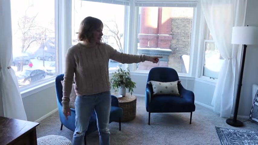
It feels like it's all one kind of grouped space , but this is its own little vignette over here .
And then we have this really cute little um woven uh basket like side table coffee table thing .
It's a great height .
It also has storage in here .
And again , it helps to kind of create this little conversation seating area over here when you have guests over .
And then we also added a poof from article because I am obsessed with poops pretty much , I think they're super functional there .
You can kick your feet up on them , on the couch or on the chairs .
But you can also , if you're having like more people over pulled out and it can be like additional seating and you guys can like watch a game or something like that and you have like your friends and family over , but for now we just get through it off to the side .
So next to the poof over here is this cabinet , it's actually a cabinet that was made by our like great grandfather .
It's a little worn on the top .
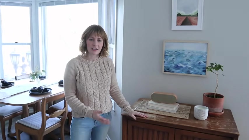
But I think that it adds a really cool like conversational piece because , you know , it's made by somebody in their family .
But also it adds a lot of warmth , the wood tones and a lot of character to the space .
This wall here divides the um bay window and the other bay window that holds the dining um table over there and putting a cabinet like this really helps to kind of divide this space and ground this wall so that it didn't feel so like vast and open .
It kept this room feeling like its own um separate kind of cozy area and the dining room is off , you know , on the other transition over the floor , which helps to kind of divide them .
But this also helps to kind of anchor this space here too .
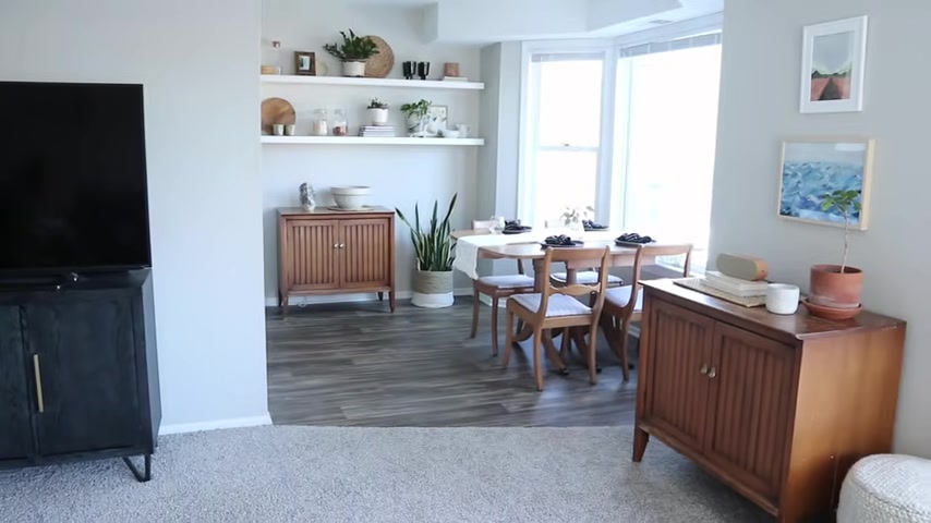
And then off over here , this is the dining room or like kitchenette type of nook .
My sister really wanted the dining table to be in the window because they have these amazing huge bay windows and to take advantage of that such like a wonderful spot to like have your coffee and eat breakfast and stuff in the morning .
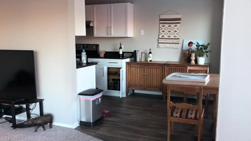
So then this space over here , it was just kind of a random recessed nook because they didn't extend the cabinets all the way out here with the kind of remodel that they did in this apartment .
Um So instead we kind of decided to add some floating shelves to make it feel like an extension of the kitchen itself .
So we added two shelves and then styled them with all the fun things that you find in the kitchen and just cute pretty things .
And then we ground it with , um , there's actually a set of these cabinets that my grandfather made underneath it for more storage in the kitchen , another surface space .
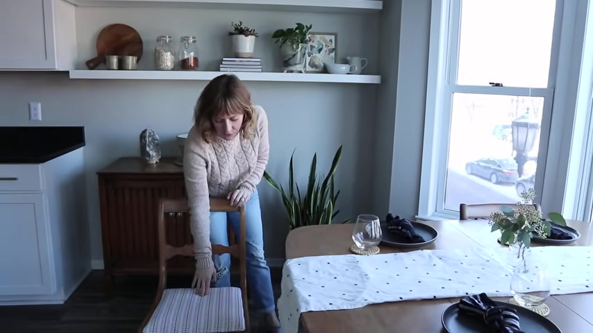
And , and next to that , we have just a nice little plant to add kind of a obviously green element again , but a little bit of a sculptural moment to this kind of very square angular space we have going on this table here is actually a hand me down and a great way to like upcycle a table that you may found a second hand or got gifted and it's in good condition , but it feels a little like dated or a little too like in this case , it was a little like grandma with the um upholstery that was on the chairs , just Reupholster your chairs .
It is one of the easiest and really inexpensive ways to modernize a set of dining chairs and a kind of an old vintage table .
I got this fabric just from Joanne fabrics reupholstered , it popped them back on and now it feels much more modern and fitting with the space .
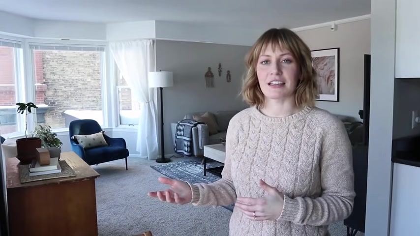
So you can see behind me the whole layout of the living room , this is kind of a good shot of it .
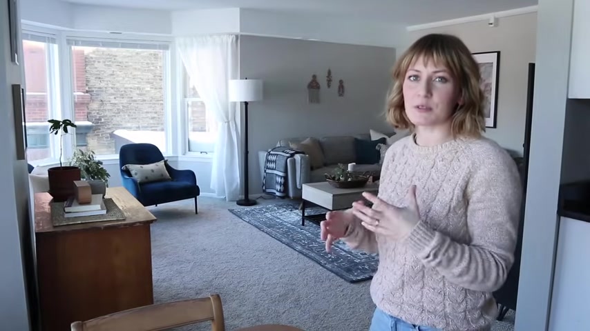
You can see the sectional over here that were the grounds and it's like the focal point of the living room paired next to it in the bay window with these beautiful , they're like a , I don't know , like a , they're like a bluey teal velvet chairs from article with these black legs that I think just look so sophisticated and have like an element of whimsy in the room because they have kind of curves to them .
I think it helps to kind of break up some of the like square , square , squares ankles in here .
And then you can see the cabinet that's dividing the space , that kind of helps to break the two spaces up .
Gives you kind of a nice overview of the room behind me .
So when I hang up stuff on the walls , I take into consideration a few things like ceiling heights in apartments can vary .
You can kind of have low ceiling heights or in this case , the um wall right there that has like a soft running above it .
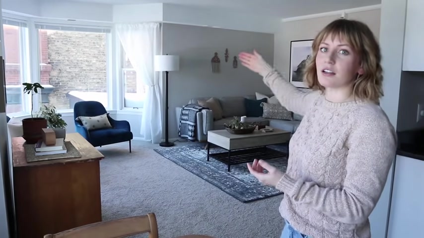
So with that , if we were to put those two tall um posters on the left side of the sofa , it would have felt really short , really cramped because those posters would have been like almost touching the socket .
But a big piece of artwork was really needed to kind of balance out the largeness of the sectional .
So we shifted them and put them on the right side because we had full ceiling height there .
And then we added these really cool um clay .
I don't even know what I want to call them , but I diy them and I will make a video on how I made them , I promise .
But they turned out really cool .
Um And they just kind of add a really cool sculpture element .
I made three of them and group them into a nice little grouping of three and then also in this bay window area to really kind of make it feel cozy and even like more inviting around those chairs and those chairs feeling like they're more part of the space of the sectional .
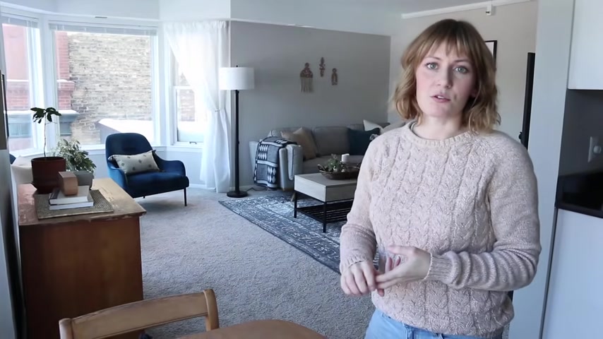
We hung some curtains in there and curtains just really do an amazing job for making something like an apartment or a rental space feel really homey and cozy .
And then greenery add lots and lots of greenery to your space plants .
I mean , they have an amazing amount of sunlight and natural light in this space .
So I filled them up with lots of plants in here because I love plants .
But even little things like uh some eucalyptus like this .
I love this stuff because it's really inexpensive and it lasts for a long time .
And then when it does actually dry out , it's still pretty much looks like this so you can have it still sitting out for like months .
I have that at my house and I just think it looks so pretty and adds a lot of like whimsy again and like sculptural elements to the space and it's just , I love greenery .
It just makes every room feel so much better .
Article is an original modern furniture brand engineering remarkably better experiences .
Article offers a flat rate fee of $49 or $90 for small shipments for most orders , no matter how large choose some affordable upgrade options for in room delivery and assembly .
A checkout article offers a 30 day satisfaction guarantee so you can try out your new furniture in your home .
If you're not completely happy , they'll pick up the furniture and provide a refund minus delivery and pick up charges , which is $49 .
In most cases .
I want to say thank you to article for partnering with me again on this video .
Uh The pieces that are from article in this space are that sectional , those amazing chairs and the poof I'll have all the items from article linked in the description below .
Thank you guys so much for watching this video .
I hope you enjoyed seeing an apartment makeover and enjoyed me .
Kind of walking around and talking through the space a little bit different for me and talking about the different design challenges into and how we overcame them .
And everything in this video is renter friendly , which I think is a fun change for my channel .
I'll link as many things as I can down in the description box below .
If you're looking for specifics like the coffee table or rug and stuff like that and then all the items from article as well are going to be linked in the description .
I'll also have a blog post with photos and again the links of things that are in there .
So thank you guys so much for watching and I will see you in my next one .
Bye but that it a good high five .
Yeah , that was a good high five .
Who knew where that was going to .
Are you looking for a way to reach a wider audience and get more views on your videos?
Our innovative video to text transcribing service can help you do just that.
We provide accurate transcriptions of your videos along with visual content that will help you attract new viewers and keep them engaged. Plus, our data analytics and ad campaign tools can help you monetize your content and maximize your revenue.
Let's partner up and take your video content to the next level!
Contact us today to learn more.