https://www.youtube.com/watch?v=rov_BhzfNGA
How to layout your Living room furniture using Fengshui

Hello , it's cliff again .
And today I'm going to show you how to lay out your living room in a way that confounds the three principles and make your space really , really nice .
So the first thing you do is look at the space , not the furniture , the living room being the first space in the house is very , very important .
It needs to be quite big , it needs to have lots of light , it needs to have lots of promote good circulation .
Regular shape is always a bonus but not necessary .
So the first piece of furniture that you need to look at is the sofa .
The sofa is a command piece just as a bed is for a bedroom .
The sofa is the the piece of furniture that needs the commanding position just like a throne room in a castle .
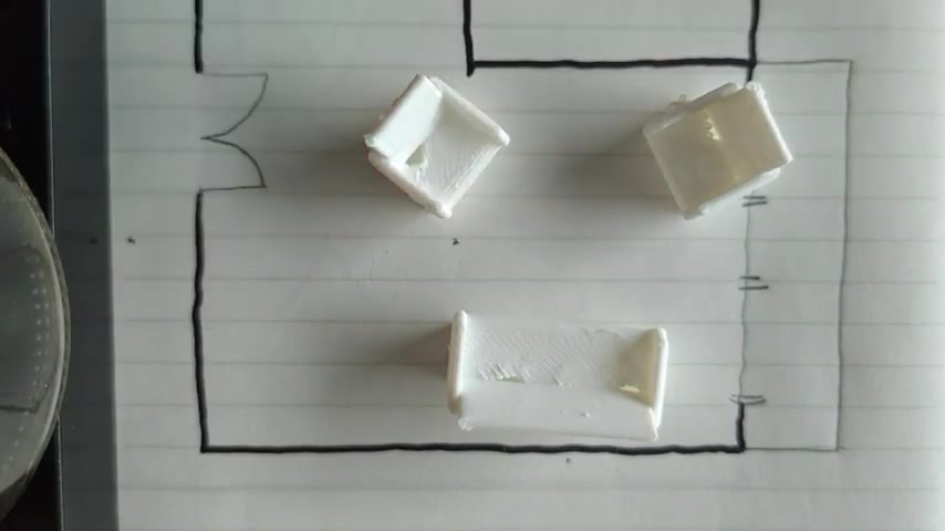
It needs to be as far as possible from the door , but also not with windows behind it because it needs a nice sound backing .
So like this is really good .
This is not good , as I say , because it's against a window , you don't feel like you are supported at the back .

It can't be like this because you're in line with the door , it can't be towards facing the door as well because you feel like people are like watching you or coming straight into you .
Definitely not against the door like that because you wouldn't be aware if some in some guests or intruder comes in .
So I would say this is the best position here .
It should be against the wall .
If you don't , if you don't want it against the wall , it's fine to leave a little gap but not too much , not enough so that people can walk behind you or if you do need to have it against the wall , maybe because you have a study table there or something , then you can put a heavy piece of console just to act like a wall .
So let's put this back in the original position that I like .
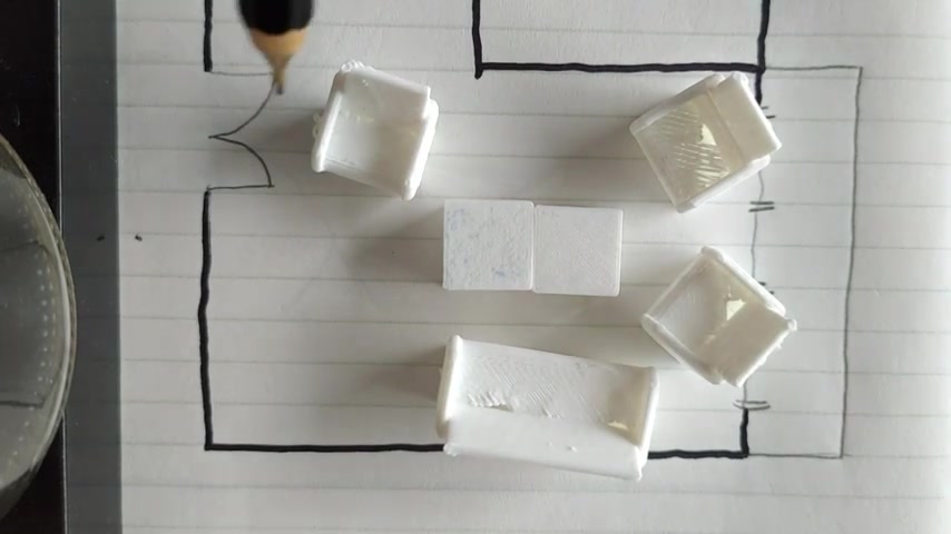
Now , the principles of Feng Shui likes to um create social spaces in the living room because the living room is a social space after all right .
So you create this nice circle where people can socialize and talk .

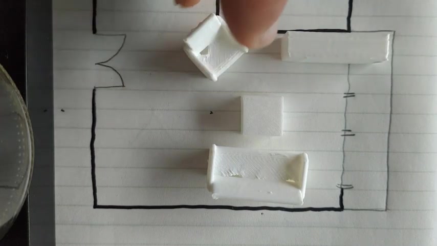
Some people , they like to have a more formal arrangement where you have two similar sofas facing each other like that .
This is fine .
It's just a bit confrontational as you can see almost like a meeting room .
One way to mediate , this is to mitigate this , I mean is to put a coffee table in the middle .
You see it softens the whole space already amazing what a little piece like that can do .
Personally , I still prefer individual pieces because you can play with them .
You can even have one if your space is not too big .
And if you want to have a TV , that's absolutely fine .
But please remember it is not the main thing in your house .
The main thing is a social interaction over that .
If your living room is quite big , try to maximize the space because let me show you why it's not so good to not maximize the space .
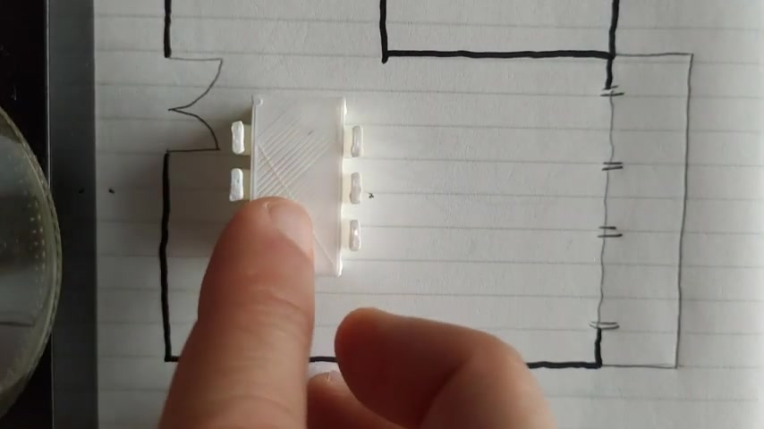
Let's say this is my living room .

What you have over here is a pocket of , of dead space here , which is not very good because it's , it's like uncertain and it's not useful .
Some people they put a console there and put a light that's fine .
But if possible , try to maximize your space .
I mean , if you have so much space , why not make the most out of it ?
Right ?
And if you need to have two coffee tables , have two coffee tables , coffee table is an important thing .
It is almost a focal point of the living room where everybody faces because that's where you put your stuff and things like that .
If you are laying out your furniture , also try to avoid this other thing which is to have it in an irregular way .
Let me try to make an irregular arrangement .
It's very hard to do it because not many people would make a regular arrangements like that .
But for instance , you do this , this is a bit weird because you have this chair down here which doesn't really face the group .
It is like an unwanted guest .
If you have a group of friends , you wouldn't want anybody to be in that position .
Right ?

So always turn the living room is you only have one living room and it is seen as a whole .
Ok , these days , a lot of people have living rooms combined with dining rooms .
I'm sure nobody has the luxury of having your own living room .
So that is fine as well .
Just try to avoid being too ambiguous .
You don't want the living room and the dining room seen as a single space .
You try to segregate .
This is a place for dining , there is a place for chatting .
So by turning my armchair away from the dining room , I already create this separate circle , this separate space , which is quite um defined .
So I hope this is helpful and you can start to look in your into your living and dining spaces to see how you can make it better .
And yeah , I'll see you again next time .
Are you looking for a way to reach a wider audience and get more views on your videos?
Our innovative video to text transcribing service can help you do just that.
We provide accurate transcriptions of your videos along with visual content that will help you attract new viewers and keep them engaged. Plus, our data analytics and ad campaign tools can help you monetize your content and maximize your revenue.
Let's partner up and take your video content to the next level!
Contact us today to learn more.