https://www.youtube.com/watch?v=1IM_MCW9mWs
Create a WordPress Movie Review Website with Elementor and Toolset
Hi , everyone .
This is Paul from Bring web dot com and I'm back with another element or dynamic field tutorial .
This time , we're gonna take a look at tools set , which is a really cool plug in that helps us with creating custom post types , custom fields , custom taxonomies and a bunch of other really nice features .
So let's first start by showing you what we're gonna create you in this tutorial .
This is a movie blog website with a nice full width hero section here at the top with a search widget inside of it .
A lot of you ask in the comments of the last video , how to create a custom search and custom filters for your custom post types and actually toolset has this functionality inside of their tools set views , blogging .
Sadly , for this tutorial , I won't be showing how to create that because it gets a bit technical and would make the video too long .
Maybe we'll have a separate video in the future explaining how to do it .
However , if you need that functionality now and you decide to go ahead with tool set , you can take a look at the documentation on their website for tool set views on how to create them .
They do a great job explaining it .
That being said , let's scroll down the page where we can see a list of movies that come dynamically from the back end .
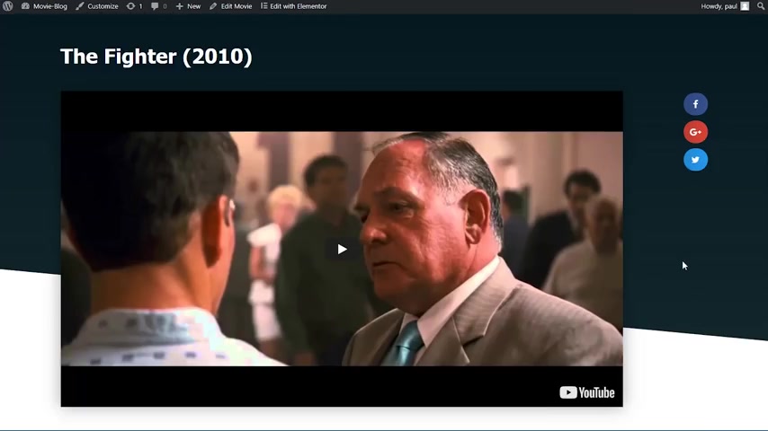
And if I were to click on one of them , like for example , this one , the fighter , we can see the single page template for that movie load up here at the top .
We have the title followed by the trailer .
And on the right side , we have a nice social sharing widget under the trailer , we have the plot of the movie as well as the IM DB rating followed by a code about the movie and then some content here at the bottom .
And lastly , we have the image of the movie and some general information like the genre director writers and a few more .
On the right side , we can see our latest movies .
And if I were to click on one of them , for example , Captain America , we have the exact same design .
So all we have to do if we want to add a new movie is just fill in the information on the back end and the movie is going to follow the exact same template that being said , let's jump into wordpress and create that .
Ok .
So we're now inside of wordpress and I already went ahead and set up something .
So we don't waste any time with them .
I've already created the header and the footer , we can see them here on the front page and the page is empty right now .
It's only the header and the footer with no content here yet .
I've also went ahead and installed the required plugins .
Let me quickly jump back into the dashboard and go under plugins , install plugins .
We will be using three plugins element or element or pro and tool set types .
That's all we need right now .
So let's jump into building a custom post type .
You can see on the left side bar under element or that we have a new entry called tools set .
I will hover over that and click on post types on this page .
We can see the prebuilt post types of wordpress , but we don't need to worry about them .
So I'm going to click on add new and we're now inside of the add new protype page here .
We need to provide a bit of information to create our post type .
The first thing being the plural name of this post type .
So I'm going to call that movies .
Then we need to provide a singular name which is going to be moving and then I'll press tab to go to the slug .
So it automatically completes it with the lower case version of the singular name .

That's perfect for now .
I also want to change the icon .
So I will click on change icon here and I will search for tickets and I will choose this one tickets out .
Perfect .
Now , we don't need to worry about the labels or about the taxonomies right now .
All I want to do is come here to the sections to display when editing movie and I want to check on the featured image because we want to be able to provide an image for our custom post type .
I also don't have to worry about the options .
So I will go here at the top and for the admin menu position after I will choose comments because I want this custom post type to be displayed after the comments here in the sidebar .
And I will click on save post type and we now have a new entry called movies here under comments .
So I will hover over that and click on all items and you can see this is empty right now .
So we can go ahead and create our custom fields .
I will hover over toolset again and this time click on custom fields here , we can create our new field group .

So I'll click on the add new group button and I'll give a name to this group .
I will call it movie fields .
Perfect .
And now I will click save field group because I want to be able to specify where this appears on .
So I will now click back on settings to expand this and here it's by default , this group of fields will appear when editing all content .
We don't want that .
So I'll click here on edit and I will check here our newly created custom post type movies and then I will click on apply .
Perfect .
So now this movie fields group will only show up on our custom post type .
So we can now go ahead and create our first field .
I will click on the add field button .
The first field that we're going to create is the trailer link field .
So I will choose the URL type of field .
If you look into the top right corner of the screen right now , you will be able to see how this field is going to look like .

On the front end , we will link this field together with a video widget to dynamically display the movie's trailer into the template that being said , I will link this field , trailer link and hit tap to automatically fill in the slug just like this .
You can see the slog was filled in automatically by pressing tab .
We don't need to worry about any other settings .
So I will close this up and create our second field .
I will click again on the add new field button .
And the second field is for the plot of the movie , which is a small paragraph .
So I will choose the multi line type of field here .
Once again in the top right corner of the screen , you can see the result on the front end .
This field will be displayed under our trailer describing the action of the movie .
I will therefore name this field plot and once again press tab to automatically fill in the slot .
We don't need to worry about any of these settings either .
So I will close this up and create our third field .
The third field that we will create is the IM DB rating field .

So I need to select a number type of field .
This is going to be displayed under the trailer on the same line as the plot showing our visitors .
What rating this movie has on IM DB ?
We will hook this up with an icon box field allowing us to have a nice visual way to describe what type of rating this is .
So I will name this field rating that being said , I'll quickly create the other fields on fast forward .
So we don't waste a ton of time with them .
OK ?
So now we've created all the custom fields that we need in case you're wondering this one with a little a from this single line custom field .
With that being said , I can go ahead and click on save field group .
Perfect .
And we can see that the post field group was saved .
I only want to do one more thing before proceeding with filling in the information , our custom post type and that's creating a custom taxonomy .
So here on tool set , I will choose taxonomies .
And now on this page , we can see the built in wordpress taxonomies .
We don't need to worry about them .

So I'll click here and add new and now we are on a screen pretty similar to the one that we've used to create our post time .
So I will now name our custom taxonomy .
I will call it movie genres for the singular , I will do movie genre and for the slug the default works .
And I also want here to change the taxonomy type from hierarchical like categories to flat light tags .
You will see why when we start using them .
And also I want to associate movies with this taxonomy .
So it only works with this one and I will click on save taxonomy .
Now , if I have a of movies here , you can see we have our movie genres taxonomy and if I were to click on it , it's a very similar screen like the one used to create categories and tags , we've not completed our custom post type set up so we can go ahead and fill in the information .
We'll start off by creating our movie genres .
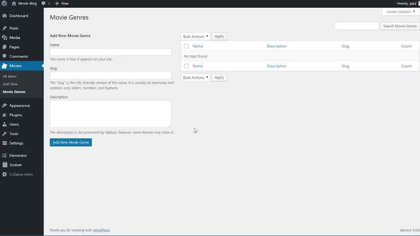
Those are going to be very helpful later on because it will allow us to filter movies based on genre .
So I'll start with the first one which is going to be action .
I will type here under name action and then I will just click on ugly movie genre because the slot is going to be taken care of automatically by wordpress .
Now , I have a few more to add .
So I will add them on fast forward .
So you can see that we now have here a whole host of movie genres that will allow us to filter movies based on them .
That being said , I will now go ahead and create our first movie .
So I'll go under a new here .
So we are now inside of the add new movie screen .
And as you can see in addition to the title and content inputs that come with the default wordpress post , we have all the other fields that we've created earlier , like the trailer link , plot rating and all the others .
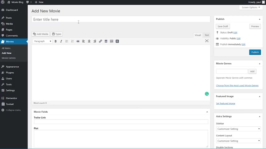
So I'll start by filling in the title which is going to be the fighter and 2010 .
Then I'll copy , paste some of the content .
So we'll start with the actual content of the page which is in this case , Laura Ipsum , then I'll paste in the trailer link the plot .
I will provide a rating which is 7.8 on IM DB .
Then I'll provide a code about the movie .
The country is usa director writers stars .
What awards this movie won and the duration which is one hour 56 minutes .
Perfect .
So we fill in the information here and what we want to do is come up here and fill in the movie genres and because we've set them as tags , we need to search for them .
So I know this one is a biography .

So search for biography and then click on it and click on add and you can see we have it here now and this one is also drama and sport .
So we have our genres here .
The last thing that we need to do is set a featured image .
So I'll click here on set , featured image and I will choose the movie poster , which is this one and click as set featured image .
Perfect .
So now our movie is done and I can click on publish .
And if I go here to all items , we have our entry , the fighter here , so I can start creating a few more and I'll be back in just a second .
All right .
So I've added a few more movies .
So we have what to work with .
Now , we can go ahead and create our first template , which is going to be the archive so we can display our movies in the nice grid that I showed you at the beginning .
So I will now hover over element or my template and you can see here we have the header and the footer that I've created earlier .
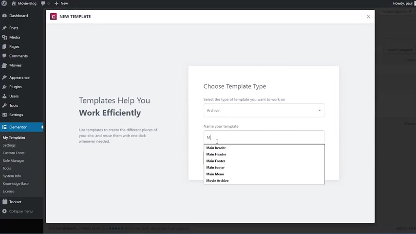
Now we can go ahead and click on add new and here it asks us what type of template you want to work on .
So I'm gonna click on this and select an archive and I will name this movie archive .
So it's easier to find and I will click on create template once inside of elementary .
You can see that the library panel for the blocks was automatically open , but I don't want to use it .
So I will close it up .
So there are two things that I want to do before creating the template .
The first one is setting the right preview for our archive .
So I'll click here on the little eyeball icon and I will click on settings and you can see that right now .
It says preview dynamic content as a recent post .
We don't want that .
So I will click on this and choose movie archive and click apply and preview .
Perfect .
Now , the second thing that I want to do is set some colors in our color picker .
So it's easier to choose them .

So I'll click here on the hamburger icon and I will choose color picker and I want to change this screen here with a yellow color that I need , which is F ad 168 , this one .
And I also want to change this green here to 003 C 54 which is a nice blue color .
Perfect .
And then I will click on apply .
Now we can go ahead and start creating our first section .
So I will click on the plus sign here and choose a one column section going into the section settings .
I want this to be boxed and to have a 600 pixel width .
I also want to set a minimum height for it and that's going to be 700 pixels right here .
700 .
Great .
Now , I will go to the style tab and choose background type as classic and choose our image , which is this nice full width image I will pick on in street media .
I will also change the position to center , center and the size to cover .

So it shows a bit more out of it .
Perfect .
And I also want to set an overlay for the image to darken it a little bit .
So I'll click on background overlay .
I would do classic and for the color I'm gonna do black at around 50% around here and I will leave the opacity here at 50% as well .
So this is now our first section and inside of it , I want to add and search widget .
OK .
So I'm gonna search for it and is this one search form ?
The skin is going to be classic placeholder , search .
The button type is going to be icon and we will leave this magnifying glass here for the size .
I'm gonna increase it a little bit and make it 60 .
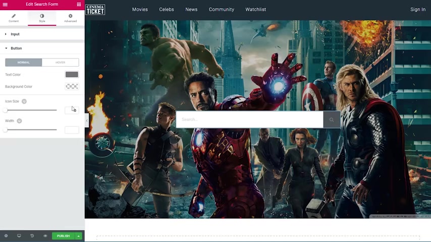
Now under style , we want the text color to be babab A it's nice gray color , the background color white and the border color this darker gray which is 787878 and the border size has to be one pixel perfect .
Now for the button , the text color is going to be again , that's 787878 .
And the background color , the yellow color we've set earlier and this is our search .
Now , I can go ahead and add the second section .
So I will click again on the plus side and choose a one column section to this section .
We will leave everything here .
By default , I will just go under the style and make sure the background color is white and under advanced for the padding .
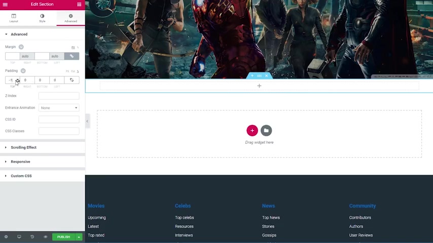
I will unlink the values because I just want to add padding to the top and to the bottom and I will go to the percentage and I will do top 3% and bottom 3% right now .
We can add our title for this .
So I'll search for a heading widget and drag it inside .
It will say movies .
Uh The html tag is going to be an H two and the color is going to be that blue color , the dark blue and for typography , the defaults are fine .
I just want the size to be 35 pixels .
I only have one more widget to add , which is this one , the archive post and this returns all the post in this current archive .
So I will drag it in and you can see we have our movies here , but they look a bit odd right now .
So we're gonna work a bit with them .
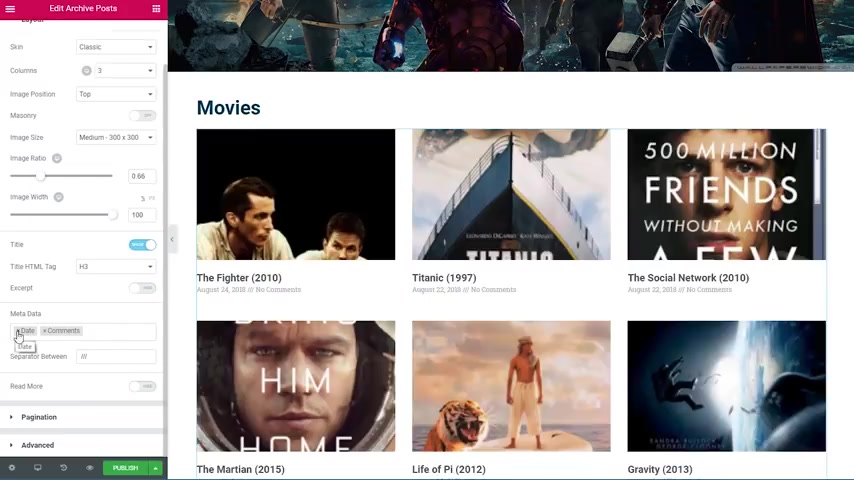
The first thing that I'm gonna do is come here and we will turn off the excerpt as well as the read more and I will get rid of the date and comments .
We just want to show the image and the title of the movie .
Now , I want to change this from three columns to four columns .
The image ratio is going to be 1.5 and the width is going to be 100% .
I will change here the image size to large because we want them to be nice and crisp .
Look how good they look right now .
Perfect .
Now I will go under style and for the columns gap , I'm gonna do 55 rose gap is going to be 40 .
Now under image the spacing , I will make it 16 .
So we bring the title a little bit closer .

And now in the content , what I have to do is make the title color that dark blue that we had and also come back here to delay out and choose the alignment as center .
So our title is centered with our images and this is pretty much done right now .
So I can click on publish and we have the display condition screen .
I will click on add condition and by default , it wants to include this template on all archives , but we don't want that .
We just want to use it for our movies .
So I will take here and choose movies archive here and then I will click on publish and now the document is live .
So I can click on the hamburger icon and go exit the dashboard .
I will go to visit the website .
And if I click here on the movies , you can see our template is live with all the movies coming from the back end .
Right now .
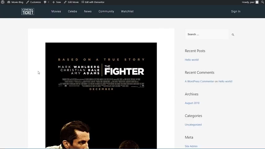
If I were to click on one of those , this is what's gonna load up because this is the default theme template .
So we're gonna go and create a single template to display our movie with all the information that we set up in the custom fields .
Now , I will go back to the dashboard and I will have again under element or my templates .
I will click on add new .
And this time we're gonna select a single instead of an archive and now it asks us what type of uh post we want to use .
So I'll take here and I will choose move and I will name this moving single and I , we can create a template .
OK ?
So we're now inside of the single builder .
And once again , the library was automatically opened up for us , but we don't need that .
So I'm gonna close it up and I'll add here a new section .
I will click on the plus sign and choose a one column section .
I want this one to be boxed in with 12 80 width .
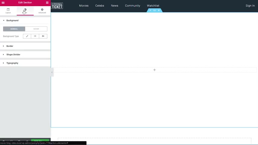
I also want to set a minimum height here to 680 pixels and make sure that the column position is in middle .
Perfect .
Now I will go under style and for the background type I will choose gradient .
The first color is going to be 0517 21 .
And the second color is going to be the same one .
Just a bit more transparent here .
It's a very subtle gradient that we use here .
Location 0 100 type linear and angle 1 80 .
Perfect .
Now I will go to the shape divider and for the bottom , I will choose the tilt one like this .
OK .
So that's all that we need for this section because the second section that we're gonna create , we are going to pull it up using negative margin to have it here on top of this one .
So I will create a new section .

This one is going to be a two column section again boxed with 12 80 with the first column I'm gonna select and the column width is going to be 86% and the second one is going to be 14 .
But uh it was done automatically .
Now I want to go under the section settings under advanced and for margin , I will do a margin , top of minus 600 pixels and a margin bottom of 50 pixels right now .
It looks very odd , but it's gonna look perfect in a few seconds .
So I'll start by adding a new widget .
It is going to be a post title widget .
I will add it here and you can see it takes the title that we've uh set in the back end , which is the fighter .
Now , I'll go under style the text color .
I'll make it white .
And for typography , we want the phone to be 40 pixels line height 1.3 .

And we also want to go under advance for this and add a paging bottom of 25 pixels .
Nice .
Now , the next thing that we're gonna do is add a video widget this one and add it under this for the source .
We're gonna leave youtube .
And here in the URL , we'll click on this little dynamic link , scroll all the way down and we can see we have tool set here and we have tools that field , tool set , date field and toolset URL field .
So I will click on the toolset URL field .
And then if I click here again , it's gonna ask for the key .
And our key is the only one that we have because it's , we have only one tool set URL field and that's the trailer link .
So I'm gonna click on that and you can see our link is now displayed here and it looks really nice .
OK ?
Under this , I'm going to add a columns , widget , which is this one here .

And I want to go under advanced and do a 50 pixels margin top to make a bit more space .
And also for the columns .
I want the first one to be 70% and the 2nd 1 30% .
So I'll do 70 here and the second one is automatically 30% .
Now , in the first column , I want to add a new heading .
And this time I'm gonna click on the dynamic link and scroll all the way down and choose to set field from here .
And now I will think again on it to choose our key and for the key , we want to show the plot here and you can see we have the plot .
It looks really odd right now , but we're gonna fix it in a second .
So I will now go under style for the color .
I'm gonna input 54595 F which is a dark gray color .

Then for the typography , I will leave the family to default size 17 pixels , wait 300 I want to have under style here .
Italic perfect line height 1.6 and letter spacing 0.5 .
And now it looks really nice on the right side , I will add an icon box wit we want the icon to be IM DB icon , just this one .
The view is going to be default .
It will have no description .
And for the title , I will click here on the dynamic link , go all the way down to tools set field and I will choose our rating field good .
Now , I want to make this to go to the right side like this and play a bit with the styling of it .
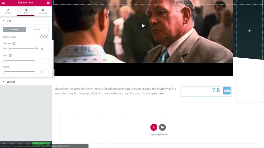
So I go under style and for the primary color , I will do our dark blue color spacing is going to be 19 , the size is going to be 55 .
And for the title on the content title , I will go with the same color and on the typography , I will do a line height of 1.8 and now it's pretty much centered with the icon .
Now , I want to add the shares button widget .
So I'm going to search for it and added it inside of the page .
We only want Facebook , Google plus and Twitter .
So I will delete the linkedin one and I want to change some settings here .
So the view is going to be only the icon .
The skin is OK to be gradient shape is going to be a circle columns , one like this .
Now under style column gap and row gap is OK to be 10 .
So I will go under advanced and I will do a 100 pixel margin top here .

Now I will go under the column settings here and under advanced .
I will do a margin left of 100 pixels .
So our items are nice and small here .
OK ?
We can continue on with the next section .
I'll click on the plus sign to add the new section and I will choose a single column section again , I'll make the content with 12 80 pixels and inside of this , I will drag a divider widget .
Now I'll choose the style to be dotted one pixel weight , color black with 100% and a gap of 15 .
Perfect .
Now , I will move on with the next sections while I'll click again on the plus sign .
And this time I'll choose a two column section again , I'll make it 12 80 in width .
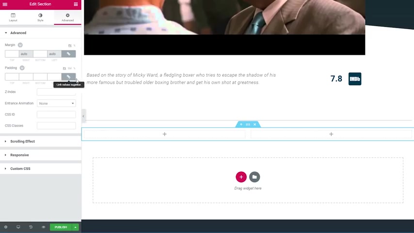
I will go under advance and do a padding top of 45 pixels and I will also change the first column to be 70% 1 .
So we have 70% and 30% on the second one .
Great .
Now in the left one , I will add a heading field and I will click on the dynamic link here , choose to set field and then for the key , I will choose the code nice .
Now I want to style it a little bit .
So I'll go on style for the text color .
I will choose the dark blue color .
And for typography , we want the phone to be lap 56 pixels , a weight of 901.2 line height and I will go under advanced and for margin , I will do a 30 pixels bottom margin .
Nice .
Now , under this , I will drag a new widget which is the post content , which is this one from here .
And you can see it brings back the content that we've added when we've created this uh movie .
So we don't need to worry about any of the settings , this the defaults look perfectly fine .
All right .
So under the content , I want to once again add a columns widget , which is this one here .
But before continuing , I just want to make a short point about them .
If you're using elemental version 2.2 or later , this widget was renamed from columns to intersection .
So if you're using that version or later , make sure that you're looking for in intersection instead of this one .
Now I will drag that in .
And the first thing that I want to do is select the first column here and choose a column width of 25% leaving the second column at 75% .
And I will choose here the column gap to be no gap , then I will move over to the advanced tab .
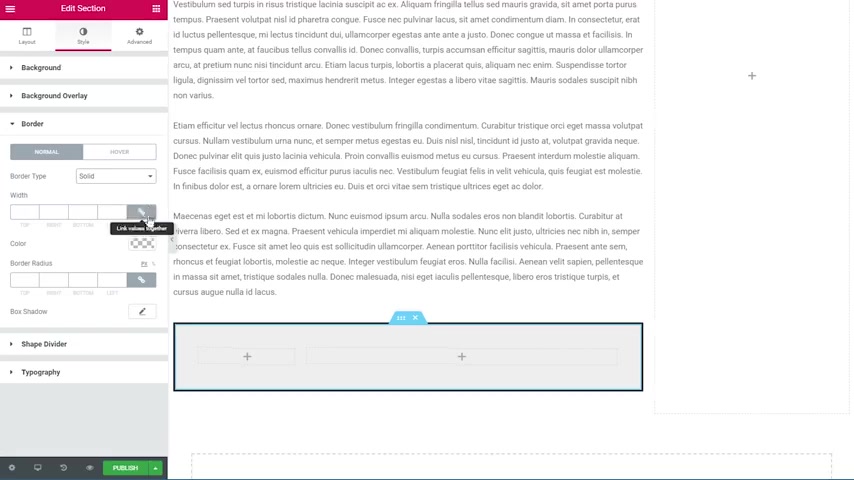
And here I will do a 40 pixel margin top and bottom .
So I'll write here for it and also I want to do a 4% padding all around .
So here I will change it 2% and then do four .
So we have a 4% padding all around our section .
Next , I will move over to the style tab and I will choose a classic background type and I will input a color which is EFEFEF , which is this light gray color here .
And also I will go here down to the border , choose a border type of solid .
I'll link the values because we only want to add the border to the bottom of this section .
And for the bottom , I will do two pixels and then I'll change the color of this to our dark blue color .
Now I want to add to the left column of featured image widget .
So I'll go over to the widgets panel and I will drag in the featured image widget here .
Very nice .
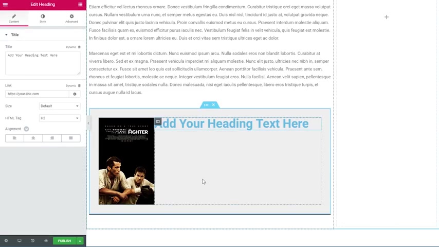
Now to the right column , I want to add a heading widget and I want to change the styling a little bit .
So I will go under style here .
I'll make the text color , our dark blue color .
And for typography , I will choose the form Lato , I will make it 19 pixels .
I will choose a weight of 700 I will do a line height of 1.4 .
Very good .
Now , I want to select this column again the right one and change the content position from default to middle and also go under the advanced tab and set a 30 pixels padding to the left like this .
Now , I need six more copies of this heading widget because I need seven in total .
So what I can do is either right click here and choose duplicate to duplicate this widget or I can just press control or command D to duplicate .
And now we have seven copies of this so we can start working with them .

I will select the first one and here you can see our little dynamic link .
So I will click on this scroll all the way down and choose tool set field .
Now nothing shows up because we haven't chosen our key yet .
So I will click on the two set field here .
And for our key , we will choose country because that's the first thing that we want to display .
Also , I will go here under advanced and in the before input , I will type country and column and the space .
So now we have a label for our input here .
Now I will skip the second one because that's a bit different .
I will create the third one here .
So I will click on this , click again on the dynamic link , scroll all the way down and choose tools that field .
And I will choose the key of director and you can see our director shows up so I can go under advance and for the before tag , I will do director and column and a space .
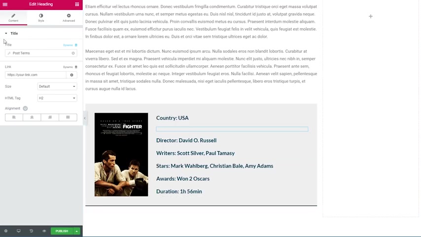
Now I will do the last four on fast forward and then we will return to the second one .
Perfect .
So now we have all of our fields in place except for the second one .
So I will click on that and I will once again choose the dynamic link .
But this time instead of choosing the tool set field , I will actually choose this one here post terms because this will return our terms for the post .
And right now it's empty because we haven't chosen our taxonomy of choice .
So I will click here on post terms .
And then for the uh taxonomy , I will choose movie genres and now we can see our genres for this movie display here .
I will also change here , the separator to space by space .
So it looks like face now and under advanced in the before input , I will write a genre .
OK .
So our little section is done so we can continue on with creating our sidebar .

First thing that I want to do is scroll up and choose our big column here .
The left one click on advanced and I will choose a padding right of 40 pixels .
I will also choose the right column here and go under advanced as well .
And this time , I will add a 90 pixels padding to the left .
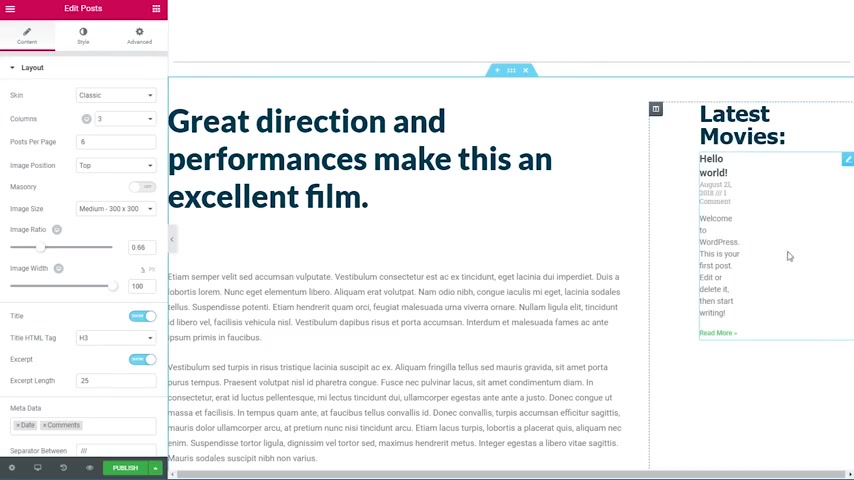
Now I can go ahead and drag in a head in widget .
I will write in your latest movies .
Then I will go to the style tab .
I will choose our dark blue color for the text color .
Then I'll go under typography for the font family .
I will choose Tahoma .
I will also make these 40 pixels in size and then I will go under advanced and add a 10 pixel padding to the bottom .
Now I can drag in one more widget which is the post widget .
So I will search for it and is this one post ?
So I'll drag it inside of this column , but you see that by default address to return from our default wordpress post , but we don't want that .
So here on the left side , I will scroll all the way down and choose query for the source .
I will change these two movies .
I will leave here .
Order by descending and I will exclude the current post by clicking here and checking on avoid duplicates because we don't want any duplicate movies here .
Then I can return to the layout tab and style this a little bit .
So the skin is going to stay on classic .
For the columns , we want to show only one .
We want to show three posts per page , not six , the image position can stay to the top .
We want to change the image size to medium large .
So it's nice and crisp .
Also the image ratio should be 1.52 .
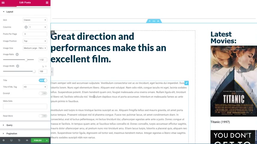
Then we will leave the title on .
We will disable the excerpt as well as the date and comments here and we will also disable our read more button .
So we will only show the image and the title .
Now I will go to the style tab , go to content here and for the title color , I will choose again our dark blue color .
And here in the layout , I will make sure that the column gap is 30 the road gap is 30 as well .
Perfect .
Now , there's one more thing that I want to do .
I just want to add uh some comments to this page .
So I will search for the Facebook comments , widget and I will just drag it in here and move it under this section .
So now we have our comments , the defaults are fine with the common count of 10 and order by social .
So now our template is complete .
We have the posts here inside of the sidebar .

We have the trailer and the title at the top as well as all the other fields that we've set up inside of the tools of plug in .
The only thing that's left to do is to publish this template .
So I will expand this and I will click here on publish .
You can now see the display condition screen came up .
And because when we've created this template , we've already chose our movie custom post type .
The conditions are automatically set to include all movies , all .
So all I have to do is now click on publish and then we can exit to the dashboard .
I will go ahead and visit the website .
I will click on the movies and we can now see the list of movies that we've set up before .
So I'll click on one of the movies , for example , Captain America , and you can see we have our template live in here .

So I'll choose a different movie from the sidebar now like this one and you can see it follows the exact same template .
So this was my movie blog tutorial using two certain element or the builder .
I really hope you found it useful and learn something new out of it .
If you have any questions , don't hesitate to ask them in the comments below .
Thanks for watching and see you all soon .
Are you looking for a way to reach a wider audience and get more views on your videos?
Our innovative video to text transcribing service can help you do just that.
We provide accurate transcriptions of your videos along with visual content that will help you attract new viewers and keep them engaged. Plus, our data analytics and ad campaign tools can help you monetize your content and maximize your revenue.
Let's partner up and take your video content to the next level!
Contact us today to learn more.