https://www.youtube.com/watch?v=WTtRWGFqO9o
TINY_ 70 Sq Ft Living Room_Entryway Makeover On A Budget!
Hey guys , welcome back to my channel .
I'm Alexandra .
And today's video is really exciting .
It is a virtual makeover of a living room and entry way .
This living room really does it all .
It's in a very small apartment in Montreal .
This virtual makeover is for a viewer completely free of charge .
I sent her everything she needed to make her dream living room come to life .
I'm so excited for you guys to see it .
A huge shout out to Squarespace for sponsoring today's video .
I love Squarespace .
I love working with them .
I can't wait to tell you more about them and give you a discount code later on in this video .
But for now , let's get started .
Bam , bam , bam , just me jamming to my own intro music .
So as I mentioned , I am making over a viewer's living room from afar .
We're doing this virtually now .
This viewer isn't just any viewer .
Her name is Eva and she's actually Noah's sister .
If you guys want to story time on how the three of us all met .
It's a good one .
Let me know in the comments down below .
But Eva has been watching my videos since my Chad Elaine days .
So she's like an OG fan and we have since become really close friends .
So I'm really excited to make this happen for her .
I'm packing up this camera to send to Montreal .
So Eva has something to film on and then we can get started with the makeover .
Hi , my name is Eva .
I've been a fan of Alexandra since her Chatelaine days when she was sort of carving out her presence in the interior decor world as the pom pom enthusiast .
I really do love my apartment , but I don't feel my living room is sort of , I feel like we haven't quite optimized this space yet .
So I think the main thing that I need right now is a more comfortable sofa .
I'm a student , so I'm on Zoom pretty much all day Monday to Friday .
My matte vinyl floor show everything , especially dog paw prints of which there are many , I would love a space that feels eclectic and warm and homey without feeling too busy .
And I hope the living room can be a bit more of a defined space from the rest of the apartment .
Thank you so much , team A G for helping us and we're very excited to get started on the makeover .
Her living room is her entry way and also kind of flows into her kitchen .
It's a really , really tiny space .
This apartment is also really narrow so that kind of limits the configuration of furniture and just really inhibits the flow of the space .
So my goal in this video is to help Eva create a cozy living room that's comfortable for her to work in that feels separate from the kitchen and the bedroom area .
And hopefully when COVID is over , also make it so that this space is a place where she can host , make it work a lot better and it's working now .
So it is day one of planning Eva's makeover .
I'm so excited to get started .
I've done a bit of planning already and I wanted to walk you guys through what I'm thinking .
So one thing I know for sure is that I want to move her bookshelf .
I want to move that beside the fridge .
I feel like that's going to create a really great divide between the living room and kitchen .
And also it's gonna hide the fridge because no one wants to be sitting on a sofa beside their kitchen fridge .
That feels wrong .
So I think this is a good solution .
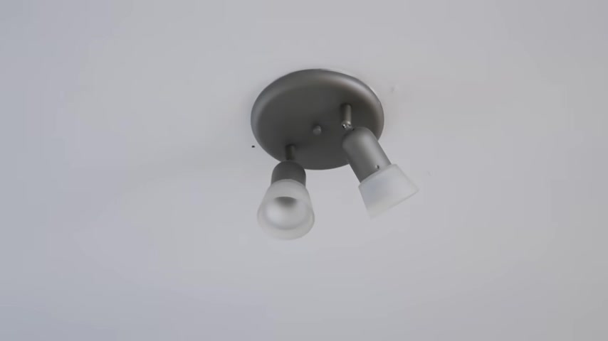
I also want to do a fun Rotan Diy pendant and I want to make it so that this is completely rer friendly so that Eva doesn't have to take down the light .
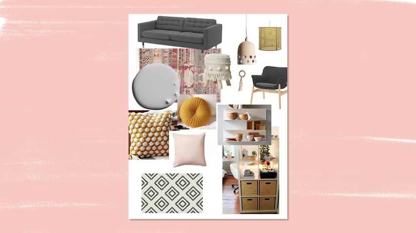
This rug is beautiful .
I feel like it really kind of sums up Eva's eclectic Boho style and I'm pulling up that like purple gray color in this bare paint .
This is called Opera .
I've never used a color like this .
So this is what I'm thinking .
All the packages have arrived at Eva's Place in Montreal .
It's time for Eva to either sell or donate that futon and get the whole space cleared and ready to start the makeover .
So someone just came and picked up the Futon frame and this big box is the sofa .
Super excited to get the accent wall behind me going .
The paint just arrived today as well .
Let's move the dresser , undress the walls and get the furniture out of the way so that we can get the paint started .
Alexandra .
And I spoke about some ways I could free up space in here and we agreed that this dresser behind me could go out into the hallway .
I've spoken with my neighbors .
They're cool with it going there and most of what it houses is stuff for the dog .

So it's actually gonna work really well because that will stay just outside the door so I can wipe her dirty paws before we come in .
Retro ski boots .
Better be in the water .
Ok .
So everything's cleaned , everything's off the wall , everything's moved out of the way .
It's time for Eva to get painting .
But first she's gonna spackle and fill all of those holes in the wall .
Hi , it's the next day I have got my itty bitty roller and my brushes for the corners and for cutting in , this is what I have on hand and I'm stubborn and don't want to go to the hardware store .
So I have picked this gray purple color .
It's from there and it's called Opera .
And I've never used a lilac color in a makeover , I don't think , but I was drawn to this because it's actually a gray with purple undertones .
And I really think it's going to kind of tie the space together once Eva brings in that rug .
Ok .

It feels very subtle but like beautiful and I'm sure it'll dry a bit darker .
I'm excited .
She is a liar .
Should we swatch it ?
You guys ?
I feel like Eva really hates the pink color pot pod .
I just wanna mention that Eva is painting with like a children's paintbrush that you'd find in like a kindergarten classroom and she's also not using painter's tape .
Now , is this what the Jade roller craze is all about ?
It just like feels nice .
Say hi to everyone in your video or the one time I'm like , just taking a break on the sofa making you look like I do nothing all day .
Everyone's supposed to take breaks no matter what .
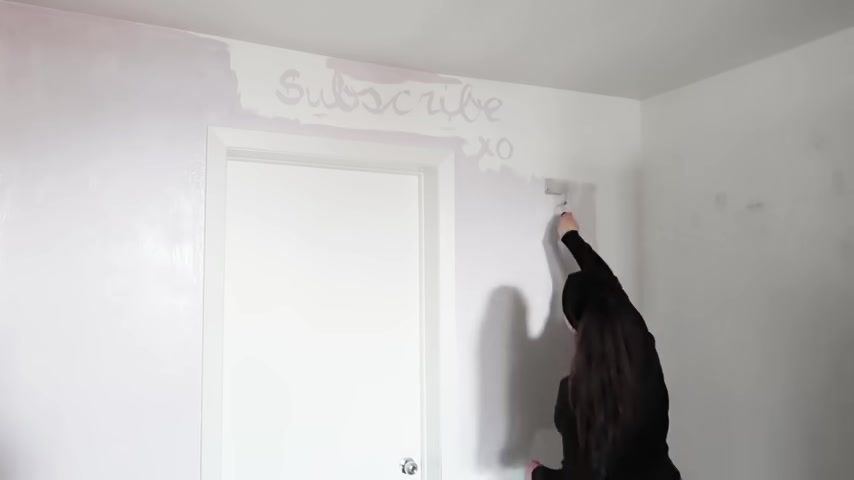
I love this pink color .
I love how it has these purple undertones but it kind of skews gray and I really think that the rug is going to make it look perfect and we're gonna unbox the sofa .
Now , I haven't had a sofa in like three days .
I feel like people struggle with this all the time and you live in a small space .
You want a comfy sofa but you also want it to fit and not look too bulky .
My go to for small space sofas is always IKEA .
They have tons of different options and I love this gray sofa because it's pretty much full size , but it's like the perfect small space apartment condo sofa .
It is linked down below .
Let's check in with Eva and see how she's doing .
Hello ?
Like what is happening ?
I'm literally just like in a sea of cardboard .
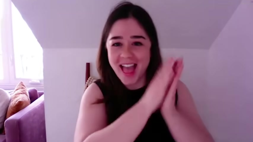
Like you can see the sofas like in place .
It looks so good .
It's like an amazing size .
I love the color .
It's the perfect size .
Like who said , you can't have a sofa in a studio apartment .
Ok .
So show me , show me the wall if you can .
Ok .
So I've been saying I'm like , still not sold on it to be honest , but I like trust the process .
I also think when you bring in the rug , it's going to like bring it all together .
That rug is so beautiful and I feel like it has that wall color in it .
Kind of .
Well , this has been a great check in .
We've learned that Eva now has a sofa , a painted wall and lots of cardboard tomorrow .
What are you tackling ?
I'm gonna move the bookcase .
Yep , I'm gonna do the Light Diy and install it .
If I have time , I'd love to put the shelves up too .

So that the sofa is like fully functional and this whole wall aside from artwork going back up is like in its functional state .
I can't wait .
Come on up .
Yeah .
Good girl .
What do you think ?
You like it ?
Yeah .
So Eva has moved to the bookshelf and I'm so happy with how this looks .
It's doing exactly what I wanted it to do , which is to create a little bit of a divide .
It's maximizing that vertical wall space .
It's adding tons of storage for her .
So good .
A huge shout out to Squarespace for sponsoring today's video .
I love working with Squarespace and especially this year , I feel like it's such an applicable service for people who are at home thinking of starting side hustles or have started side hustles .
And it's been truly inspiring to see so many small businesses pop up .
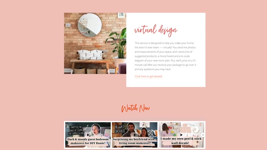
So squarespace if you guys don't know is like your one stop shop to creating a beautiful website .
My website is powered by Squarespace and I use it as a place to sell virtual makeover packages to house my portfolio for sponsors who are looking to sponsor videos is a place for my viewers to catch up on like the latest and greatest news .
When it comes to anything .
Team A G and you really get a custom feeling website that's easy to create .
Even if you don't know how to code or like use HTML .
It , it's simply drag and drop and then you can look back in the back end and see what's performed , well , see what's selling out , see what blog post people are reading .
So if you are looking to create a small business , I will say it forever use Squarespace .
It has really been a great thing for me and my brand .
So head to squarespace dot com to start your free trial and when you're ready to launch , go to squarespace dot com slash Alexandra Gator to get 10% off your first website or domain .
OK .
Let's head back into the makeover and see how Eva is doing .
So update .
And a few days later , Eva called me and she was like , I really don't like the wall color .
And at first I was like , just trust the process .
Then I thought , you know what , this is totally part of the process and when you're making over your own space , it is OK to change your mind halfway through .
It's all part of the process .
And to me that's like part of the fun of a makeover is sometimes things just don't work or don't turn out how you envisioned them .
Welcome back to the corner of my living room .
Got a new color through to wood .
So pretty .
Oh baby .
This looks like pistachio ice cream in the best way .
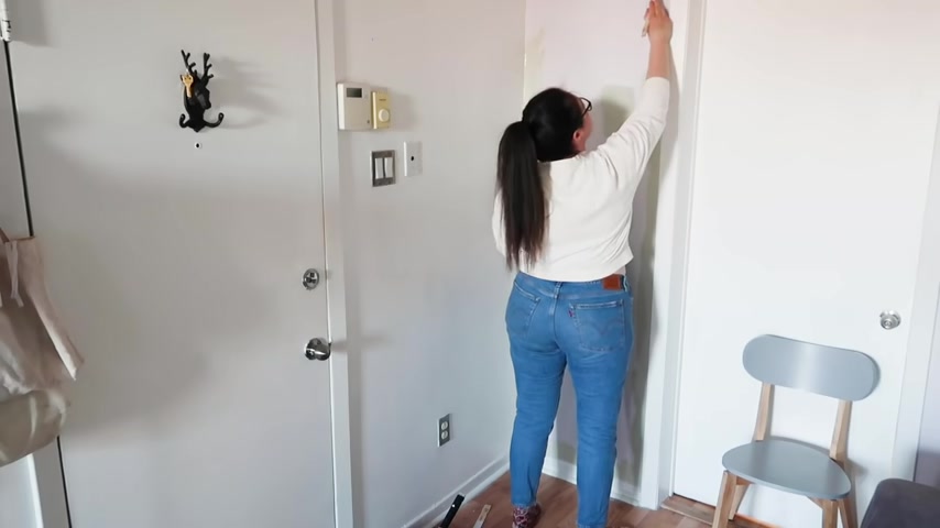
So I'm not sold on this brush that dusty lilac color .
I still love it .
It is linked down below and I think it's a great choice for someone who feels comfortable putting purple gray on their walls , but it just wasn't for Eva .
So we've gone with this beautiful sage green color also linked down below and I love how warm this is and the rug is still going to match with it and it just feels like much more Eva .
Oh , that sage green looks so good .
Ok .
So while we wait for this first coat to dry , which , by the way , I'm loving so far we're gonna do a quick little diy .
I'm really excited .
I'm so excited about this project because I'm gonna show you how to make a renter friendly pendant light , how to cover up those ugly ceiling lights that come in just about every rental on a budget .
And without taking down the light , you've been asking me to do this forever .
The day has finally come .

I already have this lamp shade .
It's a little beat up , but like in totally great condition .
And so we're gonna upcycle it .
I think Alexander is gonna take you through the steps and I'm gonna watch the office .
I sent Eva all the supplies .
But if you are gonna make this at home , here's what you need .
Some cane wedding , some edge banding and some really super adhesive glue .
You're also gonna need a white lampshade , Eva already had this , but you could thrift it for under like $5 .
There's tons of options at the thrift store to install it .
You're also gonna need cup hooks .
You can get these from the hardware store also under $5 .
So the first thing you want to do is take your lampshade and wrap it with the cane webbing to see how much you'll need .
I find it's easiest to attach binder clips to the cane webbing like Eva's doing here .
Once you have your desired amount , you want to cut the cane webbing two sides .
It's around perfectly with some allowance and overlap over here .
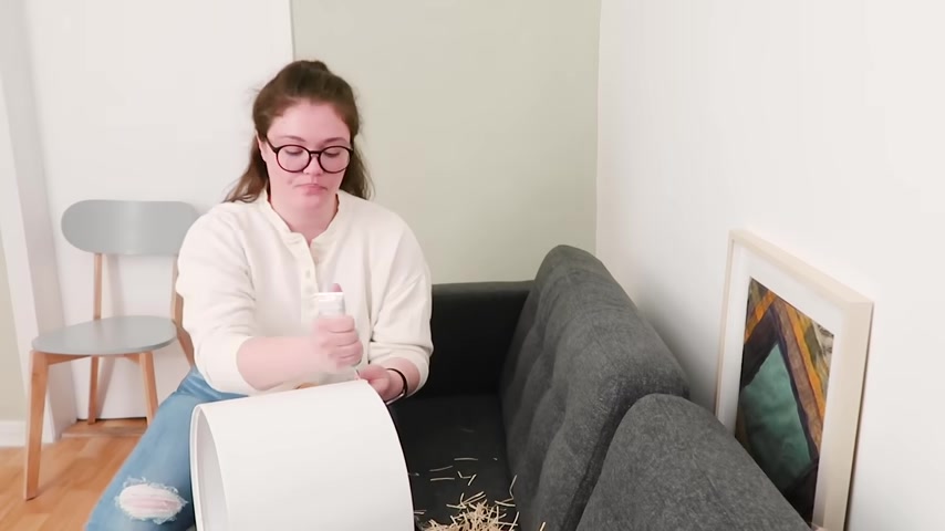
You also want to cut the edging off as well .
I actually think it could work with the edging , the little like tassie bits at the end .
But for this project , we are cutting those off .
Now it's time to start gluing it down .
So you just want to go kind of piece by piece , put the glue all over the lamp shade and stick the cane wedding to the lamp shade .
These binder clips again are super important just to hold the whole thing in place .
Then the last step is to use some edge banding to finish it all off .
Usually edge banding is ironed on for this project .
We are just going to glue it down .
I will also mention you could totally use a hot glue gun for this both work .
You just want to make sure you're not putting the glue where the holes are in the cane webbing because it's just gonna like seep through the holes of the webbing .
So for the edge banding .
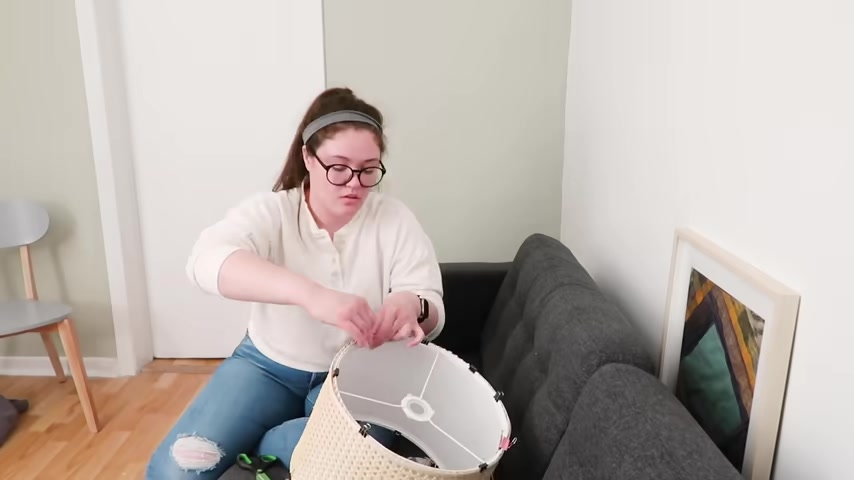
You just want to wrap it around the edge , glue it down again , clamping it with binder clips and you want to put the whole thing aside and let it dry for 12 to 24 hours with those binder clips still on .
It looks so good and the battery is about to die when it's dry .
It's time to hang .
This is super simple .
You just want to hang some cup hooks three to be exact if your lamp shade has the like three metal bits at the top , the cage , the cage of the lampshade , hanging the cage of the lamp shade on the cup hooks .
And you guys look at that .
It's level in everything .
I mean , a super ugly renter light completely disguised by this beautiful caned pendant light beauty in my notes , I wrote in Caps Renter Friendly Pendant because that's what it is .
This is so good .
I want to do this more because it is a great hack .
Now it's time for Eva to hang shelves .
Now , Eva has a ton of art that she wanted to put on display .
And I always like to opt for photo ledges instead of putting a million holes in your walls because photo ledges only require three usually screws .
Yeah , that's like really not it at all .
We're gonna pretend it is .
And then you can just place your art on those shelves and you can change it up whenever you want .
So I always opt for if you're renting , patching up three holes is way easier than patching up like a million level cameras .
Does the camera look level ?
I definitely knew that I wanted to use these metal IKEA floating shelves beside the sofa so Eva could use it as a side table level broken .
Oh , no .
When you're working with a small space , vertical wall storage is a must .
Now it's time to check in with Eva .

We're gonna chat about the pieces going above her sofa .
I think we've landed on going with three art pieces .
So we're just gonna figure out the configuration .
Hello ?
So what I would recommend is starting with your biggest piece of art .
Yeah , and figuring out where you want that and then working around that piece of art .
I think I wanna just use like these larger pieces and no small ones .
These two stocked .
Yeah .
Next to the bigger one , 12 and then three .
Yeah , I really like that .
I also feel like you could put some of the other ones on the shelves maybe .
Yeah .
Yeah .
Yeah .
And center those within the sofa .
Yeah , I feel really strongly about just three .
I'm glad yay .
Exciting .
I believe in you .
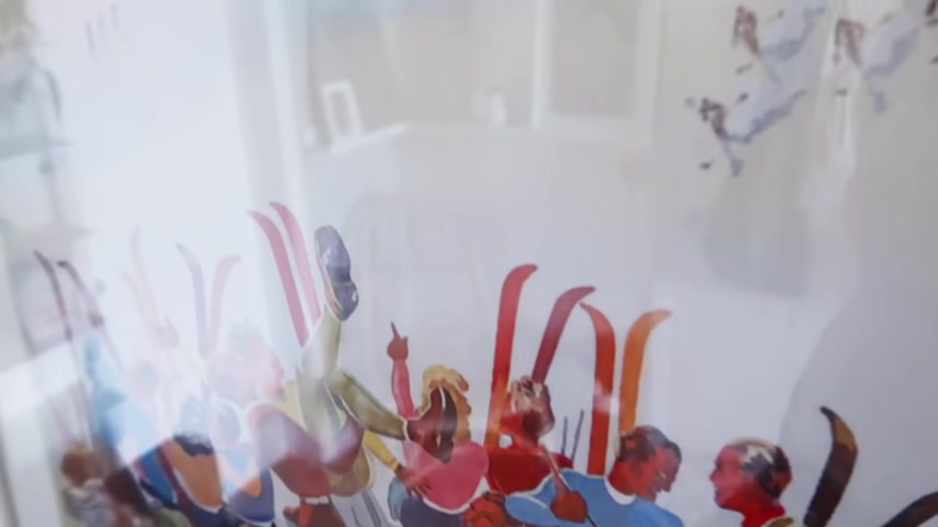
So , pretty much Alexander and I agreed less is more on this wall , partly because there's a lot of color .
So I have this ski poster that is in a frame and looks like an actual art piece which I'm really happy about .
And then I have two sort of similar drawings from my mom who is an artist .
And um it would be nice to have some of her work displayed every day .
Beautiful .
So the main problem with any entry way in a small apartment that opens up to your living space is like , how do you make it feel separate ?
So , Eva actually had the awesome idea to use the floor towels that I use in my bathroom .
I've also used them in kitchen videos for backsplash and we're going to create like a little vinyl kind of matte .
This is going to visually separate the entryway from the living room .
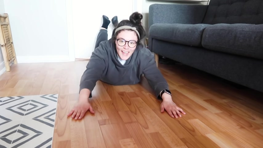
Welcome to my entryway floor .
Now we're gonna lay down this Quadros style vinyl tile .

I love this idea to sort of help define the entry way and also love the colors and how it's going to tie in the white walls and the gray sofa .
I think it's going to be really fun and it's actually going to help cover up some of the imperfections that are already in my floor .
I went with this bold pattern because I want it to really visually represent that like this is the door , this is a little entry way .
Once you step off these tiles , you're in the living space , sometimes it's like the most simple changes like this that really make a big difference in a small space .
So all you want to do is cut to size .
You want to peel the sticker back and just run your hand over it and smooth it .
So it sticks to the floor .
I have these in my bathroom , they are waterproof .
You can put them in a kitchen .
They're super durable .
So this is a perfect option for a small entryway .
And when Eva leaves all she has to do is pull these up and they don't leave any sticky residue behind .
They're completely renter friendly .
I really feel like we're in a long stretch , we're gonna get the rug and lay it out and see it in the room and everything .
And I'm so excited I had left .
I went with a round rug for this space because when you're working with a really narrow living , you want to bring in other shapes to make it feel a little bit more open and because the sofa is rectangle , I didn't want everything to feel super boxy .
So if you are working in a small space and you have a narrow layout like Eva does try around rug .
Enter , live in this room , enter here , live in this living room .
And now it's time for Eva to start styling those shelves .
I'm gonna call her to check in to see how she's doing and maybe style from afar because I truly can't help myself .
Oh , it looks so good .
That light looks amazing .
Busy for me though like , yeah , I actually think it's perfect .
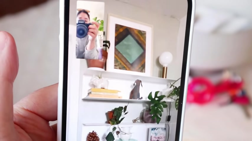
I think you could have one thing on that shelf just like something small , like maybe the dog sculpture .
Yeah .
Oh , yes .
Oh , my gosh .
Eva , that looks so good .
That looks so good .
Move that stack of books and the jugs over to the left like this .
Yeah .
Yeah .
Move the yellow stack of books and the elephant over to the right of just a tad .
So it's like it doesn't feel super pyramid .
Yeah .
Yes , I love it .
I love that green .
Me too .
Eva looks so good .
It looks so so good .
Yay .
Well done .
We're getting there .
Could you wanna say bye to the vlog ?
Bye vlog .
Thanks for coming on my chaotic adventure with me .
Now it's time for those finishing touches .
300 years old .
This is the closest I've been to holding hands with anyone in so long .
Thank you to article for this perfect Boho chair .
It fits so well in this little corner and turns this entryway into a place where there's also extra functional seating .
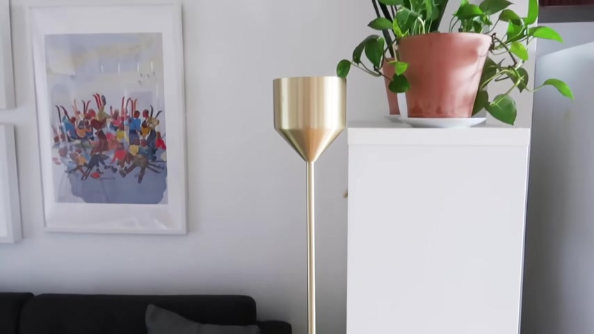
They also sent this gorgeous gold floor lamp a business , isn't it so cool ?
Again ?
It's like vertical .
So it's maximizing that vertical space gives off a lot of light and just adds some ambience to the room .
Hi .
Hi , welcome to my living room .
I'm so so excited to see it .
First of all , how is the process of everything ?
Honestly ?
Like this is the kind of thing I really enjoy doing , but it was nice to like be backed by you and your team .
Oh my God .
I love that before you reveal it .
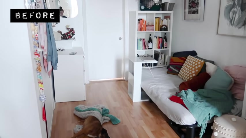
Let's just chat about what it looks like before .
I feel like the main issue was that it didn't really feel like it was a living room .
It felt like it was an entryway and there was a futon and it didn't feel like an enclosed cozy space .
It wasn't like purposeful and it also wasn't comfortable .
You have such a unique and specific style .
And so I really kind of let you take the lead on this and you had so many good ideas , you get special treatment because you're basically family .
Ok .
So let's let's reveal the space .
Ok ?
Oh my God , it's so good .
It's so so good .
Eva .
Right ?
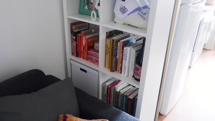
That bookshelf makes such a huge , huge difference .
It blocks the fridge , which is amazing .
So it really does feel like a separate space .
Let's see that sofa , it looks like a regular size sofa , but it doesn't feel too big or too bulky .
I love it .
The gallery shelves , you did such a good job with those getting a good balance of it , not looking super cluttered like it looks full , but it doesn't look overwhelming .
Also , I love the shelf by the sofa because you can use it as a side table , which is I think just genius my water shelf , it's my beer shelf .
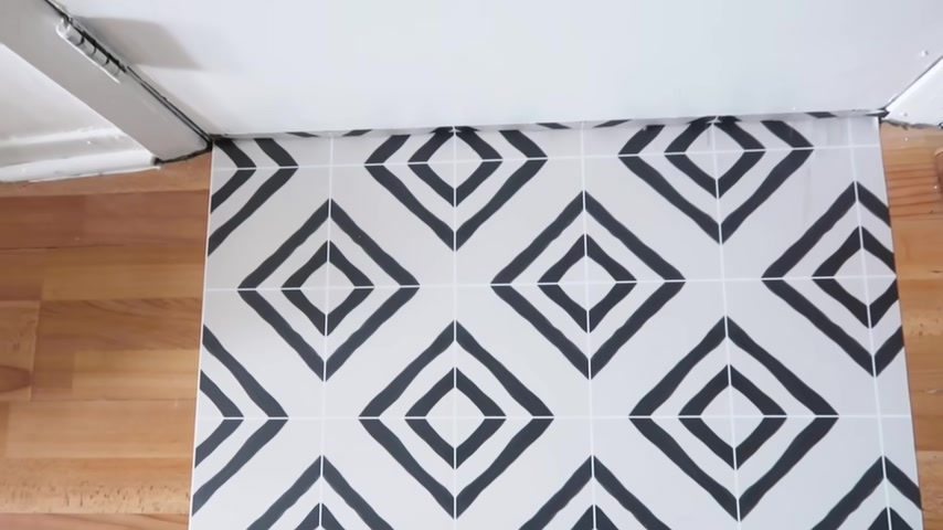
Also those peel and stick tiles on the floor , they look so so good .
That was such a good soul for creating a visual divide .
Thank you for doing this .
Thank you for doing this .
Well , no , this has taken up like a month of your life , but it's been more like a month and a half .
You're the best .
Bye .
And there you guys have it .
A complete living room makeover made over from afar .
I really hope that this episode helps you guys and your own small spaces .
I feel like Eva's apartment is so relatable .
Thank you so much to Squarespace for sponsoring this video .
Make sure you guys guys use my code and my link in the description box to get 10% off your first website or domain .
Next week .
We have a crazy crazy kitchen makeover .
Can't wait for you guys to see it .
Ok .
See you guys then .
Bye .
Are you looking for a way to reach a wider audience and get more views on your videos?
Our innovative video to text transcribing service can help you do just that.
We provide accurate transcriptions of your videos along with visual content that will help you attract new viewers and keep them engaged. Plus, our data analytics and ad campaign tools can help you monetize your content and maximize your revenue.
Let's partner up and take your video content to the next level!
Contact us today to learn more.