https://www.youtube.com/watch?v=KbjmCjYbM6E
YOUR COFFEE TABLE IS A PROBLEM...Lets' fix it!
Hey guys , welcome back .
I'm so excited today .
I'm starting a new series all about your Decor .
Oh , we're gonna have so much fun with this and first up is coffee table .
Uh Yes , the ubiquitous coffee table .
We all have one usually and you know , you finally decide on one that works for your style and there it says blank .
Oh , too afraid to deal with it or even worse .
It's covered in junk that doesn't belong there .
I'm gonna show you today exactly what to do with it to make it fit your style and nail your Decor .
Now , as I mentioned , this is the first in a series and we're just starting with the coffee tables .
But understand this when you're working with Decor , it's all about understanding the basic rules around styling .
And interestingly enough , a lot of the styling rules actually pull from your basic design principles .
Now , if you want to know more about that , be sure and sign up at the design club dot com because I've got a whole series of lessons all around the basic principles around design and how you can apply them in your spaces to make it work for you .
Rule number one about styling your coffee table is how many surfaces does the coffee table have ?
I mean , honestly , you can get one with just the simple top or you can have a double or you can have a trio .
So there's all different types .
So you need to know what you're working with there .
That's the first parameter .

The second parameter is what's the table's material made of very important because you're always going to be playing off of that visually .
So is it all glass ?
Maybe it's a glass and metal ?
Maybe it's a beautiful solid wood one ?
There's just , you know , there's all kinds out there , even like this trunk .
So there's all kinds out there and you wanna make sure that you're considering that when you're both choosing , arranging the pieces that will go on the top and the last parameter that you'll always wanna remember is what's your style statement ?
Right ?
Are you a minimalist ?
Maybe you're a maximalist , maybe you're something in between one candy boho , any of those ?
Remember this decor , the whole category always is what nails your design statement .
So you wanna make sure that it's always in alignment and injecting the final element of your style .
OK .

Now , speaking of elements , rule number two is elements and the rule of odds .
Now it's something in the universe and basic principles of design , but things look better when they are collected together in odd numbers , ones , three fives even seven .
So depending upon how many layers of table you've got , how many things you want to put on it , what you need on the top of that table .
Remember that you always wanna have groupings or elements that end up in odd numbers , it will just feel more satisfactory .
Now , rule number three is function and meaning .
So obviously , there are certain things that you kind of need on a coffee table and a lot of them can be sort of flotsam and jetsam , like , you know , a TV remote or a matchbox or all kinds of different things .

So you want to make sure that what you've got going in there is collected in a way that ends up looking visually organized .
So you're gonna think about really useful tools like bowls , boxes with lids , baskets with lids , uh trays , all of those kinds of things .
There's lots of different ways to collect the smaller pieces , pop the lid on them .
So they don't show and the collective decorative element does .
And that looks much more organized .
Now , like I said , there's always that element of function .
I need the coffee table or I need the television remote , I need XY or Z .
But then there's also the element of what would complete this statement and completely be decorative .
Maybe it's a found object or a piece of sculpture , maybe it's a couple of books , maybe it's just this exquisite bowl that you love or a simple vase with flowers in it .
They can even be fake if you really want .
That element is purely decorative and it's there to serve to create often either a height element or that purely decorative statement that helps round out the collection go to elements can be things like trays , uh bowls for vases and flowers .
Candles even can be good collections of candles but not too many , no more than three books boxes for coasters , perhaps that's actually a useful item and can be beautiful at the same time .
And like I said , a found object or perhaps some sculptural piece can be also very interesting and help complete the texture and balance statement .
So let's do this .
Let's study some gorgeous tables that I've collected by style .
So you'll understand how they got that way and you can do it too .
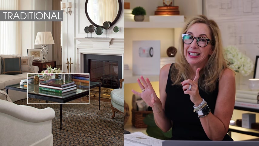
So let's start with a really beautiful traditional coffee table .
Now , this is a whole , a completely lovely room .
But on that coffee table , what they've done is they've placed a series of elements of books .
Now , I'm gonna tell you this , you don't really need that many books a lot of times they do that for styling .
But at the end of the day , you can't put a whole lot down on that .
So think about function and go uh maybe they only need three stacks of books or one stack of books .
It doesn't really matter .
But for the styling , for the picture , they added a few more , but it still looks lovely .
They've also got an ashtray , they've got a formal cut vase with flowers in it .
So it's a very sort of formalized composition .
It works very well for the space because the table top is glass .
So what they've added to it is rather mass like .
So that's really good .
Now , how about this next one ?
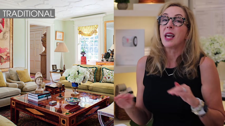
Oh my gosh , this is another traditional style table and it's a gorgeous market table with a super , super high gloss finish .
So what did we say about applying the rules and the parameters with that high glass finish ?
It's almost like glass but it's not see through .
So what they've done is they've added elements that have pops of color and texture that push back against that glossy bossy table and create a little bit of an interesting contrast without looking like a hodgepodge .
They've done a beautiful stack of books again with a lovely little bust on the top , a gorgeous footed vase that's blue with some white hydrangeas in it .
That's lovely .
A couple of small trinket boxes and a small bowl .
Again , odd numbers of elements and it looks absolutely intentional and beautiful and like it actually lives there all time like that because they probably used those smaller elements .
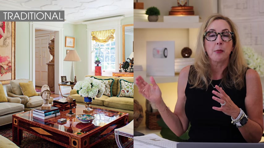
So that's a lovely example .
Now , another thing that you can always consider with traditional is you can have a little bit more than say , if you're leaning more towards the contemporary style statements because traditional allows you to have a little bit more of the elements of statement that create that style and it feels good .
Still .
All right .
So now let's take a look at some contemporary options that I pulled together that I thought would be good examples .
I love this one .
It's a trio nesting table that I think is absolutely stunning .
It's a stone top to it .
Now , what have you got parameters ?
You've got three levels .
You've also got a very contemporary space and there's that textual stone top .
So what they did is keep it very , very simple .
There's only three pieces on that entire table , which is great .
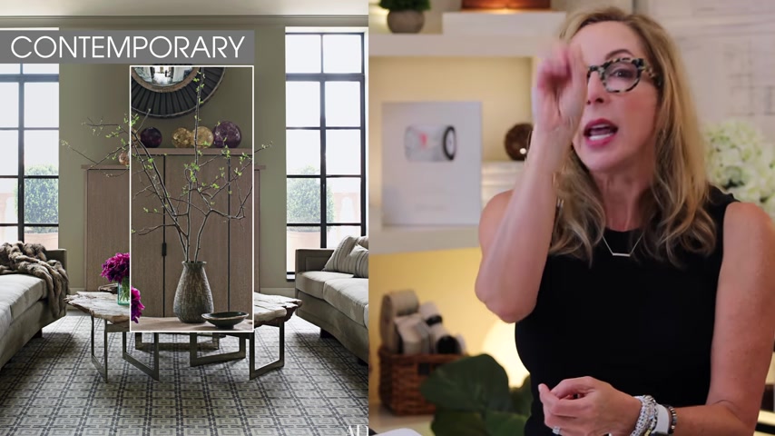
Two of them happen to be vases .
One of them is a tall vase that has high sprigs in it .
And what that does is that gives you that element of height that you want in a composition as well .
Then there's a lower vase which is really quite beautiful with a pop of color florals in it .
And then there's a simple bowl .
So they kept the statement of the three pieces very simple because not only are they dealing with level changes , but they're dealing with that incredible textured stone .
So that's a beautiful solution to that table .
Now , the next one also very textured .
Interestingly enough , we're getting lots of texture in these contemporary examples .
It also has a high element that happens to be florals , but it's kind of these rough he logs that are tied together .
It's a very interesting table actually .
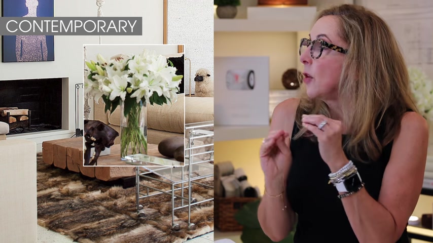
And what they did was they wanted to contrast that roughness with some beautiful gloss , clear glass .
So that kind of plays against the statement of the rough table , simple white flowers in it and a beautiful sculptural piece in the center that has this lovely textured surface to it .
It looks like it might be cast bronze and that also plays against that .
So again , they're using odds , they're using textural combinations and they're placing items in ways that allow you to think that there's actually function around it , which is really great .
Now , this last one I simply couldn't resist .
And it's for all of you minimalists out there because it's a gorgeous coffee table and you never want to have an empty coffee table .
Never .
But it's this stunning stunning tree root .

Now , the tree root in and of itself is a sculptural art statement , right ?
So they didn't overburden it with too much decor , one simple glass bowl with a little bit of a greenery in the top .
You're done and that's all it needs .
Gorgeous , simplistic rule of odds .
Perfect levels of contrast , minimalist Decor statement nailed .
Now , for all of you guys out there that are transitional , you know , there's so many different looks with transitional .
So it's a really broad palette that you're working from , right ?
So I love this piece here .
It's a double layer coffee table .
OK ?
So we haven't addressed that yet .
And what they did was they took a stack of books .
I think there's four or five there .
And remember this , when you do a stack of books , it kind of counts as one element .
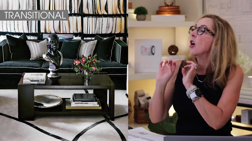
So they did that on the lower level along with this gorgeous flat bowl .
Then on the top , they added this high , gorgeous , gorgeous , super high gloss bust and then a gleaming silver vase with a little bit of florals in it .
And a couple more books that act again as a single element .
Clearly , you can see by the back wall that someone here is either a literary person or that reads a lot because there's a ton of books in this space .
So books are a kind of a decor theme for this individual .
And so they've kind of expressed that along the coffee table as well .
And so it's really nice to see how they played both layers of the coffee table in a way that you could see through and see it and it was important and well combined for both layers .
Now , a pro tip on this one is fiddling with your decor and that's an official Lisa term is the way you get it to finally work .
So if you play some things down and it doesn't work on the table , remember to squidgy something over an inch or maybe move something around just a little bit , maybe turn something a little bit and sometimes that's all it takes to kind of make the composition lock into place in a way that you go , ah , done .
And here's the secret super tip when you have it done , take a photograph of it from all four sides .
Why ?
Because the minute somebody else comes in the room , the kids throw their feet up on that table , your husband does this with a remote .
It's right .
No , because you've got those pictures , you can always refer back to them and go .
Ah , yes , it's peace of mind and insurance that you know that your table will always look fabulous .
Ok .
So now here's another great transitional example and this is an exquisite room leans more towards the contemporary side but very interesting what they did with this coffee table .
First of all , because that table is a high gloss shine .
They wanted to get some definite texture play against it .
So they've done a beautiful sculptural piece .
There's a little bit of sheen , but there's some sinuous lines to it which really contrast with the lines of the table .
Then they have this what looks like this gorgeous blob .
It actually might be an ashtray of molten glass , which is absolutely lovely and it feels solid and formed , which is gorgeous and then it looks like they have some sort of bronze art which is absolutely gorgeous and then there's a couple of books in the back .
So again , odd numbers , a high element that stays relatively low .
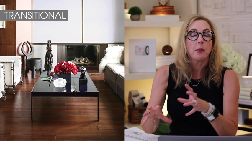
But pops with a series of serious red color because you've got the formal sitting arrangement and then just kind of placed in a way that looks like you can still use the coffee table .
But that all the elements look intentional .
That's a gorgeous example of a lovely transitional coffee table .
OK , guys .
Now , this last gorgeous transitional coffee table is actually Ellen degeneres Residence and I loved the composition on this one because of all the ones we've seen , we haven't seen somebody work with a plinth and this plinth is stunning .
It's just a simple plain wood grain , which is really very beautiful .
So what has she done with it ?
She's added a high element that is in clear glass because that plinth is so solid .
So that clear glass vase with just a few lovely little twigs on the top is so light and airy and clear and it's beautiful .
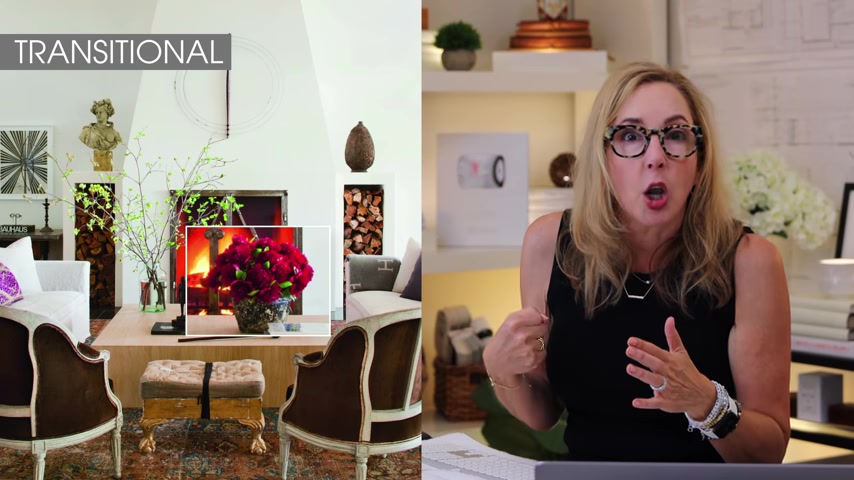
Now , the second floral arrangement again is a little bit lower , but it's a pop of color which is really fantabulous .
And then she's added a little bit of a small scope through piece , a couple of books and it's just a beautiful composition .
Again , it looks real , it looks lived in , but it looks intentional and well put together .
That's a gorgeous composition to be inspired by .
All right guys .
Now , I know you've got this , you have got this , I have faith .
Now , here's the deal .
I understand it is really tough to design for your style .
It's super hard .
So what you want to do is keep watching the channel .
Now , every time I drop a video , if you got your bell on ding , ding , ding , ding , then you're gonna get notified that I've just dropped some new super groovy little bit of information and make sure you subscribe .
Oh , I love that .
That's always great for the channel .

And what I want you to do now is I want you to go right over here to this button where I've created a special playlist just for this Decor series which will talk all about different style statements and how you get them beyond your Decor .
So go right here , click on this thing and I'll see you guys next week .
Are you looking for a way to reach a wider audience and get more views on your videos?
Our innovative video to text transcribing service can help you do just that.
We provide accurate transcriptions of your videos along with visual content that will help you attract new viewers and keep them engaged. Plus, our data analytics and ad campaign tools can help you monetize your content and maximize your revenue.
Let's partner up and take your video content to the next level!
Contact us today to learn more.