https://www.youtube.com/watch?v=q2qWQjpVmdg
How to Make Your Living Room Look Expensive

Hi , everyone .
It's Nick .
Welcome and welcome back to my channel .
Ok , in this video , we are going to be talking about how to make your living room more expensive .
So the first video I ever did on youtube coming up three years ago is how to make your home feel more expensive .
And I thought let's revisit that topic but just go room by room .
And so in this video , we're gonna be talking about the living room and I'm also gonna do bathroom and bedroom and all sorts of stuff later important to note though , that expensive isn't into design styles .
It , it just basically what I say when I mean more expensive is just a little bit more personal , a bit more to you , a little bit more custom rather than just sort of feeling so basic .
That's what I mean by expensive .
But um you're just gonna give you some tips on how to make it a little bit more special so that you can love your place a little bit more .
So let's get going .
Ok , first up on my list is going to be paneling and other wall treatments .
So walls are , I was gonna say underutilized , but maybe they're not properly utilized .
I would say wall treatments do a fabulous job of just providing some beautiful texture to a wall .
They give it some visual interest , but they don't necessarily feel really heavy and overwhelming .

I think sometimes what people do is they see a blank white wall , they throw a piece of art on probably from home sense and then I shouldn't chuckle probably from home Sense or somewhere else that you may enjoy and then they go .
Ok .
Well , that's it .
I'm done .
I fill the space but wall treatments just make a place feel really tailored and don't ever underestimate the importance of kind of your finishing carpentry .
I think crown moldings if you have high ceilings and you have a big beautiful space that might make sense .
You don't necessarily need them though .
But um beautiful baseboards , uh panel moldings , chair rails , all sorts of really gorgeous moldings .
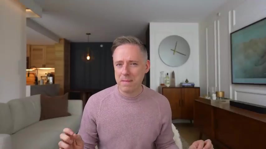
Again , you know , if you paint them out to the same color , like I've done in my background here , uh uh with , with the rest of the wall , it just sort of fades into the background , but it really helps your space , sort of feel a little bit more custom .
It gives it some texture on the wall provides a little bit of shadow and just some visual interest .
You can also then hang your art on top of moldings and it just sort of kind of provides like a nice layered look .

It's kind of like just like layering an outfit , you know , like you've kind of got multiple pieces and then you've got kind of your jewelry and you've got whatever and it just sort of kind of really elevates your outfit and makes it feel a lot more interesting .
The same is true with wall treatments .
It typically just kind of fades into the background and provides a nice backdrop for the rest of the space .
Now , wall coverings also work like beautiful wallpapers .
You can use everything from really simple , like a nice gorgeous grass cloth all the way to some like a really funky jungle print or some sort of really interesting print that you love something geometric , maybe lots of different options on the wall treatment side that you can do as well as you know , vertical slat walls , stone .
I mean , if you've got the budget for it , of course , gorgeous , like lots of different gorgeous wall treatments that you can do , going to make your space feel more interesting , gonna feel a lot more expensive and a lot more custom and tailored to you .
OK .
Next up on my list is going to be to create vignettes in your space .
So in the context of interior design , a vignette refers to a sort of carefully curated arrangements of different displays of really interesting objects and furniture and sort of decorative elements within sort of a defined space , right ?

So it is a composition of items that are grouped together to create some sort of visually interesting and cohesive .
And I think it's really important to both create focal points in your space , but also to create these vignettes of sort of these curated objects to make it feel really special and interesting .
So examples of areas to create a and yet it might be something like on your mantel , it could be on your coffee table or sort of maybe on top of like a bar cabinet or a media console or some sort of other table top , something something like that .
But you know , shelving units also make sense , built ins , make sense .
So just creating these vignettes of sort of really carefully curated objects that sort of tell a story and they just make a space feel a lot more visually interesting and it's a way for you to sort of personalize it with your own personality as well .

Hi , everyone .
It's Nick .
Welcome and welcome back to my channel .
Ok , in this video , we are going to be talking about how to make your living room more expensive .
So the first video I ever did on youtube coming up three years ago is how to make your home feel more expensive .
And I thought let's revisit that topic but just go room by room .
And so in this video , we're gonna be talking about the living room and I'm also gonna do bathroom and bedroom and all sorts of stuff later important to note though , that expensive isn't into design styles .
It , it just basically what I say when I mean more expensive is just a little bit more personal , a bit more to you , a little bit more custom rather than just sort of feeling so basic .
That's what I mean by expensive .
But um you're just gonna give you some tips on how to make it a little bit more special so that you can love your place a little bit more .
So let's get going .
Ok , first up on my list is going to be paneling and other wall treatments .
So walls are , I was gonna say underutilized , but maybe they're not properly utilized .
I would say wall treatments do a fabulous job of just providing some beautiful texture to a wall .
They give it some visual interest , but they don't necessarily feel really heavy and overwhelming .

You've got some pieces that are high , some pieces that are low , you know , it's , it's balanced .
You don't necessarily have a whole bunch of objects on one side and then nothing on the other .
You know , they sort of vary in size .
They've got lots of different textures and colors happening there .
I just really sort of tell a story and I think that these vignettes really sort of are what people see when they see on Instagram and they sort of see in some of these design shows and they go , God that looks beautiful .
Why does it , and why does it my home ?
And oftentimes that's it , it's , it's a , it's an area of the home that is curated and special and interesting .
And I think that really makes the place feel premium and a lot more expensive .
Ok .
Next up on my list is going to be keep it clean and organized .
I feel like this one should be kind of obvious but surprisingly kind of like not really , but also speaking to what I was mentioning earlier of like the not so pretty stuff that you have , which might be practical and super important to have .
And I get that if you can store it or you can find places for it so that you're organized , it's gonna go a long way to make your space feel more expensive and more kind of custom and tailored to you , right ?
It's gonna look a lot more beautiful because it's not gonna have clutter .
So clutter is not , you don't have to be a minimalist , right ?

Like I'm not saying like , don't get rid of everything but just maybe be mindful and intentional on what is being displayed and what is not being displayed because so often we get lazy myself included and we tend to kind of throw things in the space that is not particularly attractive , but we use all the time and we just kind of like go like , I know I should put that away , but like , I just don't have the energy and I think having that energy to actually put stuff away that you're not using or that maybe isn't that attractive ?
And then having things on display that are beautiful can really go a long way to making your space sort of feel organized .
It will feel a lot more cohesive and more intentional with what you put out because that's really the name of the game .
Like a lot of designer look sort of thing or just everything's really intentional .
Everything is thought through and sometimes that is impractical , but sometimes it's just a matter of putting your stuff away .
You know what I mean ?
Like , we can sit and blame like , oh , that's impractical all we want .
Sometimes it's just on us to just kind of keep our place clean , you know .
And , um , that is honestly a good starting point to make your place feel more organized and , and a lot more expensive too .

I think sometimes what people do is they see a blank white wall , they throw a piece of art on probably from home sense and then I shouldn't chuckle probably from home Sense or somewhere else that you may enjoy and then they go .
Ok .
Well , that's it .
I'm done .
I fill the space but wall treatments just make a place feel really tailored and don't ever underestimate the importance of kind of your finishing carpentry .
I think crown moldings if you have high ceilings and you have a big beautiful space that might make sense .
You don't necessarily need them though .
But um beautiful baseboards , uh panel moldings , chair rails , all sorts of really gorgeous moldings .
Again , you know , if you paint them out to the same color , like I've done in my background here , uh uh with , with the rest of the wall , it just sort of fades into the background , but it really helps your space , sort of feel a little bit more custom .
It gives it some texture on the wall provides a little bit of shadow and just some visual interest .
You can also then hang your art on top of moldings and it just sort of kind of provides like a nice layered look .
So it is a composition of items that are grouped together to create some sort of visually interesting and cohesive .
And I think it's really important to both create focal points in your space , but also to create these vignettes of sort of these curated objects to make it feel really special and interesting .
So examples of areas to create a and yet it might be something like on your mantel , it could be on your coffee table or sort of maybe on top of like a bar cabinet or a media console or some sort of other table top , something something like that .
But you know , shelving units also make sense , built ins , make sense .
So just creating these vignettes of sort of really carefully curated objects that sort of tell a story and they just make a space feel a lot more visually interesting and it's a way for you to sort of personalize it with your own personality as well .

So make sure that it reflects who you are .
And you know , if you can have some personal objects maybe mixed in with some , you know , mass produced stuff can be fine .
I think it helps , you know , make your place like a lot more expensive , a lot more customized to you and more authentic to who you are .
And I think that goes a long way to making your space in my view feel really expensive .
Ok .
Next up is going to be lighting upgrade your lighting , people underestimate lighting .
And I feel like I do talk about lighting a lot on the channel and for good reason because lighting is very important .
We , we tend to stress about like getting out the paint swatches .
To determine , ah , do I go with Chan to simply light ?
The truth is honestly , sometimes a lot of it , it just comes down to lighting , how lighting affects the rest of your space is massive .
You can take a mediocre space and make it fantastic in my view by just simply swapping out some of the lighting .
So , when I'm talking lighting , I'm talking about a few things , I'm talking about color temperature .
So choosing something that is a little bit more on the warmer side , you know , rather than choose , it's fine .
If you want to choose like a brighter white , that's ok .
We all have our preference .
That's ok .

Like I'm not saying like , don't get rid of everything but just maybe be mindful and intentional on what is being displayed and what is not being displayed because so often we get lazy myself included and we tend to kind of throw things in the space that is not particularly attractive , but we use all the time and we just kind of like go like , I know I should put that away , but like , I just don't have the energy and I think having that energy to actually put stuff away that you're not using or that maybe isn't that attractive ?
And then having things on display that are beautiful can really go a long way to making your space sort of feel organized .
It will feel a lot more cohesive and more intentional with what you put out because that's really the name of the game .
Like a lot of designer look sort of thing or just everything's really intentional .
Everything is thought through and sometimes that is impractical , but sometimes it's just a matter of putting your stuff away .
You know what I mean ?
Like , we can sit and blame like , oh , that's impractical all we want .
Sometimes it's just on us to just kind of keep our place clean , you know .
And , um , that is honestly a good starting point to make your place feel more organized and , and a lot more expensive too .

So to me , something as simple as concealed storage .
So baskets for things , closed door cabinetry goes a long way towards being a little , a bit more practical .
So keeping the stuff that's maybe not super attractive because you do need it realistically .
It's because you don't live in an architectural digest magazine , but you're still able to maintain the rest of your space looking really beautiful .
Ok .
Next up is going to be really unique items , personal items preferably .
Now again , I'm not gonna sit here and tell you that everything in my home is some completely like beautiful found piece that is not manufactured and found at like an IKEA .
I'm not going to tell you that you're probably looking around my background right now being like , yeah , we know that that's not , and that's fine .
But like , that's not because , like , I don't know , that's not real for most people .
But I would say that if you can find some pieces , just some that just tell a little bit of a story and reflect sort of who you are .
You know , if you're a vintage person , if you're an antique person , if you're a thrift shop person , go have at it .
If you know , you like to travel and you like to bring home souvenirs and you want to just play that , go for it .
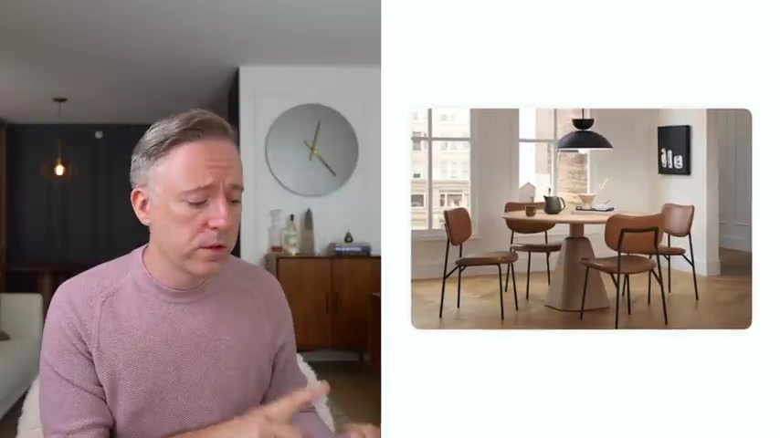
If you're a photographer and you want to frame your own stuff , amateur photographer though , you may be and you want to like take some beautiful shots and then , you know , print them out and then put them and frame them and put them on your wall , all that stuff , I think goes a long way to making your space feel a lot more personal .
And again , it's going to tell that story of who you are .
I think , you know , some people say design doesn't matter in which case , go live in a hospital for a few weeks and then tell me design doesn't matter because it matters , right .
Go live in a prison and tell me design doesn't matter .
It does design matters .
And so to me , you know , having a space that you love that tells your story does matter .
Obviously , that's why I do what I do .
And II , I obviously believe that , but I think it's really important that it also reflects who you are .
And that means , you know , taking pieces that you have found that you really enjoy and showing them .
Because I think one of the best parts of a design too is that unlike , say , clothing , which reflects who you are as well .
You get to welcome people into your home and they get to kind of experience who you are in like a really real honest way .
They get to come and spend time in your home .
They get to experience you first hand on a kind of a practical basis .

I , I , you know , there are things that you can do a gallery wall might make more sense .
But I would say that finding art , especially large scale art , if you can really makes a space look a lot more premium and a lot more expensive because when a place in art piece looks a little bit too small , it just doesn't fit with the scale of the rest of the space and it just , it doesn't work .
You need something that is going to fit the wall roughly that you're going to be working with .
Again , if you can't afford a really big piece and you don't want a diy because you don't have any talent like me , then I would say if you do want to go with the gallery wall , go for it , you can buy some riba frames , you can buy some prints off of Etsy or Society Six or whatever , find some interesting vintage movie posters or whatever you're into and you can cluster them in an interesting action on gallery walls .
Go check that out and you can actually cluster , but it's gonna fill the space a little bit better .
Than some dinky little art piece that's just gonna be sitting in the corner .
I get that .
It's cheaper .
I understand .
I get it .
But um it's just not really doing any favors .

But I think the stuff that's reserved for the garage , the lighting that's meant for a garage is not lighting that should be brought into your home .
I would also say something that people don't talk about enough when it comes to color .
Temperature is being consistent .
So what I cannot stand , what literally gives me a headache is , is when I see a lamp that's got a really like warm golden light , but then you've got another lamp and it's a really bright white and now you've got mixing lighting temperatures .
Oh , that gets me , you know , at least be consistent , get something , get bulbs , whether it's the Phillips U or the whatever or you just get a consistent lighting temperature and use that throughout the space .
Find something that you like .
I would veer it less on the hospital lighting and more on the nice warm , comfortable lighting .
That's just my personal preference , but be consistent with your lighting temperature .
Also put things on dimmers .
So yes , dimmers are really important because you can kind of set some ambience , you can kind of set the mood a little bit in your space because oftentimes a max brightness is not attractive for anybody .
Ok .
It's just not .
So I think going for something where you can dial back some of the brightness is going to be huge .

So putting things on dimmers is very , very important using ambient lighting , task lighting and accent lighting , very very important .
So having the one light in the center of the room , probably not going to be enough .
You want to make your space feel like more expensive , a lot more interesting , have a dynamic lighting plan where you got lots of different lighting types in necessary .
I mean , maybe not a lot .
So you don't need like 12 , but like , you know , have a few different sources for light can really make a big difference .
Also , if your space is really dark , maximize that natural light .
If you can , natural light is fantastic , it's wonderful .
If you can maximize it , I would in any way you can .
So that means not covering it with these heavy drapery panels .
If you already don't have a lot of lighting , there , be very aware of how much light lighting you have .
And also adjust accordingly to try to get as much of it as you can because my natural lighting is beautiful .
Let's be honest , I would also say in terms of lighting , got a lot to say on the subject .
I would say that choose interesting lighting , it literally lights up .
You want to talk about a focal point in the room .
There you go .
Like your lighting really makes a big difference .

A diffuser can work and senses can work .
Candles can work , find something that sort of makes your space feel a little bit more fresh and interesting and just subtle .
It's one of the senses that is so often ignored .
Right ?
And there's a reason why the old like realtor trick where you bake cookies , no one does that anymore .
I want to go to an open house and have some baked cookies for me , but I've never had a cookie at an open house .
So these realtors are really phoning it in because that was always an old realtor trick .
But I haven't had a cookie in a long time .
Something to think about .
You know , you don't have to bake the cookies .
But like there's a reason why people do that is because it is an , it's a scent .
It , it's one of our senses that is so often ignored and it really does help you because I would say a scent transports you unlike any other scent .
Do you know what I mean ?
Like if you smell someone's perfume that they used to have like , oh it like takes you back , doesn't it ?
So scent ?
You know , it's really important to consider scent in your living room in your space , especially because you're gonna be doing a lot of entertaining there .
And I would say it's just something to consider fresh flowers .
I'm gonna put in sort of the same category here .
Not only are they visually appealing and beautiful , but also can provide a little bit of scent as well .
So that's why they're kind of in the same category .

And I would say swapping out that tired old boob light that I have told you to swap out 10 times before .
But you never actually did time to do it .
Time to swap out the boob .
It's not doing you any favors .
Find something a little bit more interesting .
There's and you don't have to spend a lot of money .
This is an area , by the way where I would say yes , there's gorgeous designer lighting .
You don't need to spend a lot of money on lighting .
It can look a lot more expensive by just shopping for some beautiful lights .
I can link some down in the description that I think are really beautiful , semi flush mounts , flush mounts , pendants , whatever .
They're all fantastic .
There's great ones at lots of different price points .
This is an area you don't have to spend a lot of money , but it will make a big difference in making your space look more expensive .
Ok .
Next up , it's going to be large scale art and mirrors .
So I think that a lot of times the scale of art is off and people like to choose really small pieces .
Oftentimes I think this is budget and I get it if you can Diy , go for it , grab an old canvas from home goods , that's probably hideous .
And then do it yourself and like paint over it .
I , I , you know , there are things that you can do a gallery wall might make more sense .
But I would say that finding art , especially large scale art , if you can really makes a space look a lot more premium and a lot more expensive because when a place in art piece looks a little bit too small , it just doesn't fit with the scale of the rest of the space and it just , it doesn't work .
You need something that is going to fit the wall roughly that you're going to be working with .
Again , if you can't afford a really big piece and you don't want a diy because you don't have any talent like me , then I would say if you do want to go with the gallery wall , go for it , you can buy some riba frames , you can buy some prints off of Etsy or Society Six or whatever , find some interesting vintage movie posters or whatever you're into and you can cluster them in an interesting action on gallery walls .
Go check that out and you can actually cluster , but it's gonna fill the space a little bit better .
Than some dinky little art piece that's just gonna be sitting in the corner .
I get that .
It's cheaper .
I understand .
I get it .
But um it's just not really doing any favors .

And again , you know , if you want to go to some artist or an art gallery and you want to buy something super expensive and you're like , oh , this art is by , look at this amazing artist behind me , then you go for it .
But if you don't have the budget for it , but you want to look the part , go with some really cool prints , there's cool prints that are out there .
Photography is fantastic .
Lots of different places that you can get great art that is not as mass produced .
Like it's not the Amsterdam photo from IKEA that we've all seen a bazillion times .
It's a little bit more interesting than that .
Something a little bit more uniquely your own personality .
That can be fantastic too .
So gallery wall can help you cluster to sort of fill some space .
But a large scale art piece is really going to make a big difference .
I'll also say mirrors , same sort of category mirrors also have the advantage of opening up a space which is awesome if you have a say a smaller room and you know , you don't really know , you want to make it a little bit bigger .
I would , you know , put a large mirror there , you can lead it up against a wall absolutely gorgeous if you have the space for it .
And this actually is an area where a home sense or whatever can actually make a lot of sense .
Going with a larger scale mirror .
Just be careful not to point mirrors into each other .
OK .
Be mindful of that .
Are you looking for a way to reach a wider audience and get more views on your videos?
Our innovative video to text transcribing service can help you do just that.
We provide accurate transcriptions of your videos along with visual content that will help you attract new viewers and keep them engaged. Plus, our data analytics and ad campaign tools can help you monetize your content and maximize your revenue.
Let's partner up and take your video content to the next level!
Contact us today to learn more.