https://www.youtube.com/watch?v=2vKf3V0AL8I
How To Create A One-Page Website (In WordPress) _ 2020
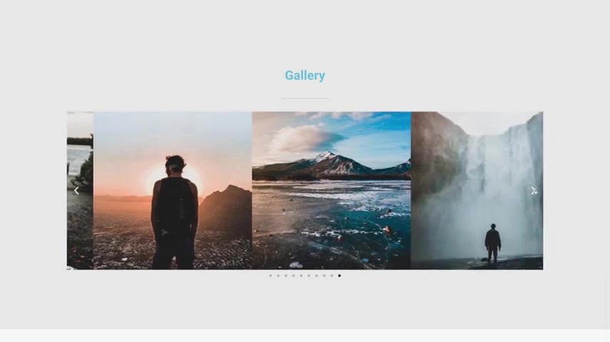
What's up guys today ?
I'm gonna show you how to create a one page website just like this .
This website has a call to action section at the top and about section , a services section , a gallery , an entire portfolio section which I'm using for videos , a working contact form and the buttons in the navigation menu at the top will jump to different sections on your website , which in my opinion is the coolest part about a one page website .
I'll show you how to create this website using an awesome drag and drop plug in .
That's very easy to use in this tutorial .
I'll show you how to get your very own custom domain name and web hosting for your website as well as how to install wordpress , customize your website , how to edit it from mobile and tablet as well and publish your site .
You can also use the right and left arrow keys on your keyboard to go forward or backward by five seconds throughout this video .
And if you feel like I'm going too fast or too slow , you can change the playback speed down in the bottom right corner with the little gear icon .
I also put time stamps of all the steps in the description so that you can skip ahead or go back to any step at any time .
All right , with all that said , let's get started .
Step number one is to get a domain name and web hosting , a domain name is just the address to your website .
It's what people will type in to get to your site .
So something like your website dot com , but most people don't know what web hosting is and that's ok .
I didn't either .
The very first time I made a website , web hosting is basically just renting space on a server somewhere that's connected to the internet so that you can store that server with all of your media for your website , such as your text pictures , videos , themes , plugins , et cetera .
And there are web hosting companies that have buildings full of these servers and they also offer you 24 7 support in case anything were to ever happen with your website .
And if you want to own your own website and have a custom domain name for it , then you have to purchase web hosting and I'll show you how to do it in this tutorial and I'll give you a massive discount code for it just for my viewers here at Creative Pro website now .
Yes , you can get a free website , but that comes with a lot of limitations .
Like you won't own your own domain name .
It will be something like your website dot wix dot com or dot squarespace dot com or whoever is hosting this website for you , or it might even be a random string of words and numbers that you don't even really get to choose .
You also can't upload new themes in order to customize your website exactly how you want .
There's usually very limited options .
You can't upload plugins to increase the functionality of your website .
You can't monetize your website with ads in order to make money with it and your website could be deleted at any time because you don't technically own it .
So this is why I recommend getting web hosting .
So in order to get it , just click on the very first link in the description or you can go over to create a pro website dot com slash hosting and this is how you can get that discount code that I mentioned and this is my affiliate link .
So I do receive a commission when you use it , but it also saves you a lot of money .
So it's a win , win for both .
It also helps me put out more free tutorials like this .
So as you can see here , we have a few different plans .
We've got the hatchling plan which will give you a single domain name and a free SSL .
And then you've got the baby in the business plan .
The baby plan will give you unlimited domain names in case you want more than one .
And then the business plan I really only recommend if you are starting to make a lot of money with your website .
But you can always start with the cheapest plan and then you can upgrade to the business plan or the baby plan later if you want .
So let's just go ahead and start with the hatchling plan .
It's more than what we need .
So let's just go ahead and click on buy now .
And here is where we can search for a new domain name .
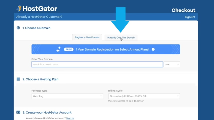
And if you already have a domain , you can just click on this tab right here , but I'm going to get a new one .
So I'm just going to type in a domain name like create a one page .
We'll just do that , create a one page dot com and here you can see it's available and if not , it would come up in red and then you just want to search for a new one .
Now , I don't recommend using like a dot club dot net dot online dot net you can kind of get away with , but honestly , a dot com is the most professional way to go .
So I recommend just changing your domain name around until you can find a dot com that's available .
Ok ?
So with that selected , let's go ahead and scroll down and make sure that you check the a domain privacy protection because if not , then your information like your email and your phone number are going to be public once you actually purchase this domain name and then solicitors can call you .
And it's super annoying .
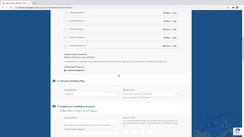
So I highly highly recommend leaving the domain privacy protection enabled .
Otherwise you're just gonna get bombarded with people that want to offer to build your website .
And that's what I'm showing you here in this video .
Ok ?
So let's go ahead and scroll down .
So make sure that your package type says hatchling or whichever one that you selected .
And then you've got the billing cycle , which is automatically set to 36 months .
And this is going to give you the largest discount , which is gonna be 61% off .
And this is if you clicked on the first link in the description or went to create a pro website dot com slash hosting and this is my affiliate link .
So I do receive a commission when you use it , but it also saves you money .
So it's automatically set to 36 months .
But if you want my recommendation is to change it to 12 months , give this a one year's try .
It's really only gonna be $3.95 per month or if you want , maybe you're just not even sure .
This is your very first website .
You just want to try it out and kind of see if you like it .
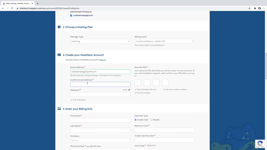
You can just go ahead and do the one month .
It's still gonna give you 30% off .
Ok ?
So I'm just gonna go ahead and leave that one selected .
But again , the more that you commit to then the bigger the savings that you're gonna get , but you will pay it for it up front , down at the bottom .
But I'm just gonna stick with the one month .
So let's just go ahead and create a host gator account and then confirm that email and then a password and then a security pin and then just go ahead and scroll down .
And here is where you're gonna put in all of your billing info .
And you can use either a credit card or you can pay with paypal .
I'm gonna go ahead and use a credit card and fill that info in now and then just go ahead and scroll down to the add additional services section .
And here what we're gonna do is actually uncheck the site lock essentials as well as uncheck back up your hard work .
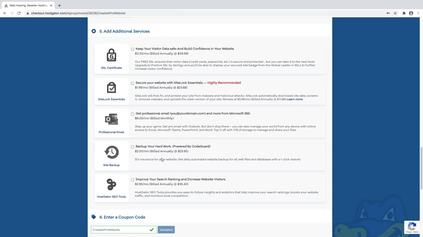
And this is because I've got videos on my channel that teaches you how to do all of this stuff for free and the SSL certificate you don't need because it comes with a free one .
This is just an upgraded SSL and what that is just this little lock symbol up here that lets people know that this website is safe and secure , which you're going to want on your website , but you don't need to check this one .
And again , I've got videos for all of this stuff and I will link them in the description including how to get a professional email .
So something like your name at your website dot com will be your new email address that you can use .
Ok ?
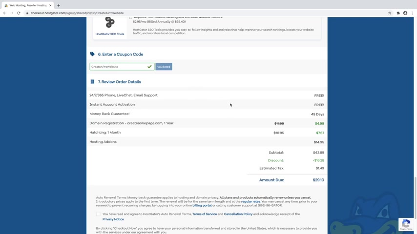
So I'm gonna go ahead and scroll down , leaving all those unchecked and then make sure that your coupon code says create a pro website , which it does .
And again , this is my affiliate link .
So I do receive a commission when you use it .
But again , it also saves you a lot of money .
And I worked it out special with host skater for all my viewers here at create a pro website .
But for whatever reason , if you don't like me and you don't want to use it , that's totally ok .
But it is gonna be the highest discount that you're gonna find anywhere on the internet .
Ok .
So you can see that our domain name went from $18 down to $5 .
Our one month of hosting went from 10 95 to 7 67 .
And again , this is going to be a much higher discount if you went for the 12 months or the 36 months , but you will be paying for it all at one time .
And then the hosting add ons is just our domain privacy protection , which again , I highly recommend leaving that checked .
Ok .
So once that all looks good , let's just go ahead and click on agree to the terms and then click , check out .
Now .
Cool .
So now host gate are setting up your account .
So just give this a minute and now you can go ahead and hit the X and close out of this and then you can also hit the X on this as well .
Cool .
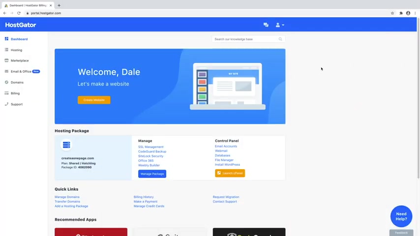
So now we're inside the host gator dashboard and now we can move on to step number two , which is to install wordpress .
Wordpress is the free software that we're going to be using to build our website and customize it , how we want it .
So let's go ahead and get it .
So to do that , you can see that you've got your hosting package right here with your new domain name , whichever one that you chose and then you can just click on launch C panel .
And now once we're in our C panel , what we're going to do is just go up to the search function and we're going to type in soft .
And then you can see here we've got soft Ulus apps installer .
This is what we want and then we want to use wordpress to build our website .
So let's just go over to that and click on install .
Cool .
So from here , we just want to make sure that we're installing the latest version of wordpress .
So if you just click on this , you can see this is the latest version and then we'll just scroll down , make sure that this is at your domain name , which it is .
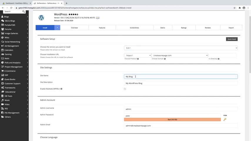
You don't need to change anything here and then we can give our website a title .
So I'm just gonna call this create a one page website .
And don't worry , you can always change this later once we're actually in wordpress and then just give your site a description .
So I'm just gonna say something like how to create a one page website step by step .
And then we'll just scroll down and for admin user name , we're just going to go ahead and change that to your name , which you can just do your name , your first name , lower case and then admin password .
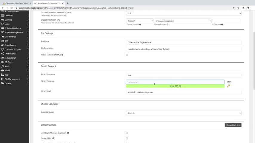
We'll just go ahead and put in a custom password and this is going to be the password that you use to actually log in to wordpress to edit your website any time that you want to make changes .
And then admin email , let's just go ahead and put in the same email that you used to sign up for host gator with .
So mine was just create a one page at gmail dot com , but this will likely be something like your first and last name at gmail or whatever your normal email address is .
And then we'll just scroll down and our language is set to English .
So you can change that if you want to and then we can just ignore the rest and then we'll just scroll down to the bottom and click on install and then just give that a couple of minutes .
Cool .
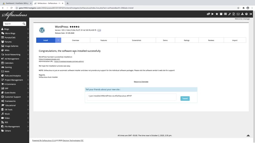
So now wordpress has been successfully installed and the way that you should always get used to signing into your wordpress website is using the URL , which is gonna be your new domain name dot com forward slash WP dash admin .
This is always the URL that you should use to sign into your new website and you can just go up to a new browser and put that in , but it's right here .
So I'm just gonna go ahead and click on it .
And if for some reason , you do not get taken over to your Wordpress dashboard and you're on any other page than the Wordpress dashboard , then this means that your site has to propagate .
And what that means is that host gator has to send out your new domain name across the entire world to every server in the world to let them all know that , hey , this new domain name now exists and this process can take anywhere from 30 to 60 minutes and they say it can take up to 24 hours , but I've never actually had it take that long lately .
It's just been no more than about 2 to 3 minutes .

So every few minutes just click on that URL and see if you are taken to your wordpress dashboard .
OK ?
So now that we're inside the Wordpress dashboard , let's just go ahead and clean it up So just go ahead and click on dismiss and you can click on the arrow to kind of just close all these boxes just to keep things nice and clean .
There we go .
And you can just ignore this jet pack thing for now .
And what we want to do is move on to step number three , which is to activate a new theme .
So if we just go over to the top up here and go over to visit site and just open that up in a new tab , you can kind of get an idea of what our website currently looks like , which you can see it is pretty basic and honestly pretty ugly .
So what we want to do is install a new theme that will change a little bit of how this looks .
But really what we're going to be using is a plug in that's going to allow us to drag and drop and build our website visually and it's super easy .
But first we need to go get that theme .
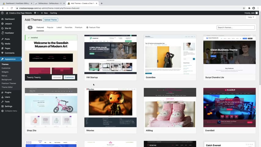
So I'm just going to go ahead and close out of this and then just go over to appearance and then go to themes .
And here you can see that we've got a few themes already installed , which is just the standard ones .
But what we're going to do is just add a new theme .
So just click on this button right here and we're going to be getting the Astra theme .
It's honestly a crowd favorite .
It's my personal favorite for a reason .
It's very clean , very easy to use .
So just go ahead and type in Astra up in the search bar , then you'll see Astra right here .
Just go ahead and click on install .
I've used a lot of themes and honestly , Astra is the best one and no , I'm not endorsing them for any other reason .
Other than that , I really like them .
They're not paying me to say this genuinely Astra is the best theme .
So now just go ahead and click on activate .
Ok .
So now that that's activated , let's just go ahead and look at that .
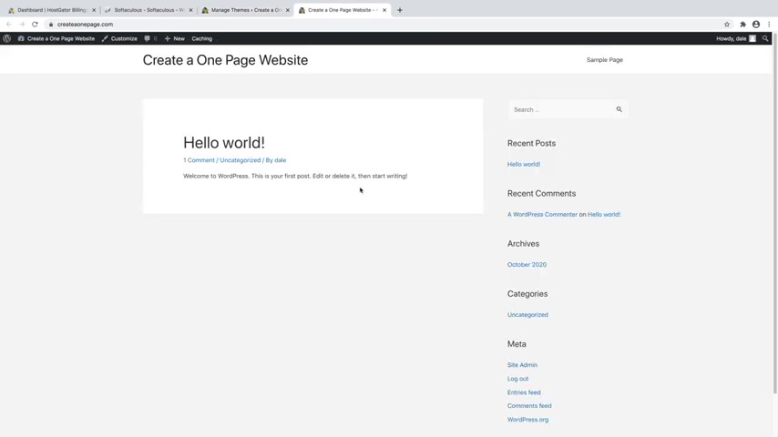
So we'll just go up to visit site and open that up in a new tab and you can see that our website has changed a little bit .
So it's still very boring because we don't have any content on it yet .
But you can see that it's a little bit more clean , a little bit whiter and grayer , which is looking a lot better .
So let's just go ahead and X out of this .
And next , what we want to do is move on to step number four , which is to install plugins .
So we're going to need a couple of plugins that are going to allow us to visually drag and drop and build our website visually .
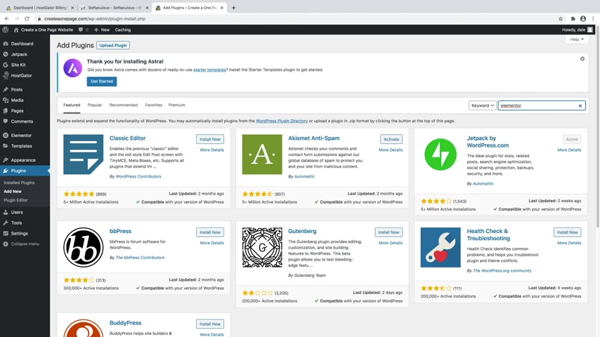
So let's just go ahead and get them just going over to plugins and then go to add new and then we're just gonna go over to the search bar and we're gonna type in mentor just like that and you'll see the element or website builder plug in right here .
It's got 5 million active installations , tons of five star reviews .
That's how , you know , it's a super legit plug in .
So we're gonna go ahead and click on install now and it's completely free .
Ok ?
So now I'll just go ahead and click , activate .
Cool .
So now you can just go ahead and ignore this .
And we're gonna go back over to plugins and go back over to add new and then just go back up to the top .
And again , you can just type in element or one more time and we're going to grab the essential add-ons plug in , which is going to be this one right here , essential add-ons for mentor .
Just go ahead and click on install now and then activate .
Ok ?
So now we can move on to step number five , which is to customize your website .
So this is going to be the fun part where we drag and drop and start actually visually building our site .
But first , we need to create an actual page that we're going to call our home page .
So in order to do that , let's just go over to pages , I'm going to add new and then you can just close out of this and we're going to add a title .
So you can just click on this and we're just going to call it home page just like that .
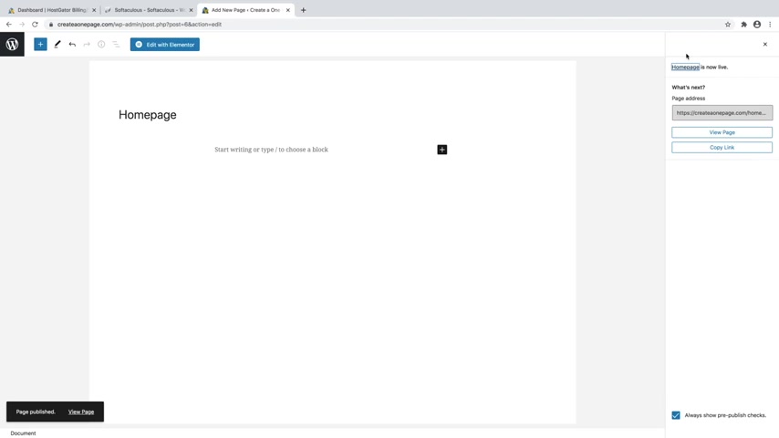
And then just going over here to page attributes and open that up and then underneath template , we're going to change that from default template to element or full width just like that .
It's very important .
And then we'll just go up to publish and then publish again .
Cool .
So now we need to actually tell wordpress to use this page as the home page .
So it's going to be a little confusing .
Let me show you .
So you can just go ahead and click on view page and then we'll just go over to customize right here and then underneath homepage settings , we'll just go click in that .
You will see that you can change it from your latest posts to a static page .
So we're going to change this to a static page and then for the home page , we're going to tell it to use home page just like that and then you can just go up to publish .
Cool and then just go ahead and click on the X .
Cool .
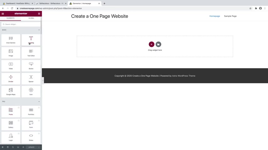
So now we can just go over to edit page and then just click on edit with element or .
So here we are inside of the element or page builder menu and you can see that we've got this sidebar over here and it's got tons of widgets that we can use in order to build our site .
So what I'm going to do first is show you how to use mentor in order to build out a section .
And then I've actually made it super easy and given you a template for this one page website which you can download in the description .
And then I'll show you how to install that in just a bit .
But first , I do think it's important to know how to use mentor .
So what you can do is just create a new section by just clicking on the plus button .
And then you can select the structure , which basically means how many columns do you want in it ?
So let's just say I just want one just to keep things simple .
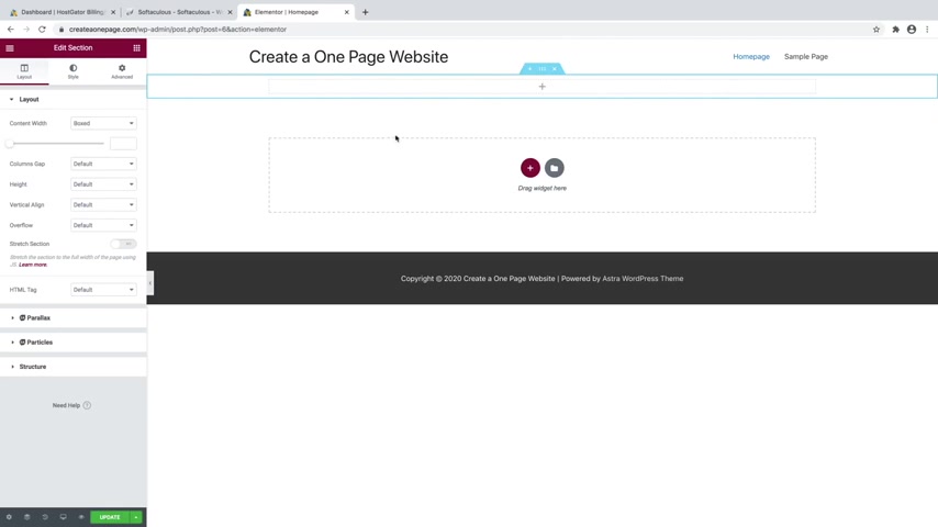
Now , that's going to create a new section which is in blue .
And then you can see in the gray dotted line , we've got the column inside of it .
And then what you do is put widgets inside of each column .
So first , what I want to do is actually make this a bigger section because right now it's really small .
So in order to do that underneath edit section , which you can find by just simply clicking on the little six dots right here , you can just go over to advanced and then you can see we've got padding and padding basically means the room at the top bottom , left and right side .
So the more we give it , the bigger it's going to get .
So what we want to first do is uncheck this little link button .
And let's say we want to add some to the top , we can just increase that value and that's gonna give us some space up at the top .
So I'm gonna actually do something like 200 and then I'll also do 200 down at the bottom , maybe something like that .
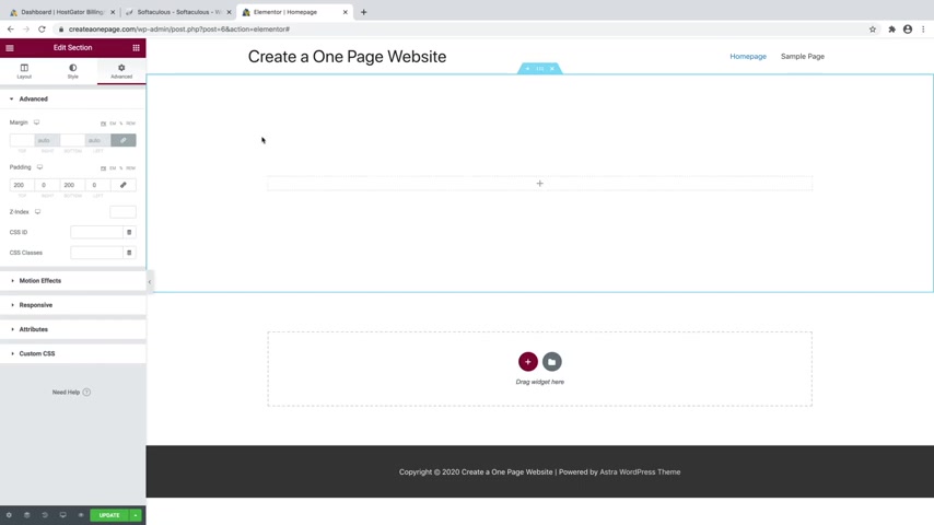
Just give us lots of room to work with .
OK .
So now you can see we've got this column and we can add stuff to it .
So in order to actually get to widgets , you can just go over to this little Rubik's cube looking symbol right here and you can click on that and here is where you can find all of the widgets that you can use in element or , and then you've also got this pro section which these are locked , meaning that you can't use them .
So we'll just go ahead and close that , but you've just got tons of them here .
You've got general ones .
And then if we scroll down , we've also got essential add-ons , which is that other plug-in that we installed .
And this gives us a bunch of extra ones as well .
So I will show you first how we can actually add a background image to this , which you actually don't do with a widget .
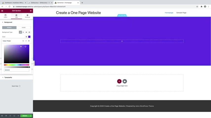
So what you do is just click on the little six dots and then we'll just go over to style for this whole section and then you can just go to background and we can just change that to classic with this little paintbrush and then we can select a new image .
So you can do a color if you want .
So if you select a color , you can change that to whichever color that you want .
But I'm gonna go ahead and put in a image .
So we'll just go over to image and click , choose image and you can just upload files from your computer .
So if you just go over to select files and then I'm just gonna grab an image .
So I'm gonna do this sample hero image , which again , you can find these images in the description as well if you want to follow along .
So I'm just gonna grab that one .
Cool and then I'll just click on insert media and that's gonna put our image in there , which it's really big .
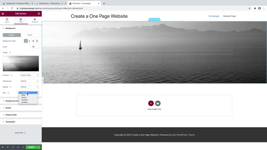
It looks a little broken .
So what we can do is just going over to position , we'll change that to center , center and then for the size we'll go over to cover and that's gonna perfectly size it for this section .
And then you can also change it .
If you go over to attachment , you can change it from scroll to fixed and I'll show you what this means .
So I will do this one as scroll and I'll just duplicate this whole section just so I can show you what that's gonna look like .
I'll go to the bottom one and I'm just going to change that to fixed .
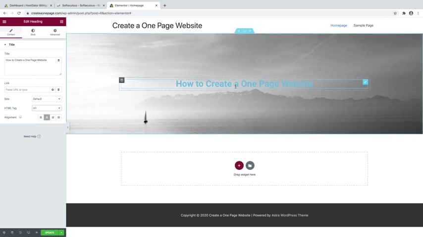
And now you can see the top one moves with the scroll and the bottom one , the image stays fixed to one spot .
So it kind of gives it this really cool parallax effect , which I really like .
So I'm gonna go ahead and leave the bottom one .
So I'll just go up here and delete this one by clicking on the X .
There we go .
And I can't scroll right now because there's not enough things on my website in order to allow me to do that .
OK .
So let's go ahead and add some text to this .
So to do that , you can just go over to the little Rubik's cubic and symbol and then we can just click on heading and we can just drag that in just like that .
And you can either triple click right on the screen or you can actually change it over here in this little box , whichever one works for you .
So I'll just go ahead and triple click and I will change that to how to create a one page website , something like that .
And then you can change the alignment over here .
So I'll change that to center just like that .
And I'll change the text to an H one because this is gonna be our biggest text .
It's gonna be our main text .
It's like the thing that describes our title .
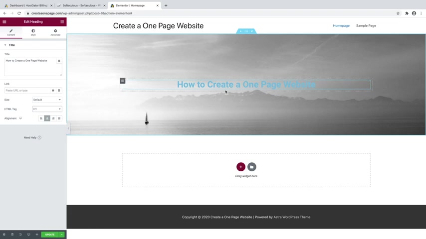
So I'm gonna make sure that this is an H one and you can change the color and the font and all of that by going over to style and then we can just go to text color .
We'll just change that to maybe a white just like that .
And then you can go over to typography and if you go over to family , you can change it to any type of font that you want .
And these are all Google fonts .
So if you just scroll down and kind of give them a second , they'll load and you can see what they're going to look like .
So I'll just pick one just so you can see that you can change to any font that you want .
But I'm gonna go ahead and leave it as the default font .
So I'm just going to scroll up and go to default just like that and you can change the size of the font by just dragging on this little slider here .
So I think something like that like a 50 looks pretty good .
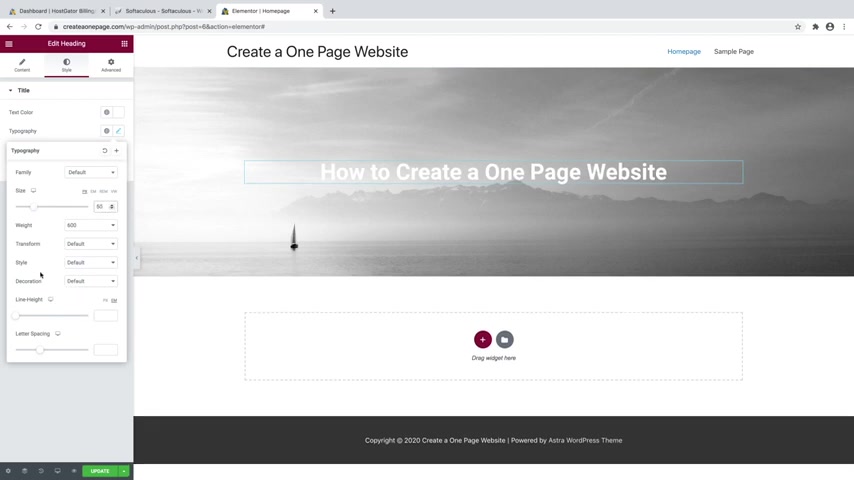
And then you can also change the weight and the style and some other features about your text down here , like the line height or maybe the letter spacing , you can change that as well , but I am not going to mess with any of that .
And if you want to undo anything , you can just use command Z on a mac or control Z on a PC and that will undo any changes .
So now what I'm gonna do is just duplicate this text .
So I'll just go over to the little pencil icon and I'll just right click and go to duplicate and then I'm gonna change this to an H two heading and then I'm gonna change this text to say something like step by step , guide 2020 in all caps , just like that .
And then I'll just go over to style and then underneath typography , I'm gonna change the size to be a lot smaller , maybe something like that , like a 2021 .
And then I'll change the letter spacing to be pretty spaced out , something like that .
I think that looks pretty good .
Cool .
So now let's go ahead and add a button .
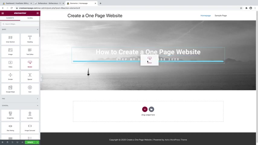
So I'll just go over to the little Rubik's cube looking symbol here and then we'll just go down to button and we can just drag that in and you can see indicated by the blue line is where it's going to be placed .
You could put it in between or underneath .
Obviously , you wouldn't really want to put it in between .
So we're gonna put it underneath just like that and we'll change the alignment to be in the center and then you can change the text on the button .
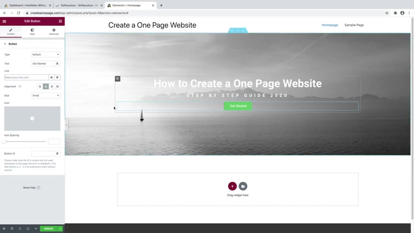
So right now it says click here , I'll say something like get started and here's where you can put in a button link and I'll talk more about links in a little bit .
But what you'd want to do is just delete the hashtag and you can put in any URL that you want this button to link to .
But you can also use this to create a jump button , which is ideal for one page websites .
So a jump button , if I were to click on , it would jump to a different section on the same page .
So on the home page , but again , I'll show you how to do that a little bit later , you can change the size of the button over here .
So you can do a large button if you want to .
But I'm going to go ahead and leave it as small .
You can add an icon to the button here if you want and edit some of the spacing on the button as well or on the icon and then we can go over to style and we can change the color .
So we've got normal and hover .

So right now this is normal and then whenever we hover over it , that will change to a different color .
So we can change the background color to maybe something like blue , maybe something like that .
I think that looks pretty good .
You can also change the text color if you want , but I kind of like it as white .
And then we can go over to hover and then we'll change the background color of hover to be something like a dark blue to kind of indicate that .
Now this button is able to be clicked .
So you can see once I hover over it turns dark blue , I think that looks pretty good .
And then you can also do a hover animation .
So if I change that to something like grow , you can see that whenever I hover over it , the whole thing kind of grows a little bit , which is pretty cool and there's a bunch of them in here .
You've got pulse , something like that .
Some of them can get a little obnoxious .
So I think grow is actually a pretty good one to go with .

And if we just go back over to normal , you can also add a border to your button .
So if we just go to border type , we can change that to something like a solid line and then we'll just give it a little bit of width here .
So maybe something like four .
You can see we've got this white border which you can change the color of right here if you want to .
And then the border radius will indicate whether it's a square button or something more like a pill button like that , which I kind of like the look of the pill button , but I don't really like the border .
So what I'll do is just change this value up here to zero in the width and that will just get rid of it .
And now I've got this pill button without the border , which is pretty cool .
And you can also give it a shadow by clicking on box shadow .
And that's gonna give the button a little bit of a shadow .
And I will just go over to the color here and we'll just change that to be a little bit lighter , something like that .
I think it looks a lot better .
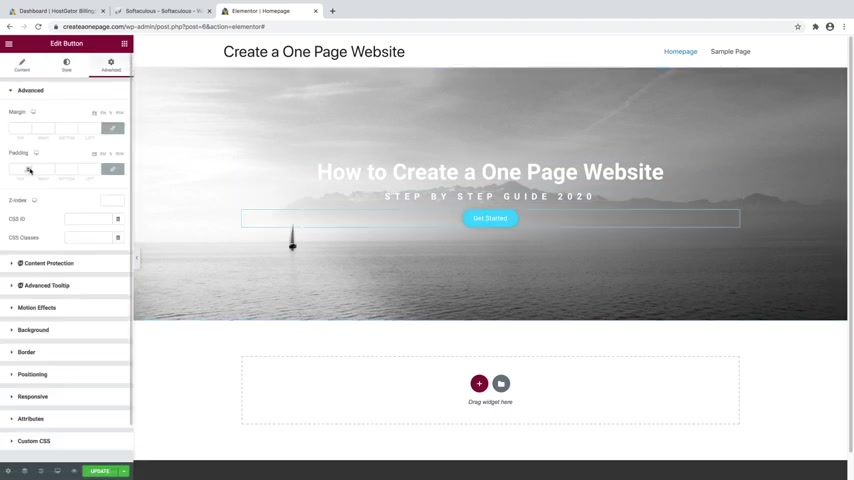
And then we also want to add some space around this button .
So we want to keep our two titles together like this , but we want some space in between our button and our text .
So we'll just go over to advanced and then we'll just add some padding to that button .
So it's more like that .
I think that looks pretty good .
And then you can also add a background overlay so you can see that our text is kind of blending into the background here .
So what we're gonna do is add a dark overlay to any image that you want .
So in order to do that , we'll just go up to the six dots and then you can see we're on background , we'll disclose that and go to background overlay and then go to background type and change that to classic .
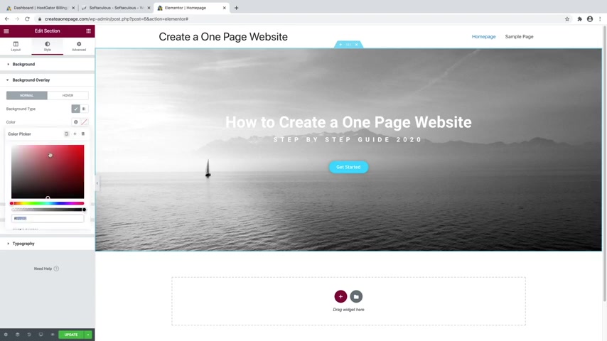
And then for color , we're just going to select a black just like that , which is a little dark .
So what we'll do is just go over to opacity and we'll just bring that back just a bit .
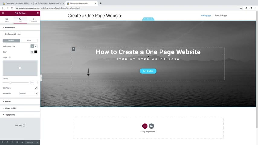
So it's more like that .
So now you can read the text a bit better and you can change that color to anything you want .
So if I wanted like some sort of a red background , I could do that or some sort of a blue or green , anything that you really want to , which honestly , purple actually doesn't look too bad , but I'm gonna stick with black .
I think black and white are really the best choices because they go with everything and then you can always want to go down to update in order to save your work .
And that in a nutshell is how to use mentor in order to actually build your website out from scratch .
But like I said , I made it super easy and created a template that you can get in the description .
And I'm going to show you how to install it .
And then all you have to do is replace the text , replace the images and your website is already built for you .
So to do that , just download the link in the description .
And then what we're gonna do is actually delete this whole section that we just made .
I know tragic .
We just worked so hard on it , but it's OK .
So we'll go ahead and delete that .
And then we're just gonna go over to this little folder looking symbol right here .
It's in gray , it says add template , just go ahead and click on that and then just go up to this little up arrow up here at the top right , that says import template .
And then we'll just go over to select file and then we're just going to grab that uh template that you just downloaded from the description .
And it should be a dot Json file and I'll just click on open and then you'll see it right here .
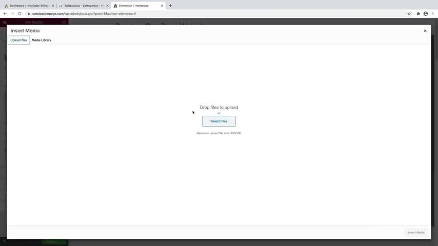
So just go ahead and click on insert and we're going to say yes , we want to import the document settings and then now you can see if we scroll down .
We have got our whole template for our one page website and all we need to do is just go fill everything in .
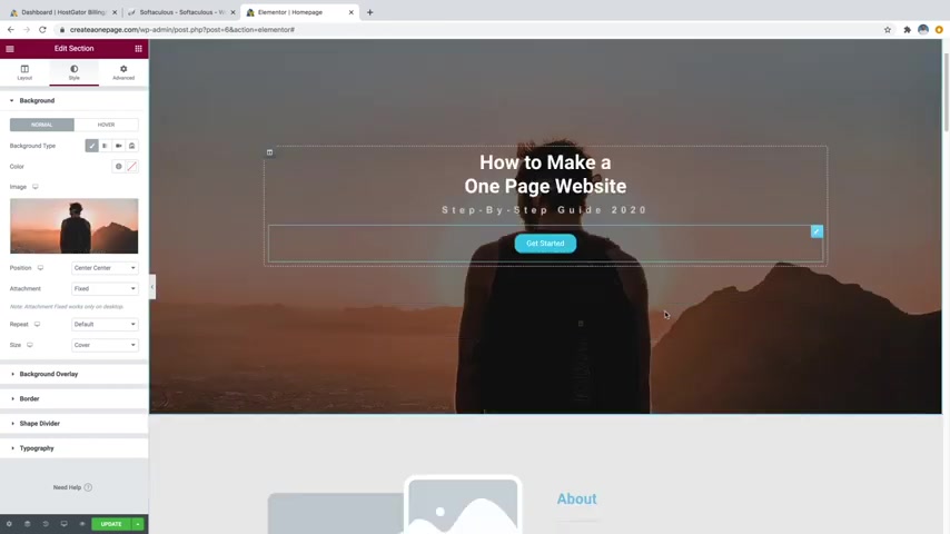
So let's just go up to the top and let's just go ahead and put in a background image .
So I'm just going to go up to the six dots and then go over to style and then go over to image and we'll just choose a new image .
And I'm just gonna go to upload files and then select files and I'm just going to go into my images and I'm just going to bring in a bunch of my images from my personal Instagram account .
Now , these are not for download in the description .
So you want to have your own images to use on your website .
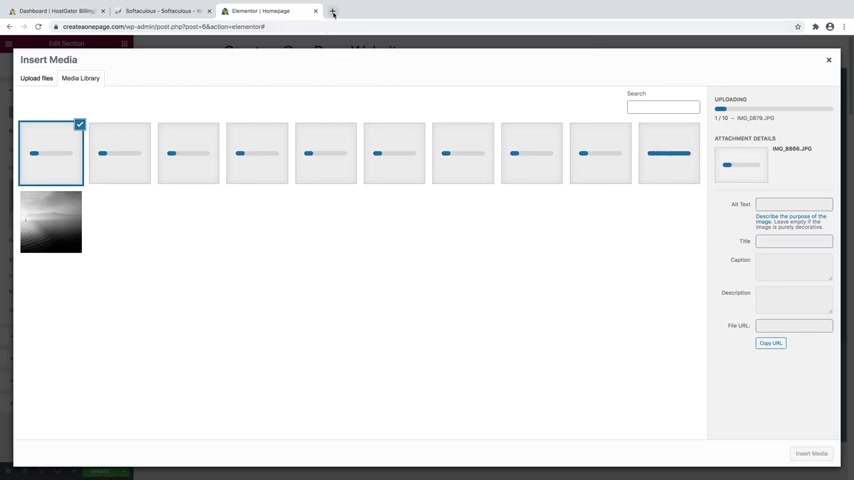
So I'll just go ahead and click open and a place that you can find images for free to use on your website while these are uploading is if you go up to a new browser window and you type in pix A bay dot com just like that .
Here , you can find tons of free images to use on your website .
So if I want to do something like travel , I would just type that in .
And here you can see we've got tons of travel images that we can use .
And if you want to use one , you just click on it and then you can just go over to free download and then you can just download whatever size that you want .
Now , I don't recommend really going much higher than 12 80 by 8 53 because then your website is going to be really slow if your images are very high file sizes .
So this middle option is a pretty good way to go , but I already have images from my site .
So I'm gonna go ahead and hit the X , then go back over here and wait for these to finish uploading .
OK ?
So now those images are finished uploading .
So I'm just gonna go ahead and select the one that I want to use as my background .
And then I'm gonna go to insert media .
Cool .
So there's my image and I've got this parallax effect on it .
So it stays where it is .
And then I already showed you how to edit the text and everything .
I think I am actually going to make this text just a little bit bigger .
So I'm gonna go over to style over to typography .
And I'll just drag this up just a bit , maybe something like that .
And I showed you how to edit the button style as well .
But I'm gonna go ahead and change the link on this button .
So I'm gonna say that this button is going to be something like start here .
And then for the link , we're going to use this little hashtag here .
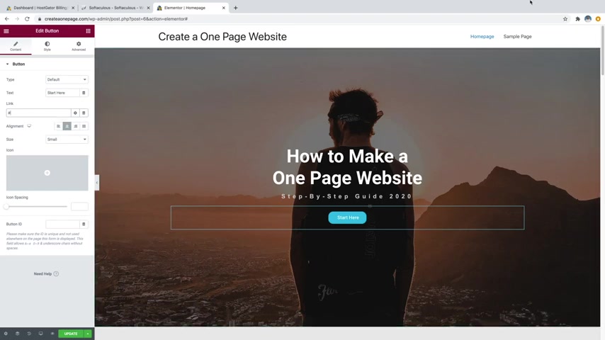
So the hashtag is how you're going to be able to create jump buttons on your website .
And I'll go through this a little bit more later whenever we work on the navigation menu at the top .
But just for this button right here , I'm going to , whenever I click on this , I want this button to take me down to maybe the about section .
So what I'm gonna do is just do hashtag about in the link section just like that .
And the reason why I did that is because this whole about section down here has an ID on it .
So let me show you whenever I click on this section .
So I click in little six dots and we go over to advanced .
You can see CS S ID , it's set to about now .
There's no hashtag on the CSS ID .
It's just the name .
So each section I have tagged as one of these CS si DS .
So if I go to services and I go to advanced , you can see we've got CS S ID as services .
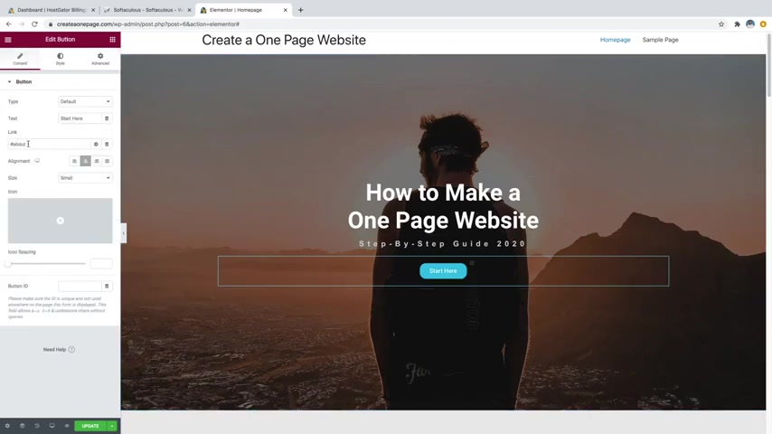
So , and you can customize this to say whatever you want and then you can use the hashtag on this button in the link to say hashtag about or you could say hashtag services whatever it is that you want to put and it will jump there .
So I'll just click on update and show you how that works .
Cool .
So now I'm just going to preview my changes .
Cool .
So now I'm just gonna click on the start here button and that's going to jump down to the about section , which is really cool .
OK .
So you can go ahead and close out of this .
And again , if you want to edit the font and colors of the text , you can just go on over to the style tab for the text , same with the button .
If you want to edit the color or anything like that , you can just go over to the style tab , but I'm gonna go ahead and move on to the next section because I showed you how to do all that earlier .
So what we're gonna do is put some images in this about section .

So I'm just gonna go ahead and click on this first image and then I'll just go over to choose image over here and I'm just gonna grab one of the images that I want to use , click on insert media .
And then I'm also going to click on this one right here , this little image box and then I'm going to add an image in that one as well and I'll just add maybe like that one click on insert media .
There we go .
And then you would just want to come over here and change this dummy text over here to have some sort of a description about yourself .
But I'm not gonna bore you writing a description about myself .
I'm just gonna go ahead and leave it as dummy text and then same with the button .
You can alter that the same way that we did the one at the top .
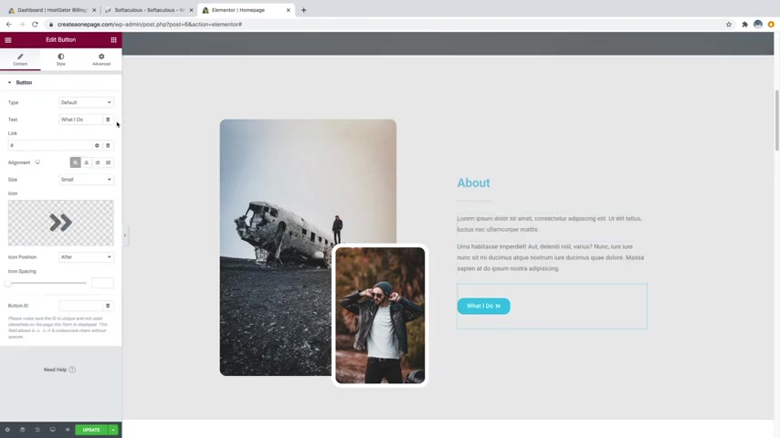
So for this one , I will just click on the button and I'll change it to something like I'll say something like see my work just like that .
And then I'll change the link to go to my work because I've got a whole section down here below that says my work .
So I'll just say that that button will take them there .
So we'll just go ahead and update that .
And another cool thing I want to show you about each section is you can add shape dividers .
So let me show you , I'll just scroll up to the top section and I'll click on the little six dots and then we'll just go over to this style tab which we're already in and then just go down to shape divider .
Click on that and you can do the top or the bottom .
We're gonna go click on the bottom right here , we're gonna change the type to pretty much any one of these that you want .
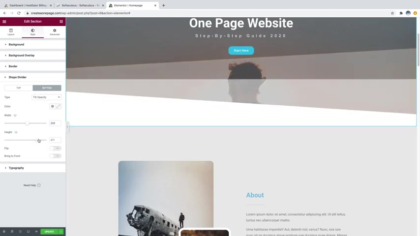
I'll do like a tilt opacity so that I can show you , you can see that kind of added this whole section down here .
And now if I change the width , you can kind of see it adds this whole different feel to , you know , sliding down our website into the next section and then you can also change the height on it as well just like that and you can do this with anything .
So you've got mountains in here , which is pretty cool as well and you can also change the color .
So what I'd want to do is change the color to match this section here .
So I would just go into this bottom section , go over to style and then I'm just gonna grab this color right here .
So that's eaeaea .
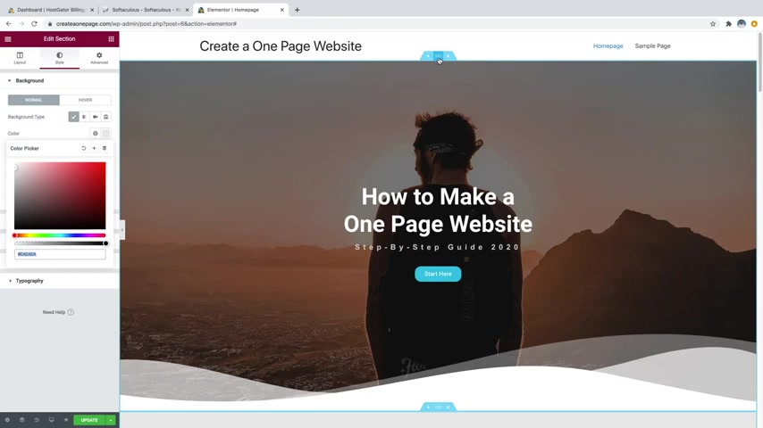
I can also just come in here and copy it and then we're just going to go back up to this section , click on the six dots , go back over to the shape divider , go back over to the bottom and then we're just gonna put that color in right here just like that .
And now that matches the color of this bottom section .
So it all looks like it flows into one .
And again , you've got all sorts of different options in here .
Clouds uh drops all sorts of different ones .
I personally like just the tilt opacity or maybe just the mountains .
But in this case , I'm actually just gonna leave it blank .
Just kind of a fun tip that I wanted to show you .
OK .
So let's just keep going down , add more to our site .
So we can edit our services section over here .
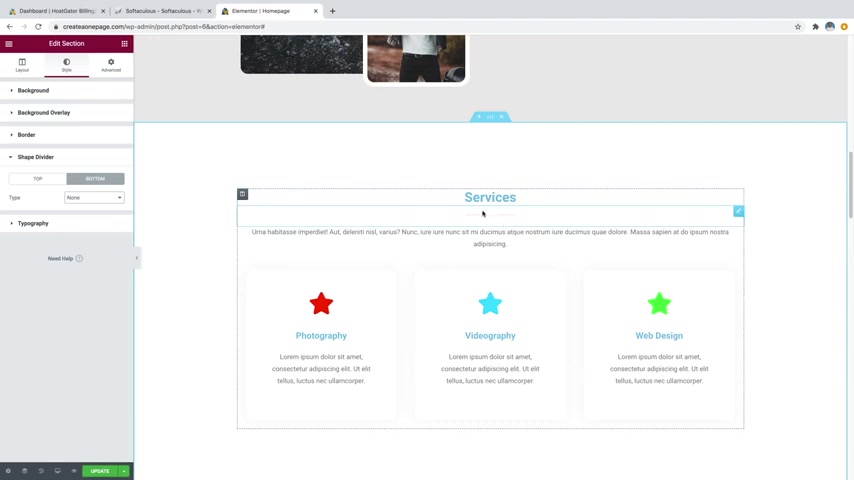
So again , you can triple click , change the text if you don't want it to say services and then you can also edit these icons over here .
So if you just click on the icon , you can change it to anything you want over here .
So if you just click on icon library , you can scroll through all of these different icons .
There are tons of them .
Honestly .
The best way to search for one though is just to simply type it in .
So I might say something like photography .
I just say that's one of my services or actually let's do maybe a camera you have to type in what you want .
OK ?
So camera , I'll just grab this one right here and I'll just insert that .
There we go , just change to a camera and then you can also put a link on it so that if somebody clicks on it , it will take them to a different link .
We can also change the style .
So we got a style primary color .
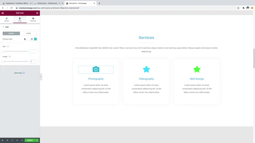
We'll just change that to , you know , maybe like a blue , something kind of like that .
I'm good with that can also change the size here by simply dragging up .
So I'll say something like a 50 just like that .
And then you can also change the hover .
So on the icon , if we just go over to hover , you can change the primary color of that and also the animation .
So I will change the animation to maybe grow and then I'll change the color to be sort of similar , maybe just a bit darker , maybe something like that .
There we go .
So whenever I hover over it kind of activates , which is pretty cool .
And then you can also change this text down here simply by clicking and then you can just type anything you want in this box here .
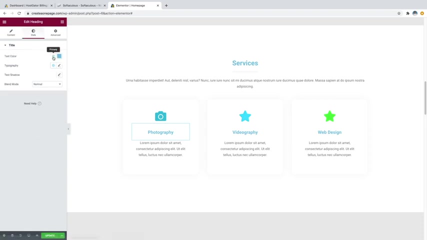
And I'll go over to style and I'm actually going to change that text color to be sort of like a gray , like a dark gray , maybe something like that .
I think that looks pretty good .
Cool .
And then once you've got one built , the way that you want it , what you can do is actually come over to this whole section here or sorry , this whole column here and click on this little widget here and just duplicate it just like that .
And we're actually gonna delete the other two here .
So I'm just gonna go up here and delete this one and then I'll also delete this one and then I am just going to copy this one or sorry , duplicate this 11 more time .
So now we have three of the same .
And then all you gotta do go do is just change the text .
So I'll just say something like videography just like that .
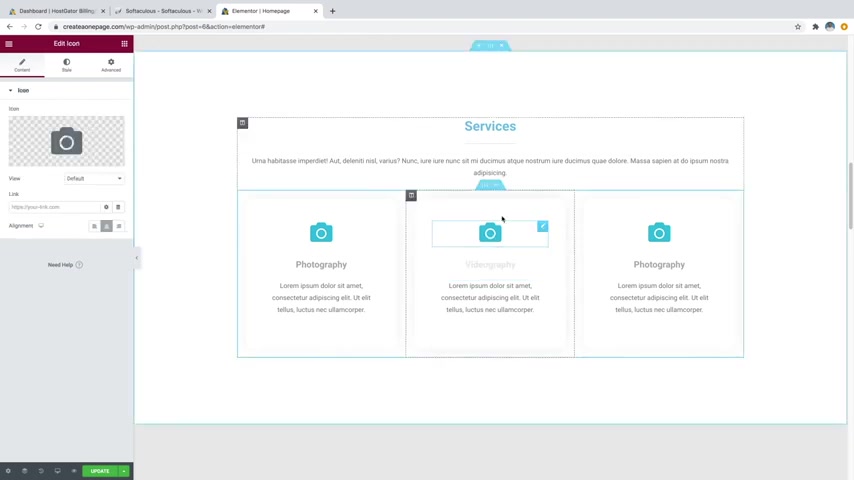
And then I'll just go over to the icon and I'll change that to a video camera .
So I'll go to icon library and then I'll say video , grab this one , insert it and then I'll change this text over to web design and then I'll change the icon .
So I'll just click on the icon widget .
Oops , misplaced it , command Z icon , widget .
There we go .
And then go over to icon library and we'll just change this to a laptop just like that insert and there we go .
Cool .
So now we've got a whole services section built and let's just keep scrolling down and we're gonna want to add in our gallery .
So let's just go ahead and click on this widget .
You can see it's kind of gray out here .
It's supposed to have images in it , but it does not currently .
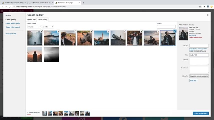
So we'll just click on this little widget and then if you come over here , you'll see the little plus icon underneath the image carousel .
We're just going to go ahead and click on that plus icon and then just select all of the images that you want to put in it .
So in this case , I'm just going to select every single one of my images except for this last one .
And then I'm just going to create a new gallery down here and then you can rearrange the photos in the gallery by how you want them to appear .
So if I want to have that one display first , I could do that and you can just kind of rearrange them however you want .
But I'm gonna go ahead and leave them the way they are and then just say insert gallery and now you can see all the images popped up here and they've just loaded inside of our gallery and then anyone can just click on the little arrow and kind of sift through all of your photos .
And if you go over here , you can change slides to show .
So right now it's currently set to three .
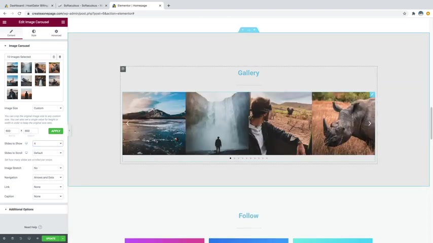
You could say like four if you want and that's gonna show four images all at once , but they do get a little bit smaller .
You could change it to two if you want , just like that .
They're a bit bigger , I think three is a pretty good size though .
Cool .
So now we will just go down to update to save our work .
We'll just scroll down some more and now we've got the follow section .
So this one's pretty cool because it's got these flip boxes so that whatever one they hover over , it'll show your handle , which is pretty tight .
So I'll show you how to edit these .
So just go ahead and click on the widget and you can see we're in the flip box settings and you can tell it which way that you want to flip .
This one's flipping to the left , you could say , let's say flip top and then that way it's gonna flip upside down like that , which is also pretty cool .
I'm just kind of sticking with the flip left though .
You can change the icon down here .
This one's automatically set to Instagram .
This is what I chose earlier when I built this site .
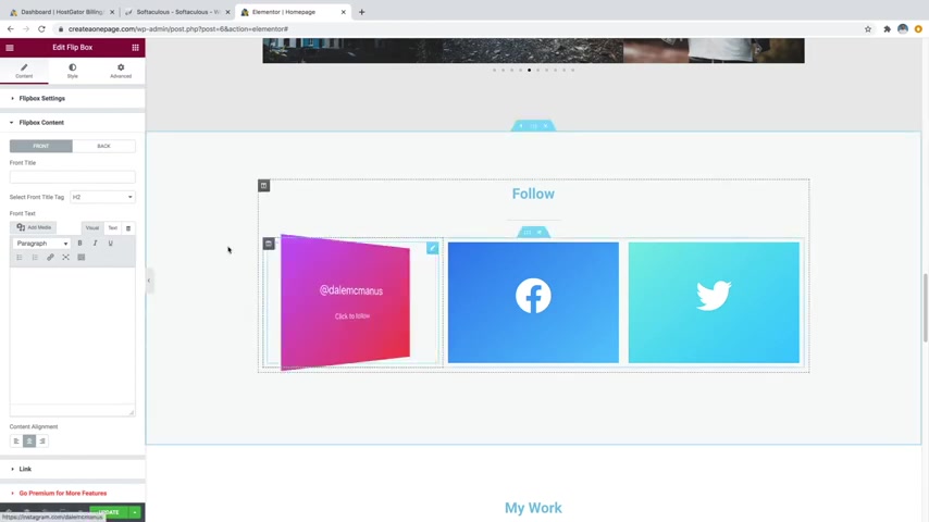
And then you can go over to flip box content right here and then you can change what the title is on the front and some text on the front .
But I purposely left these both blank because I just wanted the symbol on the front .
So I'll show you if you were to type something like Instagram on here , it's going to write Instagram on there , which I don't really think looks that great .
So I just went ahead and left it blank .
But if you go over to back right here , this is where you want to change your handle .
So I currently have my handle on there .
So if you want to change it , you can just simply come in here and we'll say something like create a pro website is my other handle .
There we go .
And then I also wrote in here , click to follow because whenever somebody clicks on this , you can have it go to a specific URL .
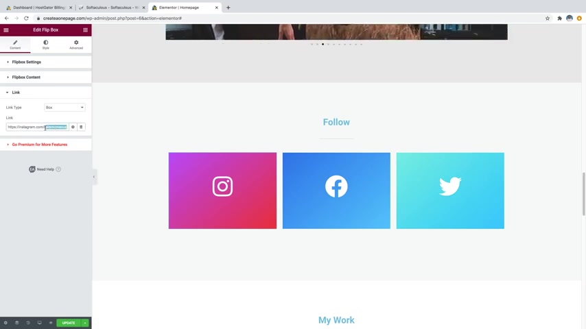
So to do that , you just go over to link down here and you can see I have this going to Instagram dot com slash Dale mcmanus , which is my personal Instagram .
So I'm gonna change this to create a pro website just like that .
And that way whenever somebody clicks on this box , it will take them over to Instagram and they can follow me , which is pretty cool .
And then you want to do the same for Facebook or Twitter and you can change this to be whatever you want .
And if you want to change the colors of any of these or maybe change it to a different social media because let's be honest , not a lot of people use Twitter .
So I'll show you how to change this one .
You would just want to click on the edit flip box button on the little widget and then you would just want to come over here to the icon library and I'll just search for something else .
Not many people really use Snapchat nowadays either , but I'm gonna just go ahead and put in Snapchat just so I can show you how to change it .
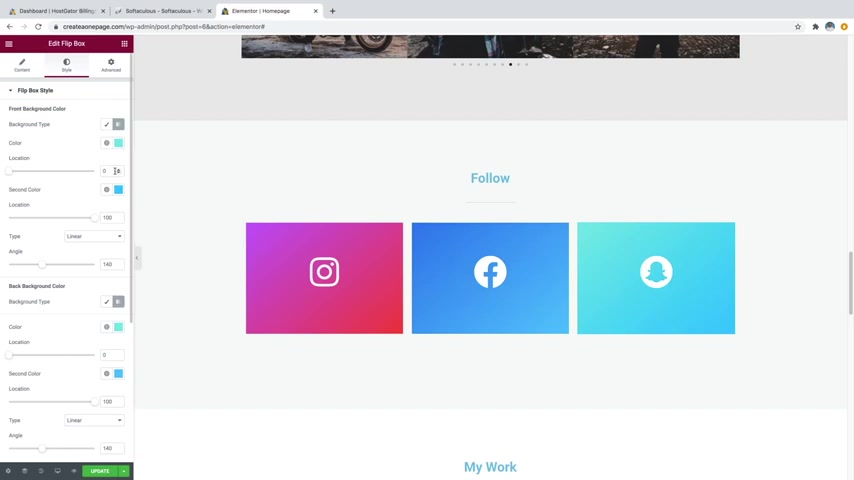
So then you can just grab whatever icon you want , click on insert and then that's gonna change it .
And then you can go over to style and then you can see we've got our colors here .
So it's kind of like a gradient .
So it starts at this color and kind of fades into that color .
So I'll just say something like yellow for Snapchat like this and then I'll change the bottom one to maybe just the barely off yellow kind of like that .
Like a little bit of an orange looks kind of cool .
And then you'd want to change the back as well .
So whenever it flips over , you can see it goes back to this blue .
So what you'd want to do is just grab this little color here , copy that and then you'd want to bring that down to the back background color right here and we'll just put that in and just paste it , click off and then grab this color as well .

I'll just copy that come down and we'll just paste that in that way it matches .
So whenever I flip it over , it is the same colors , which is pretty cool .
So that's how to change any one of these to any social media that you want .
But I'm just going to go ahead and control Z and go back to Twitter .
OK ?
So now we'll scroll down and we've got the my work section .
This is kind of like your portfolio section .
So you can change it to anything that you want .
This one .
I've just put a bunch of my youtube videos on here so I could even just change this text to videos if I really wanted to .
And then if you were going to do that , you'd want to make sure that you update the section ID .
So this is the ID that you use to whenever you click on a button to jump to this section .
So you just want to go to the little six dots and then over to advanced .
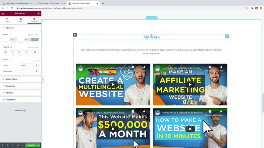
And then I would want to change that from my work over to videos or something like that if I were going to change this text here to videos , but again , I'm just gonna leave this as my work and you can put whatever you want in here .
It doesn't just have to be videos .
You could go over to the widgets up here , the little Rubik's Cuban symbol and you can scroll down through here .
You can put images if you want to display some images of your , you know , photography , your web design skills , your paintings , drawings , like anything that you want to display , you can put an image in there if you want to and there are tons of different widgets .
So if you just go ahead and close the pro section right here , you can just scroll through and there are just tons of different widgets .
It's really fun to just grab any one of these widgets and just play around with it , try it out and mess with the settings .
So let me show you how to change these videos .
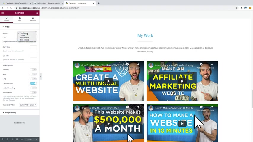
If that is something that you want to do , you just go ahead and click on the little uh widget little icon and then you can change this youtube link to any youtube video that you want .
So you'd simply just go over to youtube dot com , grab a video , uh the URL and just paste it in right here and you can do Vimeo Daily Motion or you can even put in your own videos which are hosted on your site by themselves .
But I think youtube is a much better way to go really helps you save space as well because the youtube video is actually embedded and not actually uploaded to your server .
And you've got a few options down here , like auto play the video loop it , whether you want to show the player controls things like that .
All right .
So let's keep on moving down .
Oh , we've also got this button here .
So if we just go ahead and click on the little widget icon for that , you can add a link over to your other videos .
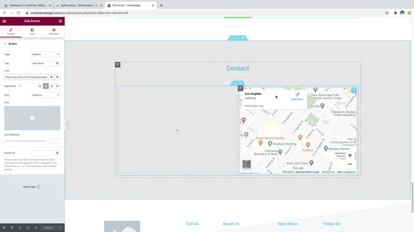
So I just have my youtube dot com slash create a pro website link in here .
So feel free to change that to whatever you want and then keep on scrolling down .
And we are now in our contact section and you can see that we've got an empty space here , which is where our contact form is going to go .
But first let me show you how you can change the map .
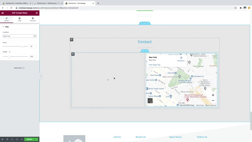
So what you can do is just click on the little pencil icon for the map and you can just type in any location you want .
So I'll just put in something like New York and there we go .
Now it's gonna bring us to New York , New York and you can zoom in and change the height and things like that .
But I kind of like the way it looks .
So I'm gonna just go ahead and leave it and now we can move on to step number six , which is to create a contact form .
So , having a contact form on your website is a must so that any of your viewers can contact you about services or products or anything that you want to do with your website .
So first we're gonna go ahead and put in the widget to put in our contact form , then we'll actually have to make one .
So let's just go on up to the little Rubik's Cube looking symbol up here and then just go to the little search area and just type in WP forms and then you'll see the WP forms widget right here .
Let's just go ahead and drag that in and drop it in the space .
And then it's gonna say WP forms is not installed .
So this is actually a plug in .
So let's just go ahead and go get it .
So let's just click on update to save our work and then just go up to the little hamburger symbol up here and then go to exit to dashboard and then just click on the word press symbol up here .
And then we'll just go down to plugins and then go over to add new and then we'll just go up to the search bar and we'll just type in WP forms .
Then you'll see contact form by WP forms here .
So let's just go ahead and install that and then click , activate .
Cool .
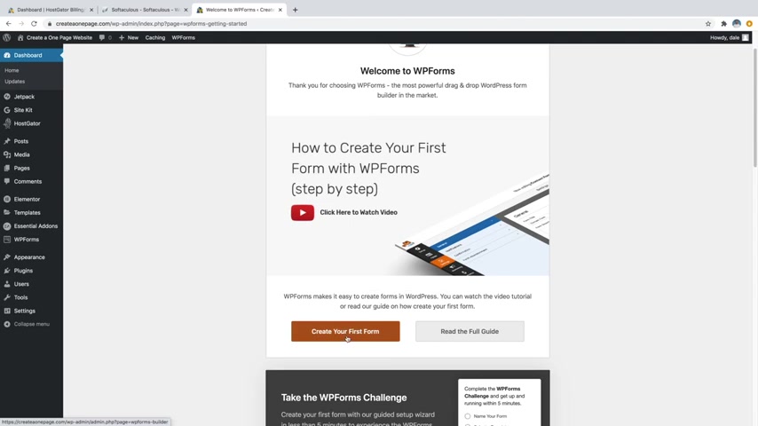
So now it will be brought to this page and then from here , we're actually gonna want to create our first form .
So we'll just click on the create your first form button right here .
And then we're just going to start with a simple contact form .
It's sort of just a really easy template to start with .
So we'll just go ahead and click on and create a simple contact form .
Cool .
So you can see that this one comes with a name section which has first and last comes with email and then comment or message .
And if you want to add any sort of field that you want , you can just click on any of these standard ones over here .
So let's say that you wanted to add something like a phone number , you can just go ahead and click on that and that's gonna add that down here at the bottom .
And if you want to reorder it , you can just click and drag and move it up and then you can also change the names of all these .
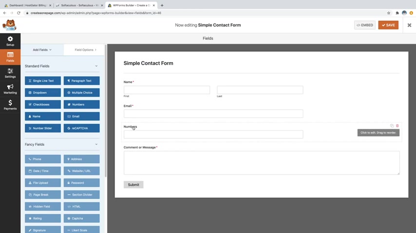
So if I wanted to change numbers to phone numbers all I have to do is just click on it and you'll see the label right here .
I could just say phone number like that and then I'll also change comment or message .
I'll just go ahead and click on that and change it to message just like that .
And then I'm also going to edit the name of the contact form .
So I'm just gonna go ahead and click on this simple contact form up here .
Then you can see the form name .
I'll just change it to something like Dale's contact form , but nobody's gonna see this .
So it's totally OK to name it whatever you want .
It's really just for you .
And then you can also change the submit button text down here so you can change it to send or you know anything like that .
And one other change we're gonna make , we're gonna go back over to fields and then we're just gonna click on the name box .
And what we're gonna do is actually end up making this one .
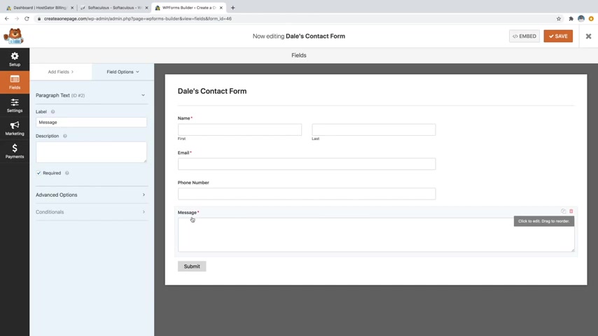
So you can see this stops a little over halfway .
It's about two thirds of the way there .
And then the message box goes all the way from one side of the form to the other .
We want all of them to be that big .
So they fit nicely in that square on our website .
So just go ahead and click on the name section and then you can see in advanced options if we open that up and we go to field size , we can change that to large and then that's going to go from one side of the form to the other .
So we want to do the same thing with email and phone number .
So I'm gonna click on email and go to advanced options , change the field size to large and then same with phone number , go to advanced options , field size to large .
Cool and then just click on save to save your work .

And now we're gonna go over to settings and then we're gonna go to notifications and here is where you're gonna want to put in the email that you want all of these emails from your customers or viewers to go to .
So right now it's set to this little uh short code with these brackets that says admin email and this is going to use the same email that you put in to sign up for wordpress .
So if that's the same email that you want these emails to go to , you can just go ahead and leave it .
But if you wanted to put in a different one , you could just delete it and you could put in whatever that email is , so I could do something like that .
And then this is how it's going to be displayed whenever it actually comes through on your email , it's gonna say new entry from the contact forms .
I'll say Dale's contact form , it's gonna have your site name on there from the email and then where their message is .
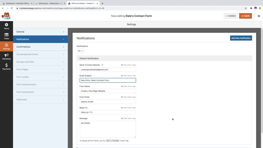
So we can just go ahead and leave the rest of it the way that it is and just click on save and then we can just go over to confirmations and then you can see that you can change the message .
So whenever they actually hit submit , this message will come up and say thanks for contacting us .
We'll be in touch with you shortly .
I could say something like thanks for contacting me .
I'll be in touch with you shortly .
So you can edit this .
However you want , you can also have it go to a whole different page or a completely different website if you want .
But I think the message does the job .
So I'm gonna go ahead and leave that .
And again , I will click on save and then I'm just going to click on the X .
Cool .
So let's just go back over to our website .
So we'll go up to our website name and click on visit site and then we're just gonna click on edit with mentor and then we'll just scroll all the way to the bottom to back where our form was .
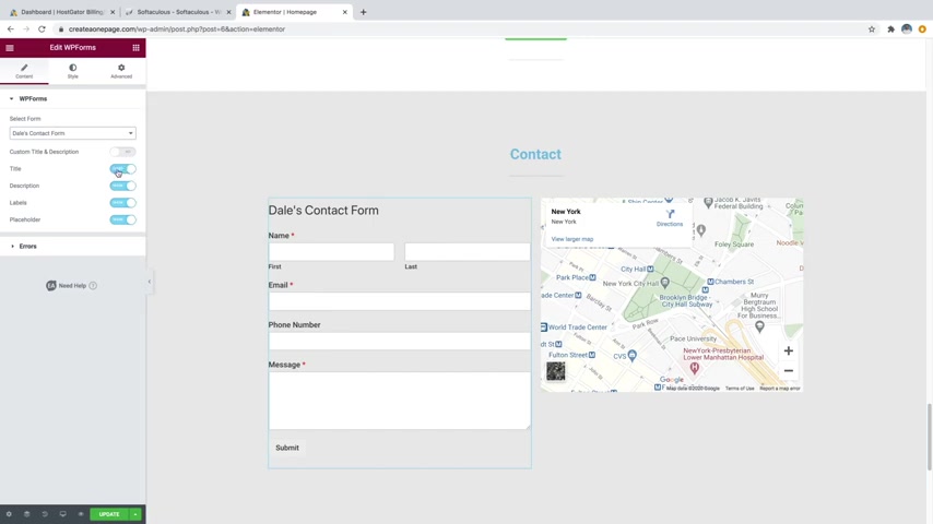
And we'll just click on that little widget that we put in earlier .
And again , that's the WP forms widget .
And we'll just go over to select a form and go to Dale's contact form .
You should see that your form pull up in here and there we go .
You can now see my new form and what we're gonna do is actually just get rid of the title .
So I'm just going to unclick that so that it says hide and then that's gonna get rid of the whole Dale's contact form up at the top and it's just gonna leave our fields in here and then we'll just go over to style and then if we scroll all the way to the bottom , you can see that you can edit all sorts of things about your contact form in here .
As far as the style goes , like the titles and descriptions and things like that .
But honestly , I think the default looks very good .
So I really wouldn't change it too much , but we can go over to submit button because the submit button is kind of hiding .
So we want to make sure that stands out .
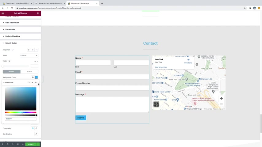
So just go ahead and click on submit button and then just scroll down and then you can see we're on normal and then you've also got hover .
So underneath normal , we'll go to background color and we'll just change that to something a little brighter .
We'll do like a blue , maybe something like that a little bit lighter .
And then we'll also go over to text color and we'll change that to a white , which I think looks pretty good .
And then we'll just go over to hover and then we'll go to background color and we'll change that to blue and make it maybe kind of a dark blue , something like that , maybe a little bit lighter .
There we go , something like that .
I think looks pretty good .

So you can tell that it's being activated and then text color will also change that to white just like that and then just click on update and if you wanted to change the background of this whole section , you can do that as well .
So I actually think an image might look pretty good back here .
So I'm just gonna go ahead and click on these six dots and then I'll go over to style and then for image underneath background , which I'm on the classic background , I'm gonna go over to choose an image and then I'll just pick whatever image I want maybe , you know , something like this and then just click on insert media .
There we go and I'll change the position to center , center also change the size to be cover just like that .
And then I'm also going to add a background overlay .
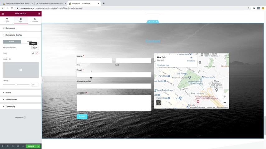
So I'll just go over to background overlay and then I'm going to do the classic and then I'm just gonna choose a color which I'm just gonna do as black , maybe even like a blackish blue , something along these lines kind of like that .
And then we'll just make the opacity a bit stronger , maybe something like that .
I think that looks pretty good .
And then I also want the image to stay where it's at .
So I'm gonna go back over to background and then we'll just go over to attachment and change that to fixed that way .
It's kind of parallax , which I think looks pretty good .
Cool .
I just click on update .
OK ?
So now we can move on to step number seven , which is to edit the header and the footer .
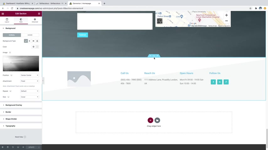
So we're actually gonna start with the footer since we're already down here at the bottom .
So we'll just scroll down to the bottom and then you could put in an image in the background or you could just put in a color .
So let's go ahead and start with that .
So I'm just going to click on the little six dots for this section and then I'm just gonna go over to style and then we can just put in an image here or we can just choose a color .
But in this case , I think I'm actually gonna do a gradient so I can show you how to do that .
So just click on the little gradient symbol and then I'm just going to put in a color .
So we'll put in a color for this first one up here .
We'll just do maybe just like a light gray , very light .
And then we'll also go down to the second color and we're going to change that to kind of a darker gray , maybe something like that .
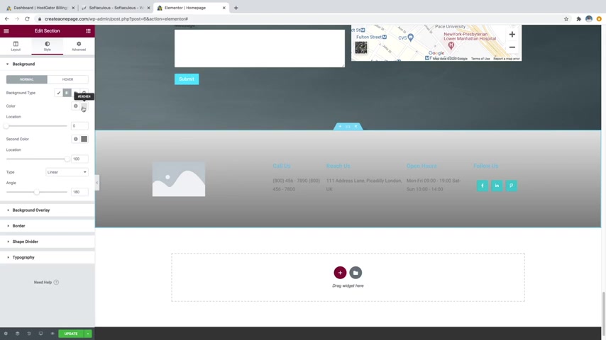
And then you can see it's only affecting this one section here , which is kind of like a long triangle .
So what we need to do to fix that is just going over to shape divider and then we're just going to change the type to none just like that .
And then that's gonna fill in that whole space .
So now we can just go back over to background and then you can play with these colors again .
So I think I'm actually going to change this top one to kind of a darker color as well .
Maybe actually , you know what I'm gonna go with white and then I'm gonna go with a very light gray , something like that .
I think looks pretty good .
And then you can change all of your text here by simply clicking and then you can just type right on the screen and then you can also change your social links over here .
If you just click in little widget , you can just open up whatever one that you want .
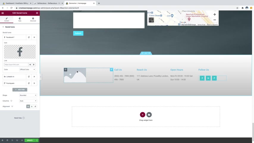
So the Facebook , you can just open it up and delete the hashtag and then you can just put in your Facebook link , same with linkedin four square .
You can change this to whatever you want by just clicking on the icon library .
But I'm gonna just go ahead and leave them blank for now and then we'll just go over to this image .
And what we're gonna want to do is put in a logo for this image .
So let's go ahead and make a logo really quick and I'll show you how to do it for free with an online software .
So what we're gonna do is just click on update to save our work and then we're just going to go up to a new tab and we're gonna type in logo maker without the E dot com just like that .
And this is super easy to use .
So first what we're gonna do is just cancel out of that little tutorial thing .
And what you can do is search for any graphics that you want .
So let's say that your logo was something about plants .
You could just type in plants like that and then you're just gonna get tons of different plant icons and you can scroll forever and there's just so many of them in here .
Now , I'm not actually gonna do anything about plants .
What I'm gonna do is actually delete that and just click on shapes .
So you've got all these categories up here , which is pretty cool .
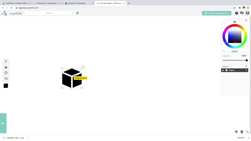
I'm gonna click on shapes and I am just going to select a random shape to use as my logo like this one .
So you can just click on it .
It's going to put it into your project and then you can just click on any of the corners and you can drag it up to resize just like that .
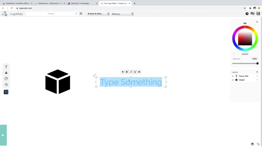
So what I'm gonna do is actually just move this over to the left and then I'm going to click on the t for text that's gonna put some text on our project and I am just going to call this my logo just like that in all caps .
And I'm also going to change it to black .
So what you can do is just going over to the little color wheel and you can do this for the logo itself or the actual text .
You can just click on whatever it is and then you can change that to black or if you wanted to change it to a whole another color , you can just drag around this wheel and that'll change it to any color .
But I'm gonna go with black and then I'm gonna change my font .
So first , this first box is your font category and then you've got your font family .
So first I'm gonna go to the category .
You can see we've got fancy cursive text , scary , simple and modern , fun and funky .
All these different ones .
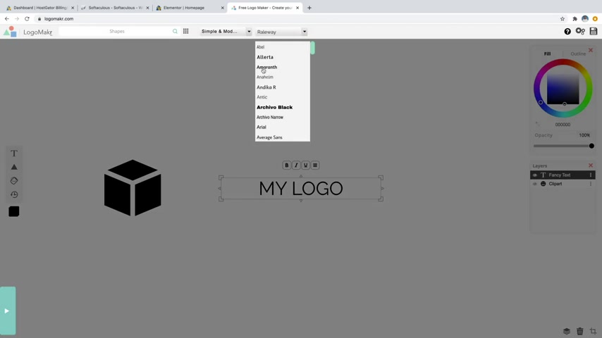
I like the simple and modern because I want to have a very professional logo .
I don't want really too crazy text .
And then we're just gonna scroll down and I'm going to select a new font like this one .
There we go .
And I'm just going to resize this .
I'm gonna bring it up and make it somewhere about that big .
I'll just drag that to the middle , put my logo next to it .
Maybe make it a little bit smaller , something like that .
And there we go , there's a logo , a sample logo obviously and not a whole lot of creativity built in .
But you get the idea .
It's a pretty simple software to use .
So I'm just gonna go ahead and click on the little save logo button up here and it's gonna say , hey , do you want to buy it for $19 ?
It'll give you the high res version .
But to be honest , you can just click on the No , thanks .
Download the low resolution file and that's going to be plenty high enough resolution for a website logo and it's completely free .
So it's also going to ask you to credit them .
You can just put that small , like logo by logo maker somewhere on your website .
Very small .
Um But yeah , you can just go ahead and click on that and then that will download that for free .
So we're just going to X out and then we're also going to need to create a site icon for our header .
So what a site icon is , is going to be this symbol right here .
There's this gator or you've also got this one over here .
That's just the little image that's in the actual browser tab for your website .
So you'd obviously want to use the same logo that you use for your long logo like this .
So what I'm gonna do is just delete the text .
I'm gonna grab this little icon , bring it in the middle , drag it way up .
So it takes up a little bit more room and then what I'm going to do is save that and that's going to be used as our site icon up here .
So I'm just gonna click on save logo and again .
No , thanks .
Download the low resolution file .
There we go .
So now you can see , I've got both of those logos .
I've got the site icon and the sample logo that are now in my downloads .
So I'm just going to close out of that because I also have these images in the description if you want to follow along .
So I've already got them on my computer .
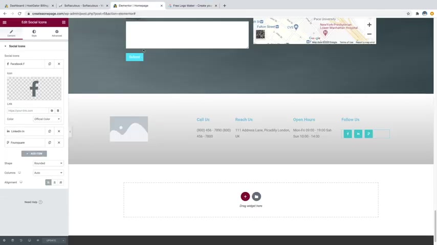
So what I'm gonna do is just go back over to edit our website with mentor and I'm going to change this image to our logo .
So I'm just going to click on the little pencil icon and then I'm gonna go to choose image and I'm just going to upload files , select files and then I'm just gonna go to that folder that contains the logos .
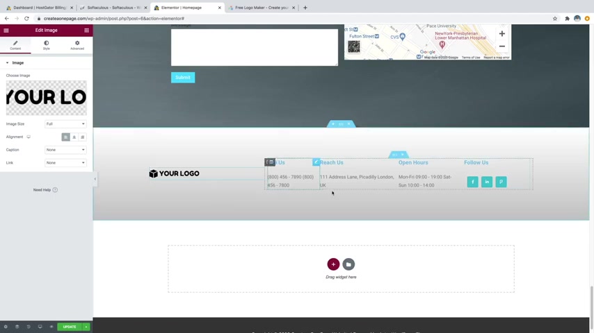
So I'm just going to grab both of these actually and upload both .
Click on open .
There we go , I'm gonna select the logo right here , the long logo and then just click on insert media and there we go , it's gonna put my logo in there , which is pretty cool .
And now we also want to put that up on the header .
So let's just go ahead and click on update to save our work and then we'll just scroll up and you can see that we're gonna want to put it right here .
It just currently says our website title , which looks a little ugly .
So let's just go ahead and click on the little hamburger looking symbol to get out of mentor and we'll go back to exit to dashboard and then we're just gonna click on the little uh wordpress looking symbol up here at the top left to go back over to our wordpress dashboard .
And then we're just gonna click on our site title again and go to visit site and then just click on customize .
Cool .
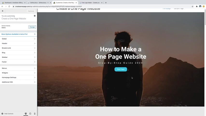
So now we're actually using our astra theme settings in order to customize the header .
So all this stuff , the actual content as well as the footer was all done with the element or page builder plug in .
This is now using the theme settings , which is all this stuff right here to edit the header .
So in order to actually change this to our logo , just go ahead and hover over this and click on the little pencil icon next to it .
And then you're gonna see site logo right here .
So we'll just select a site logo .
We'll just grab that same logo right there and then click on select , then it's gonna ask you to crop it , which you can do just by kind of dragging over to the edge there , drag all the way to that edge and then just click on crop image and there we go , that's going to add that in .
So what we want to do is obviously make it a bit smaller and then also get rid of the site title .
So now let's just click on display site title .
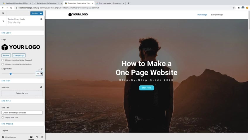
We're just gonna uncheck that .
There we go , that's gonna get rid of that .
And then for logo width , you can just drag that down and that's gonna make that quite a bit smaller .
I personally like a very small logo up there .
So I think something like 100 and 50 is pretty good .
And then we're gonna want to add in our site icon , which again is this symbol up here .
So right now we've just got this gator , which is for host gator , which is our hosting provider .
We're going to change that to our own custom one .
So let's go over to select site icon and then we'll just click on that box icon that we made and then click on select and then you can see a little preview of what it's going to look like right here and then just click on a crop image and there we go .
Now you can see we've got our new site icon up there which matches our logo .
And if you ever want to change the name of your website , for whatever reason , you can do that down here with the site title .
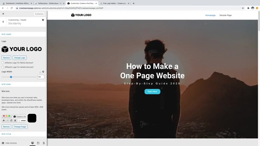
You can see , I've got to create a one page website and then also the site tagline , you can change those here as well any time that you want .
But I'm going to leave them the way that they are and just click on publish to save my work .
Ok .
So now we can move on to step number eight , which is to create a navigation menu .
So , as you can see , currently , our navigation menu only consists of home page and sample page , which is a little useless .
Uh So what we want to do is actually put in a bunch of links up here or a bunch of buttons up here that will jump to different parts of our website .
So I showed you a little bit in the beginning about how to create a jump button .
Um So I'll show you again how to create the navigation menu to jump to all these sections .
So let's go ahead and do that .
So what we're gonna do is just click on the back arrow and then hit the back arrow again .
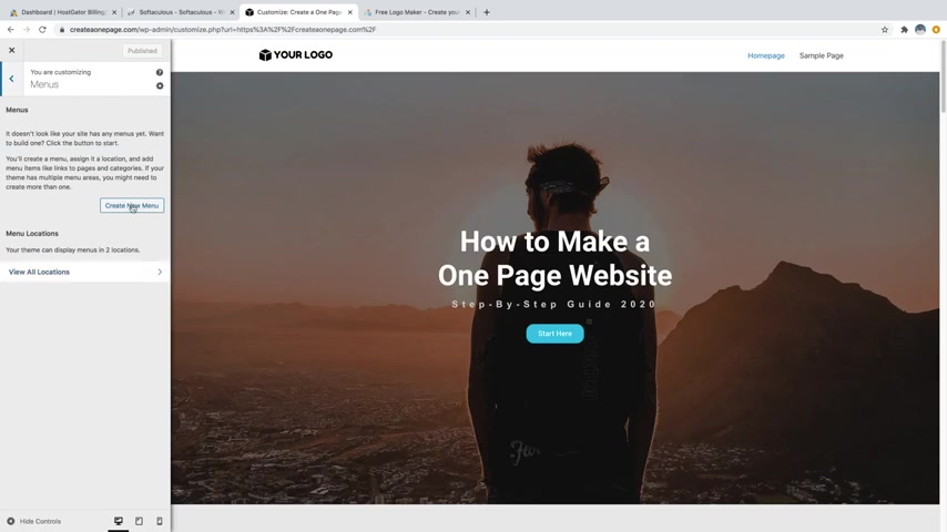
And then we're just going to go down to menus and then we're just going to create a new menu and we're just gonna call this primary menu just like that .
And for the menu locations , we're gonna say primary menu , which is going to be this section right up in here .
So now we'll just click on next and then now we can just click on the add items button in order to add some buttons to that .
So just go ahead and click on add items and it's automatically going to bring you to the pages category .
So you can see that the pages is open and all we have is home page and sample page , which we don't want .
So let's go ahead and close that .
And what we're gonna do is do a custom link .
So let's just go ahead and open that .
And the first one that we're gonna be making is the about .
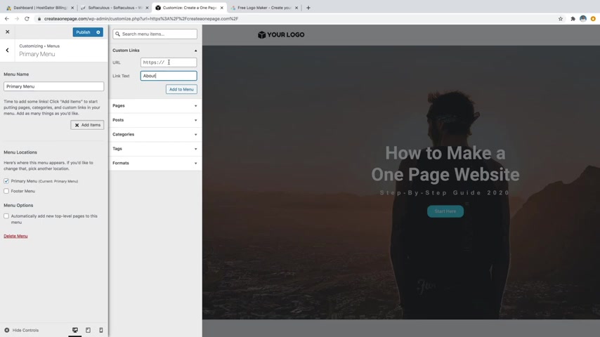
So what we're gonna do is just type in about for the link text and then for the URL , we're actually just gonna do a hashtag about .
And if you remember from the beginning that hashtag is what's going to allow us to jump to that section on our website , which again has that little CS S ID that says about on that section .
So with that said , we'll just go ahead and click on , add to menu and then that just added it .
So in order to see it , all you have to do is just click on the hide controls down here and then you can see we've now got about on there and if we were to click on it , it's gonna jump down to our about section .
So let's go ahead and add some more .
So we'll have to add in here services gallery follow and my work as well as contact .
So let's just go ahead and open up those controls again by clicking on this little arrow down here at the bottom left .
And then we're gonna go to add items again .
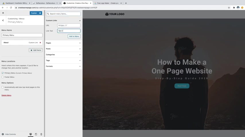
And for custom links , we're going to go to link text and do services and then we'll just do hashtag services add to menu .
We're also going to do gallery hashtag gallery add to menu .
I do my work and then hashtag my work add to menu and then we're also gonna do contact and then hashtag contact and then add to menu .
Cool .
And then the way that these are ordered from top to bottom is how they're going to display left to right .
So you can see kind of over here .
They go from left to right .
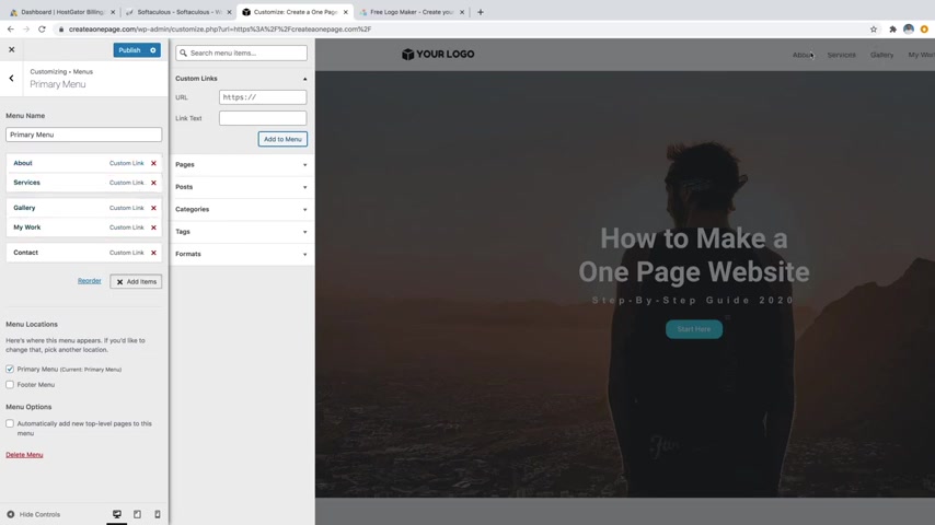
If you wanted to reorder anything at all , you can just click and drag and move it down and then it's going to update up here so that you can see about which has moved .
So I'm just gonna go ahead and move that back up to the top .
And then one other trick I'm going to show you is how to create a dropdown menu .
So I'm gonna go ahead and close this and let's just assume that for my work or maybe services actually , services would be a better one if you wanted to display the services underneath .
So like my photography , my video , you know , my web design and create a dropdown , I'll show you how to do that .
You can just open up the controls and I'll just use a few of these items for now just to show you .
So if I were to move , let's say gallery underneath services and I kind of move it to the right , it's going to create this little stair stepper effect .
And I'll also do that with a couple of these just so I can show you .
So let's just pretend that this says photography , video and web design .
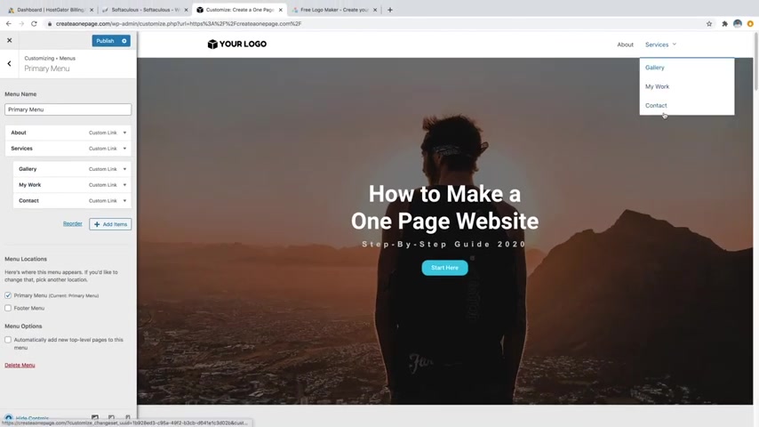
Now they're going to all be underneath services and then you create this little dropdown menu , which is pretty cool .
But I'm gonna pull these out because I want them to be their own separate links .
Just a fun little trick I wanted to show you in case you needed a dropdown menu .
OK ?
So now let's just go ahead and click on publish and let's just test out those links to make sure that they're all working .
So we've got about got services .
It's also working gallery , that one's working as well .
My work just working , then we've also got contact which is also working and it looks like I forgot the follow .
So let's just go ahead and add that really quick .
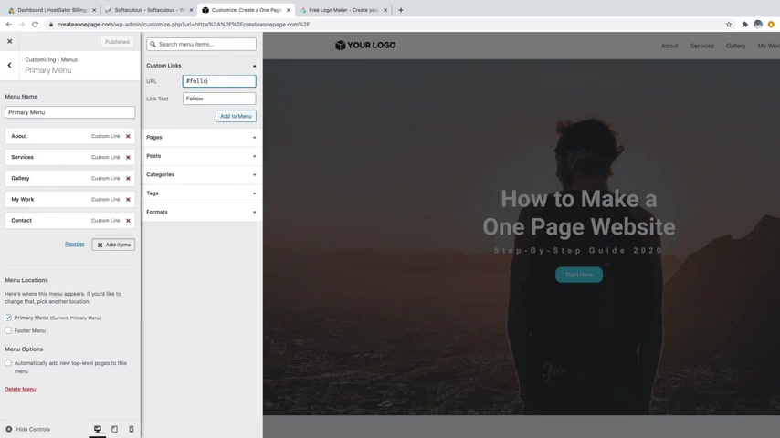
I'll just open this back up , add items and then we'll just do follow and we'll just do hashtag follow and then add that to the menu and we'll just drag that up somewhere in the middle just like that and then publish that .
So we are almost done .
Our website is starting to look really cool , looking really nice and clean .
We've got everything built out .
But what we want to do is move on to step number nine , which is to edit for mobile and tablet .
So the reason why you want to make sure that your website is going to be responsive as far as the design for tablet and mobile is because over 52% of global online traffic , which is basically just people browsing the web is actually done on a mobile phone because everyone's got them in their pockets nowadays .
So making sure that your website looks great on mobile is a must .
So let me show you how to do that .
Let's just go ahead and click on the X and then just going over to edit with mentor .
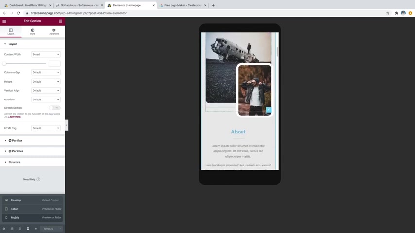
So if you want to see what your website is going to look like on mobile or tablet , you can just go down to this little responsive mode tab right here and you can click on that and we'll go over to let's say mobile first and it's gonna give you this little phone simulation and then you can just scroll down your website and make sure that everything is looking .
Ok ?
Now , I already did build this template to be responsive for mobile and tablets .
So everything should look fine .
But just in case you've added some texts that might have messed up the spacing or something like that .
I'll show you how to change that .
So , what I'll do is let's just go to like this text over here and let's just click on that little widget and then let's say that you want to edit the spacing .
Maybe like this whole section isn't quite big enough .
Actually , let's do that first .
So I'll click on the little six dots for this whole services section .
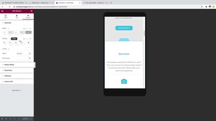
And if we go over to advanced , you can see now on the padding if we wanted to change the spacing on that .
So let's just say we wanted to add more room to the top , you know , or maybe less room .
Let's say we want to do like 75 bring it a bit closer to the top , whatever is got this little symbol next to it , which says mobile .
If you click on that , you can change it to whatever you want .
As long as it's got that symbol , it's only going to affect just the mobile version or if you're on tablet , it'll just be the tablet version that way , regardless of whatever you switch to it is still going to have the same values that it had before .
But if it doesn't have that little symbol next to it , of the device , then you're actually changing it on all three modes .
So just make sure you watch out for that .
So now that we're on tablet , let's make sure that that is looking pretty good as well , which it looks like it is really , I just want to check the website to make sure nothing's broken looking and everything is looking .
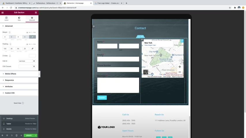
Ok .
So like this , I do think it looks a little funny to have the map to be a little bit higher than the contact form .
So , what I'm gonna do is actually add a little spacer in there .
So let's just go over to the little little Rubik's cube looking symbol and then we'll just go over to spacer and we're just gonna drag that above our map until the blue line snaps right there .
And now that's gonna position that map to be more in the center , which I think looks pretty good and you can edit the amount of space over here and again , you can change it based on whichever device .
So what I will do is actually go over to advanced and then we're gonna go down to responsive and we're actually going to hide it that one widget .
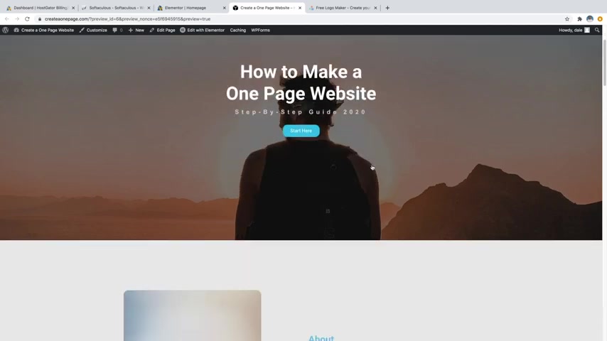
We're gonna hide it on desktop and on mobile because I really only want that widget to be active just on the tablet view and then just go ahead and click on update .
All right .
So let's go ahead and click on the preview button to preview our changes and it looks like our website is looking awesome .
We've got this cool parallax effect going on with that image in the back .
We've got our about section which has a working button on it which jumps down to my work , which is pretty cool .
We've got our follow section .
The gallery is working , which is pretty cool .
Got our work and our working contact form which you're gonna want to test out and make sure that that mail doesn't go to your spam folder .
Always check your spam folder and if it is in there just go ahead and mark it as not spam .
And then anything else coming through should go to your regular inbox inbox and make sure to check your spam folder .
Because if it does end up in there , you'll just want to mark it as not spam and then everything else coming through should come to your regular inbox .
All right guys .
So that was how to create a one page website .
If you enjoyed this video , please hit that like button and feel free to subscribe .
If you want to see more videos on how to create professional websites from home and how to make an online income with websites .
My whole channel is full of videos like this and feel free to check out Creative Pro website on Instagram and tiktok for more quick tips , web design inspiration and behind the scenes .
Fun .
All right guys .
Thank you so much for watching .
I'm Dale mcmanus from Creative Pro website and I will see you on the next video .
Are you looking for a way to reach a wider audience and get more views on your videos?
Our innovative video to text transcribing service can help you do just that.
We provide accurate transcriptions of your videos along with visual content that will help you attract new viewers and keep them engaged. Plus, our data analytics and ad campaign tools can help you monetize your content and maximize your revenue.
Let's partner up and take your video content to the next level!
Contact us today to learn more.