https://www.youtube.com/watch?v=Sx1hsKQ1Mec
DESIGN HACKS! TOP 9 TRICKS to Style Coffee Tables, Consoles, and Home Decor _ Julie Khuu

Hello , everyone .
Welcome back to my channel .
I'm Julie .
And today we'll be talking about all of the designer tricks to style your coffee table consoles and pretty much any surface in your home with ease .
I've been getting a lot of requests on what the basic requirements are to make a home look elegant , style , polished , really pull together .
And to be honest , there are no real rules that you need to buy by , but all designers do have some styling tricks , their sleeves and I will detail my favorite top nine so that you could do it at home before we jump into it .
Please take a moment to give this video a thumbs up if you love this type of interior design content .
Of course , comment below .
I read all the comments .
I try to respond to every single one of them .
So know that I am absolutely listening to your feedback and don't forget to subscribe to my channel if you haven't already .
So if you're struggling to pull your rooms together and learn how to style with ease , this video is for you .
So I'll be breaking down this video into two parts .
The first part is all about the rules , the tips and tricks that designers use to style any surface and then I will dive into all the different types of surfaces from coffee tables to entry consoles , bookshelves , nightstands , and more to illustrate how you can effectively use these tips in any type of setting .
Let's start with my top nine favorite tricks that designers use to pull any tablescape together .
The goal is to always make your table scapes look completely balanced .
You can start by using the rule of three .
If you love interior design and home decor , I am sure you have heard of the rule of threes .
The rule of three basically states that items like to be grouped together in odd numbers .
Typically , you'll start with a set of three decorative items .
Three just feels more dynamic than two .
It gives your collection a little bit of variety where your eye can land from one item to the next .
When you have two items , you're really just going back and forth .
And to me , that's not enough of variety to make it interesting .
You want to keep your tablescape looking like a collection and not like a bunch of knickknacks just thrown together .

The next tip is to use a variation in heights and scales of your decorative objects .
What you're looking to create is a little vignette of small , medium , large or low , medium , high objects .
When all items are the same , nothing gets noticed .
This type of variation allows your eyes to travel around and focus on something really important .
Next , we'll be moving on to the variation in sizes , texture and sheens .
Maybe you'll have something glossy next to something matte , you'll have something small next to something large and you might want to even keep something really textured next to something smooth .
Styling objects is all about contrast .
If everything looks the same , nothing feels important .
My next tip is all about focusing on color .
Your color palette could be all similar colors or all contrasting hues .
I always like to start with my table base .
If the table is dark , look for decorative objects that are a little bit lighter in color .
On the flip side , if the table is light , you want to look for something dark to anchor the space .
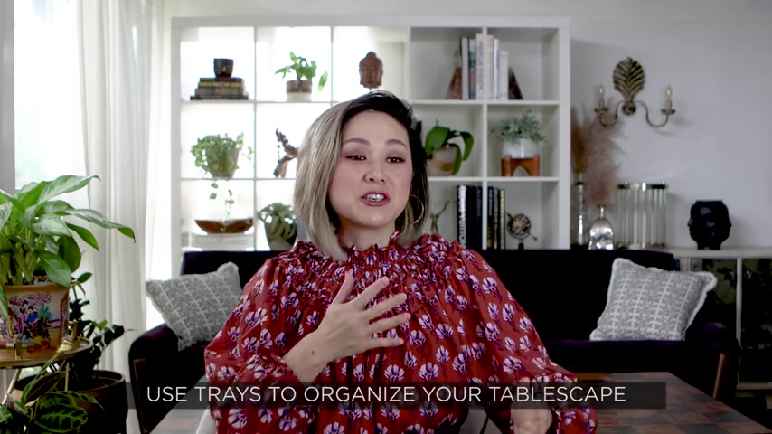
If you caught my holiday gift guide from last year , one of my favorite decorative items to have in the home is a tray .
I pretty much have a tray styled on every single surface in my home .
Whether or not it's a little bowl or an actual tray with handles .
You want to use a tray to streamline the look , it keeps your surface looking tidy , clean and Uncluttered .
Instead of having all these little knickknacks thrown about your surface , a tray can give them a place to land instead of floating around in space .
The next tip is to play with your angles .
Styling with photos are best used against a wall .
You can place that photo frame in the bookshelf since it has a backing to it , no one's gonna walk around it .
No one's going to be able to see this exposed back .
So that photo frame makes more sense up against a wall .
On the same note , you'd want to keep a photo off a coffee table , especially if people are seated all around it .
If someone is sitting in the back of the , they'll constantly be looking at the back of a photo frame instead of the pretty front side that you want everyone to see .
My next tip is my favorite tip .
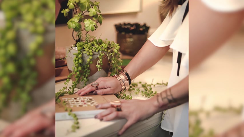
Foliage is your friends .
Every single styling group , it can bend it from something green , something fresh , whether it's fresh flowers or a branch that you simply cut from your yard .
I love how a little foliage can just brighten up every space plus free .
I mean , just go outside with a pair of sharp shears and look for like a really sculptural branch .
A little bit of green leaves cut that off , bring it into your home and you can mess around with how it looks in a variety of different faces .
Bonus points for being able to change this out as the seasons change .
Bringing the outdoors in is one of the top designer tricks that every designer is used to make a space feel more lived in .
I am all about personalizing your space .
I love it when a home kind of shares your story and the viewers know instantly who lives there .
So my advice is to always make these little groupings as personal as possible .
Let those items on your coffee table tell a story about your passions or a special memory .
It's all about giving your home Decor a personal twist and a conversation starter to boot .

My final tip is to look for Interactive Decor .
What does Interactive Decor mean ?
It basically just means styling with a personal object that begs the viewer to touch it .
It could be a photo album that encourage your guest to kind of flip through it .
It could be your favorite coffee table book , open to a page that really inspires you .
The more you encourage activity , the more these objects than just decorate to say something is merely decorative is to miss the point entirely .
Think about styling and decorating with pieces that you absolutely love something that has a special meaning to you .
Something that feels very personal .
The goal is to be able to decorate your home in a very stylish design or way while still allowing a sneak peek into your personal life .
Let's start with the basics of coffee table styling .
You always want to consider the shape of your coffee table first .
If you have a rectangular coffee table , you wanna look for groupings .
Of course , in rules of three , maybe even use a tray and fresh greenery .
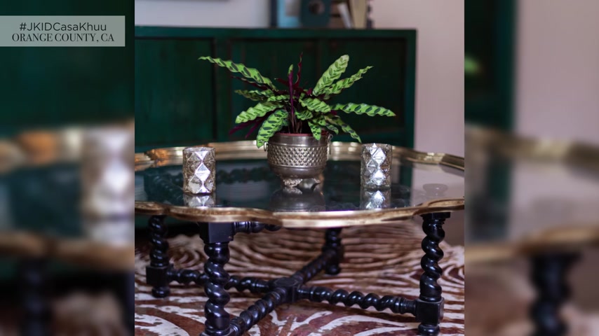
You want to group them in a way where they have a dialogue with each other but not so far apart that you miss the story that you're trying to tell .
If you have a round coffee table or a round ottoman , you want to mimic that shape with a round tray or round basis .
If you have a beautiful bold patterned rug underneath a glass coffee table that you can see through .
I like to keep the styling on top , really simple and streamlined .
Maybe it's just a vase of fresh flowers or a little bit of greenery for a pop of color coffee table styling is probably one of my favorites to style since it's front and center in the living room .
I love to change it up seasonally with the Decor in the springtime , I always use fresh vibrant flowers and then during winter time or fall , it gets a little bit moodier with metallics and candle light .
You can always use the seasonal changes to dictate how you style a surface for entry console styling .
It's all about function .
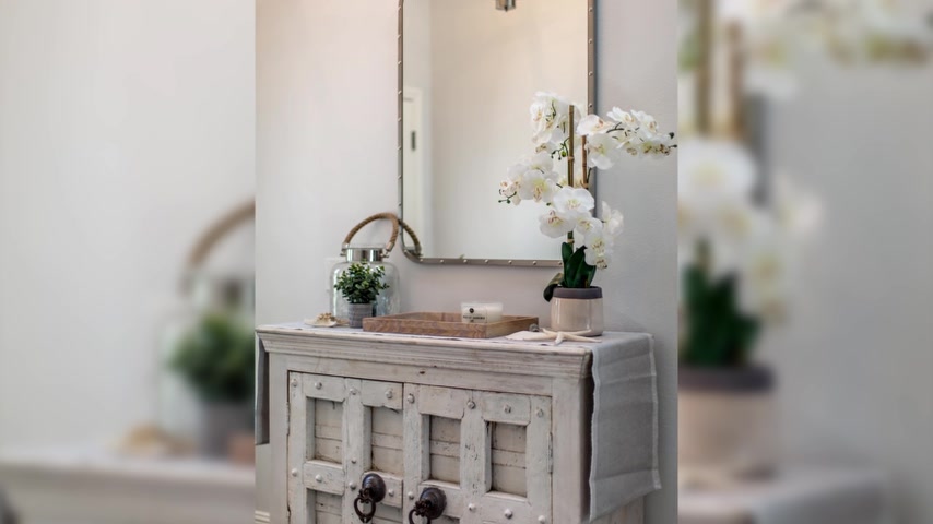
I always like to anchor the entry consoles with the mirror because of course you want to check yourself out before you leave the house a little to put your keys , your wallet , anything that you need to grab right before you leave and of course something fresh in this case , a really beautiful sculptural orchid .
I love the way the organic shape plays up with these hard rigid lines .
So you also want to play with your shapes and angles .
In this case , if you have a round entry mirror , you want to mimic that shape with round vases or round objects , maybe like a really cool globe or a little orb .
The idea is to be able to walk around that round table and not see like unfinished backs of squared items for nightstands .
I like to keep it really simple .
Of course , you'll have your table lamp .
So depending on the size of your table lamp , you'll figure out how much surface space there is left for all of your decorative objects .
Typically a nightstand doesn't have a ton of surface space .
So I wouldn't decorate just for looks .
It's all about function .
In this case , you can style the stand with a little box for your vitamins or a larger box to Hyde your remote control .
You can also finish a look with a journal or book and even a candle for aromatherapy .
You want to streamline the look of your nightstands as much as possible because you have to remember bedrooms are for resting .
So in this case , you'd want to minimize the clutter as much as you can .
I have so many videos on styling bookshelves from Doctor Mona's apartment makeover to my own living room makeover .
But my favorite tip is to always style with larger decorative boxes .
These boxes can hide a multitude of sins , especially if you love to keep like a lot of loose paperwork around .
You can have these boxes anchored by more personal items like photo frames .
I love to use marble bookends .
I mean , it just makes the bookshelf look so polished and chic .
And again , you'll always see the rule of threes used for similar items .
So the rule of three is not about like every single piece .
You're counting 123 , you're really just counting similar items .
So for example , if you have a decorative box that looks the same , these two decorative boxes that are stacked right on top of each other is considered one item .
Just because visually , it looks the same .
And then your next item that has a different texture , a different size or a different shape could be the second item followed by a third item in a contrasting height or color .
Don't just throw the books on the shelves .
Think about a really cool way to display them .
Some of them can be in the vertical orientation .
Some of them can be in a horizontal one .
You want to play with variety and introduce different way to display common items .
In one of my favorite custom home design .
The Heights Project .
The homeowners and clients are these like crazy world travelers .
I love that .
Everywhere they go , they bring something home from their travels .
I remember when we were building the house , they just came home from this amazing trip to Asia .
They had these beautiful handmade clay figurines that I designed this entire great room bookshelf around .
I designed these glass of recess Mische in the bookshelf specifically for these clay figurines .
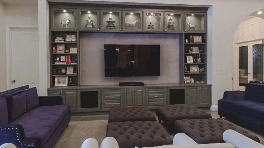
We lit them from above and from every vantage point in the great room .
I mean , they were just a beautiful focal point when they have guests come to the home .
It's one of those things that they guests always sit in the living room or the great room and kind of remark about and that's what design is all about .
It's about decorating with items that really share your story and give the viewer a sneak peek into what you're all about .
Moving on to bar styling .
I had a client who used to be a bartender and I had designed his home from when he was living , you know , as a bachelor in an apartment and then he upgraded to a condo and then finally his first home .
So a bar has always been amazing stay and bars are probably one of my favorite things to design just because , you know , it could be fun .
It could be quirky .
It's all about styling , really cool bottles , really chic glassware and anchoring the console was something that shares more of your personality .
This vibe is really industrial .
So we went for this really sleek metal console and we styled it with these industrial cage candelabras .
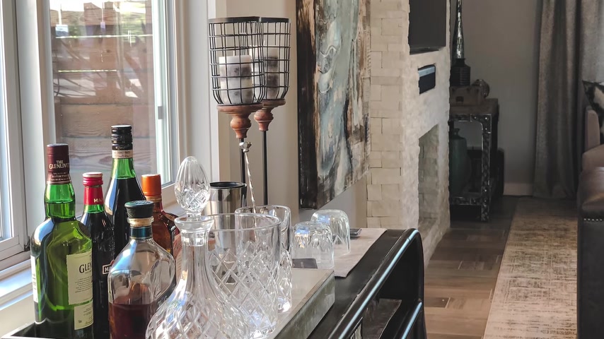
It gives you the option to change out the colors of the candles with the seasons or any time you feel like something new .
One of the questions I get asked a lot is how to style a dining table .
It's really a personal preference .
I have clients who want the dining table to look completely set every time .
Of course , over time , all of that table where it gets dusty .
So you have to be willing to maintain it .
If that's the look that you're going for , if you have a really beautiful light fixture above the dining table , keep the table scape really simple .
There's no need to dress the table because you're trying to draw the viewer eyes up .
In this case , a simple centerpiece with just a little bit of flowers or foliage or even a cluster of really bold colored hurricanes is gonna do the trick .
My tips for styling a really long console or a buffet is to break your vignette up into little groups .

The rule of threes still apply in this case .
But what you'll be doing is creating little groups of threes all along the surface .
If you're styling a buffet set in a dining space , you can start it by anchoring that surface with symmetrical table lamps .
I love placing a mirror right in the center of that buffet because what you'll be doing is bouncing the light back from the lamps .
You'll also be harnessing that really great Chee or good fun .
And lastly , you can style that buffet with a little tray that you put fresh flowers on it's a look that's really timeless , classy and elegant .
If you're going for a more modern or minimal look for your buffet .
Try anchoring that look with smaller lamps or even a makeshift bar in the middle .
Remember that you're always aiming for a little bit of contrast .
So if you have a wood buffet , try looking for metal or glass lamps .
If you have a console that's on a pony wall , which is like a half wall or a wall with a cut out where you can see behind it .
Try not to decorate with anything that's too high .
You want to be able to see through to the other room without any obstructions .
That's it for this video .

I know it's a lot of information but there you have it guys , all of my designer tips and tricks when it comes to styling virtually any surface in your home before you run out to your nearest store or you're shopping online or you're looking for links to anything that you see in this video .
I want you to just take a minute and just stop shop your home first .
I bet you that there is like a treasure trove of items .
Just kind of bare in little cabinets , bookshelves , even your garage that you probably forgot about .
Anything can be considered a decorative if you love it .
And it has a special meaning to you .
This weekend , I want to challenge you to shop your home , lay a blanket or a towel on the floor , grab all of your decorative items .
So they're all in one place and then start styling room by room , start with a coffee table , use a combination of my tips and tricks and just mess around and play with it .
That is the fun of interior design .
You'll start with one surface and then you'll move on to the next and then you can mess around with it .
Start filling in the pieces where you feel like it's missing or sometimes you'll walk away from a surface and just think , ok , that's it .
That's the look and then you'll move on to the next .
Don't try to do everything at once .
Interior design is just not a race to the finish line as every great designer knows design is just never done .
It's ever changing .
And every , just like you , I often get lost in like corners of my home .
I'll start the day off by like cleaning or wiping down my coffee table .
And then all of a sudden I picked up a coffee table book or like a photo album and it will remind me of a moment .
And then here we are hours later and I'm still sitting here .
My husband laughs at me all the time because it's like I'm starting to do one thing , something as mundane as cleaning .
And then all of a sudden he can't find me for the morning .
That's the beauty of interior design .
It's all about being completely immersed in your space , inspired by your own life , your own home decor , and then all of a sudden you're just in peace and complete bliss .
Please let me know if you have any questions when it comes to styling any surface in your space .
If you like this video , please give it a thumbs up .
Comment below and let me know if you have any questions when it comes to styling any surface in your home .
And of course , subscribe to my channel if you haven't already .
Thank you so much for watching guys .
I'll see you in the next one .
Are you looking for a way to reach a wider audience and get more views on your videos?
Our innovative video to text transcribing service can help you do just that.
We provide accurate transcriptions of your videos along with visual content that will help you attract new viewers and keep them engaged. Plus, our data analytics and ad campaign tools can help you monetize your content and maximize your revenue.
Let's partner up and take your video content to the next level!
Contact us today to learn more.