https://www.youtube.com/watch?v=t990IZ16B_w
Oddly Shaped Living ROOM FOR IMPROVEMENT _ Design Time

I know you're gonna say there's too much stuff .
Hey , everybody , it's design time .
How are we feeling about this shirt ?
I don't know .
It was from the what ?
$100 buys you at Forever ?
21 .
And that was a long time ago and I haven't even looked at it since .
So I thought , why not wear it actually , why ?
So a couple of weeks ago we looked at a kitchen , a room in somebody's house that we had pictures or video of and I kind of just went through what I would do to improve it .
Now , mind you , the person that sent in those pictures actually asked for help .
I didn't just say this is what's wrong with your kitchen .
Well , as I mentioned in that video , it's going to be a series .
I just am not positive about what I want to call it and I want to call it something anyway .
I think I'm so clever sometimes and I thought of room for improvement because it's one room in the house or room to improve .
Well , I looked that up on youtube and it's actually a show from Ireland called Room to Improve .
So for quite some time .
I was against that , but I'm for it now and I'm thinking a room to improve .
Let me know what you guys think of that .
A room to improve .
Anyway , we're going to do the second video in that series and it is a living room and this is sent in by Catherine .
I have yet to actually ask her what city she lives in , but I will find that out before posting this video .
I feel so smart with this shirt on like I'm at work with my glasses .
So like I said , this is a video , it is filmed with the camera vertically .
If you guys send stuff in , try to take video horizontally .
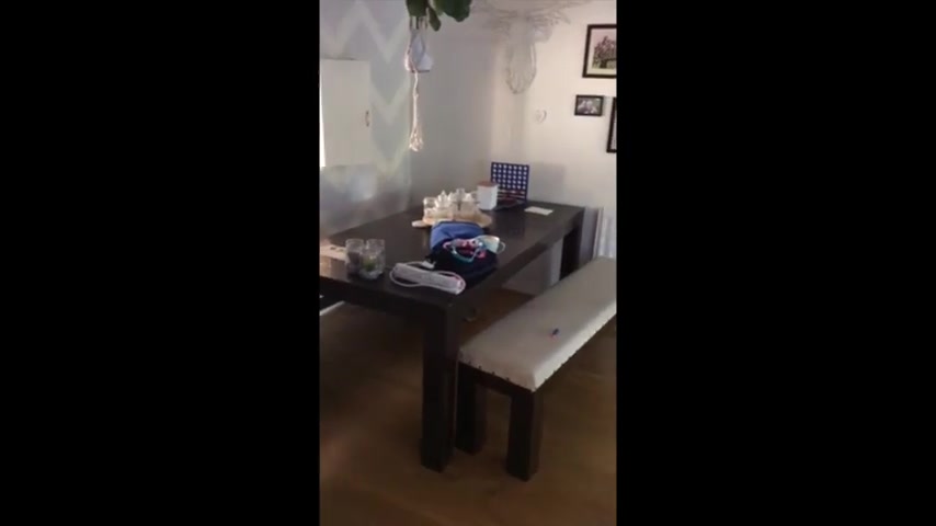
Hi Lou , I need some help with my living room .
So this is my living room TV .
There's a blue sofas , it's like a lounge dining room in one that's my dining table there .
It's like a piano and that goes outside .
Um Basically , it's a strange shaped room that's the kitchen through there .
And the number of times I've had it in different different ways just trying to get it right .
Um I feel like this one is quite good because it's cozy around the TV .
And I know we've got a lot of seating but we need this much seating .
Um The only thing is I think it looks really cluttered , but also that's the wood burner behind there , which is fine in summer .
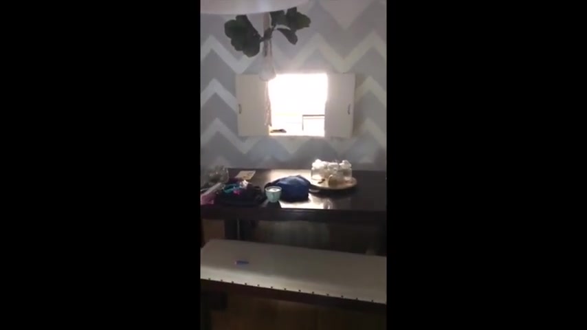
We don't need it but obviously I'm gonna need to get that out again .
Um , in winter .
Um , I know you're gonna say there's too much stuff .
Mhm .
I do need to have a bit of a tidy up and also outside .
Obviously we're just in the process of cutting up some wood there for winter .
Um , I'd really like to knock through this wool into the kitchen but , uh , I haven't got the cash for that at the minute .
Um Yeah , I'd love to know what you think .
If you can think of some better way of arranging all this seating .
That'd be brilliant .
Thank you .
All right .
So we are gonna start with the main part of this living room , which she admits has too much stuff in it , but really likes the amount of seating because she needs it .
That means she has lots of friends .
My living room has one chair .
So to improve this living room , I would start by taking down those lines completely and putting up a rod and some really cozy curtains , maybe something patterned or a light color to brighten up the living room , which looks I wouldn't say dark , but with allowing some of that light from outside to come in , it would surely improve it .
Now , when I give advice about these rooms and what to do in order to improve it , I am not looking for you guys to spend a whole lot of money .
I just want to help out with what you have and maybe add or take out a few things .
So actually going back to toward the end of the video , she shows where her window is in relation to another sliding window and her sofa is about this far from those sliders , I would push that couch back a little bit .
So you have more room in the middle where the coffee table is and that's what we're gonna talk about .
Next , the coffee table , which looks to be , be an ottoman .
And I actually think I have that Ottoman as part of a couch from IKEA that I use to stage a really modern home .
Now , I would take that Ottoman out and get a wooden or glass coffee table which would sit on top of a very big light colored maybe cream area rug .
The one that's down there now is dark and too small and a larger , lighter colored one would certainly make the space look bigger .
Now , speaking of bigger , those two side units with the cubbies , I would pull out completely .
Now , that might seem unfortunate due to the fact that there are tons of things .
There are wicker baskets plants , there's a unicorn and a lot of other stuff that can actually be hidden and open up that living room to be and look more spacious .
Instead , I might put one more custom unit on one side of the television , which we'll get to in just a second and make it more of an enclosed unit where a lot of these items can be not necessarily hidden but put away on the other side of the television , I would say nothing but a giant plant .
It's amazing what plants can do for a room .
All right , let's address the TV .
Catherine shows me later in the video that behind that television is actually a fireplace .
That is something that I would not cover up .
Although a television and a fireplace are the same kind of focal point in a room .
A fireplace is much cozier .
It's a great aspect of the home .
That's part of the home .
So I would take that TV away and either raise it up above an actual fireplace or put it somewhere else in the room , easy for me to say .
Right .
All right , I am going to show you the virtual picture that I came up with or this living room looking at it toward the television , which I now have as a fireplace .
As you can see , there's drapes on the window , there's a big light colored rug on the floor with a wooden coffee table .
And we have taken out those cubby units and replaced it with a cabinet on the left and a large plant on the right .
And there is the choice of a piece of art or a television above the fireplace .
Those are simple ideas .
I don't know how difficult they'll be to execute , but I think it would make a huge difference in that room moving on .
You know , Katherine's main point with this room is that it is an odd shape , which I must agree with , but I don't think it's a problem here .
We have the wall with a cut out towards the kitchen , which I think is super fun .
I would love to pass plates through there during dinner time .
Catherine mentions how she wants to take that entire wall down , which I think is a great idea .
But if we were to work with the hole in the wall , I think we can do it .
So what I've done here in this virtual picture and again , I promise to get better at this , the space is going to look bigger because pictures are supposed to look like what real estate agents would take and they have a wide angle lens and everything looks bigger .
Anyway , the hole in the wall .
Yes , it looks like you're looking to outside .
But what I've done here is actually , if it can be done , make the cut out bigger and put glass doors coming out .
So it feels like there's more of a flow into the kitchen and I thought it would be really nice to put some lighting in there .
And I've placed them on either side of those glass doors , a piece of art to the right and a curio or buffet on the left , the furniture that I threw in there is very similar to what's in there now ?
I just lightened it up a little bit and made the bench wicker instead of cloth .
I don't know .
I might have taken off a few of those pieces of the collage of pictures .
Is that a heater ?
A radiator ?
If so ?
That's pretty cool .
Oh , they're not sliding doors .
They're french doors .
Those French doors look to lead to a really beautiful outside space .
It just needs to be cleaned up a bit , maybe throw a rug out there and a little conversation set and bam beautiful backyard .
I think this space is very cozy and charming .
It just seems to have a lot of stuff .
We all have a lot of stuff , but it doesn't mean that everyone needs to see it .
I'm a big fan of furniture that you can store stuff in that is out of sight rather than an open shelving type situation .
It just makes everything appear tight and you don't have to get rid of your stuff .
All right , I think that that is it .
We actually tackled two of the main areas in this living room .
Let me know what you guys think , what would you guys have done or would do in order to improve Catherine's living room .
Let us know in the comments down below .
You can also let me know if you thought anything that I said sucked .
Just kidding .
If you think it was not right .
So , before I sign off , I want to remind you guys if you have a room in your home that needs improvement and you'd like a little bit of help .
All the information is down in the description box on how to send me pictures or a video .
I'll definitely take a look at it and see what I can do .
So that's it for the oddly shaped living room that was a room to improve .
I hope you guys enjoyed it .
If you did , please make sure to give it a thumbs up and don't forget to subscribe .
I'll see you guys next time on design time .
Bye .
Are you looking for a way to reach a wider audience and get more views on your videos?
Our innovative video to text transcribing service can help you do just that.
We provide accurate transcriptions of your videos along with visual content that will help you attract new viewers and keep them engaged. Plus, our data analytics and ad campaign tools can help you monetize your content and maximize your revenue.
Let's partner up and take your video content to the next level!
Contact us today to learn more.