https://www.youtube.com/watch?v=8rA4cVAKyxI
STOP DOING THIS TO YOUR LIVING ROOM! (PRO TIPS INCLUDED)
Hey guys , welcome back and oh my gosh , you guys are destroying your living room , but don't worry , I've got nine easy ways to fix it .
So let's go .
So number one is never shove your furniture up against the walls .
Now , this is just not a good look .
A and B if you have on a smaller side space and you begin to put your furniture out intentionally into groupings , it actually makes the space feel larger .
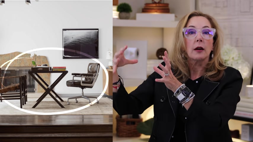
So don't be afraid to kind of create seating arrangements and usable configurations with your pieces in the room because that's what makes the room feel more graceful and more voluminous .
Now , appropriate seating arrangements kind of fall around your style statement .
So if you're more traditional , you're going to want to have 2 to 3 sort of formal sitting arrangements like you can see here .
So it's not necessarily a formal space , but they've done a sofa , two small chairs and another bench .
Those are all separated places .
This is where people can sit .
Now , if you're doing a room that's a little bit more like a great room or maybe even a den area .
Oh The magic of sectionals , sectionals are great because more people can sit closer together because usually in dens they're more familiar with each other .
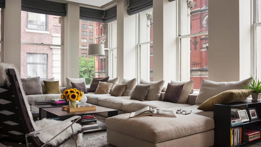
So if you're doing something that has a little bit more of a casual air to it , sectionals are a great solution with a couple of other options .
But again , get it away from the wall , get it moving out into the room .
Easy fix .
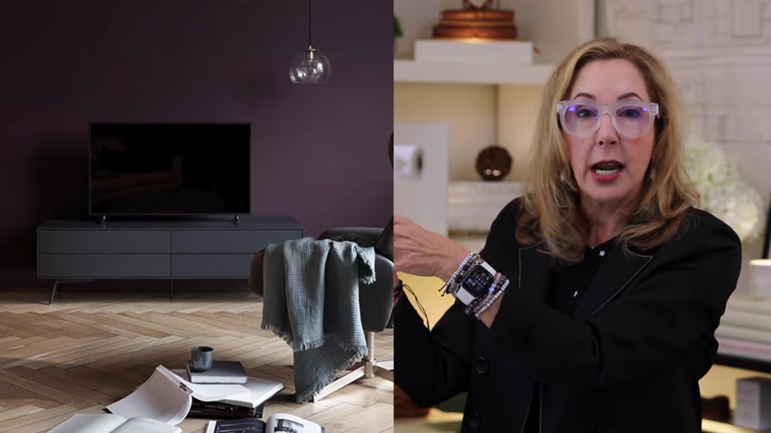
Number two , never put your TV above your fireplace .
Oh , guys , this works for no reason whatsoever .
It only works because builders put the outlets there .
They're not thinking about how you use that in that space .
That's absolutely ridiculous .
Hey , it's so high that you are gonna have neck problems if you leave it there .
So think about this , there's a lot of good other solutions .
You can make it a second , very focal point on a credenza or something lower .
So that gets the middle of the screen down .
So it's eye height when you're sitting .
That's what's important .
If you're gonna put it up there , you better be standing up all day watching that television .
So it makes no sense and it's super easy to fix .
Just find another location on a good wall that you can reorient the television towards that and make sure you've got a little bit of seating that can face that way as well done .
Easy .
Now , next up , number three , never have so much stuff in your space that you have no clear traffic pattern .
There's a lot wrong with this picture .
But one of them things that's major is that there's so much furniture jammed into that space that you can't actually pass between the pieces .
That's absolutely ridiculous .
And if your house looks like this thing with , there's just clutter everywhere you got to start editing .
So what do we do ?
We figure out what our traffic , natural traffic patterns will be right ?
Look at this beautiful space that has a clear path between the dining room and the kitchen counter and then you can move easily around the sofa or this other space that in plan you can see has plenty of kind of circulation room .
Here's a tip .
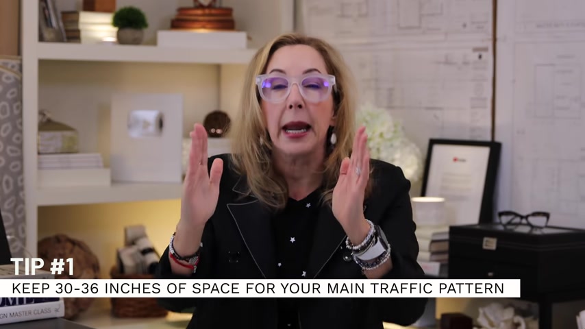
You want to keep 30 to 36 inches of space for your main traffic pattern and that can be around a large piece like a sofa or between chairs , easy , easy fix .
So just rearrange things until it kind of gives you a better traffic pattern done .
Number four is oh , never have too small a rug .
Oh , that's a terrible problem in many ways .
So you wanna make sure that you get a giant or a big , super big rug .
So if you want to know more about how to get a great big rug , check out my video on rugs .
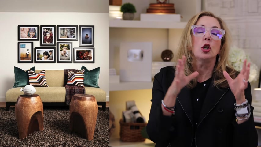
So number five is never feature personal photos in your public spaces .
Now , you may ask me why .
Well , let me tell you because it makes people feel uncomfortable .
A lot of the times they don't really want to sit and see 50 pictures of your kids' graduation .
When you're in a public space , you want to display art that you love that aligns with your style statement and then save all of those wonderful family photos and things like that for your private spaces , like your hallways , your bedrooms , bathrooms , your offices , those kinds of spaces .
That's where those belong .
Now , number six is an easy thing to think about as well .
Never forget that height and scale of your furnishings pieces matters .
So for instance , look at this coffee table , it's completely too small for the space .
So the scale on that is wrong .
Now , what do I mean by heights ?
I mean that you should have varying heights within the pieces , within the composition .
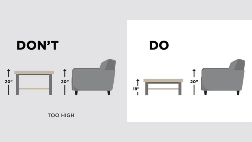
So for instance , if you have a side table next to a chair , that side table should sit below the height of the arm of the chair , if it sits above it , you're reaching up to put your drink down , that's not a way to handle that .
So you definitely want to make sure that everything kind of aligns and gives each other some balance and some space and is big enough or appropriately scaled to fit your space and the other pieces .
Number seven is a super easy one which is never forget your plants .
Living rooms are the spot where you can do a major statement with the plant if you want .
I love this picture of these two beautiful pines of some sort that have been to out .
They're amazing .
Or how about this fantastic palm frond in the corner of that ?
That's amazing .
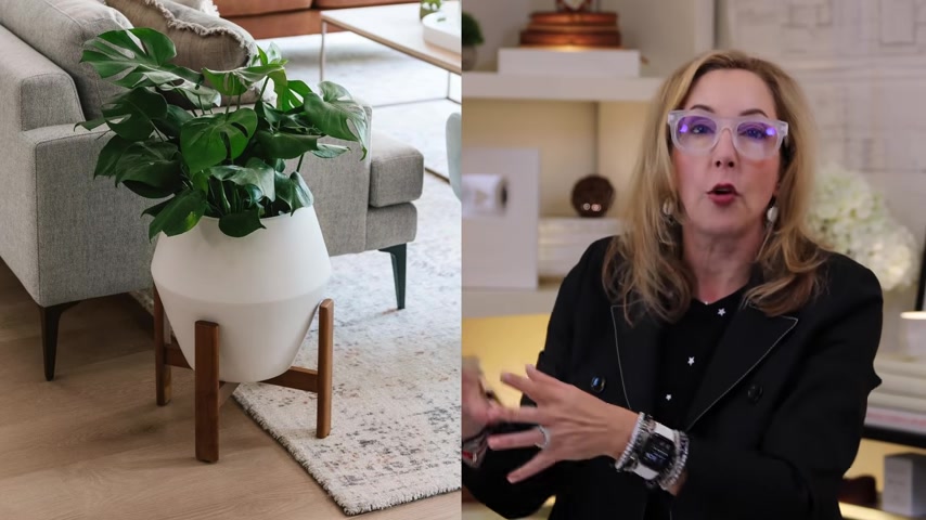
Now , you can go for big statement plants like that , that can end up being focal points or you can just add a little small something to the side that becomes part of the overall furnishings , composition .
But you want something green in your space and oh , super important .
You don't want to forget good pots and containers because they're out on display .
So you want to make sure that they kind of feel right for your style statement and they have some interest to them as well .
So I'm linking down below .
I believe this one's from West Elm , but I'm linking a bunch of really fun ones down below .
So be sure to check those out .
So number eight is , oh , it's a super easy one to fix too is never let your space be under lit .
All right , super important .
Oh my gosh .
Look at this room , one thing in the corner .
Ah that is not a good way to handle that or this other room where all the light is behind all the pieces of furniture .
So you don't know what you're getting into .
That's not fun .
Remember , living rooms are public spaces .
So you want three points of light , you wanna be able to control the light on dimmers and you want them evenly distributed around the room so that you get the light going into the directions where you want it to go .
And other people who don't live there can see what they're doing .
This is a beautiful example of a room like that .
Now , if you need more information on lighting , be sure and check out out my lighting video , it goes over all kinds of information about Kelvins and types of light you can use and gives you a bunch of info number nine .
And this is a super easy one , but it gets overlooked all the time , which is never forget the tiny details .
Here's a pro tip which is when you think you've got the room done , leave the space , literally go outside the house , ok .
Then come back in like you have never seen the room before and that will show you every little detail that you might have missed it super easy to happen .
I do that all the time .
It's a good technique and I one of the worst ones that you can do is these gangs of switches .
Oh , I don't know why builders do this and you end up with this thing .
These are not focal points and I sure as heck wouldn't knit a cover for them .
That's pretty crazy , but let's solve for them .
There's a lot of good ways to do that .
This is a beautiful example where they've purchased a gray trim piece that works really well with the tile around it .
So that's great .
You can't change the actual outlet socket itself , but you can change the trim piece and that blends in beautifully .
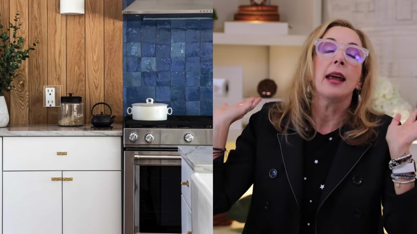
Or how about this one that's on a wood wall that they've just created a little wood trim around the , that , that's a great solution .
And if all else fails , just paint them , especially if it's an accent wall because otherwise your eye goes right to that ugly white thing and you do not want to see those .
They just want to go away and lights come on and off as if it was magic .
Now guys , the truth of it is , I can only do so much with youtube videos because they are kind of a certain length .
But if you want more , I have got so much info in the design club and it's open .
So you've definitely got to go check it out at www dot the design club dot com .
You have got to check it out .
There's all kinds of fun stuff , live chats Q and A's with me .
Tons of deep dives .
Oh , you're gonna love it .
Ok .
So guys , what I want you to do now is I want you to go right here and click this button and I've created a special playlist just for this video that you're gonna wanna see .
So click here and I'll see you next week .
Are you looking for a way to reach a wider audience and get more views on your videos?
Our innovative video to text transcribing service can help you do just that.
We provide accurate transcriptions of your videos along with visual content that will help you attract new viewers and keep them engaged. Plus, our data analytics and ad campaign tools can help you monetize your content and maximize your revenue.
Let's partner up and take your video content to the next level!
Contact us today to learn more.