
Load from PC
2024-10-04 09:58:26
Flyer & Poster Tutorial
Hello .
Hello .
And welcome back to another tutorial for , this time , our flyer and posters .
So this is based off one of our own flyers and posters for the show , one of our shows , The Fringe , last year .
And , basically , we've just sort of turned , yeah , the what are one of our designs look like into a template so you can see all the information you have to gather .
Now the idea of this is that you may want to go the whole hog and completely design your flyer and your poster yourself , in Canva or in Photoshop or whatever suits you , which is totally fine .
So what you would do is take this , sort of assemble and gather all the information that's on these pages that we've said to include , and then play with it from there in order to get it into the sort of configuration that you want for your show and your design , your for your flyer and poster .
The other option you have is to gather all of this information and maybe lay out in in this way quite in quite a kind of text blocky way like we've done , and then pass that off to your designer of choice for them to turn that into a flower and poster design as per your description or your specifications .
What I would strongly suggest , especially if you're on a budget for your friend's show or for your sort of pop theater show , whatever it is that you're doing , is instead of paying one of the specialist sort of fringe flyer and poster marketing designers who will charge you 100 and 100 of pounds , not that it's not worth it because , you know , they're great at what they do , but that might be without with your budget .
And you might think , well , I've gotta spend that money on a designer instead of eating , you know , for the next 2 months .
You don't .
What I would suggest that you do is you put this together and then you go searching on fiverr.com , f iverr.com , and find a poster and flyer designer there .
That's what we have done for multiple print shows , and there was never any difference in the quality of the flyer , whether we got it done by a West End theater designer , a marketing designer , or whether we got it done by a great person on Fiverr .
And Fiverr , across the board has very reasonable prices .
You can go back again and again as long as they include revisions .
You can go back again and again and ask for revisions and ask for changes , and you could even get them to throw in a social media kit as well that has , you know , some Instagram , like , frames for you and , like , some images to go on social media that are adjusted for the right ratios .
So here we go .
I would also recommend just make sure you get in touch with your venue as well for the fringe and say , okay .
We're gonna get , you know , our flyers and our posters done for the show .
Please reconfirm to us where we can find any guidance that we need to see from your venue because they will have specifications about exact sizing because this is just a standard a 5 and you're supposed to be a standard a 3 , and that's most likely .
But for example , I know underbelly , you can you can get one of their show boards , which is a slightly different ratio , and it's kind of like another one of their marketing things .
Anyway , check and see what ratios and what sizes of different marketing sorry , marketing materials you should have for your venue specification .
And they will give it to you , and then you'll know what exactly you need to create .
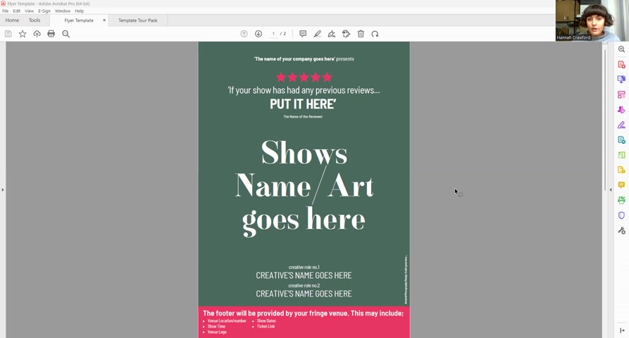
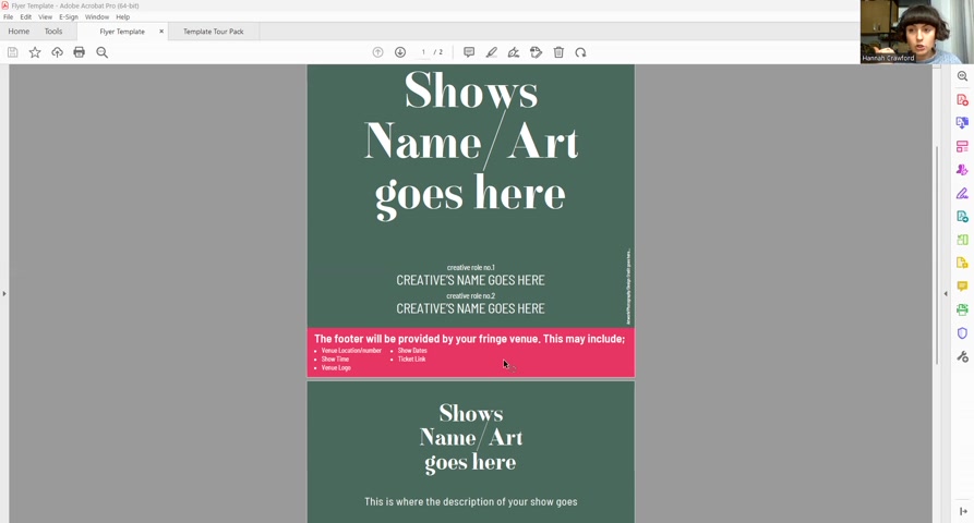
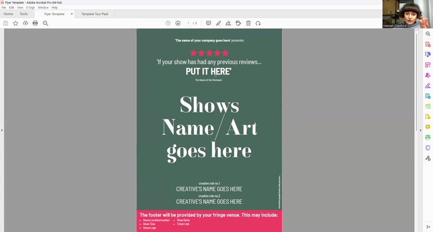
So couple of head things is that , this pink bit down the bottom here , this is your footer will be provided by your fringe venue .
So your fringe venue will give you or give you access to a directory towards their sort of marketing folder , and in there will be some specifications .
Now the specifications from the venue for this footer that you have to add on to the bottom of your poster and on to the bottom of your flyer will be very , very specific right down to , you know , with the time for your show , whether it's 2 dots and a colon between the hour and the minute or whether it's 1 dot or whether it has PM on it or not .
Like , they're very , very , very specific .
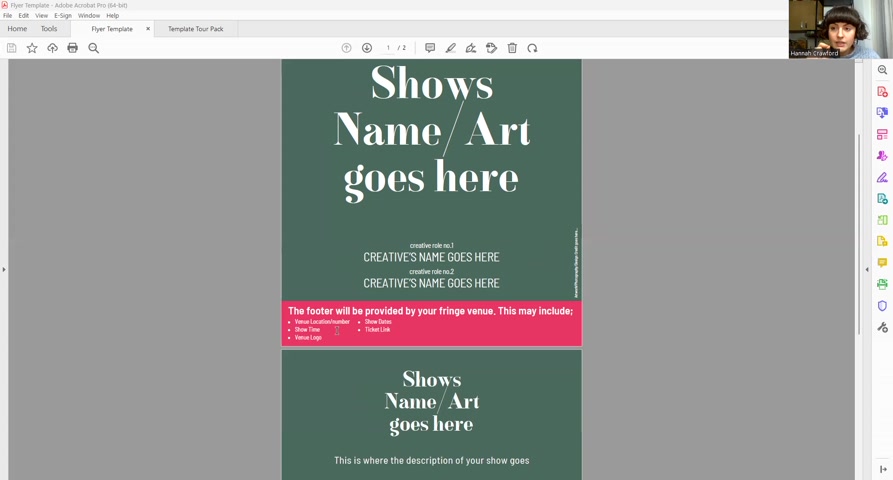
So make sure that you follow that to the letter and make sure that if you're passing it on to a designer to add on , then that you that you do that as well .
If you are doing all of this sorry , that you pass on the information and the specifications from the venue to the designer as well so they get that exactly right .
If you are doing this yourself and you're gonna create the whole design , the whole flower and poster yourself , keep in mind that the venues will probably provide this footer and any other specs to you as , like , Adobe InDesign , things .
So if you there's a couple of ways .
You can either take that InDesign file with their footer on it , and you can use some Internet applications and a bit of Canvas stuff to sort of fudge it .
So you can use Canva or use a sort of layman's design functionality to edit it , or go back to the venues and say , we don't have Adobe InDesign .
We don't have any of these funky things .
How can you help us ?
Can you give me if I give you the specs for the the information for our show , can you generate , like , a JPEG or a a PNG image for us to put on our design because we're doing it ourselves ?
Or can we send you the artwork without the footer on it ?
And can you add it in the bottom in InDesign if we leave the space for it ?
Just ask them for help because they should be able to help you and cater to you because not everybody is gonna pay Adobe to have things like InDesign , and don't waste your time doing it if it's not your area of expertise .
So what have we got on here ?
The name of your company goes here , presents .
So we would have Thistle and Rose Arts Presents .
And then before we get to the actual name of the show or the artwork , we would have any previous reviews .
If you don't have a previous review , that's okay .
You can actually put a previous review from a different show that kind of any of the main creatives or the main performers have done before .
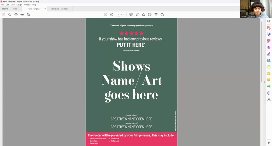
So , ideally , the kind of writer or director or , like , key performer , if you're a self performing self producing one man or one woman show , one person show , then you could put a a review from a previous show .
And then just down here , as well as the name of reviewer , you would say sort of review from , you know , for previous show , and then you would put the name of the show .
So review for Cuddles 2019 or whatever it is .
You know ?
I don't know why that show kicked my head , but I did .
So , yes , you put your your stars and what the review was , and then you would sort of style it .
So , you know , we've got if your shows have made reviews , put it here , big letters .
So you might wanna style or bold an area , a particular couple of words in the review that are particularly impactful so you could format that as you like .
Then we've got show name or art goes here .
So if you have a sort of image which incorporates the name of the show in it , then you would put that there .
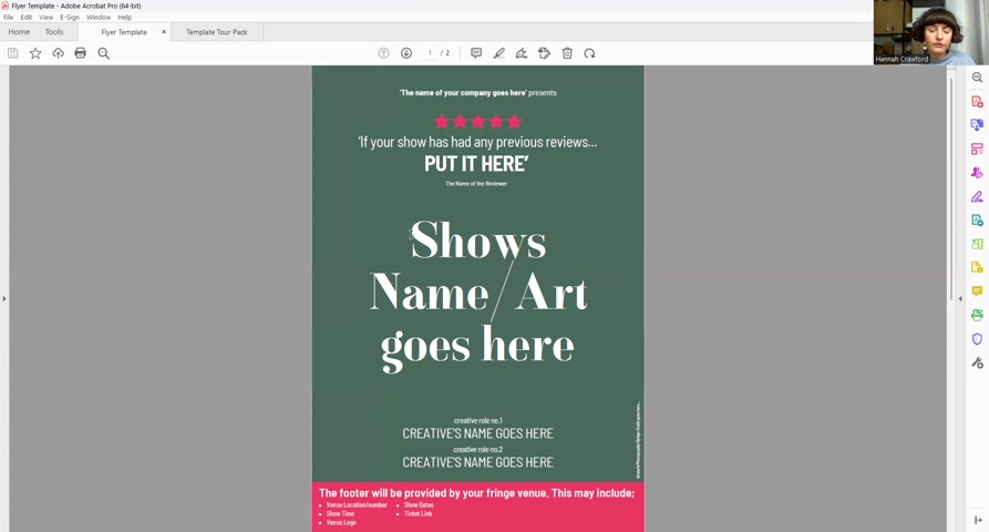
Or if you've kind of you wanna put a photo on this of your choosing and then you wanna add the name in as well .
You know , there's a few different options here , so take this with a pinch of salt .
Or if you want to combine a few different elements or if you want a fully illustrated show designed for it to to incorporate the name in the middle , then you might choose to do that .
So a few different options there , but , obviously , you want the core show image and the wording of the title that shows you the biggest thing on your flyer .
You might also want to put a couple of key creatives .
So if it's written and performed by so and so , directed by so and so , you might put that there .
And then just in the corner , we've also got here , somewhere to credit your artwork .
So you would say , you know , photography show photography by Rebecca Pitt , or she was the designer that deserves or , Michael Worley did our show photography for the for the one this was taken from .
So we would put that in little letters up the side here .
On the so sorry .
This would be the same or slightly adjusted with the margins to make sense as your poster as well .
So your poster is obviously one-sided .
It's a 3 , but all those components need to be on there .
Your flyer is double sided .
This is the front .
This is the back .
And this would be a 5 .
So you might have to edit .
It would be the same components , but you might have to edit it between the a 5 and the a 3 for your front of your flyer versus your poster , but it's the same components .
And then on the back and there'll be a footer for the a 5 version and a footer for the a 3 version for the flyer and the poster that's provided by your venue .
So you can check that and get that from On the back , once again , you'd have your show name or this kind of show arc involving the name , at the top on the back of your flyer again .
And this is where you would put the copy , the marketing copy for your show .
So what I would suggest is the venue will ask you for to provide , like , a 100 word marketing copy and then a 250 word marketing copy or something like that .
So short and a long version .
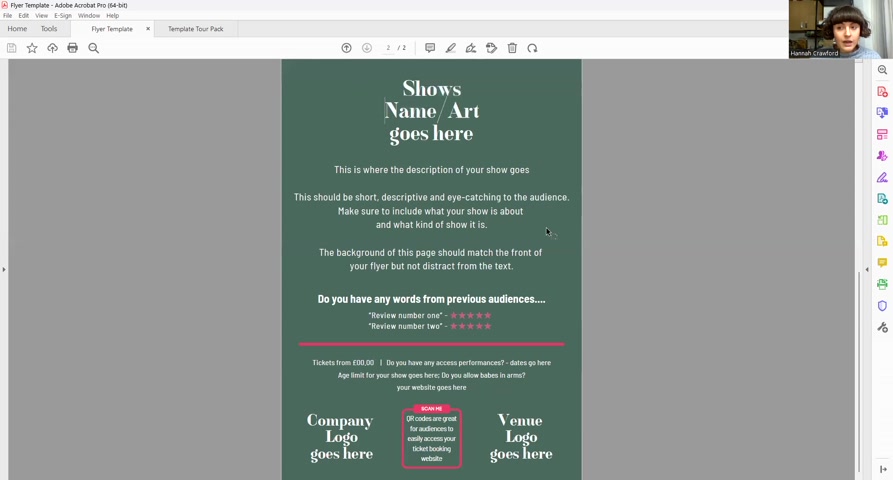
So once you've kind of written that copy once , you can repurpose it again and again , particularly for things like this and to go in your press release and all that sort of stuff .
So that's the way the description of your show goes .
We've got this pretty short description of eye catching to the audience .
So you wanna make sure that keywords that you're showing there , if there's particular topics that are covered , if there's particular kind of keywords of interest , just make sure they're all in there in your copy .
And we've said the background of this page should match the front of your flower , but not distract from the text .
So you want it to be a color that kinda matches the front .
You kind of want it if it's got any sort of decoration around the outside , particular kind of key images that can pop in from the left and right in the corners .
You'll want that on the back , but you won't want sort of loads of stuff going on .
You want this to be , quieter in terms of the amount of imagery that's on there compared to the front of your flyer .
Any words from previous audiences , again , any other audience reviews or press reviews from previous shows also work here , and you can add in very small writing that there are actually reviews from a different show .
But they're great .
So you can sort of have the text there and then the number of stars , and you could also add who the review is from .
If it's , you know , if it's from a tiny publication no one's heard of , don't worry about it .
But if it's from , you know , you got one from The Guardian previously , then obviously whack that on there .
And then we've got a little bit of a divider here .
It can be helpful to put visual dividers in the text at the back of your flyer just so it breaks up for the person reading it .
Because if it's too dense , people just won't bother and they'll just discard it .
So you just wanna give people a chance to read it .
And then we've got details of ticket prices , access performance dates , if there are any , if there's an age limit for your show , do you allow babes in arms ?
And that will be something that you decided with the venue of whether or not somebody can bring in a baby that they're or some sort of , like , under 3 year old that's gonna sit on their knee instead of having a separate ticket .
It's basically that .
And then your website , if you have one , would go here as well .
We've got here the company logo and the venue logo .
So , yeah , I would put why is this doing that ?
I do think I'd like that bar to go away .
We've got the company logo and the venue logo in each corner here .
I always like to put the venue logo because it just you know , when you've got things like that , it just makes it look very good , and let you got your shit together .
And then in the middle , we've got a QR code .
And that QR code , I used to always point towards the venue's ticket page , not the franchise ticket page because the venues on average take a lower cut for commission from the venue set the the I think most venues take 3% commission from the sale of tickets , whereas French society take 4% .
So you'll get extra 1% of every ticket sold off your venue site on average than you would from your Friends Society site .
So QR code there for your ticket page so people can get tickets super easily .
And that is the flower upholstery template .
Partnership
Are you looking for a way to reach a wider audience and get more views on your videos?
Our innovative video to text transcribing service can help you do just that.
We provide accurate transcriptions of your videos along with visual content that will help you attract new viewers and keep them engaged. Plus, our data analytics and ad campaign tools can help you monetize your content and maximize your revenue.
Let's partner up and take your video content to the next level!
Contact us today to learn more.